Weekend links 27

wang.jpg

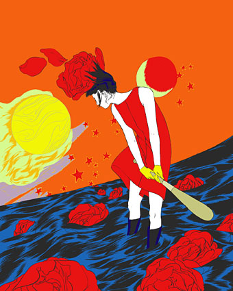
Annie Duels The Sun (2010) by Angie Wang.

I’m interviewed again, this time by James at Cardboard Cutout Sundown. Covering familiar subjects for {feuilleton} readers: art history, design, Lovecraft, the genre/mainstream seesaw, etc. Related: Jeff VanderMeer previewed my design for the forthcoming Steampunk Reloaded.

Battle over legacy of father of Art Nouveau. Prague authorities are demanding the paintings which comprise Alphonse Mucha’s Slav Epic be moved to the capital.

The films that time forgot. David Thomson on ten neglected works including a cult favourite of mine, Jerzy Skolimowski’s Deep End (1970).

The Viatorium Press: “Fine letterpress printing, digital typography, and hand painted illumination.” Among their recent productions is a poem by Clark Ashton Smith.

verne.jpg

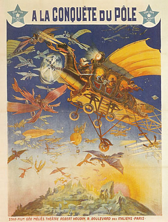
À la conquête du pôle (1912); Georges Méliès vs. Jules Verne.

Taxandria, a feature-length collaboration between Raoul Servais, François Schuiten and, er, Alain Robbe-Grillet, is on YouTube. My earlier post about the film is here.

Salvagepunk, or (maybe) Post-post-modernism: “How a music micro-trend heralds an emerging, internet-enabled, aesthetic movement.” See also the latest issue of The Wire.

Drainspotting with Remo Camerota: documenting Japan’s creative manhole covers.

• Yo-ho-ho, and a bottle of squid: a book devoted to Kraken Black Spiced Rum.

After Stanley Kubrick. Christiane Kubrick on life without Stanley K.

• Pills and penises and kissing boys: Tara Sinn’s Kaleidoscopes.

Found Objects: a hauntological dumping ground.

• Sandow Birk’s American Qur’an.

• RIP Frank Kermode.

Feuerland (1968) by Theo Schumann Combo; Feuerland (1977) by Michael Rother; Feuerland (2007) by Justus Köhnke.

Design as virus 12: Barney’s faces

lowe.jpg

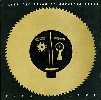
Sleeve for I Love The Sound Of Breaking Glass (1978), a 7″ single by Nick Lowe. Design by Barney Bubbles.

Continuing an occasional series. Designer Vic Fieger had a guest post at Reasons To Be Cheerful earlier this week examining Barney Bubbles’ use of the human face in his graphic designs. This is one side of the Bubbles work I really enjoy, he had a remarkable facility for demonstrating a versatility with abstract shapes—or found objects, as in the piece above—while playing games with our pattern recognition. A recurrent playfulness was one of the many notable things about his approach to design.

colour.jpg

Story title from The Best of Michael Moorcock (2009).

Fieger’s focussing on the faces in Barney’s work struck a chord for me since I’d deliberately tried something similar last year, taking a cue from Barney’s example. The Colour piece above is one of the story titles from The Best of Michael Moorcock published by Tachyon. For each story I designed a different title in a style which complemented the subject; Colour is a science fiction piece in which card games figure, hence the symbols. Mike Moorcock was friends with Barney during the 1970s so there was an additional reason for the reference.

booklife.jpg

I don’t know whether anyone has noticed the face on the cover of Booklife but it is there, with the two flowers at the top forming the eyes and the book’s title standing for the mouth. Once again, this wasn’t strictly necessary for the success of the design but it gave a rationale for the arrangment of the flowers. There’s also the hope when something is this subtle that the attraction of the pattern impells a browser to pick up the book in a shop without quite knowing why.

Booklife and The Best of Michael Moorcock are both available from Tachyon. Paul Gorman’s Barney Bubbles book, Reasons To Be Cheerful: The Life & Work Of Barney Bubbles, will be relaunched later this year in a new edition.

Previously on { feuilleton }
Into the Media Web by Michael Moorcock
Design as virus 11: Burne Hogarth
Design as virus 10: Victor Moscoso
Design as virus 9: Mondrian fashions
The Best of Michael Moorcock
Design as virus 8: Keep Calm and Carry On
Designing Booklife
Design as virus 7: eyes and triangles
Design as virus 6: Cassandre
Design as virus 5: Gideon Glaser
Design as virus 4: Metamorphoses
Design as virus 3: the sincerest form of flattery
Design as virus 2: album covers
Design as virus 1: Victorian borders
Barney Bubbles: artist and designer

Portuguese Diseases

disease1.jpg

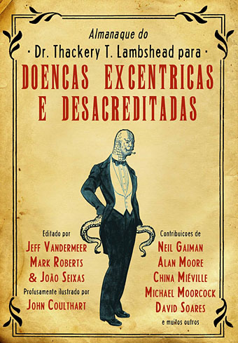
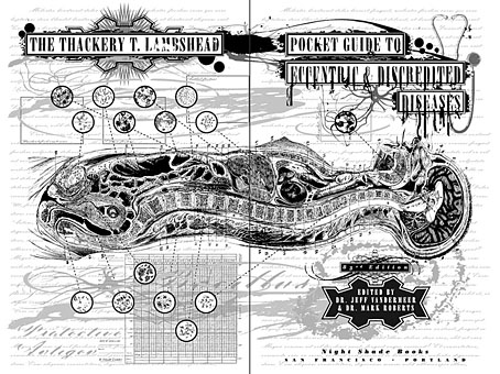
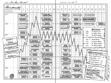
This volume appears to be in print now, the Portuguese edition of The Thackery T Lambshead Pocket Guide to Eccentric and Discredited Diseases, a unique fantasy anthology compiled in 2003 by Jeff VanderMeer and Mark Roberts. The new edition is published by Saida de Emergência and translated by Luís Rodrigues, João Seixas and Vítor Morta. I didn’t design this cover with its eccentric kerning but I did design the original edition for Night Shade, to date still one of my most elaborate and detailed book designs, too elaborate for the larger publishing houses, in fact, who either dropped or amended the deliberately diseased title spread for their paperback editions. You can see some of the original pages below. I sent the Portuguese publishers all the artwork and layouts but since I haven’t seen a printed copy of the book I don’t know how the interior looks. I don’t even know whether my name appears on the cover as it does here since other examples online show a different design. However, it’s often the case these days that cover designs get sent out prematurely for marketing purposes before things have been finalised.

disease2.jpg

Title spread.

disease3.jpg

Contents spread.

Previously on { feuilleton }
Pasticheur’s Addiction

Johann Theodor de Bry’s Neiw Kunstliches Alphabet

debry.jpg

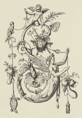
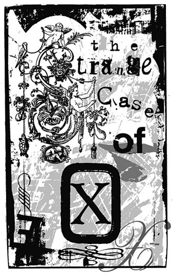
A page from Johann Theodor de Bry’s Neiw Kunstliches Alphabet (1595) which can be found in a free PDF version here, the scans being taken from a Victorian reprint. The late, lamented Giornale Nuovo featured some of these curious letter designs in 2005. Each capital is embellished with various symbolic figures—Moses appears perched on the letter M, for example—whilst also being draped with fruit, lobsters and even insects. I used a smaller redrawing of De Bry’s letter S for one of the page designs in Jeff VanderMeer’s City of Saints and Madmen in 2002. Probably not the use that De Bry intended but then I expect he’d be surprised that his work was still being used at all after four hundred years. Via BibliOdyssey.

strange.jpg

Previously on { feuilleton }
The Book of Ornamental Alphabets
Paul Franck’s calligraphy
Gramato-graphices
John Bickham’s Fables and other short poems
Letters and Lettering
Studies in Pen Art
Flourishes

Into the Media Web by Michael Moorcock

itmw11.jpg

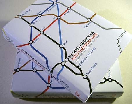
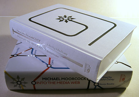
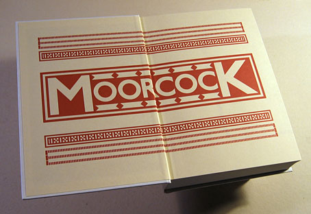
Here at last is the book I spent a good part of last year designing. Into the Media Web is a huge volume as befits a huge talent, 720 pages of Michael Moorcock’s non-fiction spanning fifty years of his career from his days writing for sf and fantasy fanzines, through to journalism, reviews and articles for major newspapers and magazines. Moorcock expert John Davey did an amazingly thorough job of compiling, editing and annotating it all, and it’s been a considerable pleasure to design such an important collection. Alan Moore provided the substantial introduction. Savoy Books haven’t announced a price yet but it’s going to be about £45 since it’s another limited edition and weighs a ton. Into the Media Web makes a fine companion to last year’s The Best of Michael Moorcock from Tachyon, also edited by John Davey (with Ann & Jeff VanderMeer) and whose interior I also designed. Details about Into the Media Web‘s design follow below.

itmw12.jpg

The dust jacket is matt white with a spot UV layer which picks out the titles and lines in gloss.

itmw13.jpg

Continue reading “Into the Media Web by Michael Moorcock”