The Colmore Fatagravures

colmore1.jpg

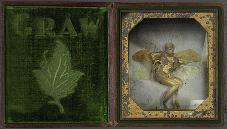
Golden Fairy Specimen.

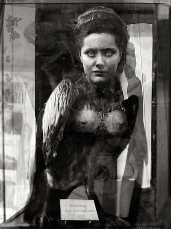
These have already been featured on many other sites but that shouldn’t exclude their presence here. The Wunderkammer concept seems to be a recurrent fascination on the web—see here and here and here, for example—possibly because the nature of the medium lends itself to the accumulation of curiosities. It’s a small step from collecting genuine curios to inventing those the world stubbornly refuses to provide, that’s what we see happening here and also at some of the earlier posts below. About the Colmore Fatagravures we’re told:

A Scottish adventurer, inventor, and photographer named Neville Colmore claimed to have constructed a device capable of “…parting the veil of Faery…”. The device, which he called the “Spectobarathrum”, produced beautiful photo graphic plates he called “fatagravures”, through a now lost process. The original “Spectobarathrum” along with all of the images he claimed to have made were believed destroyed in a fire. (More.)

colmore2.jpg

French Harpy of Questionable Provenance.

In a similar vein, I’ve already mentioned that I’ve done some design and illustration for the Thackery T. Lambshead Cabinet of Curiosities, the sequel to the Lambshead Disease Guide which is forthcoming from HarperCollins. The new book is edited by Ann & Jeff VanderMeer and publication has been announced for June. Jeff unveiled the near-final cover design just before Christmas (not my work, I should note) and a preview of some of the contents, including one of my interior pages. More about this closer to publication.

Previously on { feuilleton }
The specimens of Alex CF
Walmor Corrêa’s Memento Mori
Harpya by Raoul Servais
The art of Ron Pippin
Custom creatures
Jan Svankmajer: The Complete Short Films
Cryptozoology
The Museum of Fantastic Specimens

Ten titles and a cover

cdlcover.jpg

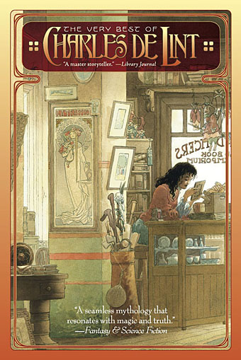
The Very Best of Charles de Lint. Art by Charles Vess.

Over the weekend I found the time to finally update the book design section of the site, adding new pages for most of the titles I’ve been working on recently. There’s still a couple of things missing but I’ll add those in due course. Many of these design jobs have been for the interiors only so what follows is a comparison of title spreads from books I’ve worked on that have been published this year. Lest it seem that I have an army of clones at my service it should be emphasised that I was working on several of these last year (and Engelbrecht was completed in 2008) but the nature of release schedules means they all carry 2010 publication dates.

sr.jpg

Steampunk II: Steampunk Reloaded, edited by Ann & Jeff VanderMeer.

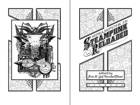
I invariably make a feature of title pages, usually creating them as a spread in order to heighten their impact. The title page is a kind of gateway to the rest of the book which gives you an opportunity to establish a mood for what follows. It’s also the area where you can be most lavish with your graphic treatment and, where necessary, add illustrative material without worrying too much about intruding on the content. With a number of these designs I was following typographic choices from pre-designed covers so the challenge was to find something that would match the cover and connect to the rest of the interior. The Charles de Lint book was a variation on this process in that the author had chosen a Charles Vess drawing for the cover art. I designed a cover to accommodate the drawing then carried the design inside. The colours were chosen to match Vess’s artwork while the general Art Nouveau style came from an Alphonse Mucha poster he’d placed on the wall. With a different cover picture the entire book would have had a very different design.

pkd.jpg

The Search for Philip K Dick by Anne R Dick.

Continue reading “Ten titles and a cover”

Gilliam’s shaver and Bovril by electrocution

pears.jpg

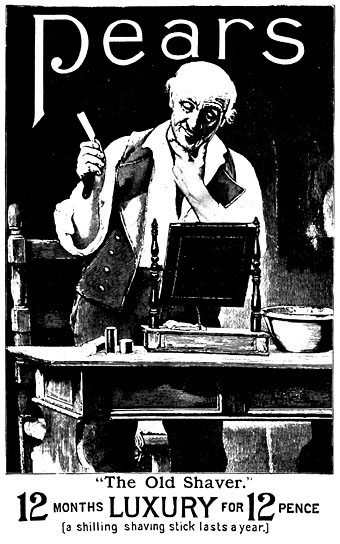
Pears Soap ad, Illustrated London News, March 16, 1895.

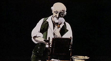
I’ve been working feverishly this week to complete page designs for The Thackery T. Lambshead Cabinet of Curiosities which will be published next year by HarperCollins. This is a sequel of sorts to 2003’s Thackery T. Lambshead Pocket Guide to Eccentric and Discredited Diseases to which I was also a contributor and designer. Ann and Jeff VanderMeer are editing the new collection, and Jeff has posted a couple of teaser introductions to the contents here and here. Gabriel in yesterday’s comments mentioned Terry Gilliam’s animations for the Monty Python TV series, something I was reminded of today while leafing through a 1968 collection of old advertising graphics looking for suitable pictures. Victorian Advertisements was compiled by Leonard de Vries and Ilonka van Amstel, and its Pears Soap ad (above) is obviously the source of Gilliam’s animation (below) showing a man lathering his face then beheading himself with a straight razor, a gag which features in both the TV series and the first Monty Python feature film And Now For Something Completely Different.

gilliam.jpg

And Now For Something Completely Different (1971).

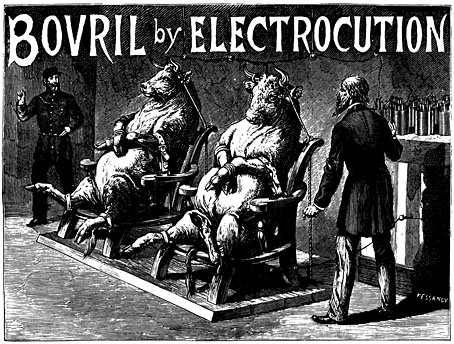
It’s easy to see what would have attracted Gilliam to the De Vries book when it’s filled with bizarre or grotesque ads like the Bovril one below; someone evidently decided that the meaty drink ought to be promoted via the novelty of electricity.

bovril.jpg

Bovril ad from The Graphic, Christmas number, 1891.

De Vries features many ads for electrical products, not all of them genuine or even likely:

Pseudo-science began to play the part it still plays in therapeutic advertising. Electric light was, by the end of the century, being installed in theatres and restaurants and in some private houses. To what other uses could the magnetic fluid be put? Electricity was the new magic and all kinds of quarters began to exploit its possibilities—and impossibilities. The Medical Battery Company Limited, of Oxford Street, assured the public that its Electropathic Belt had “restored thousands of sufferers to health and vigour”, and had “proved an inestimable blessing to the weak and languid”. It was particularly recommended for “weak men suffering from the effect of youthful errors”. Did the weak men in question wear the contraption in bed? Women also could benefit by it, and one is a little surprised to find this and other remedies for “female irregularities” so frankly discussed. An Electric Corset was the “Very Thing” for ladies. One can only wonder how the batteries if there were any operated. And what could possibly be meant by an “electric” towel, and how could failing sight be cured by an “eye battery”?

There’s also an Electric Hair Brush which gives “hope for the bald” without explaining how it differs from an ordinary brush. Several of the pieces in the new Lambshead volume will be exploring similarly eccentric territory. Watch this space for further details.

Previously on { feuilleton }
Portuguese Diseases
Pasticheur’s Addiction
Short films by Walerian Borowczyk

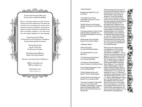
Steampunk Reloaded

sr00.jpg

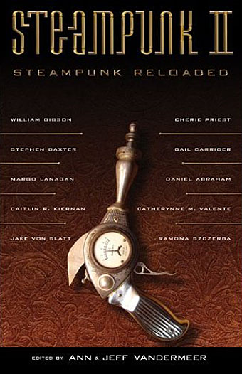
Cover design by Ann Monn. Cover image by Dan Jones / Tinkerbots.

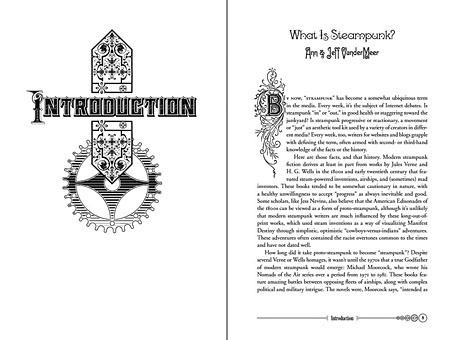
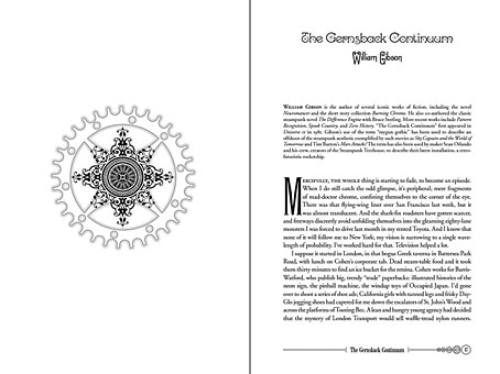
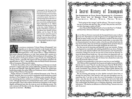
Here at last is the steampunk anthology I mentioned back in September and whose interiors I designed. This is another Tachyon publication, and also another anthology edited by Ann & Jeff VanderMeer. I went further with the design for this than I have done for other Tachyon books, partly because if there’s one thing steampunk lends itself to, it’s decoration but also because the book includes illustrations from Ramona Szczerba, Eric Orchard, and others, plus a comic strip by Sydney Padua; adding extra spot illustrations stopped the pictorial material from seeming too isolated.

sr01.jpg

Title spread. The illustration on the left is one I created last year.

This is a sequel to an earlier steampunk anthology by the same editors but the contents are just as strong as the first collection with excellent stories throughout. (For a review, see here.) By coincidence the book is published in the wake of a recent (and inevitable) backlash against steampunk as science fiction sub-genre and cultural phenomenon. This collection can serve as a repudiation to some of the lazier accusations that writers are ignoring the moral and physical squalor of the Victorian era and the legacies of imperialism; several stories in Steampunk Reloaded address those very issues. For my part I’ve read Friedrich Engels’ Condition of the Working Class in England, Henry Mayhew’s London Labour and the London Poor, and Kellow Chesney’s The Victorian Underworld so I don’t feel in urgent need of a lecture on the iniquities of the 19th century, thank you very much.

sr02.jpg

While we’re on the subject, the cover of The Steampunk Bible, edited by Jeff VanderMeer and SJ Chambers, has been revealed here. Abrams will be publishing this next year and having seen some of the interior pages it’s going to be a splendid book. More about that later. Further pages from Steampunk Reloaded follow.

Update: A couple more reviews here and here.

sr03.jpg

Contents spread.

sr04.jpg

sr05.jpg

sr09.jpg

A detail of one of the page footers.

sr06.jpg

Title page for A Secret History of Steampunk, a self-contained section within the body of the book.

sr07.jpg

sr08.jpg

Previously on { feuilleton }
Steampunk overloaded!
Skeleton clocks
Vickers Airship Catalogue
The Air Ship
Dirigibles
More Steampunk and the Crawling Chaos
The art of François Schuiten
Steampunk Redux
Steampunk framed
Steampunk Horror Shortcuts
The Airship Destroyer
Zeppelin vs. Pterodactyls

Steampunk overloaded!

infernal.jpg

Yes, it’s the “S” word again, and if there was any doubt that this has been the Year of Steampunk here at Coulthart Towers, look at these recent works. And this is by no means everything I’ve been doing in this area, there’ll be further announcements later on.

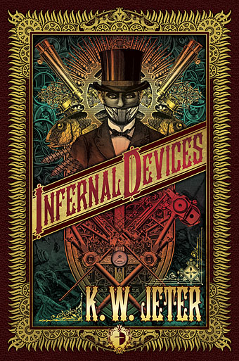
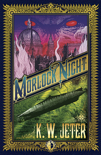
The covers for KW Jeter’s novels are a pair of reprintings from UK publisher Angry Robot whose books will shortly be available in the US and Canada. Jeter is now famous—infamous, perhaps—for having given the word “steampunk” to the world in the early 1980s. This was intended as a jest after he and a couple of other writers (including a favourite of mine, Tim Powers) had written a number of science fiction novels set in the 19th century; like many light-hearted neologisms, it gained a life of its own. Angry Robot are reissuing two of these early works as a result of the ongoing steampunk explosion.

morlock.jpg

Morlock Night (1979) is a pulpy affair which sees the Morlocks from HG Wells’ The Time Machine using the Time Traveller’s vehicle to return to Victorian London and wreak no end of havoc. Infernal Devices (1987) is a rather more substantial confection involving a great deal of clockwork mechanisms (for once the clock parts are justified!), automata, fish people, and a device capable of destroying the earth. I’ve been producing a lot of engraving collage à la Ernst and Sätty recently but the technique seemed especially appropriate here as a means of illustrating works which themselves are collages of Victorian motifs.

zeppelins.jpg

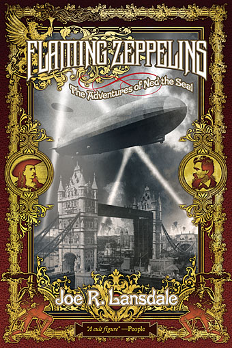
Meanwhile, over at Tachyon Publications, there’s this cover for another Victorian adventure, two in fact, from master beserker Joe R Lansdale. Flaming Zeppelins combines a pair of comic adventures, Zeppelins West (2001) and Flaming London (2006), which feature a host of notable figures including Mark Twain, Annie Oakley, Buffalo Bill Cody…and a talking seal. Publication date is November 1st.

steampunk.jpg

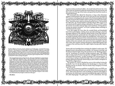
Then from Tachyon in mid-November there’ll be Steampunk II: Steampunk Reloaded, a 430-page anthology edited by Ann & Jeff VanderMeer which includes fiction and non-fiction from William Gibson, Caitlín R Kiernan, Jeffrey Ford, Cherie Priest, and many others. Also a comic strip, copious illustrations and a very full-on interior design from yours truly of which I’ll only show you the above page for the time being. Yes, that’s a mechanical ostrich but if you want to know what it’s doing there you’ll have to read the book. More about this later. And more later about The Steampunk Bible to which I’m also a contributor, a glossy, full-colour guide to the entire sub-culture which will be published next year by Abrams. By the time that appears I’ll probably be sick of the sight of clockwork parts, dirigibles, florid typefaces and Victorian decoration; I’ll be needing a good dose of Helvetica and Josef Müller-Brockmann minimalism to calm down.

Previously on { feuilleton }
Skeleton clocks
Vickers Airship Catalogue
The Air Ship
Dirigibles
More Steampunk and the Crawling Chaos
La route d’Armilia by Schuiten & Peeters
The art of François Schuiten
Steampunk Redux
Steampunk framed
Steampunk Horror Shortcuts
The Airship Destroyer
Zeppelin vs. Pterodactyls