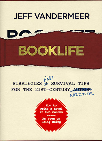
Designing Booklife

bl1.jpg

I created a cover design recently for Jeff VanderMeer‘s new novel, Finch, and shortly after completing that Jeff asked if I could put together some cover ideas for his forthcoming writer’s guide, Booklife, which Tachyon will be publishing later this year. Jeff is known as a fantasy writer but this book was intended to have a general appeal for any would-be or working writer. It also needed to look suitably contemporary and (possibly) reflect the discussion within which concerns the modern writer’s use of computers, the internet and social networks. Lastly, several lines of text needed to be placed on the cover without it looking confused or messy.

I agreed to this whilst busy with several other projects so the initial drafts were rather haphazard. (That’s my excuse, anyway.) The first version (above) came out of an idea to apply a kind of trompe l’oeil effect to the cover with a torn dustjacket and handwritten amendments. The red call-out/roundel highlights an important sub-section of the book. This was knocked up very quickly and, as well as not looking very contemporary, the title doesn’t look enough like gold blocking to be convincing. Jeff requested something more up-to-date.

Continue reading “Designing Booklife”

Finch

finch.jpg

A new book cover design which I’m posting slightly ahead of time—it still needs a suitable blurb adding—since Jeff VanderMeer was eager to show it to his readers. You can see it bigger size here.

Finch is the third book in Jeff’s cycle of unique fantasy novels and stories about the city of Ambergris. This book shifts emphasis from the previous ones with a tone borrowed from crime/thriller fiction (but still set in the fungus- and squid-infested city) hence the gun outline and blood spatters. I keep being drawn back to Ambergris, having provided designs for the first volume, City of Saints and Madmen, and recently designed a new edition of Shriek: An Afterword.

Publisher: Underland Press, October 31, 2009, trade paper

Description: A noir thriller/visionary fantasy set in the failed state of Ambergris, 100 years after Shriek: An Afterword. The gray caps, mysterious underground inhabitants, have re-conquered Ambergris and put the city under martial law, disbanding House Hoegbotton, and controlling the human inhabitants with strange addictive drugs, internment in camps, and random acts of terror. The rebel resistance is scattered, and the gray caps are using human labor to build two strange towers. Against this backdrop, John Finch, who lives alone with a cat and a lizard, must solve an impossible double murder for his gray cap masters while trying to make contact with the rebels.

Nothing is as it seems as Finch and his disintegrating partner Wyte negotiate their way through a landscape of spies, rebels, and deception. Trapped by his job and the city, Finch is about to come face to face with a series of mysteries that will change him and Ambergris forever.

The cat and the lizard watch intently. Something is about to happen. And they both want to know: who is Finch, really?

Previously on { feuilleton }
Steampunk Horror Shortcuts
A cover for Mr. VanderMeer
Pasticheur’s Addiction
Fungal observations
Shriek: The Movie
Jeff on Bldgblog
An announcement redux
City of Saints and Madmen

Mixed blessings

arthur32.jpg

Arthur #32 is now out with a great cover. As usual you can download it from the Arthur site. Unfortunately that’s the only way you’ll be able to get hold of this issue since the paper copy won’t be printing. Arthur still needs your support, however, via subscriptions, donations and/or advertising if you haven’t wasted all your money helping investment bankers hang on to their bonuses.

shriek.jpg

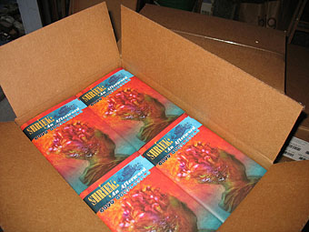
On the upside, Jeff VanderMeer notified me that Shriek: An Afterword, the novel of his which I designed earlier this year, has arrived from the printer and should be shipping forthwith. Read more about that (and order a copy) here.

Previously on { feuilleton }
Fungal observations

Steampunk Horror Shortcuts

steampunk.jpg

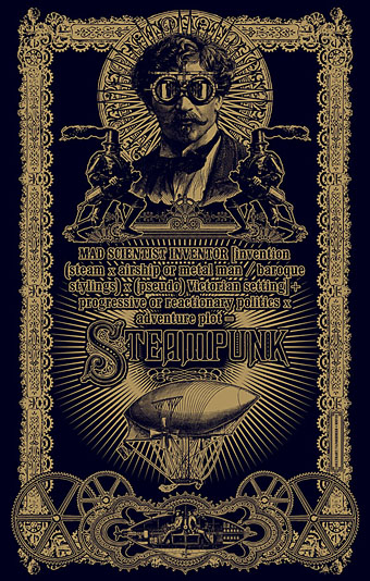
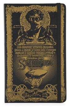
steampunk2.jpgTime again for some work updates and other news. I mentioned in August that this Steampunk design—created to illustrate a formula definition of the genre by Jeff VanderMeer—was originally going to be a T-shirt. That idea fell by the wayside when an opportunity arose to submit it to Modofly who were asking for Steampunk-related work for a new line of their laser-etched Molekin books.

I’m pleased to announce that the books are now done and on sale at the Modofly store. These are available in two sizes, large (5.25ins x 8.25ins; 13.3cm x 20.9cm) and small (3.5ins x 5.5ins; 8.9cm x 13.9cm), $36 USD and $22 USD respectively.

penny_blood.jpg

Next up is issue 11 of Penny Blood, an American horror magazine due out shortly which includes a feature on David Britton’s Lord Horror character and runs through the often tormented history of Savoy Books. Savoy’s Mike Butterworth and I were both interviewed and the piece should also include some comments from Keith Seward whose Savoy title, Horror Panegyric, examines the Lord Horror mythos. They don’t say yet when the magazine is out but it’s available for pre-order now.

While we’re on the subject of his lordship, I recently updated my pages for the Reverbstorm comics with a lot more samples taken from the re-scanned and re-lettered artwork. Work is still progressing on assembling the definitive single-volume edition of Reverbstorm as time permits. I’ve finished work on all seven published issues and am now engaged with the eighth and final section. More about that, and Reverbstorm itself, at a later date.

shortcuts.jpg

Finally, there’s another new CD design out, my fourth this year and there are more on the way; I’m starting to feel prolific. As can be seen from the cover, this was a very minimal job. A Made Up Sound is a pseudonym of Dave Huismans, aka 2562, whose excellent Aerial album I also designed. Shorctuts is a collection of electronic sketches and Dave took the moodily anonymous photographs himself.

Thomas Paul’s sealife

thomas_paul.jpg

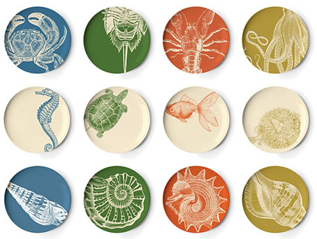
Thomas Paul’s melamine plates parallel Laura Zindel’s ceramics in their borrowing of natural history engravings. Anything which brings tentacles into home furnishing gets a vote here and the octopus design at the top right can also be found on Paul’s cushion designs. Jeff VanderMeer would probably bemoan the absence of the squid but I took care of that department last year.

Previously on { feuilleton }
The art of Rune Olsen
Laura Zindel’s ceramics
Octopulps
New things for April II
Darwin Day
The glass menagerie