Delville, Scriabin and Prometheus

delville1.jpg

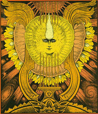
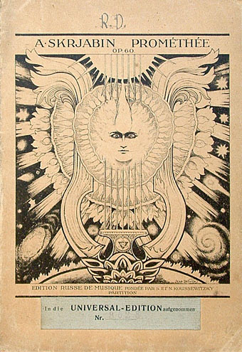
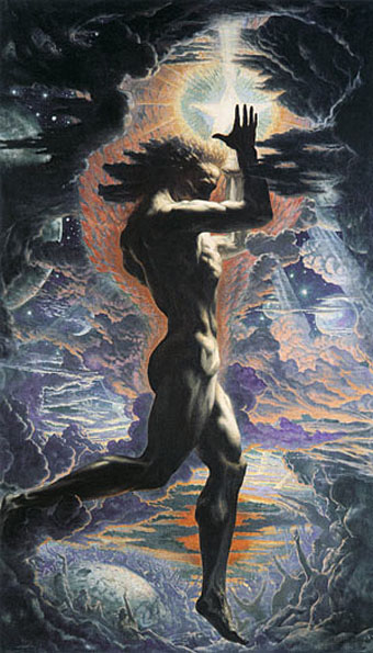
Another striking design found by chance. Symbolist artist Jean Delville (1867–1953) created this sheet music title page for Promethée by Scriabin in 1912, and the pair are well-matched given their shared predilection for mysticism (Theosophy in Delville’s case). Delville had also dealt with Prometheus in a typically dramatic, if sexless, picture a few years earlier (below). Once again it’s unfortunate that one of the really great artists of the Symbolist period is so poorly-served by the web that one has to discover his work by accident. There’s a dedicated site here but the gallery pages are only harvesting what’s already scattered around. Delville had a long and consistently high-quality career; he deserves better.

delville2.jpg

delville3.jpg

Prometheus (1907).

Update: Dave C reminds us of another Delville site with a better selection of pictures including a photo of the artist at work.

Previously on { feuilleton }
The faces of Parsifal
Masonic fonts and the designer’s dark materials
Angels 4: Fallen angels

The faces of Parsifal

parsifal.jpg

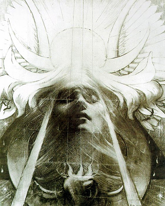
Parsifal by Jean Delville (1890).

Continuing the occasional series of posts examining the evolution of a particular design or image, this one begins with a mystical charcoal drawing by Belgian Symbolist, Jean Delville (1867–1953), our object of concern being that entranced or dreaming face.

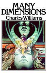
lamb.jpgMy first encounter with Delville’s image wasn’t via the original but came with this Seventies’ version produced for a Charles Williams paperback cover by illustrator Jim Lamb. (And this copy is the only one I can find, reused on a recent audiobook of Williams’ novel. If anyone has a link to a larger copy of the paperback cover then please post it in the comments.) Yes, this is tenuous but when I eventually got to see Delville’s picture it made me think immediately of Lamb’s illustration. Many Dimensions is one of my favourite books by Williams and unusually for him it deals with Islamic rather than Christian mysticism; in that case if Lamb was borrowing from Parsifal then it’s a case of the right image for the wrong book.

Jim Lamb is another illustrator from this period who now works mainly as a landscape artist.

Continue reading “The faces of Parsifal”

Masonic fonts and the designer’s dark materials

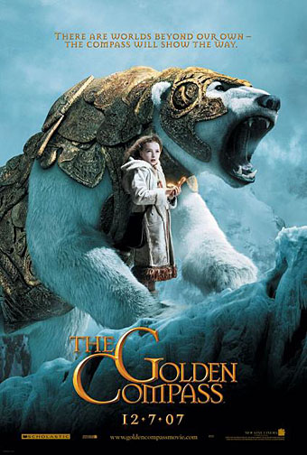
golden_compass.jpg

The trailer for The Golden Compass turned up this week, the first part of Philip Pullman‘s His Dark Materials trilogy, and I can’t help but note that the film’s designers have chosen Jonathan Barnbrook’s Mason font for the titles and the rest of the typography. This isn’t so surprising given that Mason has been used on the covers of several editions of the books already but I wonder if this flush of even greater popularity will spell (as it were) the end of a stylish typeface.

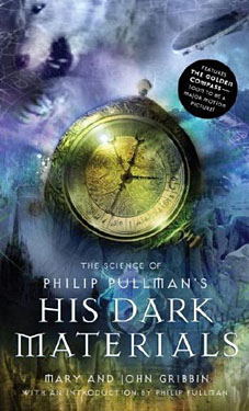
hdm.jpgMason (originally named Manson) was one of Barnbrook’s earliest published type designs, appearing in 1992 via the Emigré foundry, and over the past fifteen years has been widely imitated and become the default font for fantasy works, especially book jackets. The attraction for the genre is obvious in the way the design uses elegant and traditional serif letterforms that have been amended slightly to give them a distinctive quasi-ecclesiastical flavour, with flourishes derived from Greek, Renaissance and Biblical letters. The Gothic arch of the letter A has also helped make the font a popular choice for New Age or occult books. Mason was designed as a set of serif and sans serif variations but it’s Mason Serif Regular which is used the most. (The cover for The Science of His Dark Materials shown here is using both the sans serif variation and Mason Regular Alternate.)

Distinctive fonts take a while to get around and I don’t recall seeing Mason until at least 1994. From 1995 to 2000 it began to appear everywhere, even in newspaper ads for a while, before finding a permanent place in the book world. The trouble with this kind of ubiquity is that the novelty the design once possessed quickly vanishes and it begins to runs the risk of becoming a design cliché. Many typefaces go this way, especially in the publishing world where the choice of typeface is often dictated by genre expectations. So Orbit-B and its variants used to signify “science fiction” or “the future” in the 1970s, Caslon Antique and Rubens have become associated with horror while FF Confidential has been over-used for crime novels.

Continue reading “Masonic fonts and the designer’s dark materials”

Czanara’s Hermaphrodite Angel

czanara.jpg

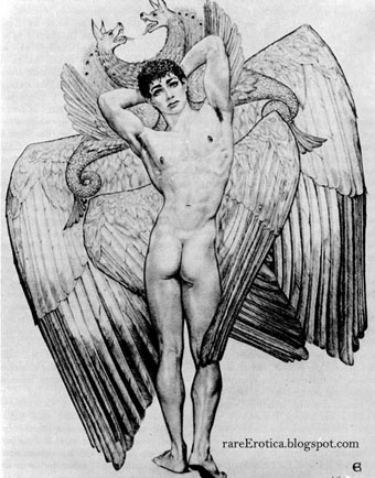
More obscure art, only now we’re talking really obscure. This remarkable picture, The Hermaphrodite-Angel of Peladan by Czanara, turned up in the archives of Russ Kick’s seemingly abandoned Rare Erotica blog. “Czanara” was one Raymond Carrance (1921–?), a gay artist who I haven’t come across before and who seems to be completely absent not only from my library, but from most of the web. A great shame, if there’s more of his work like this I want to see it.

The “Peladan” of the title might be a reference to Sâr Péladan, founder of the Catholic Order of the Rose and the Cross in fin de siècle Paris, and guru to a number of significant Symbolist painters, including the brilliant Jean Delville. Hermaphroditism and androgyny were important themes for Péladan who declared, in an outburst typical of the period, “the androgyne, is the plastic ideal!” Czanara’s picture is certainly Symbolist in its details—those multiplied wings and hippogriffs—even if its intent is most likely a result of mundane pornographic imperatives.

Elsewhere on { feuilleton }
The gay artists archive
The fantastic art archive

Previously on { feuilleton }
Angels 4: Fallen angels

Angels 4: Fallen angels

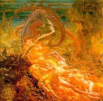
delville_satan.jpg

The Treasures of Satan by Jean Delville (1894).

Some more favourite paintings today. Jean Delville produced a splendidly strange portrayal of Satan as an undersea monarch lording it over a sprawl of intoxicated, naked figures. When Savoy Books decided to put together the definitive version of David Lindsay’s equally strange fantasy novel, A Voyage to Arcturus, I felt this was the only painting adequate to the task of filling out the cover. That was in 2002; a year later Gollancz used the same painting on the cover of their Fantasy Masterworks paperback edition of the book. Lindsay’s book has been plagued by bad cover art for years so we managed to raise the bar for future editions. Delville was one of the great painters of the Symbolist school, all his work is worth looking at.

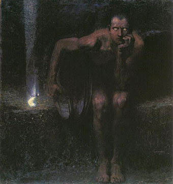
There are numerous representations of Lucifer but Franz Stuck’s is especially striking and apparently caused viewers to cross themselves before it when it was first exhibited.

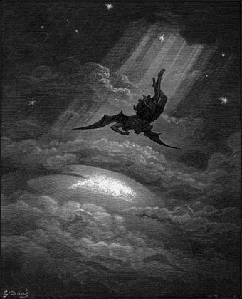
Gustave Doré’s tumbling figure is from his illustrated edition of Paradise Lost, a book full of armour-clad, spiky-winged angels. Some of those wings have even found their way into my work via the miracle of Photoshop.

stuck_lucifer.jpg

Lucifer by Franz Stuck (1890).

dore_lucifer.jpg

Paradise Lost by Gustave Doré (1866).

Elsewhere on { feuilleton }
The etching and engraving archive

Previously on { feuilleton }
The art of Thomas Häfner, 1928–1985