L’Araignéléphant

kamler.jpg

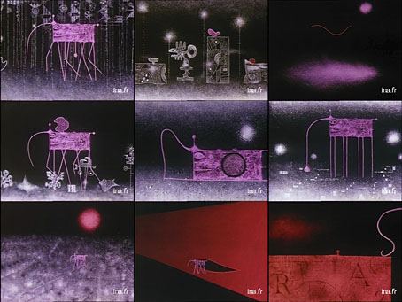
L’Araignéléphant (1967) is another of the strange animations made by Piotr Kamler in the 1960s and 1970s, this one being a 9-minute piece concerning the travails of “the spiderelephant”. As with Kamler’s Le labyrinthe, the music is by the French electroacoustic composer Bernard Parmegiani whose death was announced this week, hence the link. Parmegiani had a varied career which included scores for a number of other films (among them a Jan Lenica short, A, which I’ve not been able to find), and more commercial music than people at his serious end of the composition scale usually produce.

Ubuweb has a selection of Parmegiani’s longer compositions, one of which, Pop’eclectic (1969–1973), chops up pop and classical recordings (spot the Small Faces!) in a manner which would become commonplace a decade or so later with the advent of sampling. The Kamler films, meanwhile, are all available on a single DVD where the narration for L’Araignéléphant—which doesn’t explain very much—is subtitled.

Previously on { feuilleton }
Psyché Rock
Le labyrinthe and Coeur de secours
Chronopolis by Piotr Kamler
The poster art of Akiko Stehrenberger

stehrenberger1.jpg

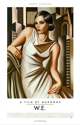
W.E. (2011).

Being someone who enjoys adopting and pastiching different art and design styles for different projects I naturally like to see other people doing the same. American illustrator and designer Akiko Stehrenberger is very adept at using this approach for her film posters. Without knowing the identity of the person responsible you wouldn’t guess that they were all the work of the same person.

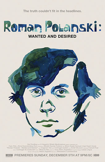
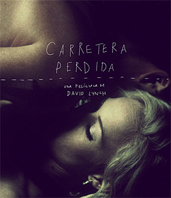
The Madonna and Polanski posters are the two most overt pastiches, being based respectively on the paintings of Tamara de Lempicka, and the posters by Jan Lenica for Polanski’s Repulsion and Cul-de-Sac. Good as the poster for W.E. is, it seems the studio preferred a more cliched “romantic” treatment for their international sales. Stehrenberger’s Mac desktop design for Burn After Reading was dropped in favour of yet another Saul Bass pastiche. (As a sidenote I’d suggest a moratorium on imitating Saul Bass for the time being; it’s getting boring.) The Lost Highway design isn’t a poster but I added it here since it’s a surprising take on David Lynch’s noir piece. I like the way the dotted line can be taken either as road markings or a line signifying the division in the film between the separate storylines and the separated characters.

Akiko Stehrenberger talked to Adrian Curry earlier this year about her favourite film posters.

stehrenberger2.jpg

Burn After Reading (2008).

stehrenberger3.jpg

Roman Polanski: Wanted and Desired (2008).

stehrenberger4.jpg

Lost Highway (Spanish Blu-ray cover).

Previously on { feuilleton }
La Belle et la Bête posters
Dr Mabuse posters
The poster art of Frank McCarthy
Repulsion posters
The poster art of Vic Fair
Petulia film posters
Lucifer Rising posters
Wild Salomés
Druillet’s vampires
Bob Peak revisited
Alice in Acidland
Salomé posters
Polish posters: Freedom on the Fence
Kaleidoscope: the switched-on thriller
The Robing of The Birds
Franciszek Starowieyski, 1930–2009
Dallamano’s Dorian Gray
Czech film posters
The poster art of Richard Amsel
Bollywood posters
Lussuria, Invidia, Superbia
The poster art of Bob Peak
A premonition of Premonition
Metropolis posters
Film noir posters

Rhinoceros by Jan Lenica

lenica1.jpg

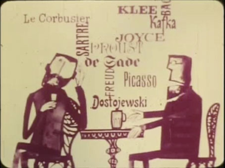
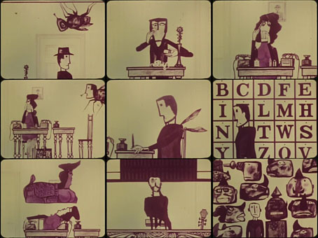
As noted here last year, Polish artist Jan Lenica (1928–2001) was also an animator as well as a celebrated poster designer. Die Nashörner (1964) is an 11-minute condensation of Eugène Ionesco’s Rhinoceros that no doubt works best if you’re familiar with the play but which nevertheless contains some funny moments, especially when “Rhinocerosism” starts to spread. The film is free to download at the Internet Archive.

lenica2.jpg

Previously on { feuilleton }
Repulsion posters
Dom by Walerian Borowczyk and Jan Lenica
Labirynt by Jan Lenica

Repulsion posters

repulsion1.jpg

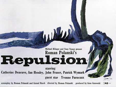
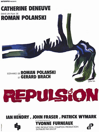
More Roman Polanski. The BFI is running a season of the director’s work through January and February so Repulsion (1965) and Chinatown (1974) have been put back into circulation nationwide. I don’t live in London but I have a large number of Polanski’s films on DVD so it looks like this month will also see a mini-season in south Manchester. Anchor Bay released a set of Polanski’s first three films (plus a disc of his short works) a few years ago, a great collection whose only flaw was a lack of Jan Lenica’s poster art for Repulsion and Cul-de-Sac (1966). I don’t know what posters are being used to promote the new release of Repulsion but something using Lenica’s artwork would seem essential.

repulsion2.jpg

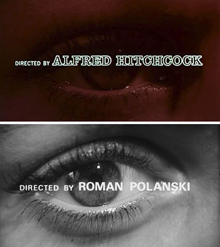
The colour and brush style of the prone figure is very typical of Lenica but when combined with either the Clarendon typeface in the British example above, or the blocky lettering for the French poster, a Saul Bass-like design appears. The gender and eye symbols in the hand-drawn lettering reinforce a resemblance which I’d guess was deliberate. The title sequence for Repulsion, with the credits sliding across a close view of Catherine Deneuve’s eyeball, could almost have been created by Bass; the director’s credit (below) requires no further argument.

repulsion7.jpg

Continue reading “Repulsion posters”

Dom by Walerian Borowczyk and Jan Lenica

dom.jpg

Dom.

Having referred this week to individual animated films by Borowczyk and Lenica here’s their ten-minute collaboration from 1959. “Dom” means “house”, with the house in question providing a vague framing device for otherwise disconnected episodes, some of which repeat themselves. It’s more of a curio than anything, most interesting (again) for the moments that would be better explored by future directors. In addition to further collage animation there’s a short sequence which gives octopoid life to a human wig that’s very reminiscent of Jan Svankmajer. Watch the whole thing here.

Previously on { feuilleton }
Les Jeux des Anges by Walerian Borowczyk
Labirynt by Jan Lenica
Short films by Walerian Borowczyk