The Dreaming City by Michael Moorcock

dreaming.jpg

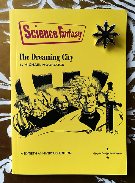
Cover art by James Cawthorn. Chaos pin not included.

More sword and sorcery. Last month I was asked to design a reprinting of the very first Elric story by Michael Moorcock, a standalone publication from Jayde Design intended to commemorate the 60th anniversary of Moorcock’s most popular character. The Dreaming City was published in issue 47 of Science Fantasy magazine in June 1961, following a request from the editor, John Carnell, for Moorcock to write a new series of fantasy stories. Over the next three years Science Fantasy published all ten of the novellas that established Elric’s character and his world, ending with Doomed Lord’s Passing in April 1964, the entry which saw Moorcock destroy his creation in a Boschian apocalyptic finale.

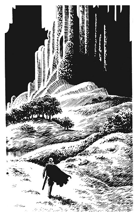
The Dreaming City: A Sixtieth Anniversary Edition is a compound facsimile of these publications. The interior design follows the template of the magazine interiors while the front cover is based on one of the later numbers which ran the fifth Elric story, The Flame Bringers, with a cover illustration by James Cawthorn. That illustration may have been attached to a different story but it actually depicts a scene from the end of The Dreaming City when Elric is leaving Imrryr in burning ruins after the place has been sacked by the raiding party he led there. It’s also a much better illustration than the one by Brian Lewis that appeared on the cover of the June 1961 issue. In addition to recreating the cover we’ve also restored the drawing, which in its printed form was slightly cropped at one side, with the complete version taken from Cawthorn’s original. Jim Cawthorn was closely involved with the creation of Elric, and even co-wrote Kings in Darkness, another of the stories in the Science Fantasy sequence. Inside the new edition there are four further illustrations which Cawthorn produced for a German collection of Elric stories published by Heyne in 1979.

dreaming2.jpg

One of James Cawthorn’s interior illustrations.

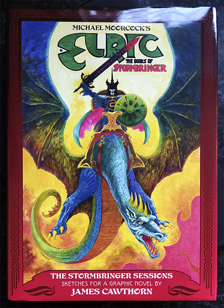
This small publication will only be of interest to collectors but it was a good thing to be involved with. In the past I’ve designed an Elric-themed album cover for Hawkwind, and last year designed The Stormbringer Sessions, a very limited publication of Jim Cawthorn’s sketched outline for his unfinished Elric graphic novel. The Dreaming City is the first Elric design of mine that features Moorcock’s own text. For an opening shot in what would become a saga spanning several decades and a variety of media The Dreaming City is a remarkably confident piece of work, even more so when you consider that the author was only 21 at the time. Elric begins and ends the story as an outsider, exiled and alone, and with his existence bound to his cursed sword, Stormbringer. Subsequent novels and stories would fill in the history before pitching Elric into the multiverse along with many of Moorcock’s other characters. But this is where it all begins, with six Sea Lords waiting in a tavern wondering whether the albino prince will turn up at all.

The Dreaming City: A Sixtieth Anniversary Edition is available here.

Previously on { feuilleton }
The Stormbringer Sessions by James Cawthorn
James Cawthorn: The Man and His Art
The Chronicle of the Cursed Sleeve
Moorcock: Faith, Hope and Anxiety
Elric 1: Le trône de rubis
The Sonic Assassins
Jim Cawthorn, 1929–2008

The Stormbringer Sessions by James Cawthorn

stormbringer15.jpg

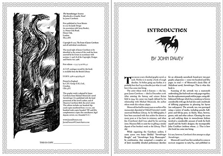
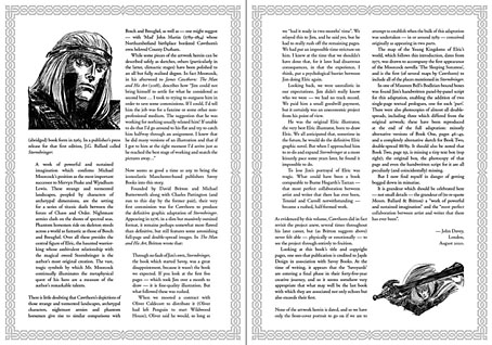
One of the books I was designing last year is published next month. The Stormbringer Sessons is a resurrection by John Davey of a sketchbook created by James Cawthorn in the mid-1980s for an Elric graphic novel that Cawthorn was commissioned to adapt and illustrate for Savoy Books. This is a limited edition that’s unlikely to be reprinted so anyone interested is advised to pre-order. (See below.)

stormbringer16.jpg

Slipcase decoration.

The original Stormbringer by Michael Moorcock isn’t a novel as such but a collection of the second series of linked novellas about Elric of Melniboné that Moorcock wrote for Science Fantasy from 1961 to 1964. Over the course of ten stories Moorcock introduced a character and a world that acted as a riposte to the Tolkienite school of heroic fantasy, where the divisions between Good and Evil are clear and fixed. Elric is like one of Sergio Leone’s characters: the difference between Clint Eastwood’s “Good” in The Good, the Bad and the Ugly and Lee Van Cleef’s “Bad” is merely a matter of degree; both men are killers chasing the same hoard of gold coins. (By coincidence, Leone was preparing to the upset the Western genre with A Fistful of Dollars just as Moorcock was finishing the first Elric stories.)

stormbringer03.jpg

James Cawthorn was one of Moorcock’s oldest friends, and a frequent collaborator. He not only illustrated the first Elric stories but also co-wrote the fourth one, Kings in Darkness. Despite having created many Elric illustrations Cawthorn always seemed to want to draw comics based on other characters, notably Moorcock’s Dorian Hawkmoon whose adventures have recently been reprinted in three volumes by Titan Books. The Stormbringer commission was a result of the late David Britton’s obsession with Elric in general and the Stormbringer book in particular. Stormbringer begins with Elric having retired from adventuring; his soul-stealing sword is locked away and he’s settled down to married life. The opening scenes parallel (and prefigure) many Hollywood plots: Elric’s wife is abducted for unknown reasons so Elric has to take up his sword and go after her. What follows is a pursuit into a world growing increasingly dark and chaotic, and with it the realisation that the events taking place are a part of a long-foretold apocalypse that will (and does) destroy that world. The progression from a regular sword & sorcery tale to doom-laden widescreen baroque, with a dragon army flying over a churning Boschian hellscape, is one of the enduring attractions of the book.

stormbringer04.jpg

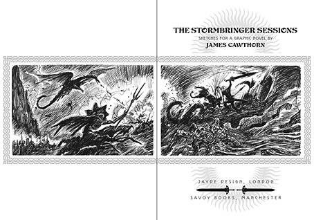
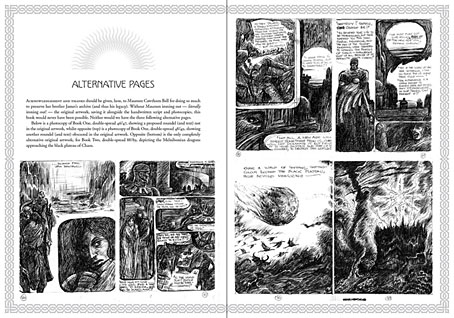
Britton had first persuaded Cawthorn to adapt Stormbringer into comic form in 1976 but the work on that occasion was compromised by lack of time. The sketches in The Stormbringer Sessions are Cawthorn’s roughs which were drawn in preparation for the second attempt, with the entire story worked out in panel form over 250 pages, complete with dialogue and captions. Some of the opening pages are rough indeed, but the drawings for the apocalyptic finale, presented in many double-page spreads, are almost finished pieces. The sketches may lack the finesse of Cawthorn’s other comics work but the power of his drawing and his imagination shines through. Nobody seems to know why he abandoned this project despite having a publisher waiting for it, but he was also adapting the third Hawkmoon book at the time, and had already spent the past decade working on the Hawkmoon trilogy.

stormbringer05.jpg

My design for this one is fairly straightforward, mostly a matter of framing and typesetting the opening and closing pages, as well as creating graphics for the cover and the slipcase. As with the Elric-themed Hawkwind album, The Chronicle of the Black Sword, I opted for Celtic-style knotwork for the decoration. Elric’s world isn’t our world but knotwork designs are universal (maybe even multiversal) while being satisfyingly antique and abstract. The publication is a co-production between Jayde Design and Savoy Books, with the book being limited to 100 numbered hardbacks in a decorated slipcase. Each copy also contains a colour print of the cover painting. The book may be ordered here. More page samples follow.

stormbringer06.jpg

Continue reading “The Stormbringer Sessions by James Cawthorn”

David Britton, 1945–2020

db.jpg

Mister Rock’n’roll, 1969.

David Britton, author, artist and publisher, died on 29th December. I wrote this for the Savoy Books news announcement:

My closest artistic collaborator from 1989 to 1999, and a close friend for longer than this: capricious, determined, fearless, funny, generous and inspirational. No David Britton, no Lord Horror; no Lord Horror, no Reverbstorm. He changed my life.

He’d been increasingly ill for several years so this came as less of a surprise to those of us close to him than to others. Dave and I used to talk at least once a week, and on the last occasion he’d sounded worse than usual. Those talks were episodes in a conversation about art that ran for over 30 years, beginning in the mid-1980s at the counter of the Savoy bookshop in Peter Street, Manchester, continuing in the Savoy offices with co-publisher and collaborator Michael Butterworth, and resuming on the phone; art in all its forms and in any medium, with no attention paid to categories of “high” and “low”.
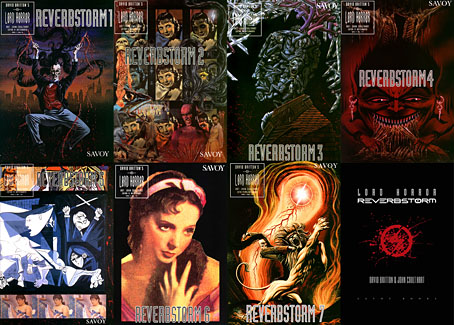
reverbstorm-covers.jpg

Reverbstorm, the Lord Horror comic series that we created throughout the 1990s, was the product of those conversations, and was also produced mostly through conversation, working by instinct without a script. The series, which was compiled into definitive book form in 2012, is testament to a pooled breadth of interest, encompassing/quoting/appropriating/reworking Pointillist, Cubist and Expressionist painting, Modernist poetry, pop songs, Sondheim musicals, Finnegans Wake, Tom Phillips’ Humument, Burne Hogarth’s Tarzan comics, Joel-Peter Witkin’s photographs, voodoo chants, Piranesi, King Kong, Bauhaus graphic design, Hugh Ferriss architecture, and illustration of all kinds, from fairy tales to cosmic horror via Aubrey Beardsley and Harry Clarke; there’s even ballet in the mix if you look closely. Dave always liked the idea of Lord Horror leaping and pirouetting like a dancer. More than anything, Reverbstorm is rock’n’roll, and this is partly what the title refers to: a thundering rhythm.
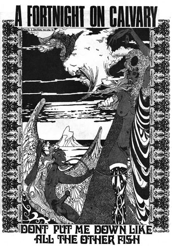
wf2.jpg

Britton art from Weird Fantasy #2, 1971. This is the drawing that caught the attention of William Burroughs when Britton and Butterworth visited Burroughs in New York City in 1979.

The term “rock’n’roll” always requires qualification when considering the Britton oeuvre, he used it with regularity while remaining bitterly aware that the original charge of the words had been degraded by over-use, reduced to a caricature by too many mediocre music acts and lazy journalists. I chided him a couple of times that his use of the term was functionally meaningless, a synonym for “my favourite things”. But the application was always a serious one, a label for any work that he found sufficiently thrilling, wild, original, excessive, anarchic, flamboyant, boundary-breaking or confrontational. Little Richard, Larry Williams, Howlin’ Wolf and Bo Diddley were Dave’s kind of rock’n’roll, as were Captain Beefheart and His Magic Band, PJ Proby, Iggy Pop, the Sex Pistols, The Cramps, The White Stripes and the Wu-Tang Clan. No surprise there, but Burne Hogarth was also rock’n’roll, although Hogarth would no doubt have disputed this. Another favourite artist, James Cawthorn, was given the label because Dave had discovered Cawthorn’s work when his teenage rock’n’roll obsession was at its height; two forms of art were permanently bound together, with sword & sorcery recast as the literary equivalent of a delinquent musical idiom. Dave’s other artist collaborator, Kris Guidio, was rock’n’roll for having served time as a peerless portraitist of The Cramps. LaVern Baker was rock’n’roll, as was CL Moore. Aubrey Beardsley was rock’n’roll and Harry Clarke was rock’n’roll; William Burroughs and William Hope Hodgson were rock’n’roll, so were Michael Moorcock and Harlan Ellison. Francis Bacon and Paula Rego were rock’n’roll; Alan Clarke was rock’n’roll and so was David Lynch. The quest for more of this rare commodity was relentless and unceasing. Many of our conversations were little more than enthusiastic discussions of shared favourites, or recommendations to watch/read/listen to something new.
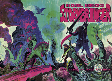
stormbringer.jpg

The first Savoy publication from 1976—Cawthorn adapting Moorcock’s apocalyptic Elric novel—was a declaration of intent: maximum rock’n’roll.

The photo at the head of this post is one that Dave had reused in recent years, one of the few portraits he seemed to like. It first appeared inside his debut publication, Weird Fantasy #1, a genre fanzine that was also enough of an underground publication to receive a passing mention in Oz magazine. The picture is emblematic of the Britton character, dressed in a manner at odds with the north Manchester surroundings he grew up in, and where he was still stuck at the time, a world of back-to-back housing and squalid ginnels. Rock’n’roll in all its forms was the great escape from a world of severely limited horizons and circumscribed lives, where all you could look forward to after a few years of poor education was a job in the local mill or factory. People who dismiss the gaudier forms of entertainment as “escapist” are usually middle class and blessed with comforts and opportunities that reinforce their condescensions; people who never had to consider a life so lacking in promise that a song heard on the radio, a vinyl record, a comic book, a paperback found on a market stall, might be the key to a wider world, an affirmation that there was more than the brick walls of your immediate environment, and there could be even more than this. “Escapist” suggests a hiding away but it also means breaking free. In later years Dave maintained a sporadic correspondence with Alan Moore; they never met but were mutually supportive, thanks in part to a shared background as bright boys from working-class backwaters with no encouragement to try and transform their lives through their escapist enthusiasms. Alan maintained an affection for his background, but Dave seldom spoke of his without a shudder, as though he’d evaded a fate worse than death. One thing he retained from north Manchester was an ebulliently vulgar sense of humour. He agreed with Picasso that good taste is the enemy of creativity.
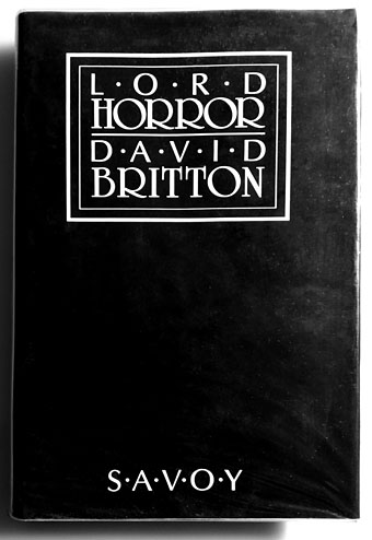
lh.jpg

David Britton’s first novel wasn’t one he considered his best but it remains the most notorious thanks to the conscientious literary assessments of the Greater Manchester police.

I’ll miss Dave’s infectious humour, just as I’ll miss the conversations that so often provoked it, the quest for better art, some new kind of kick, more rock’n’roll. I’ll miss being able to show him something I know he’ll enjoy. He always liked quotations so I’ll end this with a lengthy one from Walter Pater, the aesthetic theorist whose ideas energised the Decadents and the founders of The Savoy, the magazine from which Savoy Books took its name. It summarises Dave’s attitude to life even if he’d never discuss things in such a grandiloquent manner:

…we are all condamnes, as Victor Hugo says: we are all under sentence of death but with a sort of indefinite reprieve—les hommes sont tous condamnes a mort avec des sursis indefinis: we have an interval, and then our place knows us no more. Some spend this interval in listlessness, some in high passions, the wisest, at least among “the children of this world,” in art and song. For our one chance lies in expanding that interval, in getting as many pulsations as possible into the given time. Great passions may give us this quickened sense of life, ecstasy and sorrow of love, the various forms of enthusiastic activity, disinterested or otherwise, which come naturally to many of us. Only be sure it is passion—that it does yield you this fruit of a quickened, multiplied consciousness. Of this wisdom, the poetic passion, the desire of beauty, the love of art for art’s sake, has most; for art comes to you professing frankly to give nothing but the highest quality to your moments as they pass, and simply for those moments’ sake.

Previously on { feuilleton }
James Cawthorn: The Man and His Art
A Reverbstorm jukebox
Reverbstorm: an introduction and preview
Notes from the Underground

hawkwind1.jpg

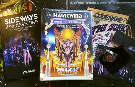
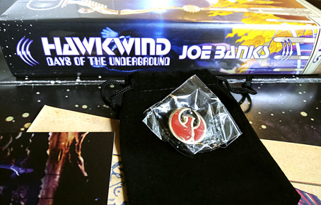
This time last year I was about to start working on the cover of Joe Banks’ Hawkwind book, and here it is at last, after a considerable delay. The special edition has been worth the wait since it comes with an additional 200-page volume, Sideways Through Time, containing the interviews that Joe used for his research. There’s also a set of cards with photos by Laurie Lewis from the session used for the cover of Space Ritual (we used some of the same photos on the book cover), and a print of the Moorcock/Cawthorn Hawklords comic strip from Frendz which further developed the group’s self-mythologising begun by the In Search Of Space “Hawklog”. And for people who pre-ordered the book last year then had to wait for months, there’s a bonus enamel pin based on the hawk design I supplied for the front board. I like badges, and I designed a few for Hawkwind in the past, but this is a better design and a nicer object than any of those I did in the 1980s.

hawkwind2.jpg

It’s a big book.

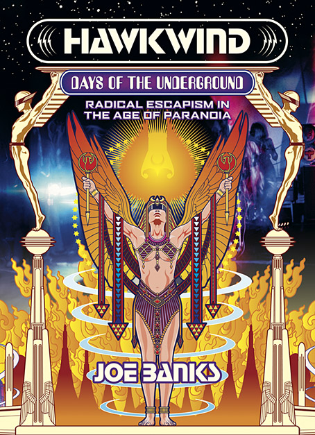
Now that the book is out I can show off the full cover wrap. As mentioned earlier, I followed Barney Bubbles’ preference for retro futurism by creating a cityscape based on the Deco-styled architecture that Frank R. Paul liked to use in his pulp illustrations. Some of the details refer obliquely to Hawkwind’s cover art or songs of the 1970s, so the speeding car can be taken as a reference to both Kerb Crawler and Death Trap, as well as the speeding Art Deco vehicle on the cover of Roadhawks. The flying saucers are a nod to those by Barney Bubbles on the inner sleeve of the Doremi album (and on one of his black-and-white posters from the same period), while the Philippe Druillet rocket refers to Barney’s own appropriation of a Druillet figure in his Hawk graphics. The combination of vehicles fleeing a burning city gives us the recurring theme in the group’s lyrics about the need to escape from a self-destructing society/planet. Welcome to the future.

Hawkwind: Days of the Underground is available now from Strange Attractor.

Previously on { feuilleton }
Hawkwind: Days of the Underground
The Chronicle of the Cursed Sleeve
Rock shirts
The Cosmic Grill
Void City
Hawk things
The Sonic Assassins
New things for July
Barney Bubbles: artist and designer

Hawkwind: Days of the Underground

hawkwind.jpg

As mentioned at the weekend, Joe Banks’ account of the first ten years of Hawkwind will be published by Strange Attractor Press later this year with a wraparound cover of my design. I never expected to be doing anything else for Hawkwind after moving on to other things in 1985, but it was the group’s first decade of music that fuelled the drawings which brought me to their attention, so this cover design brings everything full circle. The earliest of my Hawkwind drawings dates to 1979 which means this cover is also an anniversary piece.

The design combines Barney Bubbles’ Space Ritual template with elements of the art he created before and afterwards, notably the inner and outer sleeve of Doremi Fasol Latido, and the futuristic Art Deco of his tour poster for The “1999” Party. All the Bubbles Hawk-art up to and including Space Ritual is a blend of the ancient (Egypt, tribal motifs, characters that resemble pirates or barbarians), the previous century (Art Nouveau in particular), and the far future as depicted in comics and pulp magazines. I wanted to reflect this blend without being too imitative of the details, so the cover works a variation on Space Ritual, with a similar hieratic woman as the focus, and a margin of stylised flames separating the foreground from Laurie Lewis’s photos of the band (the latter are unused shots from the same session used for Space Ritual).

haberfield.jpg

Art by Bob Haberfield, 1970.

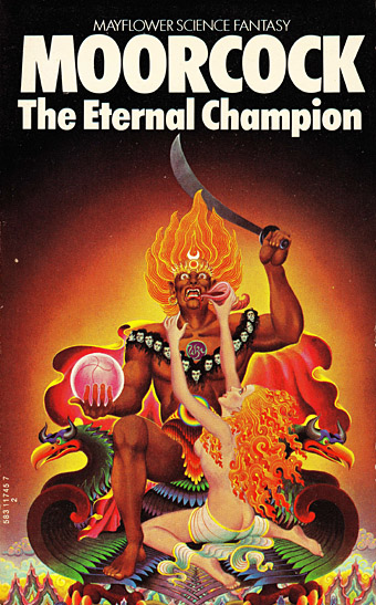
All the background elements run across the wrap but this hasn’t been revealed yet so you’ll have to wait a while to see the full design. The flames are based on Tibetan designs in a nod to the ancient side of the equation, as well as Bob Haberfield’s covers for the Moorcock novels published by Mayflower in the early 70s, many of which featured art derived from Tibetan Buddhism. (And one of the Mayflower Moorcocks, The Black Corridor, is the origin of the monologue of the same name on Space Ritual.) The full wrap shows a futuristic city whose Frank R. Paul-derived architecture is either on fire or menaced by a wall of encroaching flames. Many of Hawkwind’s songs of the period concern flight from cities or from the Earth itself—Born To Go, Time We Left (This World Today)—so the back cover also has a number of vehicles fleeing the scene: the radical escapism of the book’s subtitle in literal form. “Sign my release from this planet’s erosion,” as Nik Turner sings in Brainstorm.

Continue reading “Hawkwind: Days of the Underground”