Pite’s West End folly

pite.jpg

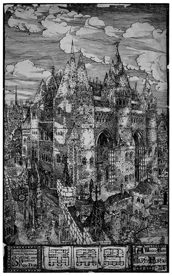
An architectural rendering by Arthur Beresford Pite (1861–1934) whose proposal for a West End club house after the style of Viollet-le-Duc’s Gothic revivalism induced howls of outrage from the architectural establishment when it won the RIBA’s Soane Medallion in March, 1882. I know this drawing solely from an appearance in Felix Barker & Ralph Hyde’s London as it might have been (1982) where it fascinates not only for being one of the least likely proposals in the entire book but also for its vision of Georgian London as some kind of medieval throwback closer to Carcassonne than Cavendish Square. This copy is from a splendid Flickr set which features a wealth of fanciful architecture, real and imagined. Lots of favourites there, including the great Hugh Ferriss.

Elsewhere on { feuilleton }
The illustrators archive

Previously on { feuilleton }
Viollet-le-Duc
Hugh Ferriss and The Metropolis of Tomorrow
Architectural renderings by HW Brewer

Exposition cornucopia

wf1.jpg

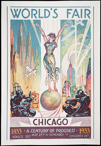
Poster by Glen C Sheffer (1933).

The image galleries at Yale University’s Beinecke Rare Book & Manuscript Library have been garnering justifiable attention recently for the quality of their collection. Among the groupings, the World’s Fairs and the Landscapes of the Modern Metropolis section immediately caught the attention of this exposition and world’s fair fan. An amazing collection of posters, exposition booklets, photos and plans, many of which augment the subjects of previous postings including the 1900 Exposition Universelle. A very brief and cursory selection follows.

Continue reading “Exposition cornucopia”

Carlo Scarpa’s Brion-Vega Cemetery

scarpa.jpg

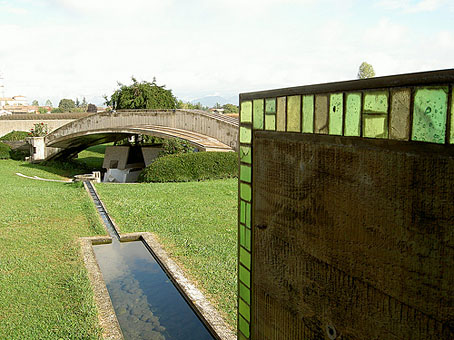
“I would like to explain the Tomba Brion…I consider this work, if you permit me, to be rather good and which will get better over time. I have tried to put some poetic imagination into it, though not in order to create poetic architecture but to make a certain kind of architecture that could emanate a sense of formal poetry….The place for the dead is a garden….I wanted to show some ways in which you could approach death in a social and civic way; and further what meaning there was in death, in the ephemerality of life—other than these shoe-boxes.” Carlo Scarpa

Dan Hill at City of Sound reminds us (okay, reminds me…) of Carlo Scarpa’s incredible private cemetery via a link to a Wallpaper* photo feature about the place. Scarpa’s final work (he’s buried in the grounds) was built for the Brion family at San Vito d’Altivole, Italy, and completed in 1978.

This construction and other Scarpa buildings often come to mind after encountering some disastrous use of concrete in architecture. Scarpa, like Frank Lloyd Wright, shows how well that meanest of building materials could be used with the application of care and imagination. And Scarpa, like Wright, also favoured attention to detail, with the cemetery providing copious examples of this, notably the motif of a pair of interlaced circles which feature as a prominent window design and recur in tiny elements elsewhere. Those paired circles and the garden itself remind me of the Jantar Mantar at Jaipur. I’m sure I read that one of Scarpa’s influences for the cemetery was Arnold Böcklin’s The Isle of the Dead but I’m unable to find any online reference. For more about that painting, there’s my earlier post on the subject.

• Flickr has a wealth of photographs of the cemetery
A black & white photo set by Gerald Zugmann

Previously on { feuilleton }
Hugh Ferriss and The Metropolis of Tomorrow
The Jantar Mantar
Arnold Böcklin and The Isle of the Dead
Frank Lloyd Wright’s future city

The Evanescent City

panama1.jpg

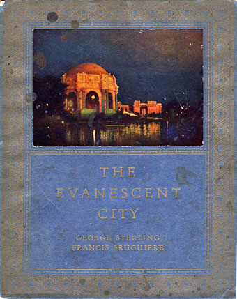
The cover of The Evanescent City shows a night view of Bernard Maybeck’s Palace of Fine Arts, one of the few remaining structures from the Panama-Pacific International Exposition that was held in San Francisco in 1915. After earlier posts about ephemeral architecture and the futuristic visions of Hugh Ferriss, I stumbled across the Books about California site which features a wealth of scanned volumes, including a number of books and pamphlets devoted to the Panama-Pacific Exposition. Expositions and World’s Fairs hold a particular attraction for enthusiasts of architectural invention, not least for the way they allow architects the opportunity to create structures that would otherwise never be built.
panama5.jpg

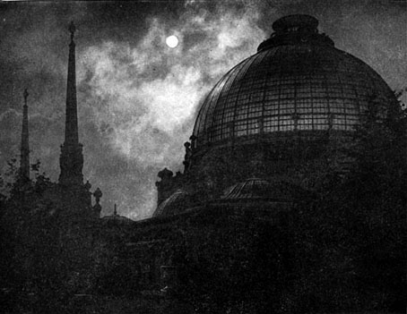
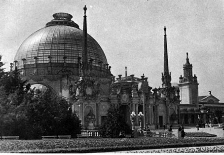
Palace of Horticulture—Dome and Spires by Night from The Architecture and Landscape Gardening of the Exposition.

At night, when the powerful searchlights within the dome are played upon the translucent glass, the effect is magical, the reflections weirdly changing in color and shape. The rich details of the decorations are softened in the night light.

The Panama-Pacific Exposition and the 1893 World’s Columbian Exposition in Chicago fascinate owing to the insight they give into the 19th- and early-20th century architectural imagination. This invariably meant huge towers, enormous domes and everything ladled with elaborate decoration, the Panama-Pacific Exposition being especially decadent in this respect, numbering a jewel-spangled tower among its attractions. With the Bauhaus innovations a few years away this was the last time the world would be offered a reflection of itself that was so excessively indebted to the past. If Hugh Ferriss shows us a vision of the world like that in Fritz Lang’s Metropolis, the Panama-Pacific architects invite us to imagine a world like the Slumberland that Winsor McCay created for Little Nemo.

The Internet Archive has a number of short films showing views of the exposition. Most interesting, if rather crudely made, is The Story of the Jewel City, a brief fantasy about two children exploring the exposition grounds.

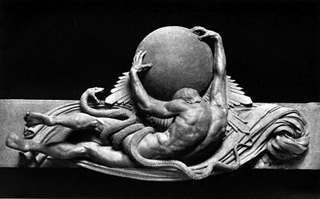
The following pictures are a small sample of the amount of material at Books about California. The snake-entwined figure of Helios would have made a good addition to the Men with snakes post while it’s difficult not to smile at the suggestion that the figure of a naked man should be preserved for America’s future gay capital.
panama2.jpg

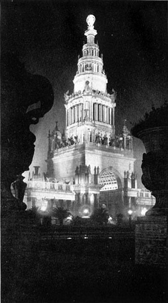
Tower of Jewels—the Illumination by Night from The Architecture and Landscape Gardening of the Exposition.

The Tower takes its name from the thousands of many-colored jewels so cut, polished and suspended that they reflect the sunshine with dazzling brilliancy by day and at night, under the white radiance of the searchlights, clothe the whole structure with shimmering splendor.
panama3.jpg

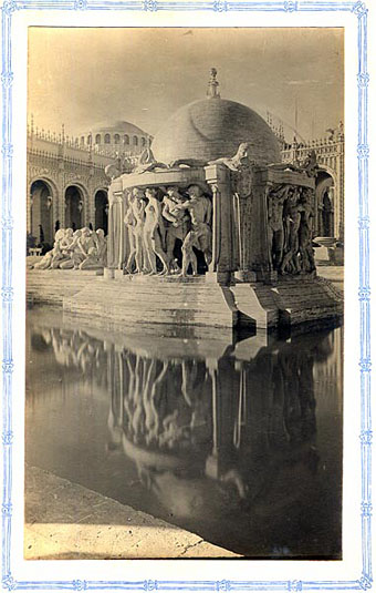
The Fountain of Earth from The Court of Ages by Beatrice Wright.
panama9.jpg

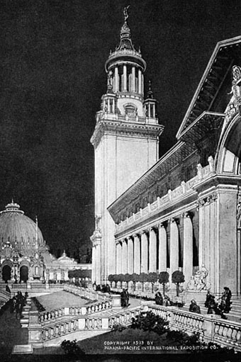
Part of Education Building and Court of Palms looking towards Horticultural Building from Panama-Pacific International Exposition—Popular Information.
panama4.jpg

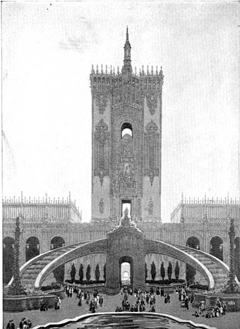
Tower and Cascade in Court of Abundance from the Official View Book of the Panama-Pacific International Exposition.

Dedicated to Music and Pageantry. Water in the cascade flows over a scheme of brilliant illumination. Designed by Louis Christian Mullgardt.
panama6.jpg

Palace of Horticulture—The Dome and East Entrance from The Architecture and Landscape Gardening of the Exposition.
panama7.jpg

Helios by Robert I Aitken from The Sculpture and Mural Decorations of the Exposition.
panama8.jpg

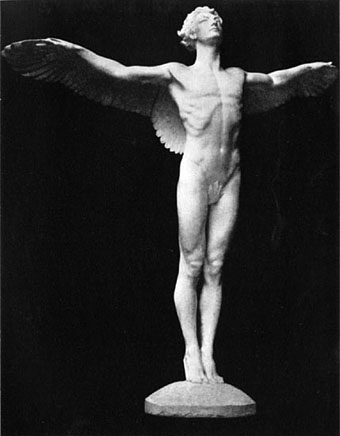
The Rising Sun by Adolph Alexander Weinman from Sculpture of the Exposition Palaces and Courts by Juliet Helena Lumbard James.

This fresh, strong young Sun is about to start on his journey – dawn is soon to break upon the world. With muscles stretched, the wind blowing through his hair, the heavenly joy of the first move expressed upon his face, the vigor of young life pulsating through his body, he will start the chest forward and move those outstretched wings. Let us preserve this glorious figure for our western city. It would so admirably suggest the new light that has been shed upon San Francisco by the Exposition of nineteen hundred and fifteen, as well as the new light occasioned by the opening of the Panama Canal.

Elsewhere on { feuilleton }
The illustrators archive

Previously on { feuilleton }
Ephemeral architecture
Hugh Ferriss and The Metropolis of Tomorrow
Winsor McCay’s Hippodrome souvenirs
The World in 2030
Metropolis posters
Frank Lloyd Wright’s future city

Blog this: tits out for the future

blogs.jpg

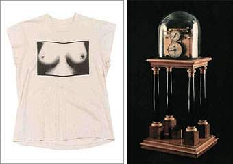
left: tits t-shirt by Vivienne Westwood and Malcolm McLaren.
right: the Hipp Chronoscope via io9.

A new year brings new blogs which is perhaps just as well seeing as the old year drew a line under some regular reads.

The Look, “Adventures in pop and rock fashion”, began posting a couple of weeks ago, spinning off from Paul Gorman’s book of the same name. Pieces there which immediately catch my eye are a skate through Billy Bowers’ outrageous clothing designs and a nice potted-history of the “tits tee”. I’d not realised before that the history of this latter creation goes back beyond punk to the early Seventies, another example of the evolution from post-psychedelic freakery to punk being a process of gradual elision, not the clean break that lazy commentary often suggests.

Also arriving (and noted everywhere by now) is io9, a new addition to the Gawker network, which looks at sf-related culture. I’ve already had a traffic spike from there after they linked to my Hugh Ferriss post and it’s good to see that Bldg Blog‘s Geoff Manaugh is among their contributors.

Previously on { feuilleton }
Ave Atque Vale!