Weekend links 260

burgher.jpg

Bachelor with “demons” (Sleezy) [sic] (2015) by Elijah Burgher. One of a new series of artworks by Burgher showing at Zieher Smith & Horton, NYC.

• The week in HR Giger: Belinda Sallin on her documentary, Dark Star: HR Giger’s World; Ron Kretsch on the unseen cinema of HR Giger; Matthew Cheney thinks the Gigeresque has become too familiar. I can see his point but originality is always in short supply; asking for something new means setting yourself up for a long wait.

Pwdre ser, or Star jelly, is “a pale, foul-smelling jelly traditionally associated with meteorite falls”. The Rot of the Stars at the ICA, London, is an audio-visual art collaboration between Jo Fisher and Mark Pilkington dealing with the mysterious substance.

• Mixes of the week: A Tri Angle Records birthday DJ set by Björk; OreCast 196 mix by Ilius; Secret Thirteen Mix 153 by M!R!M.

To assume that a given group of people would be similar because of birthdate, Ryder thought, was to risk committing a fallacy. “The burden of proof is on those who insist that the cohort acquires the organised characteristics of some kind of temporal community,” he wrote. “This may be a fruitful hypothesis in the study of small groups of coevals in artistic or political movements but it scarcely applies to more than a small minority of the cohort in a mass society.”

Generational thinking is a bogus way to understand the world says Rebecca Onion

The plan for an airport above the streets of Manhattan. Related: Charles Glover‘s similar plan for London.

Errol Morris on how typography shapes our perception of truth.

Michael Moorcock enjoyed The Vorrh, a novel by Brian Catling.

Clive Barker on almost dying, hustling, and killing Pinhead.

• A new Penguin Books website for Angela Carter.

• Callum James on artist Philip Core.

A Beginner’s Guide to King Tubby

King Tubby Meets Rockers Uptown (1976) by Augustus Pablo | Star Cannibal (1982) by Hawkwind | Sleazy (1983) by Jah Wobble, The Edge, Holger Czukay

Weekend links 257

tarot.jpg

The Nine of Swords by Pamela Colman Smith, and the same card from The Ghetto Tarot, a Haitian deck created by photographer Alice Smits and Haitian art group Atis Rezistans.

Almost four months after the murders in Paris, Charlie Hebdo continues to be problematic, to use a common epithet. The “p” word occurs with such frequency in current discussions about offence—and those discussions so often seem like a secular version of old religious arguments, with Manichean forces pitted against each other, and the same schisms, heresies and witch hunts—that I’ve taken to translating “problematic” as “sinful”. Charlie Hebdo is nothing if not a heretical text even if many of those pronouncing on its heresies have never read a copy. Back in January I was confident that we’d be seeing a great deal of equivocation (if not outright victim-blaming) when people began to look closely at the magazine, or at least read hasty appraisals of its contents. You didn’t have to be a psychic to predict any of this because the equivocations are merely the current manifestation of a familiar syndrome. This week’s authorial objections about PEN America honouring Charlie Hebdo have led to a reiteration of the grumblings we heard in January: “Yes, of course, we condemn the violence but…” But, what? “But, it’s a sinful publication…”(This piece by one of the PEN objectors in the LRB is typical.) Publication liberties, which in the UK are more constrained than in the US, are apparently best championed for the virtuous (the responsible, the respectful, etc), not the sinful. In 1963 “Yes, but…” equivocations about freedom of speech were being deployed in the letters page of the Times Literary Supplement with worthies such as Victor Gollancz and Edith Sitwell wondering why it was necessary to defend a deplorable book like The Naked Lunch; in 1992 I sat in a courtroom watching a judge make similar comments when grudgingly overturning an obscenity ruling against David Britton’s Lord Horror novel. The same judge then upheld the obscenity charge against Britton & Guidio’s Meng & Ecker comic which he regarded as trashier fare, “luridly bound” and containing “pictures that will be repulsive to right-thinking people”.

So much for old arguments. Jodie Ginsberg at Index on Censorship goes into some detail about the PEN kerfuffle in a piece entitled “I believe in free expression, but…”; Justin EH Smith for Harper’s says:

I heard from [friends and equals] countless variations on the banality that “violence is always wrong.” How did I know that this judgment, though perfectly true in itself, was only a banality, the expression of a sentiment that had little to do with pacifism? By the clockwork predictability of the “but” that always followed.”

Kenan Malik, who writes a great deal about these issues (his new book is The Quest for a Moral Compass: A Global History of Ethics) posted a statement from Jo Glanville from English PEN, and a lengthy piece by Leigh Phillips. This affair will rumble on.

• More sinful material: Samuel R. Delany’s Hogg is a novel so transgressive/offensive that it took 26 years to find a publisher. You seldom see any mention of the book when Delany’s work is being discussed, especially in prudish SF circles, but Dennis Cooper’s blog ran a retrospective feature about it this week. Caveat lector. Related: Stories for Chip: A Tribute to Samuel R. Delany is looking for crowdfunding.

• “[Judy] Oppenheimer relates that Jackson kept a library of over two hundred books on witchcraft, and her interest in the subject was not purely academic.” Martyn Wendell Jones on Shirley Jackson.

The Satyr and Other Tales, a collection by Stephen J. Clark, the title story of which is “inspired by the life and ethos of sorcerer and artist Austin Osman Spare”.

• Mixes of the week: Bacchus Beltane 2: The Mists of Avalon by The Ephemeral Man, and The Ivy-Strangled Path Vol. VI by David Colohan.

Boy and his SIR: BDSM and the Queer Family, a photo series by Kevin Warth, and Xteriors II, a photo series by Desiree Dolron.

• The Quest for Stenbock: David Tibet talks to Strange Flowers about his obsession with the eccentric Count.

Dark Star: HR Giger’s World is a documentary about the artist by Belinda Sallin.

1 in 3 Impressions, a free EP of Moog music by M. Geddes Gengras.

The rise and fall of the codpiece

Blade Runner Reality

Some Weird Sin (1977) by Iggy Pop | Sin In My Heart (1981) by Siouxsie and The Banshees | It’s A Sin (1987) by Pet Shop Boys

Dune designs

dune01.jpg

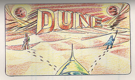
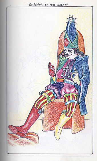
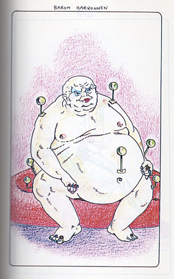
Currently racking up the bids at eBay (again) is an early draft of Alejandro Jodorowsky’s script for his ill-fated film of Dune. Aside from some diverting glimpses of dialogue and plot elaboration, what’s most interesting about the draft is the character and scene sketches, some of which are sampled below. I’ve still not seen the documentary about the unmade film so I can’t say whether any of these have appeared in public before but if they have they’re new to me. No artist is credited but the naive style rules out both Moebius and HR Giger (who arrived late to the project in any case). Best bet is either Jodorowsky himself—in 1967 he was writing and illustrating a comic strip, Fabulas Panicas—or Jodorowsky’s colleague from the Panic Movement days, Roland Topor. In the early 70s Topor was working with René Laloux on the animated SF film Fantastic Planet.

dune02.jpg

Many of the conceptions differ radically from the more graceful designs that Moebius produced later on. Also of note are details such as the anal entrance to the Emperor’s throne room, a Harkonnen orgy and an insemination scene viewed from inside Jessica’s vagina. By the time Giger joined the production team the instruction was not to create anything too erotic or adult since the film needed to reach a large audience.

There’s more from the Dune script (and larger copies of these images) here. (Thanks to Jay for the tip!)

dune03.jpg

Continue reading “Dune designs”

The kosmische design of Peter Geitner

geitner07.jpg

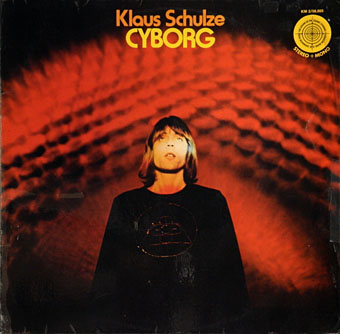
Cyborg (1973) by Klaus Schulze.

More German music design. Once you start delving into the music produced in Germany between 1969 and 1975 you eventually notice that a) the good albums generally have decent cover designs, and b) there are many justly forgotten albums with astonishingly tasteless artwork. Most of the well-known names were smart enough to craft a visual identity: Kraftwerk’s efforts have been explored here recently but there was also the Gothic Surrealism of Falk-U Rogner’s photo montages for Amon Düül II (worthy of a post in themselves); Neu! followed the lead of Kraftwerk with strikingly minimal presentation; Faust’s debut album was released on transparent vinyl in a clear sleeve while their second album was an all-black sleeve with a series of strange pictures inside, one for each song. Can are a notable exception in having no clear identity.

geitner23.jpg

Peter Geitner is unique in this scene in being the only graphic designer you can find who was creating any kind of consistent identity for a label and a group of artists. Almost all the work here is for Rolf-Ulrich Kaiser’s short-lived Kosmische Musik which replaced the earlier Die Kosmischen Kuriere. Both labels were offshoots of Ohr Records (Tangerine Dream’s original home), and catered mostly to the musicians based in Berlin, with a later detour to Switzerland. All the releases feature Geitner’s recurrent motifs of radiating stars and sunburst graphics. I think one of the reasons I like Geitner’s design is because I have a tendency to use similar spiky sunbursts in my own work. Whatever Geitner did after the collapse of Kosmische Musik I’ve yet to discover.

geitner22.jpg

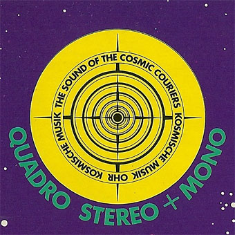
The standard design for the vinyl labels. Many of the albums were released as quadrophonic mixes so the star logo also signifies multi-directional sound. Klaus Schulze’s album is nothing if not cosmic, four sides of treated strings and swirling synth noise.

geitner03.jpg

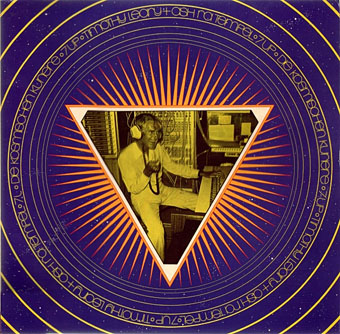
Seven Up (1973) by Timothy Leary & Ash Ra Tempel.

This is a reissue design that replaces the more common sleeve with its Walter Wegmüller doodles and poor layout. I didn’t used to like the music very much either, two sides of bluesy jams with Tim Leary and cohorts bellowing over the top. But it’s a historical oddity, a rare connection between the US psychedelic scene and the German music which took psychedelia in new directions.

geitner04.jpg

Continue reading “The kosmische design of Peter Geitner”

The Art of Gothic by Natasha Scharf

goth01.jpg

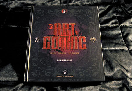
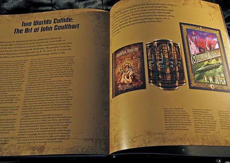
This weekend I was at the Louder Than Words music conference in Manchester to meet Peter Bebergal, author of Season of the Witch: How the Occult Saved Rock and Roll, and Mark Pilkington of Strange Attractor. By coincidence the event was hosting a discussion about goth music and culture based around The Art of Gothic, a new art book by Natasha Scharf. As mentioned last month, this book features some of my work but I hadn’t seen a copy until now.

goth02.jpg

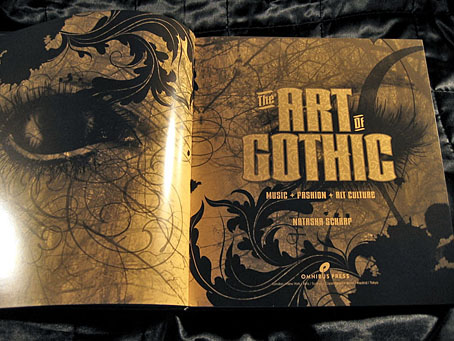
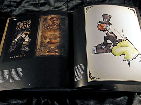
I’ve been fortunate recently to have my work appear in some impressive volumes but this outsize hardback takes some beating. It’s a very lavish production, 224 colour pages on heavy paper with gorgeous design by Paul Palmer-Edwards. Goth has been subject from the outset to mocking stereotypes, to a degree that many people would imagine they know exactly what a study such as this would contain. A recurrent theme of the Louder Than Words discussion was the growth of the goth subculture beyond its clichéd boundaries which is one reason my work is featured in the book. When Natasha was first in touch I thought it might be for the Cradle of Filth album covers but I’m in the chapter that examines the increasingly tangled goth/steampunk crossover. This is one development that’s come to seem almost inevitable given the roots of so much of the goth aesthetic in Victorian nightmares. Many steampunk novels tend towards the dark in their blend of science fiction and horror so the traffic goes in both directions.

goth03.jpg

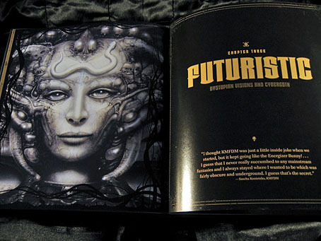
Elsewhere in the book there are chapters on Futuristic Goth, Japanese Goth, and Cybergoth, all of which maintain the requisite darkness while evolving away from the top hats, lace and veils (the latter are all present and correct elsewhere, of course). It’s a beautiful book, out now in the UK from Omnibus Press, and in the US from Backbeat Books. A few more page samples follow. There’s more at Amazon UK.

• See also: 13 Things That Prove Gothic Art Is Enchanting And Beautiful

goth04.jpg

left: The Amazing Screw-On Head by Mike Mignola (2002); centre: the full-colour version of the ever-popular Steampunk Equation (2009), words by Jeff VanderMeer, graphics by John Coulthart; right: Dr Geof’s Medicine Lady, aka Steampunk Pinup #2.

goth05.jpg

The mighty Giger again. I’ve got a framed print of that picture on the wall, a fact that will surprise nobody.

Continue reading “The Art of Gothic by Natasha Scharf”