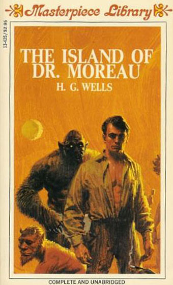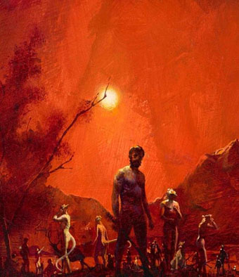
More vapour trails

jeter.jpg

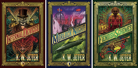
Those covers everyone likes. My designs for KW Jeter’s steampunk novels from Angry Robot and Tor Books.

When I wrote a brief history of steampunk for Eye magazine last year I ended by somewhat provocatively declaring that until something better appeared this was the defining aesthetic of the moment. A year later, the movement (if we can use that term) continues to evolve despite the steady drip of complaints that it’s all reactionary, historically illiterate, and so on. Much of the ire remains nonsensical, and often seems to boil down to a common disdain for people enjoying themselves in some unorthodox manner.

manual.jpg

Design by Galen Smith after the Hetzel editions of Jules Verne’s novels.

If I hadn’t got involved on the art side I would have found it difficult to avoid being attracted by steampunk in one form or another since so much of it originates in areas I was already interested in, not least HG Wells and Victorian science fiction. The rapid evolution of the past few years means we’re currently seeing an aesthetic leaving behind its origins to become an international subculture. What’s striking about this activity—and this is something that doesn’t seem to have been discussed very much—is the way the whole thing has been birthed by genre fiction rather than by pop music, as was the case for the second half of the 20th century. This piece is meant to be a news post, however, not another cultural critique, but if I happen to write any more on the subject there’s something there that’s worth exploring.

manual2.jpg

As to the news: this month finds my steampunk artwork manifesting in three very different locations in one of those odd coincidences of timing that occur now and then. First up there’s the Steampunk User’s Manual edited by Jeff VanderMeer & Desirina Boskovich, a follow-up to 2011’s Steampunk Bible. For the new volume I designed spreads for three entries by Jess Nevins from The Encyclopedia of Fantastic Victoriana: Alternative History Edition.

Continue reading “More vapour trails”

Uncharted islands and lost souls

lostsouls1.jpg

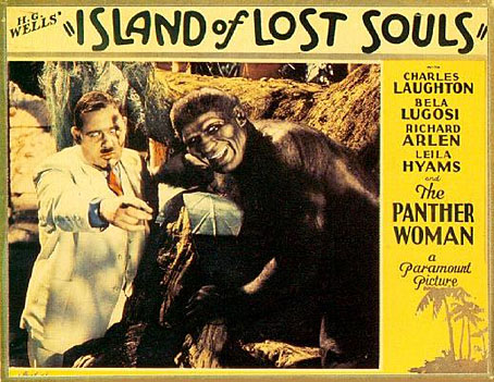
The pulp fiction of the early 20th century favoured remote or uncharted islands as locations for the bizarre and the fantastic; in isolated jungles all manner of savage and grotesque behaviour could take place out of sight of the civilised world. Islands are secure from interference; they can be visited by accident or intention, and later fled from when everything goes wrong. The Island of Doctor Moreau is an early example of the type although Jules Verne’s The Mysterious Island (1874) pre-dates it by twenty-two years. The Island of Lost Souls (1932), the first film adaptation of the Wells novel, is one of a crop of mysterious islands that appeared in the 1930s following the success of the Universal adaptations of Dracula (1931) and Frankenstein (1931). The recent Eureka DVD/Blu-ray edition of the film is the first UK release to present the film in its original, uncensored form. I watched it this weekend.

lostsouls3.jpg

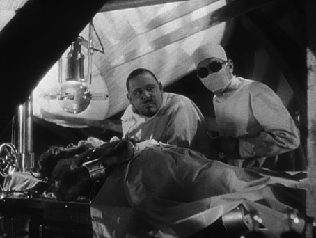
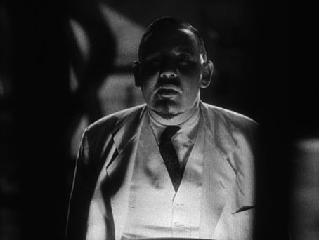
Moreau (Charles Laughton) and Montgomery (Arthur Hohl) at work.

HG Wells famously hated the film, and his vociferous complaints helped to ensure it was banned in Britain until 1958. Even without Wells’ complaints there was enough there to bait the censors who declared it to be “against nature”: writers Philip Wylie and Waldemar Young push the erotic implications of Wells’ story to a degree that would have been impossible in 1896, and would be equally impossible two years later when the Hays Code clamped down on cinematic salaciousness. Charles Laughton’s Moreau is eager to discover whether Lota, the Panther Woman (Kathleen Burke), will show any sexual interest in the marooned Edward Parker (Richard Arlen). The bestiality theme continues when Parker’s fiancée arrives on the island and finds one of Moreau’s Beast People at her bedroom window. Add to this Moreau’s declaration that he feels like God (a similar line was cut from James Whale’s Frankenstein), a traditional British squeamishness towards maltreating animals (unless they’re foxes), and the Panther Woman’s skimpy outfit, and it’s no surprise that the authorities collapsed with the vapours.

lostsouls4.jpg

Sensationalism aside, this is one of the greatest horror films of the early 1930s, and one which follows its source material with much more fidelity than Universal’s Dracula and Frankenstein. The production had been commissioned by Paramount to capitalise on the success of the Universal films, hence the presence of a very hirsute Bela Lugosi as the Sayer of the Law. Cinematographer Karl Struss had worked the year before on Rouben Mamoulian’s excellent Dr. Jekyll and Mr. Hyde; prior to this he photographed Sunrise (1927) for Friedrich Murnau. The combination of Struss’s chiaroscuro compositions, some adept direction from Erle C. Kenton (including crane shots), and a tremendous performance by Charles Laughton puts The Island of Lost Souls in a different league entirely to Tod Browning’s stagey and over-rated Dracula. Laughton’s cherub-faced Mephistopheles is a performance that runs counter to the cod theatricals of the period: he’s sly, confident and completely authoritative even if he looks nothing like Wells’ white-haired doctor.

Continue reading “Uncharted islands and lost souls”

Doctor Moreau book covers

moreau22.jpg

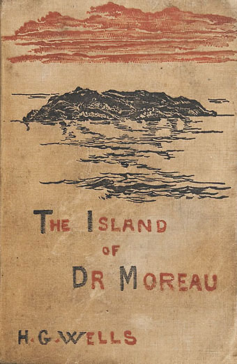
William Heinemann (first edition, 1896).

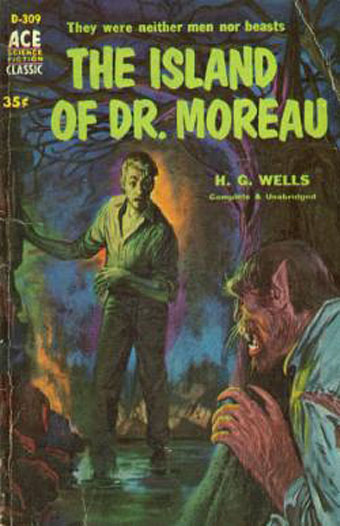
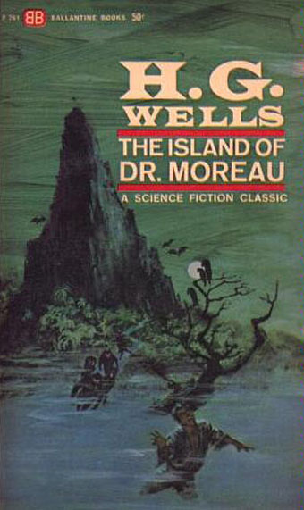
The inevitable book cover post. The examples here are among the better ones, Wells’ novel having been blighted over the years by monstrosities as hideous as those that fall from Moreau’s vivisection table. That said, some early covers might be bad but they look like masterpieces next to some of the fatuous offerings from the current ebook bonanza. The novel has great illustration potential but few of the covers below seem to have given the matter much consideration. Bantam’s Rousseau painting would suit many other novels but doesn’t belong with this particular book. Even Penguin seem to have been confounded of late; their illustration of feline eyes peering through undergrowth could again be used on many other novels, while their most recent edition sports a maze design which doesn’t communicate anything of the book’s content to a curious reader.

The one I like best of this selection is Cuchi White’s illustration for the 2001 Gallimard edition, a picture that does much to convey the novel’s disturbing blend of speculative fiction and outright horror.

moreau16.jpg

Ace (1958).

moreau06.jpg

Ballantine Books (1963).

moreau12.jpg

Magnum Books (1968); illustration: Douglas Rosa.

Continue reading “Doctor Moreau book covers”

The Island of Doctor Moreau

moreau2.jpg

Painting by Paul Lehr for the Berkley Highland paperback (1970).

The Island of Doctor Moreau is one of those Victorian novels everyone thinks they know well enough from various film or television adaptations, even when those adaptations have accreted a layer of misconception around the story. In the case of HG Wells’ novel we have The Island of Lost Souls (1932), which the author loathed for its vulgarisations, and which he helped get banned in Britain for many years; the 1977 film directed by Don Taylor which nobody seems to have a good word for; and Richard Stanley’s 1996 adaptation which might have been worthwhile if he hadn’t been kicked off his own film shortly after shooting began. These films may not distort Wells’ novel as much as the numerous adaptations of Dracula, and Dr Jekyll and Mr Hyde, but they still present a skewed impression of a book which is stranger and more disturbing than any screen version.

Wells’ story purports to be the written account of one Edward Prendick who finds himself on Moreau’s remote island after a shipwreck. The bare bones of the story are familiar: Prendick is rescued by Moreau’s alcoholic assistant, Montgomery, and ends up on the island against the doctor’s wishes. The story deviates from the films very quickly by introducing a setting that’s commonplace in Victorian literature but which Hollywood abhors: the all-male enclave. The Island of Lost Souls put “Edward Parker” on the island with his fiancée but went further (to the outrage of Wells and the British censors) by adding a sexy Panther Woman to the menagerie with whom Moreau encourages Parker to mate. There are women among the “Beast People” in Wells’ novel but we’re assured that they’re as grotesque as their male counterparts.
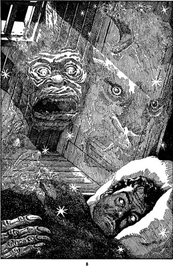
moreau3.jpg

Illustration by Lawrence Sterne Stevens (aka Lawrence) for Famous Fantastic Mysteries, October 1946.

And here we have the second major difference between novel and films: given the limitations of makeup effects—not to say the limitations of the human body—it’s no surprise that the Beast People in the films tend to be like Star Trek aliens, mostly humanoid with a variety of different facial features. Stan Winston’s effects in the 1996 film were the most successful, and were aided considerably by casting a range of actors of different sizes and shapes. All the films tend to present single types, however: wolf-man, cat-woman, bear-man, etc. Wells was writing in 1896 yet his imagination had already brought him this far:

The two most formidable Animal Men were my Leopard-man and a creature made of hyena and swine. Larger than these were the three bull-creatures who pulled in the boat. Then came the silvery-hairy-man, who was also the Sayer of the Law, M’ling, and a satyr-like creature of ape and goat. There were three Swine-men and a Swine-woman, a mare-rhinoceros-creature, and several other females whose sources I did not ascertain. There were several wolf-creatures, a bear-bull, and a Saint-Bernard-man. I have already described the Ape-man, and there was a particularly hateful (and evil-smelling) old woman made of vixen and bear, whom I hated from the beginning. She was said to be a passionate votary of the Law. Smaller creatures were certain dappled youths and my little sloth-creature. But enough of this catalogue.

Later on Moreau has this to say:

“The fact is, after I had made a number of human creatures I made a Thing—” He hesitated.

“Yes?” said I.

“It was killed.”

“I don’t understand,” said I; “do you mean to say—”

“It killed the Kanaka—yes. It killed several other things that it caught. We chased it for a couple of days. It only got loose by accident—I never meant it to get away. It wasn’t finished. It was purely an experiment. It was a limbless thing, with a horrible face, that writhed along the ground in a serpentine fashion. It was immensely strong, and in infuriating pain. It lurked in the woods for some days, until we hunted it; and then it wriggled into the northern part of the island, and we divided the party to close in upon it. Montgomery insisted upon coming with me. The man had a rifle; and when his body was found, one of the barrels was curved into the shape of an S and very nearly bitten through. Montgomery shot the thing. After that I stuck to the ideal of humanity—except for little things.”

Continue reading “The Island of Doctor Moreau”

Harry Willock book covers

moreau.jpg

This time last year I happened to be re-reading my way through the collected short stories of HG Wells; this year I’ve been reading The Island of Doctor Moreau, not to continue the seasonal trend, I simply felt the urge. More about Moreau tomorrow.

These covers are from a series of Penguin reprints which first appeared in 1967 and went through several editions. Harry Willock was the cover artist, and may also have been the designer of the Wells and Verne titles, other text-only Penguin covers from around this time being credited to Willock. The Penguin Science Fiction site describes the obtrusive “A Penguin Book” legend as the “panic top”, a heavy-handed attempt by Penguin’s management to reinforce their brand. Later reprints dropped this but it’s stamped across most of these editions.

war.jpg

This edition of The War of the Worlds was my first encounter with the novel so the cover has always been very familiar, a factor which probably prevented me from seeing how effectively all the Willock Wells covers work as a set. The Martian war machines aren’t very menacing—especially when they seem to have done little but arouse a pair of butterflies—but I do like the type layouts and the way the illustrations are concentrated into a circle. Willock’s drawings so closely imitate the style of Victorian engravings it’s easy to take them at first glance for the genuine article.

air.jpg

Continue reading “Harry Willock book covers”