The Door in the Wall, 1956

door1.jpg

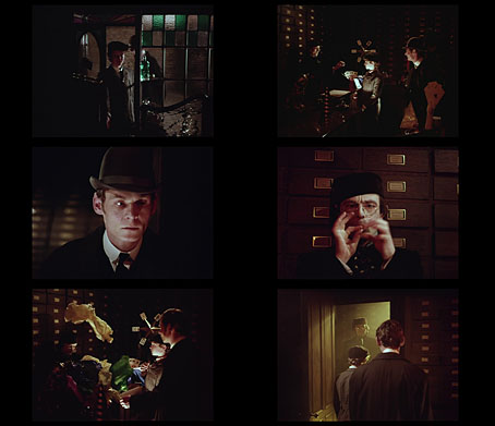
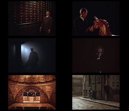
The Door in the Wall is one of HG Wells’ most popular short stories, a fable-like piece which has slipped across the genre barriers into collections as diverse as Tales of the Unexpected (1924), More Ghosts and Marvels: A Selection of Uncanny Tales (1927), The World’s Great Mystery Stories (1943), The Dream Adventure (1963), Magazine of Horror (1965), The Sixth Fontana Book of Great Ghost Stories (1970), Tales of the Occult (1975), Black Water: The Anthology of Fantastic Literature (1983), Classic Science Fiction Stories (2022), and many others. The categorisations are more an attempt to fill out a contents list with quality material than a reflection of the story itself. Most readers would regard The Door in the Wall as a straightforward work of fantasy, in which a small boy discovers a door in a wall in a very ordinary London street, a portal which leads him into a paradisiacal garden. When the boy grows into man he remains haunted and eventually tormented by his memories of the enchanted world he found beyond the door.

door2.jpg

Given the popularity of the story and its simple narrative you’d expect there to be more film adaptations than there are. This short from 1956 (links below) was the only directorial effort by Glenn H. Alvey, and a very odd film it is. What might have been a worthy if uninspired transcription of Wells’ tale is here confounded by Alvey’s “Dynamic Frame”, a trademarked invention which involved filming the whole thing in VistaVision then masking portions of the frame with a matte that continually changes the aspect ratio of the picture to suit the action, even following the actors around the screen. Adjusting the aspect ratio while the film is running isn’t an uncommon technique but Alvey’s process is a distinctly obtrusive one, which no doubt explains why it wasn’t further developed elsewhere. As for the adaptation, the enchanted garden beyond the door turns out to be nothing more than a large and very typical English country estate, with a few parrots and a pair of caged budgerigars providing some exotic flavour. (Now that London has wild parakeets roosting in its trees even these details are no longer exotic.) Wells’ garden is a numinous and magical place, one that might have been better represented with a change from black-and-white to colour, as when Dorothy opens the door to Oz. Alvey’s adaptation is worth watching more for its views of ungentrified post-war London streets than it is for the drama. It also features an unusually restrained musical score by James Bernard, a composer better known for the thundering soundtracks he provided for many Hammer horror films. Bernard aside, HG Wells’ stories deserve better treatment than this.

The Door in the Wall: part one | part two

Previously on { feuilleton }
Claude Shepperson’s First Men in the Moon
Uncharted islands and lost souls
Doctor Moreau book covers
The Island of Doctor Moreau
Harry Willock book covers
The Time Machine
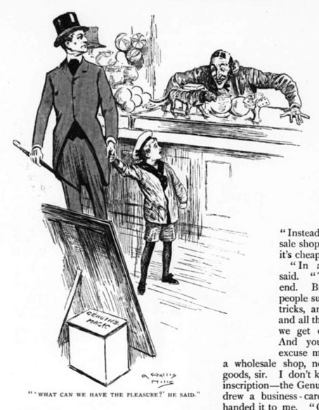
The Magic Shop by HG Wells
HG Wells in Classics Illustrated
The night that panicked America
The Door in the Wall
War of the Worlds book covers
Metropolis Magazine, 1927

metropolis1.jpg

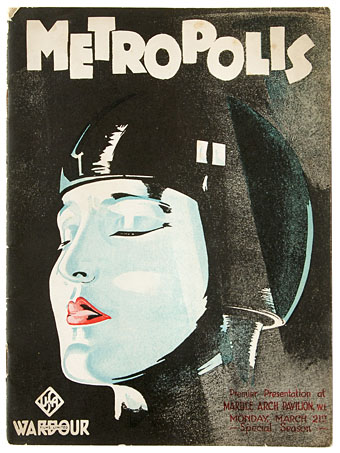
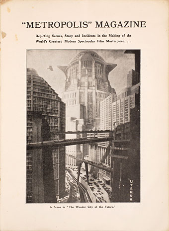
When Fritz Lang’s Metropolis was released in Britain the distributors, Wardour Films Ltd, produced a 32-page guide to the film filled with production stills and brief pieces written by the cast and crew. I have a facsimile copy of this publication, a limited reprint by Phantasm Press, but the original document is also available for reading or downloading at the Internet Archive. Publications like this were the standalone equivalent of promotional pieces created for the readers of film magazines; Metropolis was Ufa’s most expensive production to date so there would have been a need for serious promotion.

metropolis2.jpg

None of this effort helped make the film a success, however. Lang’s epic is a masterpiece of direction and production design but Thea von Harbou’s script was the kind of absurd and naive fare you often get from writers incapable of projecting the complexities of the present day into their visions of the future. (HG Wells was unsparing in his review of “the silliest film”.) A lack of audience enthusiasm prompted foreign distributors to take out their editing scissors, but cutting a quarter of the footage didn’t help either, especially when the cuts made nonsense of the motivations of Rotwang the inventor. One thing you can see in the programme is shots from sequences like the race-track scene which were subsequently removed and wouldn’t be seen in anything other than still form for many decades.

Previously on { feuilleton }
Blade Runner vs Metropolis
The Metropolis of Tomorrow by Hugh Ferriss
Metropolis!
Metropolis posters

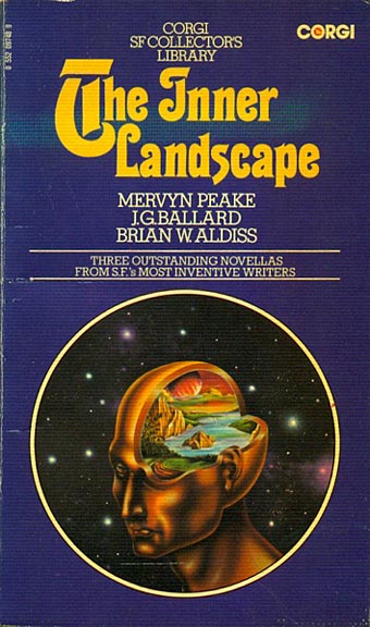
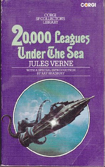
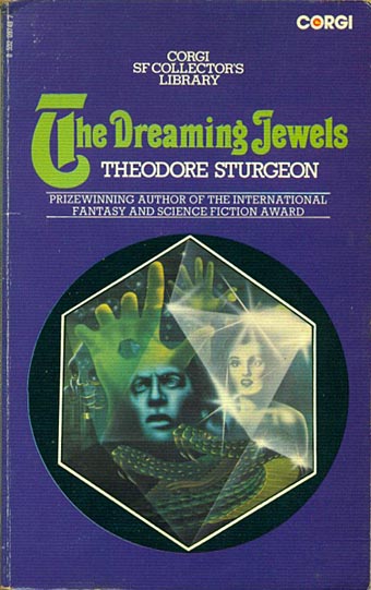
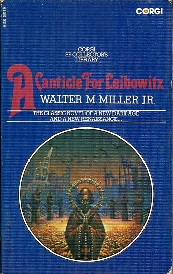
Corgi SF Collector’s Library

corgi02.jpg

Cover artist unknown.

“Here, for the connoisseur, for the devotee of the SF genre, and for those who like their reading to combine excitement with good writing, is the Corgi SF Collector’s Library – a series that brings, in a uniform edition, many of the Greats of SF – standard classics, contemporary prizewinners, and controversial fiction, fantasy, and fact…”

Only in the 1970s would you find a line of SF paperbacks with all the titles set in Thalia, a Victorian typeface revived by the post-psychedelia predilection for any design that was florid and ornate. Corgi’s SF Collector’s Library was published from 1973 to 1976, arriving just as my reading was moving from child-friendly SF to adult fiction. Consequently, I bought quite a few of these books, and still own a couple of them. The design was uniform but with a surprising amount of variation for such a short-lived series. The background colours ranged from deep blue to purple, while the card used for the covers was regular paperback stock for some of the titles with the majority using textured card, a treatment that further distinguished the series from its rivals on the bookshelves.

corgi12.jpg

Art by Joe Petagno.

Looking at these covers again I’ve been wondering if the idea of framing the artwork in a circle was borrowed from Penguin’s run of HG Wells reprints from 1967. Corgi had done something similar the same year with their Ray Bradbury series (all with art by Bruce Pennington) but the Wells editions went through several reprints, and the SF Collector’s Library follows their form even down to allowing the artwork to break the frame.

corgi03.jpg

Art by Bruce Pennington.

The samples here are a small selection of the series which featured a fair representation of British SF illustrators of the time. None of the artists were credited on the covers, however—a poor showing on the part of Corgi—so a few of them remain unidentified.

corgi01.jpg

Art by Tony Roberts.

corgi05.jpg

Cover artist unknown.

Continue reading “Corgi SF Collector’s Library”

Virgil Finlay’s magazine illustrations

finlay1.jpg

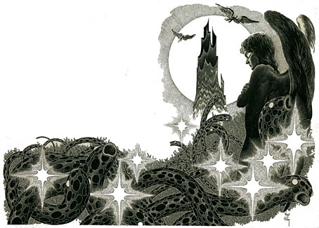
The Time Machine by HG Wells; Famous Fantastic Mysteries, August 1950.

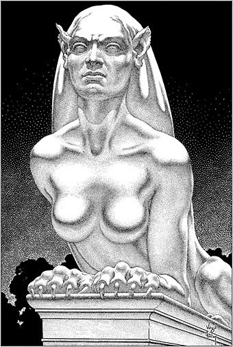
This one will be popular, I’m sure. One of the recent uploads at the Internet Archive is a massive collection of Virgil Finlay’s interior illustrations from the magazines that published most of his work—Weird Tales, Famous Fantastic Mysteries, Amazing Stories, etc, etc—together with the astrological illustrations he created later in his career, plus other material, including a few pieces that never appeared in print. Pencil drawings, lithographs and hundreds of meticulous renderings in ink on paper or scratchboard; 1888 illustrations in all. Whoever put the haul together has been much more thorough than I’d have expected. Rather than a stash of random drawings you get 10 separate folders (best appreciated in the cbz format; see the note below) with each illustration tagged with the name of the story it was illustrating, and the date of publication. The contents are a mix of reproductions from later reprints, together with cropped pages from magazine scans. Taken together, this must comprise almost all of Finlay’s published work excluding his magazine covers and other paintings.

finlay3.jpg

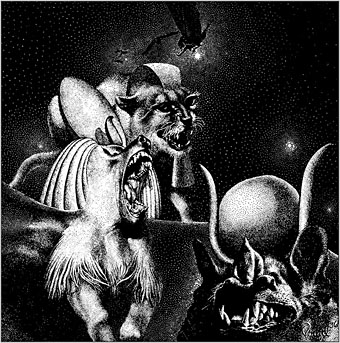
Earth’s Last Citadel by Henry Kuttner and CL Moore; Fantastic Novels Magazine, July 1950.

Virgil Finlay (1914–1971) can be a frustrating artist for anyone who admires his work. He was massively prolific, and maintained a high level of quality for almost 40 years; but his interior illustrations were often printed on pulp stock, the kind of paper that offers the worst kind of print reproduction, and which darkens and eventually crumbles into dust unless it’s carefully stored. Descriptions of his illustrations often note that his drawing style evolved to compensate for the deficiencies of the printing but much of his artwork was very finely rendered, and I’m not sure his minute stipple effects would have printed any better (or worse) than the traditional cross-hatching which he used from time to time. His drawings have at least been well-served by reprint collections, where the white art paper makes his striking compositions leap off the page. Inevitably, the best of these—Gerry de la Ree’s seven-volume collection from the 1970s, and a four-volume set from the 1990s—are all out of print. The sheer quantity of illustrations also presents a problem for any reprint collection: what to include…or leave out? All of which is a roundabout way of saying that this accumulation of his interior art may be unauthorised, and even frowned upon by some, but it benefits Finlay by keeping his work in circulation and showing the full range of his career.

finlay5.jpg

The Faceless God by Robert Bloch; Weird Tales, May 1936.

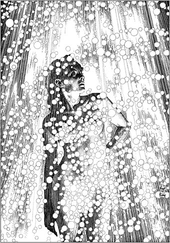
With 1888 illustrations to choose from, picking out a representative selection is a hopeless task, so what you see here are a few favourites. I said that Finlay maintained a high level of quality but there are unsuccessful Finlays, especially in the early years when his style was still evolving. (It should be noted that he was in his early twenties when he was creating pieces such as these. His errors are a lot less grievous than mine were at the same age.) One of the hallmarks of the Finlay style is a frequent use of photo-reference, especially for faces, and it’s the disjunction between faces and bodies which occasionally jars. Disparities between the size or angle of a head and a body are common in photo-collage but you don’t expect to see them in a drawing. Occasionally the disparities worked for him, as in his illustration for The Faceless God by Robert Bloch, a drawing that so impressed HP Lovecraft that he responded with a short poem praising both picture and artist. The reference images used for his later work are much more seamlessly integrated, and in the 1940s and 50s he seemed to be using posed models as frequently as the illustrators for the big American magazines.

finlay4.jpg

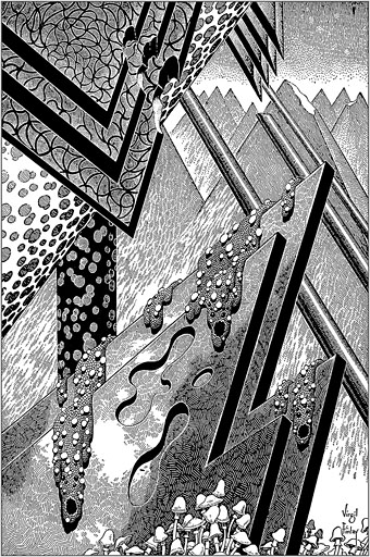
The Man Who Mastered Time by Ray Cummings; Fantastic Novels Magazine, March 1950. Remove the fungi from this illustration and you’d have an almost abstract image.

Regarding cbz or cbr files: these are simply folders filled with jpegs or pngs which have been zipped then given a new suffix. They can be browsed using a suitable comics-reader application; I use Simple Comic for the iMac and ComiCat for the tablet. The files can also be opened with any unzipping software to give you access to the images inside. I find these files so much easier to use than pdfs, especially for image-heavy publications, that I’ve taken to exporting pdf pages as jpegs then zipping a folder of the images into a cbr. One of the advantages of the cbr format is that the readers allow you to extract an image without unzipping the whole file. The only drawback with the Finlay files is that ComiCat doesn’t let you see the file name the way that Simple Comic does.

finlay6.jpg

Full Moon by Talbot Mundy; Famous Fantastic Mysteries, February 1953.

Elsewhere on { feuilleton }
The illustrators archive
The Lovecraft archive

Previously on { feuilleton }
Virgil Finlay’s Tarzan
Virgil Finlay’s Salomé
The monstrous tome

Weekend links 579

kresek.jpg

Untitled painting by Larry Kresek.

• “A good comparison might be Broken English-era Marianne Faithfull, Appalachian folk singer Hedy West, or the early-70s home recordings of German actress Sibylle Baier; spellbound female voices possessed of an uncanny emotional honesty.” Andrew Male on the songs of Karen Black. In 1989, the first issue of Psychotronic Video profiled Black’s remarkable acting career which was cultish enough for the magazine to give her the “psychotronic” label.

• Coming soon from Strange Attractor Press, In A Sound World by Victor Segalen, “a work of fantasy concerning an inventor lost in his own immersive harmonic space”.

• At Messynessychic: Inside the Imaginarium of a Solarpunk Architect, or architectural designs by Luc Schuiten, brother of comic artist and illustrator François Schuiten.

De Strijd der Werelden, 1899. The first illustrated book version of HG Wells’ The War of the Worlds was a Dutch edition with drawings by JH Speenhoff.

• New/old music: Words Disobey Me (Dennis Bovell Dub Version) by The Pop Group, part of a forthcoming Bovell remix of the group’s debut album, Y.

• Mixes of the week: A mix for The Wire by Sunik Kim, FACT Mix 817 by Malibu, and Rhythmic Asymmetrical Wyrd by The Ephemeral Man.

• “Whatever we call them, and whatever else they might be, they are, in fact, printed paintings.” Joseph Visconi on William Blake’s monoprints.

• Curious Music announces Moebius Strips, an audio installation by Tim Story from the sounds and music of Dieter Moebius.

• At Dangerous Minds: Richard Metzger‘s confessions of an analogue vinyl snob.

Strange Flowers departs from tradition by offering a summer reading list.

Moebius 256 (1977) by Zanov | Moebius (1981) by Cyrille Verdeaux | Elena’s Sound-World (2014) by Sinoia Caves