Weekend links 458

scott.jpg

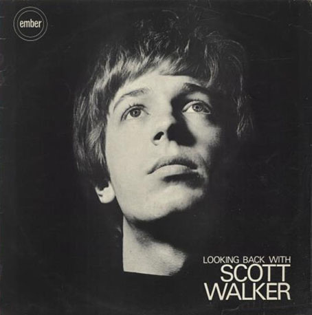
Photo by Dezo Hoffmann, 1968.

If there’s one thing everyone can agree on about the late Scott Walker it’s that his career was not only improbable but almost impossible in its range and trajectory. My mother saw the Walker Brothers perform in Blackpool 52 years ago, headlining a touring bill that featured Cat Stevens (the artist she most wanted to see) and the soon to be very famous Jimi Hendrix. She enjoyed good pop songs and big orchestras, so even though she’s never expressed a preference for the Walker Brothers or Walker solo I’m sure she could listen to an album or two. But she wouldn’t be able to stand more than a minute of Walker’s output from Tilt (1995) onwards, and even the four watershed tracks on Nite Flights (1978) would be deemed unacceptable. Walker’s progress inverted the stereotype of the 20th-century pop career, the all-too-common descent into blandness and irrelevance, by following a course closer to that taken by painters and literary artists. He walked the walk.

• When Scott Walker’s Climate Of Hunter was announced in 1984, Richard Cook persuaded its introverted creator to talk to the press for the first time in many years. Cook and Walker met again in 1995 when Tilt was released. From 2008: Sean O’Hagan talking to Scott Walker two years after the release of The Drift; at The Wire again: a recording of Rob Young discussing Walker’s career; at the BFI: Scott Walker’s selection of some favourite films; at The New Yorker: Amanda Petrusich on the weird and vast and periodically devastating music of Scott Walker.

• At The Paris Review: Jane Alison suggests meanders, spirals, radials, fractals and cells as alternative to the narrative arc, while Peter Bebergal argues for seeing belief and disbelief in a superposition when it comes to art and the occult.

Sarasota Half in Dream, a feature-length documentary by Derek Murphy and Mitchell Zemil about a decaying Florida suburb.

• Chris Marker, Always Moving: Max Nelson on a Paris exhibition, Chris Marker, les 7 vies d’un cinéaste.

• There’s a little more Scott Walker, inevitably, in this interview with Stephen O’Malley of Sunn O))).

Michael Moorcock talking to The Austin Chronicle about his long association with Hawkwind.

M. John Harrison chooses favourite stories for Jonathan Gibb’s Personal Anthology series.

• Rat Cunning and Bloodshed: An interview with Simon Sellars by Lee Rourke.

In Search of the Seas of Pleiades, a free download by Jenzeits.

• Rammstein are back with a video epic: Deutschland.

Sex Magick is Satanic doo-wop by Twin Temple.

Time, Forward! by Georgi Sviridov.

Orpheus (1967) by The Walker Brothers | Lullaby (By-By-By) (2000) by Ute Lemper | Darkness (2006) by Scott Walker

The Ingenious by Darius Hinks

hinks.jpg

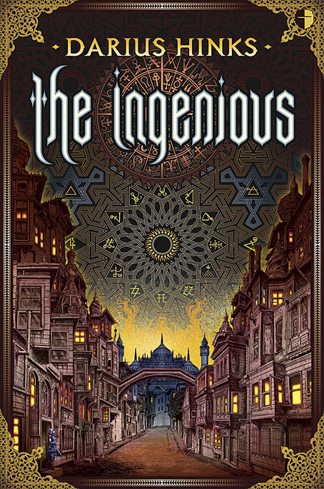
My latest cover for Angry Robot Books was revealed this week at the Barnes & Noble blog (where I talk a little about the design aspects) so here it is. The Ingenious is an alchemy-themed fantasy by Darius Hinks, the brief for which required a depiction of the city of Athanor, the central character, Isten, and some indication of the novel’s occult flavour:

Thousands of years ago, the city of Athanor was set adrift in time and space by alchemists called the “Curious Men.” Ever since, it has accumulated cultures, citizens and species into a vast, unmappable metropolis.

Isten and her gang of half-starved political exiles live off petty crime and gangland warfare in Athanor’s seediest alleys. Though they dream of returning home to lead a glorious revolution, Isten’s downward spiral drags them into a mire of addiction and violence. Isten must find a way to save the exiles and herself if they are ever to build a better, fairer world for the people of their distant homeland.

I was also asked to do something in the detailed drawing style of artists such as Philippe Druillet and Ian Miller, a challenge I was happy to accept with the proviso that both those artists are inimitable. As I say in the B&N post, I went in a Miller direction although I don’t know whether anyone would spot the influence. I was more overt years ago in some of my borrowings from Druillet whose aesthetics can be discerned in my poor artwork for Hawkwind and my much better artwork for The Call of Cthulhu. The background pattern was the kind of thing I often do where I spend hours working on something then cover it over, but more of the interlacing and symbolism (all genuine alchemical symbols) will be visible on the back of the book.

The Ingenious will be published on 9th February, 2019.

Previously on { feuilleton }
De Sphaera
Delineations
Musaeum Hermeticum
A triangular book about alchemy
Alembic and Ligier Richier
Atalanta Fugiens
Splendor Solis revisited
Laurie Lipton’s Splendor Solis
The Arms of the Art
Splendor Solis
Amphitheatrum Sapientiae Aeternae
Cabala, Speculum Artis Et Naturae In Alchymia
Digital alchemy

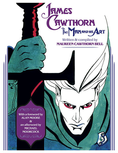
James Cawthorn: The Man and His Art

cawthorn-cover.jpg

The past year would have been busier than usual with the amount of illustration work I had to deal with, but it was made even busier with my having to design this book at the same time. James Cawthorn: The Man and His Art was originally intended to be a modest memorial by Maureen Cawthorn Bell for her artist brother following his death in 2008, but the book grew into a heavyweight volume of 448 pages containing over 800 individual pieces of art: book covers, illustrations for magazines and fanzines, private pieces for friends and relatives, and many sketches or preliminary works, most of which have never seen print before.

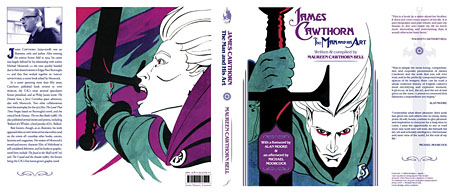
cawthorn-coverspread.jpg

Given Jim Cawthorn’s long association with Michael Moorcock, as both friend and collaborator, the task of collating the artwork and editing the book went to Moorcock bibliographer John Davey, who also serves as the book’s publisher. John spent three years locating over 3000 pieces of artwork, large and small. Some of these pieces are now lodged with the Moorcock archives in the Bodleian Library, Oxford, while others may only be found in the pages of the many science fiction and fantasy fanzines that Jim illustrated, copies of which are stored at the British Library. From this body of material Maureen and John selected a core of representative work from Jim’s private as well as public life, although no-one at the outset of the project was expecting the final picture tally to be so high.

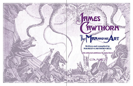
cawthorn-spread-01.jpg

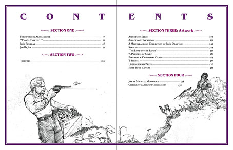
My task as the book’s designer involved making the text presentable (easy) and corralling the artwork (not so easy, and I also had to either clean or colour-adjust every single piece). Maureen had divided the book into several sections, beginning with a lengthy biographical reminiscence. Following this was “Jim by Jim”, a selection of interviews, magazine pieces, some fiction, essays and book reviews. There was also a lengthy extract from Fantasy: 100 Best Novels (1988), a book credited to Jim and Michael Moorcock but, by Moorcock’s admission, mostly Jim’s work. Jim Cawthorn was very well-read, especially in the genres—he was old enough and interested enough to have read The Lord of the Rings when it was first published—and could also present his erudition engagingly for a reader, so the text section of Maureen’s book is far from indulgent.

cawthorn-spread-02.jpg

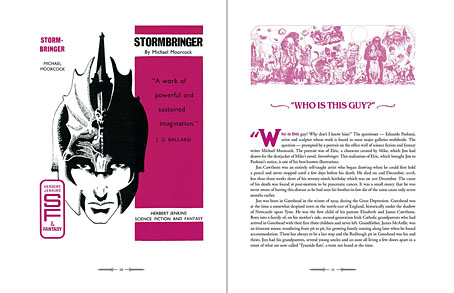
The book design isn’t as elaborate as some I’ve worked on but it didn’t need to be when the pictorial material is rich with what Moorcock calls “wizardry and wild romance”. Maureen wanted a particular picture of Moorcock’s Elric character on the cover so I took details and motifs from some of Jim’s many Elric illustrations to give the book a thematic thread and internal consistency. Cawthorn was present at the creation of Elric in the early 1960s; he not only provided Moorcock’s characters with their first illustrations but even helped plot one of the earliest stories, Kings in Darkness.

cawthorn-number.jpg

Page numbers are framed by the swords from the Elric stories.

Using motifs such as the sword silhouette and Elric head is something I frequently do with book designs but for this book I also went to the trouble of creating a one-off font for the drop capitals based on Jim’s hand-drawn lettering. Jim drew titles and other lettering throughout his career, so again this was a decision warranted by the book’s contents. The few times we met I never asked him about this but I’ve always thought his lettering designs were derived from the stylised titles that J. Allen St. John created for many of the early Edgar Rice Burroughs books. Jim spent most of his life drawing Burroughs’ characters, and was very familiar with the work of Burroughs’ original illustrators. I was hoping to find a title design of Jim’s that I could rework for the book’s title but none of the examples worked as well as I hoped. For this reason the title lettering is based on different styles from the John Carter novels that were Jim’s favourites among Burroughs’ works.

cawthorn-spread-03.jpg

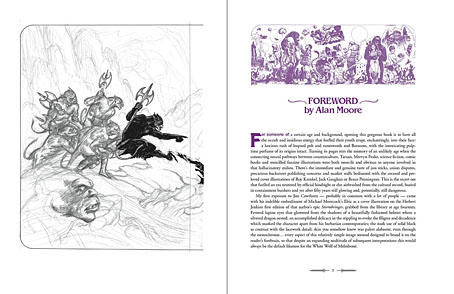
Other features include a foreword by Alan Moore, an afterword by Michael Moorcock, a gallery of Jim’s Lord of the Rings drawings and character sketches from the early 1960s (which predate all others bar those by Tolkien himself), artwork for Hawkwind (including Dave Brock’s “Meliadus” T-shirt), and even a handful of photos from the set of The Land that Time Forgot (1975), the ER Burroughs-derived feature film scripted by Jim with Michael Moorcock. The page samples here are necessarily few given the size of the book.

cawthorn-spread-04.jpg

For the moment James Cawthorn: The Man and His Art is available exclusively from publishers Jayde Design at a special pre-publication price of £20. After publication on 6th August the price will rise to £35. Further page samples follow.

Continue reading “James Cawthorn: The Man and His Art”

The artists of Future Life

future.jpg

My earlier post about Future Life magazine mentioned the regular Portfolio series which featured interviews with illustrators and space artists, the latter group being the people who providing conceptual paintings for astronomy books and government entities such as NASA. Since the magazine files at the Internet Archive aren’t searchable I thought it worth making note of the interviews here, for my own benefit as much as anything else. (This blog has often served as a useful notebook.)

fl01-bonestell.jpg

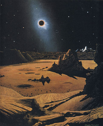
Issue 1: Chesley Bonestell.

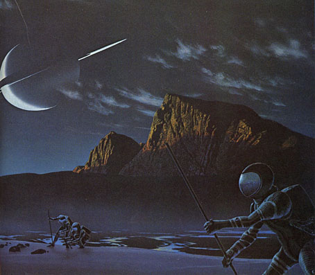
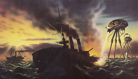
Many of the artists featured in Future Life were receiving their first (in some cases, only) high-profile feature at a time when little attention was given to the producers of this kind of work even in popular science-fiction magazines. The story magazines have always run interviews with writers but prior to Future Life, Science Fiction Monthly was the only magazine that I’d seen with a regular illustration feature, and that title didn’t last very long. Future Life covered some of the same people, Chris Foss, for example, while seeking out the prominent figures of the US illustration world. Not all the art is to my taste at all but the interviews are of interest even if you don’t like the pictures. One surprise was finding an interview in one of the issues that I’d missed with Ludek Pesek, a Czech artist whose views of the Solar System and depictions of the evolution of life on Earth I knew from the Puffin books he worked on with Peter Ryan. Those books were aimed at a young readership and were great favourites of mine before I’d seen anything by Foss and co. Another of the space artists interviewed is David Hardy, a British contemporary of Pesek’s whose view of an alien planet will be familiar to Hawkwind enthusiasts on the back cover of Hall Of The Mountain Grill. Another notable feature of the series is the lack of women artists, although this isn’t so surprising given that women creating pictures of space hardware are few even today. All the same, they might have featured Rowena Morrill, a popular cover artist for SF and fantasy novels at the time, and someone whose work I prefer to many of the people they did profile.

fl03-boris.jpg

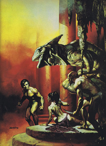
Issue 3: Boris Vallejo.

fl04-mccall.jpg

Issue 4: Robert McCall.

fl05-nagaoka.jpg

Issue 5: Shusei Nagaoka.

A Japanese artist best known in the West for his album-cover art for ELO, Earth, Wind and Fire, and many others.

fl06-miller.jpg

Issue 6: Ron Miller.

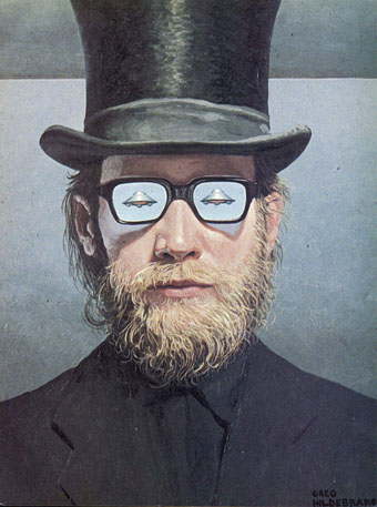
fl07-hildebrandt.jpg

Issue 7: The Brothers Hildebrandt.

fl08-hardy.jpg

Issue 8: David Hardy.

Continue reading “The artists of Future Life”

Weekend links 409

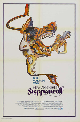
steppenwolf.jpg

Poster for Steppenwolf (1974), a film directed by Fred Haines (his only one) based on the novel by Herman Hesse, and starring Max von Sydow and Dominique Sanda. No artist or designer credited.

• “…in her 20s, she heard two elderly folk singers and was struck by their ‘gentle dignity’. It cemented her own philosophy: ‘No dramatising a song, no selling it to an audience, no overdecorating in a way that was alien to English songs, and most of all, singing to people, not at them.'” Laura Snapes on Shirley Collins and her memoir, All in the Downs.

• Many of the BBC’s sound effects were available for years in necessarily small collections on vinyl, tape and CD. Now you can download over 16,000 of them for free here. The interface is still primitive so try typing some words into the search box to see what shows up.

Carl Swanson on Natalie Frank’s paintings based on Pauline Réage’s Story of O, and the problems these caused when she tried to exhibit them.

• Pictures of the Jazz Age: Regina Marler reviews three books about photographer Berenice Abbott.

• “The late Juraj Herz was a one-man wave of Czechoslovak horror,” says Kat Ellinger.

Mark Dery on William S. Burroughs and the dead-end horror of the Centipede God.

• Mixes of the week: FACT mix 648 by Laraaji, and XLR8R Podcast 538 by Fluxion.

Kashmir by Forming The Void, and Kazakhstan by Brian Eno.

• At Dennis Cooper’s: Dominique Sanda Day.

PixaTool by Kronbits.

Born To Be Wild (1968) by Steppenwolf | Steppenwolf (1976) by Hawkwind | Der Steppenwolf (2015) by Selofan