The Dreaming City by Michael Moorcock

dreaming.jpg

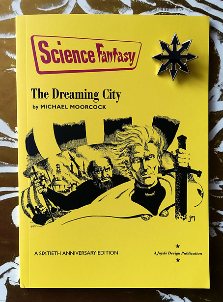
Cover art by James Cawthorn. Chaos pin not included.

More sword and sorcery. Last month I was asked to design a reprinting of the very first Elric story by Michael Moorcock, a standalone publication from Jayde Design intended to commemorate the 60th anniversary of Moorcock’s most popular character. The Dreaming City was published in issue 47 of Science Fantasy magazine in June 1961, following a request from the editor, John Carnell, for Moorcock to write a new series of fantasy stories. Over the next three years Science Fantasy published all ten of the novellas that established Elric’s character and his world, ending with Doomed Lord’s Passing in April 1964, the entry which saw Moorcock destroy his creation in a Boschian apocalyptic finale.

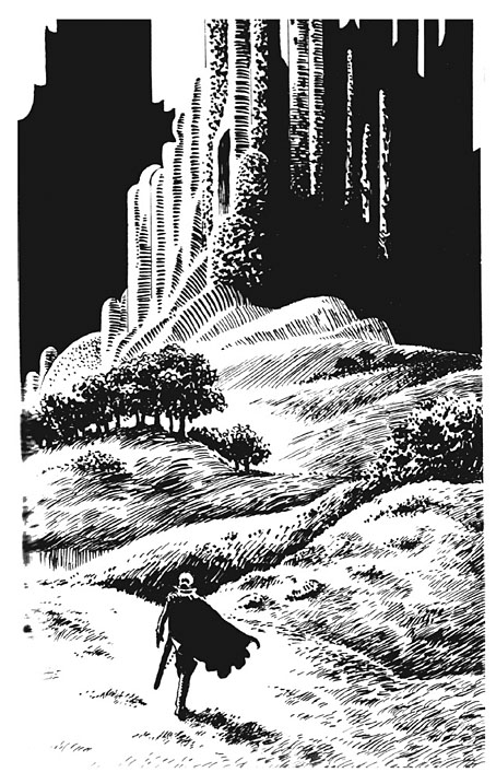
The Dreaming City: A Sixtieth Anniversary Edition is a compound facsimile of these publications. The interior design follows the template of the magazine interiors while the front cover is based on one of the later numbers which ran the fifth Elric story, The Flame Bringers, with a cover illustration by James Cawthorn. That illustration may have been attached to a different story but it actually depicts a scene from the end of The Dreaming City when Elric is leaving Imrryr in burning ruins after the place has been sacked by the raiding party he led there. It’s also a much better illustration than the one by Brian Lewis that appeared on the cover of the June 1961 issue. In addition to recreating the cover we’ve also restored the drawing, which in its printed form was slightly cropped at one side, with the complete version taken from Cawthorn’s original. Jim Cawthorn was closely involved with the creation of Elric, and even co-wrote Kings in Darkness, another of the stories in the Science Fantasy sequence. Inside the new edition there are four further illustrations which Cawthorn produced for a German collection of Elric stories published by Heyne in 1979.
dreaming2.jpg

One of James Cawthorn’s interior illustrations.

This small publication will only be of interest to collectors but it was a good thing to be involved with. In the past I’ve designed an Elric-themed album cover for Hawkwind, and last year designed The Stormbringer Sessions, a very limited publication of Jim Cawthorn’s sketched outline for his unfinished Elric graphic novel. The Dreaming City is the first Elric design of mine that features Moorcock’s own text. For an opening shot in what would become a saga spanning several decades and a variety of media The Dreaming City is a remarkably confident piece of work, even more so when you consider that the author was only 21 at the time. Elric begins and ends the story as an outsider, exiled and alone, and with his existence bound to his cursed sword, Stormbringer. Subsequent novels and stories would fill in the history before pitching Elric into the multiverse along with many of Moorcock’s other characters. But this is where it all begins, with six Sea Lords waiting in a tavern wondering whether the albino prince will turn up at all.

The Dreaming City: A Sixtieth Anniversary Edition is available here.

Previously on { feuilleton }
The Stormbringer Sessions by James Cawthorn
James Cawthorn: The Man and His Art
The Chronicle of the Cursed Sleeve
Moorcock: Faith, Hope and Anxiety
Elric 1: Le trône de rubis
The Sonic Assassins
Jim Cawthorn, 1929–2008

Getting shirty

shirt1.jpg

Another post about T-shirts… I discontinued daily posting in 2016, and I don’t usually write anything on Sundays, so take this as a bonus.

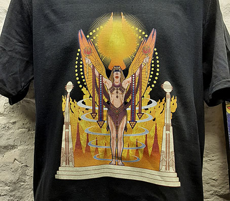
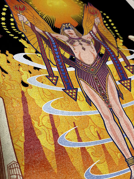
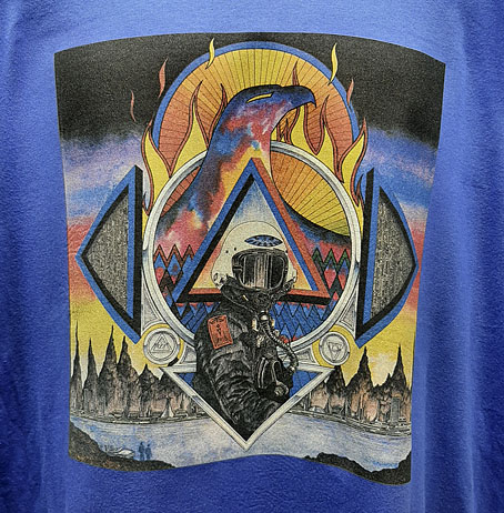
Skull Print sent these photos of the first batch of orders from the new shirt range. Very impressive detail and colour quality on both designs, especially the Zones shirt which contains a lot of fine detail. My thanks to everyone who’s placed an order so far!

shirt1-1.jpg

shirt2.jpg

Previously on { feuilleton }
More shirts
T-shirts by Skull Print

T-shirts by Skull Print

skullprint-dotu.jpg

I’m very pleased to announce that I’ve partnered with T-shirt printers Skull Print to make shirts available featuring my artwork. See this standalone page for details. Skull Print are a small business based in the UK who specialise in music-related merchandise. Joe Banks pointed me in their direction when he was wondering if I’d considered doing a shirt design based on the cover of his Hawkwind book, Days of the Underground. To thank Joe for this, the first shirt is an adaptation of his cover design, which is followed by a very old piece of cover art for the Zones album by Hawkwind. Skull Print cater to a substantial Hawkwind fanbase so it makes sense to make this one available. And since we’re now in the horror month, I’ve added a couple of recent Lovecraft-related designs which have been tailored specially for this purpose.

skullprint-monsters.jpg

A design based on my cover for Lovecraft’s Monsters, an excellent story collection edited by Ellen Datlow.

I should emphasise that these aren’t the only shirt designs available. Skull Print operate on a print-on-demand basis so in theory any artwork of mine may be printed as a shirt if someone makes a request for one. (With a couple of exceptions; a few designs are subject to copyright restrictions.) The advantage that Skull Print have over other services such as CafePress is that I don’t have to spend time uploading the artwork to a website then creating a special sales page for it. Anyone who wants a shirt can now send me a request for one then I send the artwork to Skull Press and they’ll take care of everything else.

joyce.jpg

I’ll be setting up a few more designs with PayPal buttons when I have a spare moment. Some designs have been surprisingly persistent sellers at CafePress, such as my ideogrammatic portrait of James Joyce which is often ordered in the run-up to Bloomsday. A few years ago a shirt bearing this design was ordered by one “M. Atwood” of Halifax, Nova Scotia. I’ve been hoping ever since that the M. Atwood who everyone knows as a writer might turn up somewhere dressed in this item. If anyone sees a photo like this then please let me know!

Previously on { feuilleton }
Hawkwind: Days of the Underground
The Chronicle of the Cursed Sleeve
Rock shirts
Void City

Music for people with three ears

teb.jpg

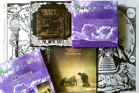
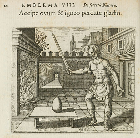
Cherry Red Records this month reissues the first three albums by the unique and wonderful Third Ear Band. I like CDs, and I especially like having them collected into boxes with Japanese-style facsimile sleeves, so this collection is irresistible. The group’s first two albums, Alchemy (1969) and Third Ear Band (1970), still sound timeless despite being products of their time, with the track you’d most expect to sound dated, Ghetto Raga, being free of sitars or Indian pastiche. Third Ear Band music is a kind of improvised folk, predominantly the product of oboe, violin and percussion, which sounds like something the group might have tuned into when they were playing for Druids at ancient sites (Stone Circle and Druid One are further track titles). The first two albums also have the additional attraction for this listener of a heavy emphasis on medieval mysticism, from the Atalanta Fugiens illustration by Matthäus Merian on the cover of Alchemy, and the symbols and astrological diagrams that fill out the inside cover of the second album, to the titles of that album which continue the alchemical theme: Air, Earth, Fire and Water. The group also borrowed some graphics from Aubrey Beardsley when they issued their musical manifesto in 1969.

merian.jpg

Music From Macbeth (1972) is constrained in comparison to the albums that precede it, being subservient to Roman Polanski’s feature film, although there’s more music here than was used in the film. It’s also closer to rock music in places, with occasional fuzzed guitar, a Mellotron, and rumbles from a VCS 3 synthesizer played by a future member of Hawkwind, Simon House. The cover painting by Roger Dean isn’t one of his best. In Views Dean complains that Polanski “got the imagery wrong” for the scenes with the witches, a comment I’ve never understood. Polanski’s film is a naturalistic interpretation of the play which is well-served by the Third Ear Band’s drones and medievalisms. Incidentally, I’m sure the phrase “music for people with three ears” was used on a Harvest records press ad but if it was I’ve been unable to find any evidence of it. Anyone out there know the source?

Previously on { feuilleton }
Night’s black agents
Atalanta Fugiens

Solid Space: Jon Anderson’s cosmic voyage

olias1.jpg

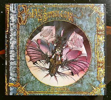
Jon Anderson’s solo debut, Olias Of Sunhillow, is reissued this week in a double-disc set comprising a remastered CD plus an audio DVD. I’d been hoping for some time that this album might be given a proper reissue, it’s one I like a great deal but my old CD has never sounded as good as it ought to. The album may command cult status round here but you don’t see it mentioned anywhere outside Yes forums or partisan enclaves like the Prog Archives. This post may be taken as a small corrective to the neglect.

olias2.jpg

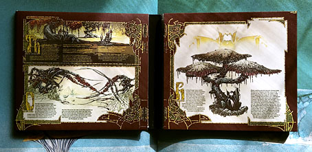
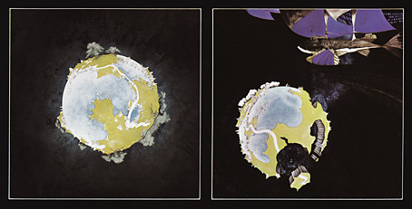
Olias Of Sunhillow was released in 1976, and was the most unusual of all the solo albums recorded by the individual members of Yes in the mid-70s, being a spin-off from some of the group’s early albums, or at least their cover art. Roger Dean’s first cover work for the group was on Fragile in 1971, for which he painted a miniature world rather like one of MC Escher’s planetoids. This was Dean’s idea, the band had suggested a broken piece of porcelain as the cover image. The back cover of the album showed the same planet in a state of fragmentation with a fish-like spaceship floating above it (see below). Another drawing of the fish-ship was added to the front cover before the album’s release, and it’s this ship, and the narrative it suggests, that leads eventually to Anderson’s solo album. Two years after Fragile, the planetary disintegration had turned into an exodus on the group’s triple-live album, Yessongs, the back cover of which shows pieces of planet being towed through space by a similar fish-ship. The other panels of the cover depict the arrival of these fragments on a newer, larger world. Anderson’s album takes this sequence of events then filters them through Vera Stanley Alder’s mysticism to craft a musical odyssey which Discogs describes as:

…the story of an alien race and their journey to a new world due to catastrophe. Olias, the title character, is the chosen architect of the glider Moorglade, which will be used to fly his people to their new home. Ranyart is the navigator for the glider, and Qoquaq is the leader who unites the four tribes of Sunhillow to partake in the exodus.

olias3.jpg

For many years in British music circles it would have been a grave error to even acknowledge this album’s existence, never mind admit to actually liking it. This was partly the old animus against progressive rock, an unexamined prejudice that lasted well into the 1990s, but Anderson’s album had so many strikes against it that it might have stood as the winner of a disapproval lottery for the more ideologically rigid writers and readers of the NME. It’s Jon Anderson (strike 1), the lead singer of progressive rock (2) group Yes (3), whose album is a science fiction (4)/ fantasy (5) concept (6), littered with Tolkien-like invented names and words (7), and with a multi-page sleeve embellished with detailed fantasy illustrations (8) by David Fairbrother-Roe. The design was art directed by Hipgnosis, who subsequently designed the next two Yes albums. Anderson originally wanted Roger Dean to create the packaging, which would have provided a further strike of disapproval against the album, but Dean’s career had gone into overdrive following the publication of Views so he either didn’t have the time or didn’t want to be involved. In Views Dean mentions “another project” based on the fish-ship’s journey which may be a reference to Anderson’s forthcoming album, the credits of which thank Dean for “planting the seed”.

views1.jpg

Roger Dean’s original artwork for Fragile (1971). Another fish-ship was added to the final cover art.

Continue reading “Solid Space: Jon Anderson’s cosmic voyage”