Intertextuality

cthulhu17.jpg

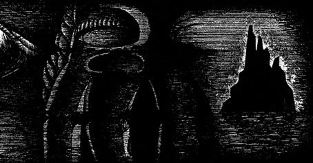
The Call of Cthulhu (1988): in the upper half there’s the big sun from Bob Peak’s poster for Apocalypse Now, in the lower half a radical reworking of Arnold Böcklin’s The Isle of the Dead.

In 1990, shortly after the first season of Twin Peaks had finished showing in the US, Video Watchdog magazine ran a feature by Tim Lucas which attempted to trace all the various cultural allusions in the character names and dialogue, references to old TV shows, song lyrics and the like. This was done in a spirit of celebration, with Lucas and other contributors welcoming the opportunity to dig deeper into something they’d already enjoyed. This week we’ve had a similar unravelling of textual borrowings in a TV series, only now we have the internet which, with its boundless appetite for accusing and shaming, can often seem like something from the grand old days of the Cultural Revolution.
cthulhu01.jpg

The Call of Cthulhu (1988): a more subtle allusion to Apocalypse Now.

The latest culprit ushered to the front of the assembly for the Great Internet Struggle Session is Nic Pizzolatto whose script for True Detective has indeed been celebrated for its nods to Robert Chambers and The King in Yellow. It’s also in the process of being condemned for having borrowed phrases or aphorisms from Thomas Ligotti’s The Conspiracy Against the Human Race (2011). See this post for chapter and verse.
cthulhu02.jpg

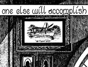
The Call of Cthulhu (1988): It’s not very clear but that’s a boat from The Creature from the Black Lagoon.

If I find it difficult to get worked up over all this pearl-clutching it’s because a) it shows a misunderstanding of art and the way many artists work; b) True Detective was an outstanding series, and I’d love to see more from Pizzolatto and co; and c) I’ve done more than enough borrowing of my own in a variety of media, as these samples from my adaptation of The Call of Cthulhu demonstrate, a 33-page comic strip where there’s a reference to a painting, artist or film on almost all the pages, sometimes several on the same page.
cthulhu03.jpg

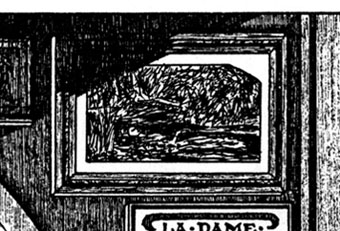
The Call of Cthulhu (1988): Ophelia by Millais.

Cthulhu is a good choice here since Pizzolatto’s story edged towards Lovecraft via the repeated “Carcosa” references. You’d think a Lovecraft zine of all things would know better than to haul someone over the coals for borrowing from another writer when Lovecraft himself borrowed from Robert Chambers (and Arthur Machen and others), while “Carcosa” isn’t even original to Chambers’ The King in Yellow but a borrowing from an Ambrose Bierce story, An Inhabitant of Carcosa (1886). Furthermore, Lovecraft famously complained about his own tendencies to pastiche other writers in a 1929 letter to Elizabeth Toldridge: “There are my ‘Poe’ pieces and my ‘Dunsany pieces’—but alas—where are any Lovecraft pieces?”

Continue reading “Intertextuality”

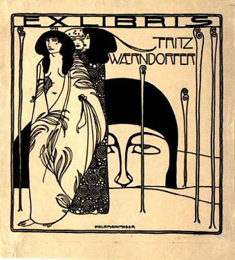
Koloman Moser bookplates

moser3.jpg

Ex libris Fritz Waerndorfer (1903).

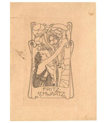
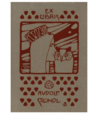
I could happily post things by the indefatigable Koloman Moser (1868–1918) all the time but he’s not exactly an unknown figure even if his work does get overshadowed by his colleague in the Vienna Secession, Gustav Klimt. This handful of ex libris plates almost all date from the Secession period, and include one for Adele Bloch-Bauer, a woman whose name is familiar these days for her being the subject of a very well-known Klimt portrait.

moser7.jpg

Ex libris Fritz Schwartz (1900).

moser6.jpg

Ex libris Rudolf Steindl (1900).

Continue reading “Koloman Moser bookplates”

Ver Sacrum, 1901

vs-1901-01.jpg

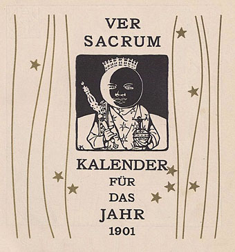
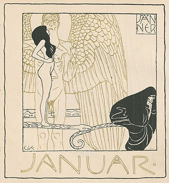
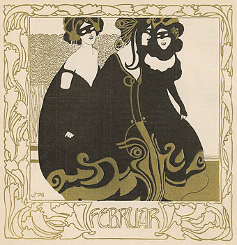
Continuing the series of posts about Ver Sacrum, the art journal of the Viennese Secession. After a somewhat lacklustre collection for 1900 the journal finds its vitality again, the painters of happy Teutonic peasants having been dropped in favour of more remarkable prints and graphics from Vienna’s finest. The contents for this year parallel some of the works being featured in Deutsche Kunst und Dekoration for the same period. Gustav Klimt is given a great deal of attention, beginning with the calendar piece below. There’s also work from the Symbolist sculptor George Minne and a feature on the Glasgow School artists Charles Rennie Mackintosh and Margaret MacDonald. Throughout the year each issue tends to concentrate on a single artist or exhibition. There’s so much good stuff in this year it’s not possible to present more than a small sample. Those interested are encouraged to browse all 432 pages or download the entire volume here.

vs-1901-02.jpg

vs-1901-03.jpg

Continue reading “Ver Sacrum, 1901”

Ver Sacrum, 1900

vs-1900-01.jpg

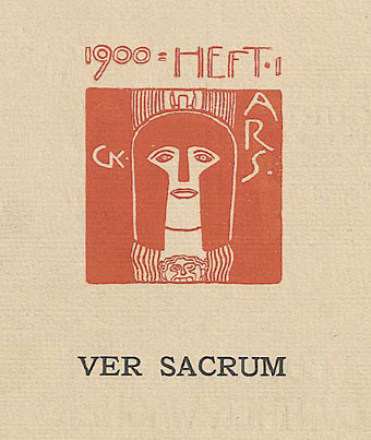
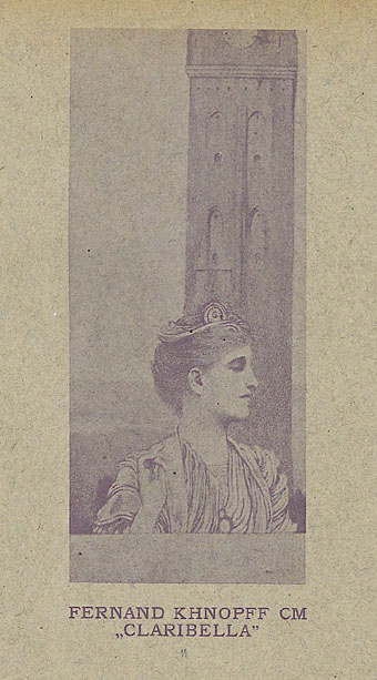
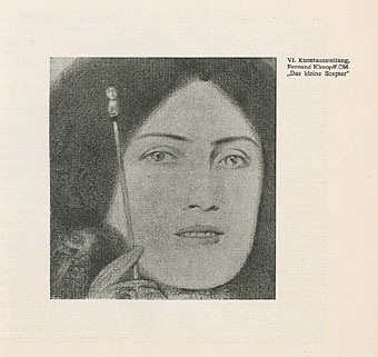
Continuing an occasional series of posts about Ver Sacrum, the art journal of the Viennese Secession. The collected issues for 1900 undergo a change of design, and not necessarily for the better. Gone are the decorative covers of previous years, replaced by small emblem-like vignettes for each issue. The one above is a design by Gustav Klimt whose work is featured throughout this year. Other familiar names include the Belgian Symbolist Fernand Khnopff, Ludwig von Hofmann and Marcus Behmer. The page design is generally less interesting, unfortunately, although the magazine did retain its square format and there are many impressive examples of Art Nouveau graphics. The complete set of pages for this volume can be viewed or downloaded here.

vs-1900-02.jpg

vs-1900-03.jpg

Continue reading “Ver Sacrum, 1900”

Jeffrey Catherine Jones, 1944–2011

jones1.jpg

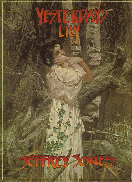
Yesterday’s Lily (1980), a collection of painting and illustration work published by Dragon’s Dream.

Artist Jeffrey Jones, whose death was announced this week, transitioned to Jeffrey Catherine Jones in the late 1990s so we’ll honour that here and won’t insist on referring to her as “he” as I’ve been seeing on some other websites. Jones’ work was significant for me mainly as a result of her participation in The Studio collective from 1975 to 1979, an affiliation of four artists—Jones, Barry Windsor-Smith, Mike Kaluta and Berni Wrightson—who shared a loft studio in New York City. The fruits of that relationship were recorded in one of my favourite art books, The Studio, in 1979. Of the four it was Barry Smith’s Pre-Raphaelite-inspired work which made the greatest impression at the time (especially Pandora), followed by Berni Wrightson’s Frankenstein illustrations. But Jones was the best painter in the group, with a style that blended influences from (among others) JM Whistler, Gustav Klimt and Frank Frazetta. There are galleries of paintings and drawings at the official website. Still to come is Better Things: Life & Choices of Jeffrey Jones, a documentary film by Maria Cabardo. Clips and trailers can be seen here.

A selection of paintings at Golden Age Comic Book Stories
The Studio Pt.1: Jeff Jones

Elsewhere on { feuilleton }
The illustrators archive

Previously on { feuilleton }
Roger Dean: artist and designer
Berni Wrightson’s Frankenstein