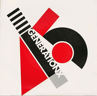
Your Generation (1977) by Generation X. Design by Barney Bubbles.
Continuing an occasional series about the work of particular artists or designers being used on record sleeves. El Lissitzky (1890–1941) is an interesting candidate in this area since his pioneering abstractions have greatly influenced subsequent generations of graphic designers. As a result of this you’re just as likely to find his Suprematist style being pastiched on an album cover as find one of his paintings decorating the sleeve. Pastiches are difficult to locate unless you already know they exist—or unless the album credits acknowledge the style they’re imitating—so this list will no doubt be incomplete.
Barney Bubbles’ design for the debut single by Generation X is the earliest example I’m aware of that makes use of the El Lissitzky style. It was also one of Bubbles’ first sleeves for a punk band, and a significant break with his often florid hippy designs.
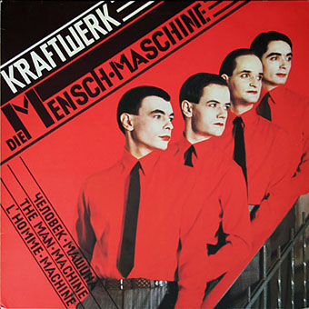
Die Mensch Maschine (1978) by Kraftwerk. Design by Karl Klefisch, “inspired by El Lissitzky”.
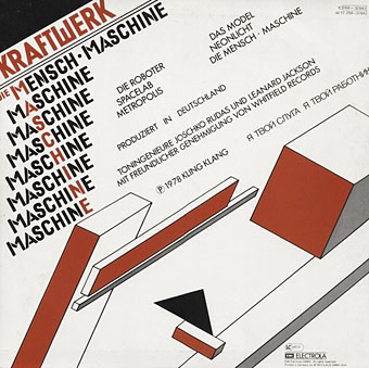
Kraftwerk’s seventh album uses Lissitzkian typography and graphics on its front and back covers. A very popular album with the post-punk crowd that would have been the first introduction for many people to El Lissitzky’s name. Kraftwerk still use that vibrant arrangement of black, red and white in their stage shows.
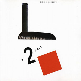
B-2 Unit (1980) by Riuichi Sakamoto. Design by Tsuguya Inoue.
More pastiche, this time borrowing from El Lissitzky’s Suprematist book for children: About Two Squares: In 6 Constructions: A Suprematist Tale (1922). The book’s two characters of a red square and a black square appear on the vinyl labels. This is a great album, incidentally, still my favourite by Sakamoto.
