Abe Gurvin album covers

gurvin01.jpg

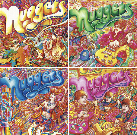
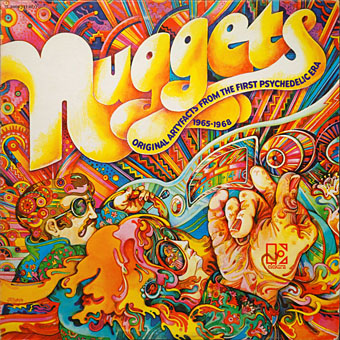
Nuggets: Original Artyfacts From The First Psychedelic Era 1965–1968 (1972).

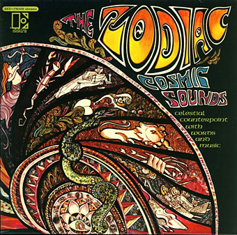
Reading this article last week about Lenny Kaye’s Nuggets compilation I realised I’d never looked up the album’s cover artist, Abe Gurvin (1937–2012); this despite owning two copies of Kaye’s compilation, one of which, an expanded box of four CDs, includes additional Gurvin art (see below). Nuggets was released in 1972 on Elektra, a label for whom Gurvin worked regularly as a designer as well as an artist. The only other cover of his I definitely recall seeing before is for one of Mort Garson’s electronic novelty albums, Cosmic Sounds (credited to The Zodiac), although some of the classical recordings on Elektra’s Nonesuch imprint look vaguely familiar. Nonesuch were using vivid art and graphics on the covers of their classical albums from the mid-60s on, years in advance of rival labels; Gurvin, along with Bob Pepper, Gene Szafran and others, provided the cover paintings. In the 1980s many of these albums turned up cheap in British remainder shops, hence the familiarity, although I can’t say whether it was Gurvin’s art I remember seeing.

gurvin02.jpg

Disc art from the four-CD Nuggets box (1998).

The subtitle of the Nuggets album—”Original Artyfacts From The First Psychedelic Era 1965–1968″—always promised more than it delivered when only a quarter of the songs could be called psychedelic. Without Gurvin’s artwork providing a contextualising frame it’s hard to imagine the compilation sustaining its reputation as a psych classic, whatever the subtitle might suggest. Gurvin’s florid aesthetics were put to similar use elsewhere, not only on classical recordings. Some of the examples below are a result of attempts by art directors to give artists like Gene Pitney a trendy spin.
gurvin03.jpg

Cosmic Sounds (1967) by The Zodiac. “Must be played in the dark” says a note on the back cover.

Nuggets, incidentally, was beneficial in its influence even if its psychedelic quotient is lacking. Without its success there might not have been the 28 psych/garage compilations known as Pebbles, a bootleg series that retrieved from obscurity many minor bands and one-off singles; and without Pebbles we wouldn’t have had further imitations like Boulders (11 discs) and all the many series that followed, including my personal favourite, Rubble, a 20-disc collection of British psychedelic singles.
gurvin09.jpg

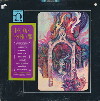
The Dove Descending: Choral Music (1966) by The Canby Singers.
gurvin10.jpg

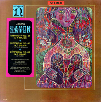
Haydn: Symphony No. 21 In A Major / Symphony No. 48 In C Major (“Maria Theresia”) / Symphony No. 82 In C Major (“L’Ours”); Chamber Orchestra Of The Saar, Karl Ristenpart / Gürzenich Symphony Orchestra Of Cologne, Günter Wand (1966).
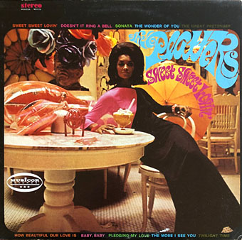
gurvin15.jpg

Sweet, Sweet Lovin’ (1968) by The Platters.

Gurvin’s contribution to this one is the hand-drawn title design.

Continue reading “Abe Gurvin album covers”

Gene Szafran album covers

szafran01.jpg

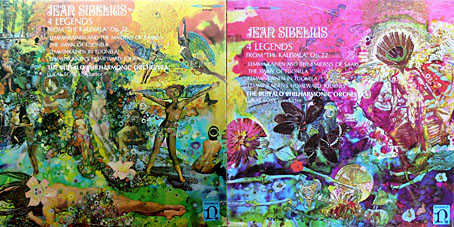
Sibelius: 4 Legends From “The Kalevala”, Op. 22 (1968); Buffalo Philharmonic Orchestra, Lukas Foss.

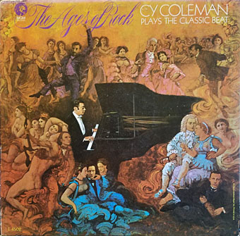
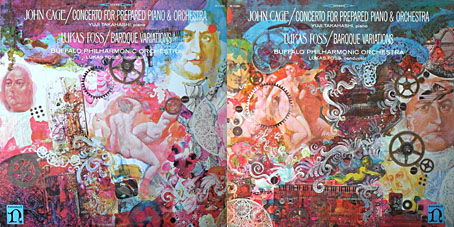
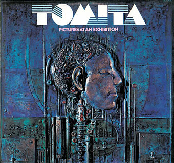
Gene Szafran (1941–2011) was an American artist who painted illustrations for magazines and provided cover art for many science-fiction paperbacks throughout the 1970s. He shared with fellow paperback artist Bob Pepper a parallel career producing album cover art for Elektra Records and Elektra’s subsidiary for classical recordings and contemporary composition, Nonesuch, the latter contributing to William S. Harvey’s policy of making classical albums look as vibrant and contemporary as their neighbours in the rock sphere. Bob Pepper’s album covers, however, tend to resemble his book covers whereas Szafran’s book covers are simpler in style than his album art which fills out the larger space in a post-psychedelic style that’s often very detailed and done in a variety of media. It took me a while to realise that I’d known Szafran’s name for a long time via his cover for Pictures At An Exhibition by Tomita, the art for which isn’t a painting but a relief sculpture of the head of Tomita-san. A similar use of three-dimensional elements occurs on other album covers, and extends to a form of collage in which painted backgrounds are overlaid with physical objects, a technique which became a common sight in the 1980s but which wasn’t common at all in the 1960s. There might have been more work like this but Szafran’s career was cut short by multiple sclerosis in the late 1970s. Glimmer Graphics has several pages dedicated to his life and art.

szafran02.jpg

The Ages Of Rock (1968) by Cy Coleman.

szafran03.jpg

John Cage: Concerto For Prepared Piano & Orchestra / Lukas Foss: Baroque Variations (1968).

szafran04.jpg

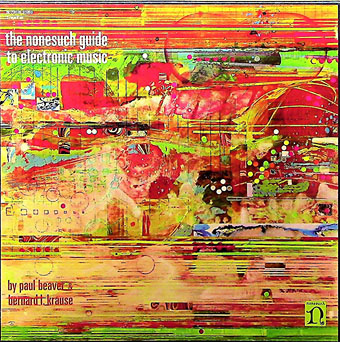
The Nonesuch Guide To Electronic Music (1968) by Paul Beaver & Bernard L. Krause.

szafran05.jpg

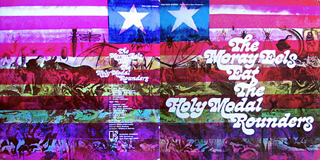
The Moray Eels Eat The Holy Modal Rounders (1968) by The Holy Modal Rounders.

Continue reading “Gene Szafran album covers”

Tomita album covers

tomita01.jpg

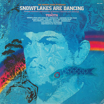
Snowflakes Are Dancing (1974); art direction; Joseph J. Stelmach; artwork: David B. Hecht.

The Japanese composer Isao Tomita died last week so I’ve been listening to some of his early recordings, and thinking—as usual—about their cover designs. Tomita was by far the best of the many electronic musicians in the 1970s who took advantage of the huge success of Wendy Carlos’s Switched-On Bach (1968) to create their own versions of classical music with Moog and other synthesisers. If this makes Tomita sound like an opportunist (and his 1972 collection of electronic pop covers was titled Switched On Hit & Rock), he quickly developed his own approach to electronic composition which ranged from quirky humour to his own brand of cosmic pictorialism. The latter was very different from the equally cosmic meanderings of Tangerine Dream which seldom strayed too far from the rock world. Tomita had a genius for taking very familiar pieces of classical music which he fashioned into synthesizer soundtracks for imaginary science-fiction films. (He also produced actual scores for a number of Japanese films but few, if any, of these were released outside Japan.) This approach is shown to great effect on The Bermuda Triangle (1979), an album that was subtitled “A Musical Fantasy Of Science Fiction”, and which filters Prokofiev and Sibelius through a library of crank paperbacks, with references to UFOs, undersea pyramids, Agharta, the Hollow Earth, Close Encounters of the Third Kind, and the Tunguska Event.

tomita02.jpg

Pictures At An Exhibition (1975); artwork: bas-relief by Gene Szafran. The first appearance of the logo that became a fixture of Tomita’s albums. No designer is credited but I’d guess it was the work of Joseph J. Stelmach. The logo typeface is Sinaloa.

As for the covers, Tomita’s recordings may have been classical music but RCA targeted the albums at a rock audience so there’s no sign of the venerable composers heads that appear continually on the sleeves of orchestral recordings. The examples here are almost all the Western releases which, surprisingly, tended to have better covers than the Japanese originals. This is also a partial selection, favouring Tomita’s own releases (no soundtracks), and mostly the early albums. The later albums aren’t as impressive, and many of them were only released in Japan.

tomita03.jpg

Firebird (1975). No design or art credit. I’d not noticed before that the logo evolves by degrees, here gaining some extensions.

Lastly, I’ll dedicate this post to my old friend Nik Green who died in March. Nik was a session musician of some note, and the first person I knew who owned a synthesizer (an ARP Odyssey). He was also a great Tomita enthusiast who shared Tomita’s sense of humour and relished the quirkier moments on many of these albums. I can’t listen to the opening of the Mars section of Tomita’s The Planets without remembering Nik shouting “That’s a Moog!” when a synthetic fanfare interrupts the sounds of a spacecraft lift-off.

Continue reading “Tomita album covers”