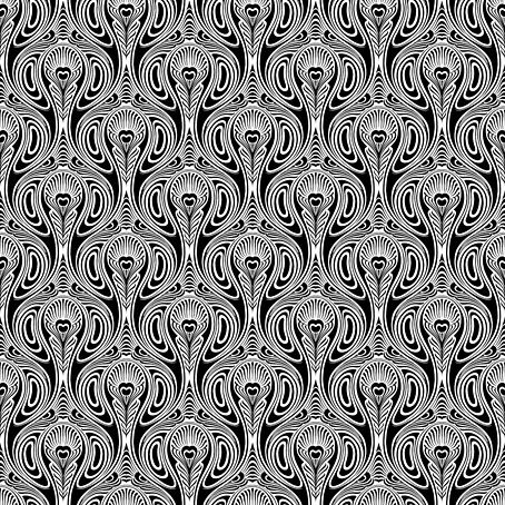
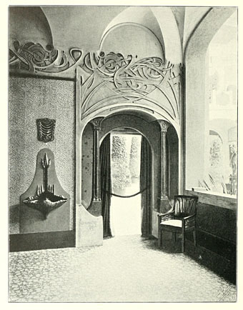
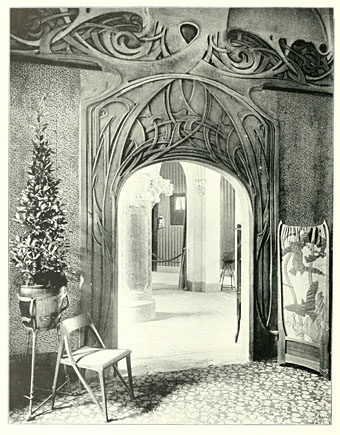
One of the projects I’ve been working on recently contains a large quantity of Art Nouveau design. I can’t discuss this any further for the usual embargo reasons, but I can show off this pattern which has been generated as a by-product of the main work. This is one of those fin-de-siècle designs that looks like it might have originated in the 1960s, a decade which saw a revival of interest in Art Nouveau graphics. Those sinuous lines would work well on a psychedelic poster, and there’s even a touch of Op art in the melting ovals that separate the peacock feathers.
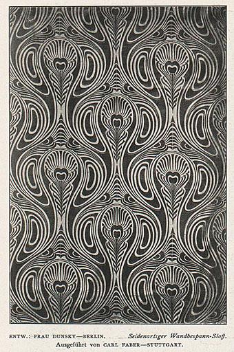
But this isn’t a design from 1970, it actually dates from 1900, the source being a small wallpaper sample that I spotted some years ago in issue 7 of Deutsche Kunst und Dekoration. “Frau Dunsky, Berlin” is named as the designer although there’s no further information about her design in the text. After seeing this I thought I’d have a go at copying the pattern in order to create a digital version but I soon gave up when it became apparent that too much work was required to convert the indistinct image into a sharp outline. I didn’t have a graphics tablet at the time, and my printer had broken down, so the only way to draw an outline was the hard way, using a mouse pointer.
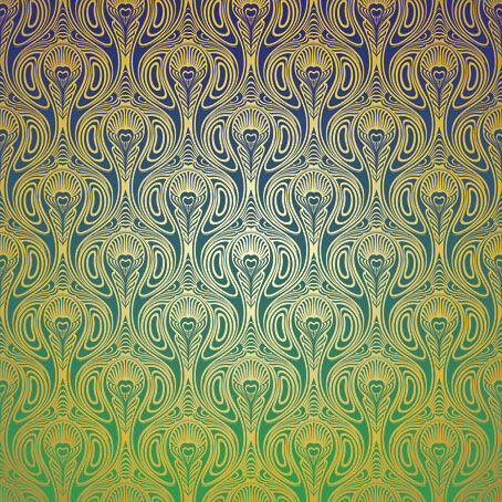
Vectorised and coloured.
A few days ago I pulled out the copy I’d been working on and, since I now have a graphics tablet, decided to try again. Even though creating the outline was easier this time I still wasn’t sure whether a repeatable pattern would be possible. The magazine sample is slightly warped, and the repeated elements don’t match exactly when overlaid, but I was able to compensate for the flaws with some stretching and redrawing in Photoshop. It’s very satisfying getting something like this to work, even more so when it’s a 120-year-old design that you’ve managed to resurrect. I also feel a little familial continuity with this kind of pattern making. My mother worked as a textile designer for a few years in the 1950s, although she never worked on anything like this, the designs produced by her studio were generally chintz-like floral patterns.
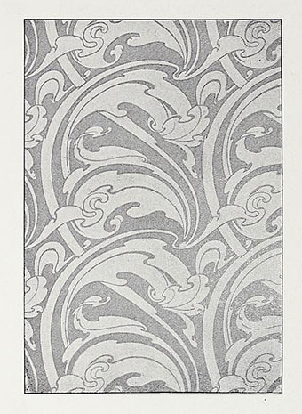
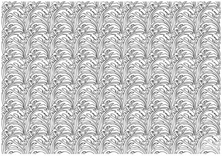
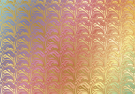
Prior to redrawing the peacock design I’d resurrected another wallpaper design from the same period. This is one of several examples by a French designer, André Morisset, that appeared in issue 15 of L’Art Decoratif. Monsieur Morisset’s design was easier to work into a digital version, being a better reproduction, while the design itself is a square that tiles vertically and horizontally so it’s easier to build into a pattern.
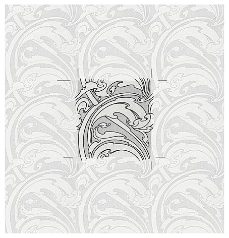
Drawing the outline.
A tessellated tiff.
A coloured vector version.
I’ll be doing a few more things like this when I get the chance. I’m not sure yet whether they’ll find a place in the things I’m working on, but once you have a satisfactory vector outline you can file the art away until you need it later.
Previously on { feuilleton }
• Louis Rhead’s peacocks
• Peacocks
• Rene Beauclair
• Whistler’s Peacock Room
• Beardsley’s Salomé

