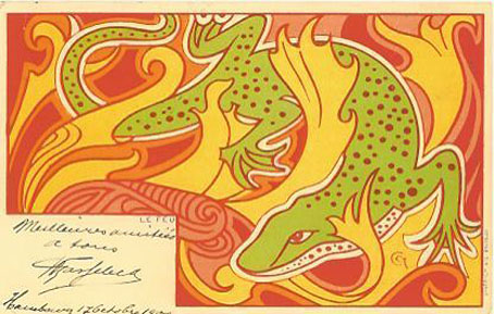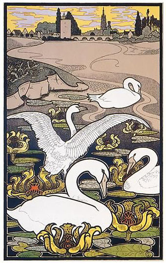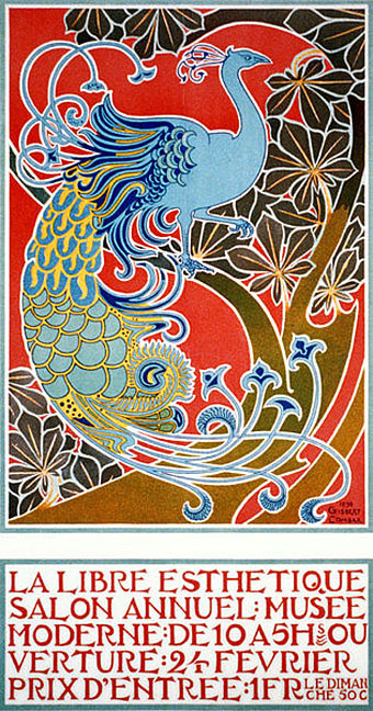
More from this Belgian artist whose splendid Art Nouveau peacock is a regular feature in books about fin de siècle art and design. La Libre Esthetique was a salon for which Combaz produced a number of posters, a few more of which may be seen below. The salamander postcard seems to be part of another set devoted to the four elements; Combaz may have produced further series as there’s also a volcano card depicting fire. All of this work dates from the 1890s. A few years later Combaz’s art took a darker turn with a series of propaganda pieces reacting to events during the First World War.
Tag: fin de siècle
The case of the fin de siècle fleuron
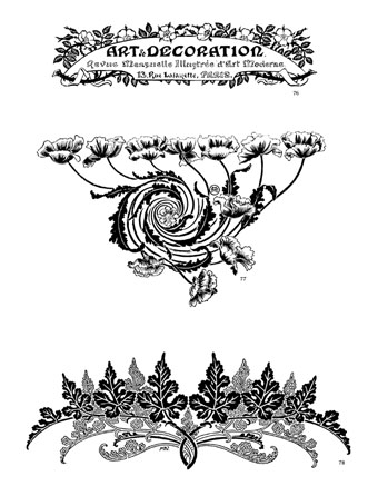
I said yesterday that poppies are a common feature of the fin de siècle magazines for the convenient way they combine long-stemmed flowers—ideal for all those Art Nouveau flourishes—with narcotic connotations that signal Decadence. The spiralling fleuron above is one example that readers of Savoy books may recognise, an occasional company logo which has been in use since the mid-1980s. David Britton chose the design from one of the Dover Pictorial Archive books, Carol Belanger Grafton’s Treasury of Art Nouveau Design and Ornament, and I later made a digital version from this page scan.
One of the earliest Savoy uses, a label design for Heroes (1986) by PJ Proby.
Having spent a great deal of time in recent years trawling through Art Nouveau magazines I was sure I was going to run into the original printing of the fleuron eventually. Some of the page decorations in Jugend are very similar but it wasn’t there or in Pan, Deutsche Kunst und Dekoration or The Studio. I don’t have a copy of the Grafton book, and Dave says his copy is lost, so I’ve no idea whether there’s a credit for the source of the designs; not all Dover books credit their source material in any detail. Earlier this week I decided to look in Art et Décoration, a magazine that was the French equivalent of The Studio, since the header at the top of the scanned page implied that the other designs might be from the same magazine. Aside from a couple of copies at the Internet Archive this means looking through the poor-quality scans at Gallica; by a fluke—because they don’t seem to have a complete run of the early issues—the January 1898 edition contained the page below showing the Savoy fleuron, an endpiece for an article devoted to another French art magazine, L’Image.
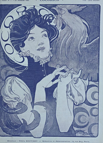
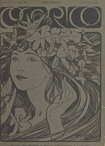
Cocorico covers
Alphonse Mucha.
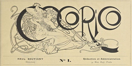
For a while now I’ve been waiting for several French journals of the fin de siècle to turn up online but humour magazine Cocorico has never been among them. I knew that Alphonse Mucha had contributed a handful of covers and some other graphics to Cocorico, notably the frontispiece (below) which ran in every issue. What I didn’t realise was that this title was effectively the French counterpart to Jugend magazine which had been running for two years when the first issue of Cocorico appeared in December 1898. Both magazines share the same mix of humorous articles, cartoons, serious art pieces and poetry, all connected by some very fine Art Nouveau graphics.
Alphonse Mucha.
Jugend has the edge when it comes to the graphics, some of which are very strange, but Cocorico looks much more like a humour magazine to contemporary eyes, with many cartoons that resemble those drawn today. Cocorico is also mostly free of the Jugend brand of satire which is often little more than nationalist rabble-rousing. Cocorico ran for 63 issues to 1902 by which time its format had changed and the florid graphics had been abandoned for a more sober layout. What follows is a selection of cover designs, many of which are Mucha’s work, and all of which follow the Jugend template of varying the art style and title design. There’s also one by František Kupka (or François as he was credited here) who also contributed interior illustrations in the later issues. There’ll be more about him tomorrow.
Alphonse Mucha.
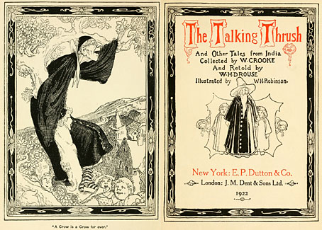
The Talking Thrush and Other Tales of India
British illustrator William Heath Robinson died in 1944 which means that 2015 will see his own books fall into the public domain in many countries. The books he produced during and after the First World War established his reputation as a creator of impromptu contraptions, to such a degree that the term “Heath Robinson” has the same currency in Britain as “Rube Goldberg” does in the US when describing an improbable mechanical device. Robinson’s whimsical drawings have always been his most popular works but I favour his earlier illustrations, especially his illustrated Poe and A Midsummer Night’s Dream.
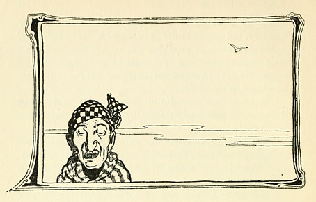
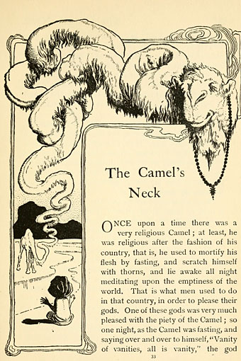
The Talking Thrush and Other Tales of India by William Crooke and William Henry Denham was first published in 1899; the version linked here is a reprint from 1922. The fin de siècle is evident in the Art Nouveau styling of some of the borders, the kind of detailing that Heath’s brother, Charles Robinson, often deployed. Heath’s later illustrations dropped the decoration to concentrate on human figures, caricature and the positive use of white space.
Continue reading “The Talking Thrush and Other Tales of India”
Weekend links 220
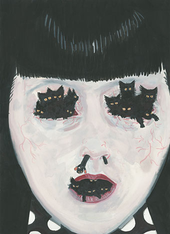
Untitled painting by Aleksandra Waliszewska.
• Ben Wheatley’s forthcoming film of High-Rise by JG Ballard now has its own Tumblr. This will no doubt be spoilerific so I won’t keep on visiting but it’s there if you require it. More Ballardianism: “Worshipping the Crash” at BLDGBLOG.
• “Aickman wandered through the sixties fantasy landscape like some curmudgeonly fetch, returning from the fin de siècle heyday of the ghost story.” Boyd Tonkin profiles Robert Aickman, writer of peerless “strange stories”.
• At Dangerous Minds: “Raise a glass to Cthulhu at the Lovecraft Bar”. Looks more like a Captain Nemo bar to me (not that there’s anything wrong with that) but I appreciate the gesture.
But to demand that a work be “relatable” expresses a different expectation: that the work itself be somehow accommodating to, or reflective of, the experience of the reader or viewer. The reader or viewer remains passive in the face of the book or movie or play: she expects the work to be done for her.
Rebecca Mead on The Scourge of Relatability
• “Space as a paranoid, static rumble featuring: 20jfg, Ben Frost & Daníel Bjarnason, Coil & Eduard Artemiev”. 20 Jazz Funk Greats on the pleasures of the Solaris soundtrack.
• What do Hawkwind, Harry Nilsson, Stereolab and The Supremes have in common? David Stubbs examines the legacy of Neu! and Klaus Dinger’s “Dingerbeat”.
• A reminder that A Year in the Country features a host of worthwhile links and associations for the Hauntologically persuaded.
• Rouge Louboutin, an ad by David Lynch. Related: An improptu biscuit ad by the Eccentronic Research Council.
• Mix of the week (a year old but no matter): JG Ballard Zoom Lens Mix by Bernholz.
• At 50 Watts: More illustrated sheet music covers by Einar Nerman.
• Five book cover designers and the books that inspire them.
• Tove Jansson would have been 100 this week.
• Solaris: Dream (1990) by Edward Artemyev [sic] | Solaris (2000) by Photek | Simulacra I (2011) by Ben Frost & Daníel Bjarnason