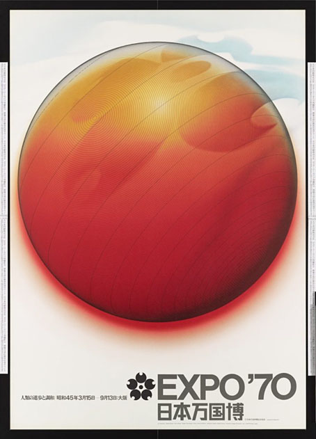
Expositiana

expo09.jpg

Poster design by Eiko Ishioka.

After writing about Expo 2000 I went looking for films of some of the other world expositions. In previous posts I’d managed to exhaust the Paris Exposition Universelle of 1900 as a subject but never really followed up on my intention to explore the 20th-century events. The 1900 exposition was the first for which a quantity of film footage exists; it was also the one where motion pictures were presented as a new invention among others, like electric light, that would dominate the coming century. The ephemerality of these big events is part of their fascination, and a reason to look for films that document them. Expositions are like temporary theme parks, where the emphasis, since 1939 at least, has tended towards the way things might look in the future. Architects and designers aren’t exactly given free reign at an exposition but they’re also not having to tailor their designs to the requirements of urban planning committees. The events provide a concentrated dose of futurity for a short time in a small geographical space. It ought to be noted that “world exposition” has a specific meaning (see this list), referring to large, general events which run for six months or more. Smaller expositions devoted to single subjects also exist, although “small” here is relative, these can still be sizeable affairs.

Most of the footage that follows is from American expositions. Americans seem to prefer the term “World’s Fair”, although not exclusively—there was a Brussels World’s Fair—and not consistently: the Seattle event in 1962 was the Century 21 Exposition. There’s a lot more footage out there, of course, but I was looking for official films and documentaries rather than home movies.


The New York World’s Fair, 1939
expo01.jpg

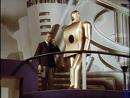
The Middleton Family at the New York World’s Fair

This drama illustrates the contribution of free enterprise, technology, and Westinghouse products to the American way of life. The Middleton Family at the New York World’s Fair pits an anti-capitalist bohemian artist boyfriend against an all-American electrical engineer who believes in improving society by working through corporations. The Middletons experience Westinghouse’s technological marvels at the Fair and win back their daughter from her leftist boyfriend.

Memorable moments: the dishwashing contest between Mrs. Modern and Mrs. Drudge; Electro, the smoking robot; and the Westinghouse time capsule.

Too much drama in this one, and not enough expo, but the 1939 world’s fair is where the preoccupation with the future begins. The Middletons were a promotional device, also seen in newspaper and magazine ads. This is the world’s fair that gave us the word “Futurama”. A shame, then, that Electro, the cigarette-smoking robot, doesn’t tell the All-American Family to bite his shiny metal ass.
expo05.jpg

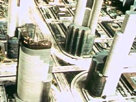
To New Horizons
The Hugh Ferriss view of the future (sponsored by General Motors), all skyscrapers and superhighways. Pedestrians? What are they?


The Brussels World’s Fair, 1958
expo04.jpg

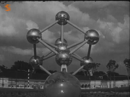
L’Expo 58, il y a un an
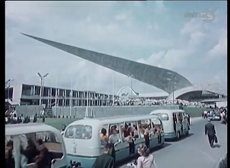
A retrospective view of the Brussels event in murky monochrome. The Czech film below is better value although the second half is mostly concerned with the Czech pavilion.
expo08.jpg

Ceskoslovensky pavilon – Expo 58


The Century 21 Exposition, 1962
expo03.jpg

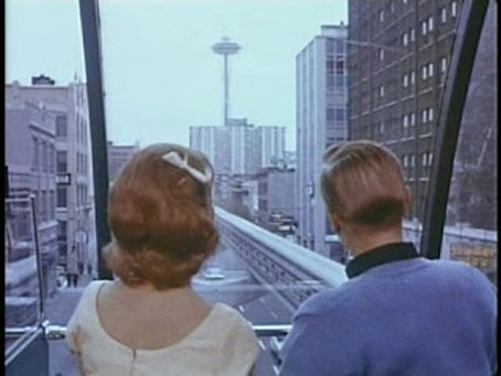
• Century 21 Calling
A trip to the Seattle exposition in which our guides are a hyperactive teen couple who look like the squares from Hairspray after they’ve been dosed with bop pills. For a generation of Brits “Century 21” will always mean Gerry Anderson’s Space-Age imagination.

Continue reading “Expositiana”

The exposition moiré

expo2000-1.jpg

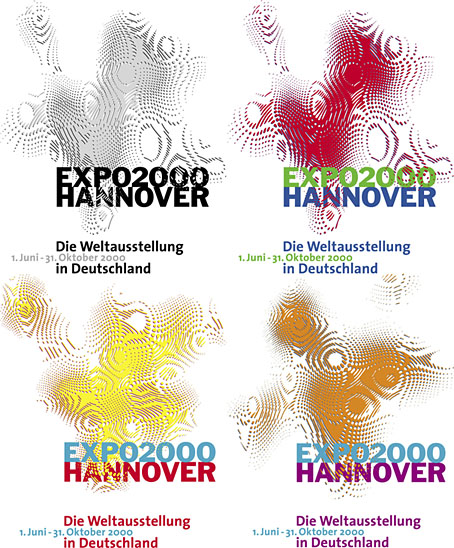
Logos designed by QWER, Iris Utikal and Michael Gais.

Hannover’s Expo 2000 wasn’t very successful as expositions go but it had an attractive logo, a combination of bold sans-serif type with a moiré background pattern which ideally had to be seen in its animated form. World expositions tend to be concerned with technical innovations and novelties, and this animated design was certainly novel, if impossible to replicate in print. All the static versions of the logo are essentially screenshots of the moving version, with the moiré image frozen at a various places to generate many shape and colour variations. Not all of these are satisfactory. I think it was Matisse who said that anyone can put two colours together; the real challenge is putting three together in a harmonious manner.

expo_logo.gifThe pattern was a little more animated on the original exposition website, albeit reduced to this tiny gif. The site is mostly intact and browsable at the Internet Archive, a primitive thing by today’s standards but Expo 2000 was the first world exposition with a dedicated website, something which really did set it apart from its predecessors. Many of the exposition’s buildings and exhibits would have seemed bizarre or alarmingly ugly to the people who attended the Paris Exposition Universelle in 1900 but much that was on display in Hannover would at least have been comprehensible to a visitor from the past. Trying to explain what “a website” was to someone in 1900, even a futurologist like HG Wells, would have required considerable effort.
expo2000-2.jpg

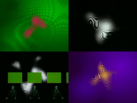
Video for Expo 2000 by Kraftwerk.

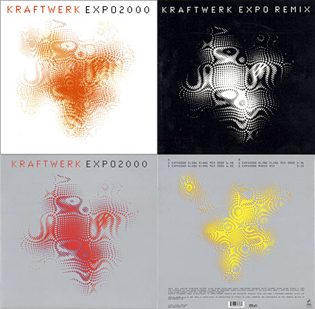
Ephemerality is a distinguishing characteristic of world expositions, all those splendid pavilions and eye-catching constructions don’t last very long even though the events themselves involve years of planning. A list of exposition features that have managed to survive would be a disparate collection, taking in well-known landmarks like the Eiffel Tower, Seattle’s Space Needle and the Atomium in Brussels, architectural projects such as the Grand Palais in Paris and the Biosphere in Montreal, and one-off oddities like the Unisphere in Queens and the cement dinosaurs in Crystal Palace Park. If Expo 2000 is remembered for anything today it’s the one-off song that Kraftwerk wrote for the occasion, Expo 2000, which arrived with graphics and visuals based on the expo logo. Kraftwerk had been hired at great cost to create the jingles in different languages that accompany the animated logo. This is turn led to the song, the group’s first new studio composition in 14 years.

expo2000-4.jpg

I thought these abstract images were a good match for Kraftwerk, I prefer them to the other designs for the single which show the four computer-generated figures that later appeared on the cover of Minimum-Maximum. The CD case at the top left was made with lenticular plastic which imitated the moiré effect of the animated logo. I didn’t buy this one when I had the chance, choosing instead the “enhanced” version which came with a minuscule copy of the video in a CD-ROM section. Like most CD-ROM singles, the audio tracks still play but the enhanced section no longer works. Welcome to the future.

Continue reading “The exposition moiré”

Weekend links 618

anderson.jpg

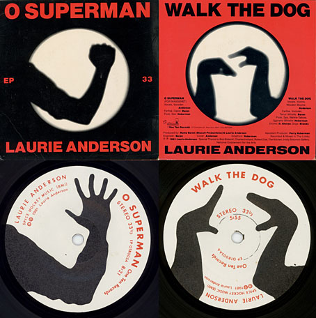
O Superman (1981), a seven-inch single on One Ten Records. Design by Laurie Anderson and Perry Hoberman.

• “…I was painting a picture of a garden at night. It had a lot of black and this green kind of coming out of the black, and I sat back, probably to take a smoke, looking at this painting, and I suddenly heard a wind coming from the painting, and the green started to move. And I thought, ‘Oh, a moving painting.’ And that experience led to cinema.” David Lynch talking to Josh Hitchens about living in Philadelphia.

• “This is the time and this is the record of the time.” Big Science, the album that propelled Laurie Anderson from performance artist to pop star, is 40 years old this month. Mat Colegate recalls his confused impression that the album was the work of a West Country folk singer, while Studs Terkel talked to Laurie Anderson about the album shortly after its release.

• At Public Domain Review: Kensy Cooperrider explores a millennium of “hand mnemonics”, “the variety of techniques practised by Buddhist monks, Latin linguists, and Renaissance musicians for remembering what might otherwise elude the mind.”

Ghosts in the Machine is an exhibition being hosted by Bower Ashton Library, Bristol, for World Book Night, 2022. 93 participants contributed ghost-related images for an accompanying artist’s book [PDF].

• “Sixty years after Seattle’s Century 21 Exposition, world’s fairs have largely fallen out of fashion in the US.” Grant Wong charts the rise and fall of world’s fairs.

• A trailer for Ennio: The Maestro, a feature-length documentary about Ennio Morricone by Giuseppe Tornatore.

• “The film Putin doesn’t want the world to see: Firebird, a gay love story about fighter pilots.”

• At Dennis Cooper’s: Andrei Tarkovsky Day.

• New music: Intersections by Specimens.

Schöne Hände (1977) by Cluster & Eno | Hands 2 Take (1981) by The Flying Lizards | Red Hand (1996) by Paul Schütze

Fantaisies Architecturales by Henri Mayeux

mayeux01.jpg

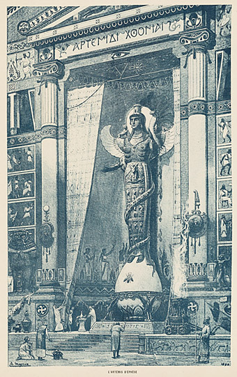
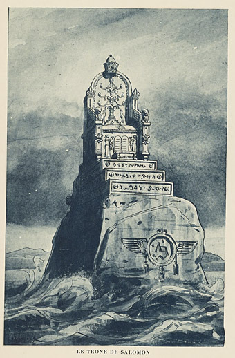
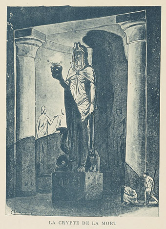
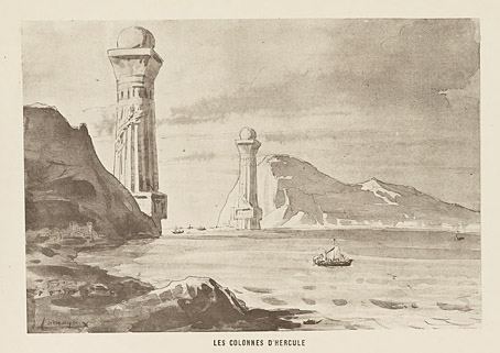
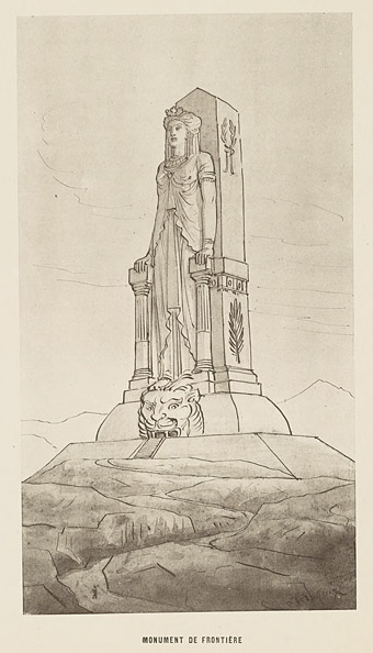
An entire book of architectural caprices is just the thing I like to see, so it’s a shame that most of the examples in Fantaisies Architecturales (1890) by Henri Mayeux are little more than sketches. Mayeux was an architect and a professor of decorative arts whose previous book had been a guide to the composition of decoration and its historical use. Fantaisies Architecturales applies a similar approach to architectural styles, offering a variety of historical pastiches as well as suggestions suited to stage designs and more contemporary buildings.

mayeux02.jpg

Mayeux’s inventiveness is considerable but he shares with many of the architects of 19th-century expositions a reluctance or inability to imagine anything that breaks with the styles of the past. Étienne-Louis Boullée’s colossal plan for a cenotaph for Isaac Newton (proposed in 1784) remains astonishing because its design is so unprecedented. The construction of the vast internal sphere may have exceeded the engineering limits of the time but the unadorned abstraction of the design is closer to the architecture of the 20th century than anything from the 19th. The Eiffel Tower had been built a couple of years before Mayeux’s book was published but it wasn’t until the Exposition Universelle of 1900 that Paris saw any other buildings that could complement its architectural novelty.

mayeux03.jpg

mayeux04.jpg

mayeux05.jpg

Continue reading “Fantaisies Architecturales by Henri Mayeux”

Angkor in Paris, 1931

angkor1.jpg

Searching for old photos of the Boi de Vincennes turned up some startling images from another exposition that I’d not come across before. The Paris Colonial Exposition filled a corner of the city’s largest park with a variety of exhibits and pavilions intended by the government of the day to show the colonial enterprise in a positive light. Among the replicas of buildings from overseas there was this spectacular reconstruction in plaster of the temple at Angkor Wat, built to represent the French presence in Indochina. No one would dream of creating such an exposition today, of course, and the idea was controversial at the time. To their credit, the authorities did allow the Communist Party to stage their own exhibit showing the damaging and exploitative nature of colonialism.

angkor2.jpg

Politics aside, I’m fascinated by the idea of a full-scale Cambodian temple materialising in the heart of Paris. The Exposition Universelle of 1900 had its share of replicas: the Swiss exhibit was a miniature mountainside populated with a chalet, cows and milkmaids, while one bank of the Seine was taken over by Albert Robida’s reconstruction of medieval Paris. Neither of those seem as surprising as this resurrection of Angkor, especially in the spotlit night shots. I’ve been wondering what the Surrealists would have made of this and the juxtapositions presented by the other reconstructions. André Breton was a member of the Communist Party at the time (they expelled him in 1933) so I’d expect from his point of view at least the exposition would have been dismissed as bourgeois propaganda.

angkor3.jpg

Among the many web pages with photos of the exposition this Flickr set of Dutch tourist pictures is particularly good. Traces of the pavilions still remain, including some of the Nagas from the avenue leading to the temple.

angkor4.jpg

Continue reading “Angkor in Paris, 1931”