Weekend links 57

softmachine.jpg

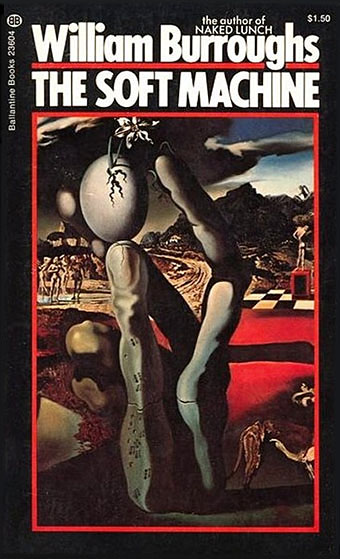
A 1973 Ballantine edition of William Burroughs’ novel with a cover illustration from Metamorphosis of Narcissus (1937) by Salvador Dalí. Via the Burroughs Book Covers archive.

The Sel Publishing House, Turkey, published a new translation of The Soft Machine by William Burroughs in January, an edition which is now under investigation by the Istanbul Prosecutor’s Office following a report by the (deep breath) Prime Ministry’s Council for Protecting Minors from Explicit Publications. The Council lodged a number of complaints, among them assertions of “lacking unity in its subject matter,” “incompliance with narrative unity,” “using slang and colloquial terms” and “the application of a fragmented narrative style.” Details here. Does Turkey still want to join the EU? Because this kind of persistently illiberal bullshit (see the earlier treatment of Orhan Pamuk) isn’t helping their case at all.

• Related to the above: Evan J Peterson reads Allen Ginsberg’s Howl in the toilet of a Seattle gay bar; Ginsberg himself reads Kaddish and other works here.

• More illiberal bullshit: LGBT activists arrested during royal wedding; Queer Resistance released a statement about the arrests. MPs, activists and trade unionists condemn new attacks on the right to protest.

The Dorian Gray That Wilde Would Want Us To Read. Harvard University Press publishes an uncensored and annotated edition of Wilde’s novel. Kudos for using Caravaggio’s Narcissus on the cover.

One weekend in late 1967, they all decamped to a hotel suite in California’s Ojai Valley for a brainstorming session. Amid clouds of pot smoke, they talked all weekend with the tape recorder running. [Jack] Nicholson then took the tapes and turned the conversations into a screenplay; according to Rafelson, he structured it while on LSD.

Revisiting The Monkees’ psychedelic movie, Head.

kraftwerkicons.jpg

Kraftwerk icons for Windows and Mac OS X by Dave Brasgalla.

Robert Louis Stevenson gets his revenge on sneaky literary agent – 120 years later. And Michael Moorcock imagines tales of unseen Mervyn Peake pictures.

Painting doesn’t look so good on the web. It looks better in life. Sculpture looks better in life. What you end up with is just a reproduction. Whereas with film or with sound or with poetry, you get the deep primary experience not the secondary experience. The web delivers those primary experiences very well.

Ubuweb’s Kenneth Goldsmith interviewed.

• Arkhonia’s Another Dispatch in a World of Multiple Veils is now a free download.

• The story of This Is The Sea: An interview with Mike Scott of The Waterboys.

Fairlight: The Rolls Royce of synthesizers.

Haeckel Clock, a free app for the iPad.

What is totalitarian art?

Porpoise Song (1968) by The Monkees | Hope For Happiness (1969) by The Soft Machine | I’m A Believer (1974) by Robert Wyatt.

CthulhuPress

keepcalmcthulhu2.jpg

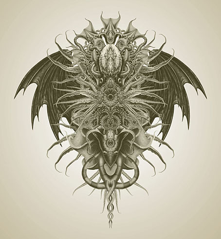
The Twitter consensus yesterday was that CafePress products based on this design were required so here they are. As usual I never know what people want from CafePress so I tend to throw the design on their entire range so long as it fits the requisite size and shape. This piece works better than most since it’s simple and direct, my more detailed and pictorial creations look better as prints. I keep feeling that someone must have made a design like this already, these variations on the “Keep Calm” poster have proliferated so much, but searching didn’t reveal anything so… The web address doesn’t appear on the CafePress things, that’s just for the images posted here if and when they drift into Tumblr’s Sargasso Sea of uncredited pictures.

coc.jpg

The Call of Cthulhu (1987–88).

While we’re on the subject of everyone’s favourite Great Old One, I may as well take the opportunity to remind those interested that these earlier renderings are also available as various CafePress products. The Call of Cthulhu piece above is the opening page of my comic strip adaptation of the story as seen in The Starry Wisdom anthology from Creation Books and my Haunter of the Dark collection.

cthulhu.jpg

Cthulhu from The Great Old Ones (1999).

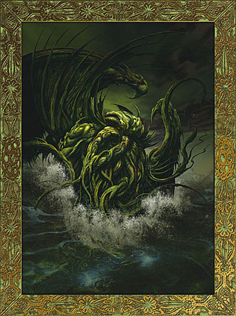
The Great Old Ones drawing was one of the plates from the series of the same name I produced with Alan Moore for the Haunter book. And Cthulhu Rising is the cover of that volume, of course, seen here with its Haeckel-derived frame. The Great Old Ones Cthulhu was drawn with a Biro pen then tweaked slightly in Photoshop. I don’t think I’ve ever posted a large version of it so here it is.

cthulhu2004.jpg

Cthulhu Rising (2004).

Elsewhere on { feuilleton }
The Lovecraft archive

Weekend links 30

woody.jpg

Did someone say “woody”? Plenty more toy antics at TheOneCam.

• And yet more Haeckelisms: Praying in Haeckel’s Garden, recent works by artist Mary O’Malley.

Seasons of the Peacock, the perennial showoff as depicted by a handful of Art Nouveau artists. A couple of examples there I hadn’t seen before.

• Dorian Cope presents On This Deity, “Commemorating culture heroes and excavating world events.”

• At long last, Fantagraphics will be publishing Ah Pook is Here, the comic strip collaboration between William Burroughs and artist Malcolm McNeill. Something to look forward to for next year. Related: Malcolm McNeill’s website.

David Lynch Dark Splendor: “Der große Filmemacher David Lynch als Fotograf, Maler, Zeichner und Grafiker.”

More on the forthcoming album from Brian Eno, Leo Abrahams and Jon Hopkins. With this degree of hype the end result is going to be a disappointment.

Book design by Richard Hollis, including John Berger’s essential Ways of Seeing.

A fistful of Vignellis: the work of Lella and Massimo Vignelli celebrated.

• Berni Wrightson’s Frankenstein at Golden Age Comic Book Stories.

Jimi Hendrix, Philip José Farmer reader.

Imagerie du Chemin de Fer.

El UFO Cayó (2005) by Ry Cooder.

Esquisses Décoratives by René Binet

exposition1.jpg

The work of French architect and designer René Binet (1866–1911) has been featured here before with one of his most famous creations, the monumental gate he designed for the Paris Exposition Universelle of 1900. Philippe Jullian in his 1974 book about the exposition, The Triumph of Art Nouveau, calls the gate the “Porte Binet” and also notes that it was referred to as “the Salamander” for its resemblance to the salamander stoves of the period.

binet1.jpg

The reference to nature is apt, albeit for a different reason, since it was Ernst Haeckel’s Kunst-Formen der Natur which Binet used as inspiration for his designs, the encrustation on the gate being based on Haeckel’s studies of shell forms. This influence was developed four years later in Binet’s Esquisses Décoratives, a series of speculative designs which applied Haeckel’s work to architecture and interior design as a whole; the Porte Binet can be seen on the title plate above and the print there seems to have been either signed by or dedicated to Haeckel.

Art Nouveau design is usually thought of in terms of the curvaceous style derived from Alphonse Mucha and others, but there were several designers of the period looking to nature for inspiration in a way which went beyond William Morris’s application of plant forms to flat surfaces. Binet’s lamp designs below show how Haeckel’s sea-life could be transmuted into enclosures for electric lights. These designs hint at a direction which went unexplored in the 20th century; the Art Nouveau style was steadily vulgarised after the Exposition Universelle until it was replaced altogether by the development of Art Deco following the First World War. Binet went on to design the extension of the Paris department store, Printemps, but his huge Art Nouveau atrium was later destroyed by fire.

binet2.jpg

There aren’t many examples of Binet’s designs on web pages, the ones here are from this Flickr set and a vintage print seller. There is a recent study of Binet’s work available, however, René Binet: from Nature to Form by Olaf Breidbach. For an idea of how an entire city based on Haeckel might look, we have Schuiten and Peeters’ imaginary metropolis of Blossfeldtstad whose “Vegetalistic” architecture was featured in an earlier post.

Previously on { feuilleton }
Le Palais de l’Optique, 1900
Exposition Universelle films
Exposition jewellery
Exposition Universelle catalogue
Exposition Universelle publications
Exposition cornucopia
Return to the Exposition Universelle
The Palais Lumineux
Louis Bonnier’s exposition dreams
Exposition Universelle, 1900

Fascinating tentacula

squid.jpg

Histioteuthis ruppellii.

Suckered pseudopods flex and writhe again this week with simultaneous postings at BibliOdyssey and Sci-Fi-O-Rama. Coincidence or some cephalopodic zeitgeist thing? You decide. BibliOdyssey has a fine set of natural history plates showing various squid and octopuses while Sci-Fi-O-Rama presents a small collection of illustrations by Barnaby Ward. If it’s boys and tentacles you want (and who doesn’t?), then there’s always the art of NoBeast.

ward.jpg

Untitled drawing by Barnaby Ward.

Ernst Haeckel remains my favourite tentacle illustrator, and the octopus below is one of his examples from Kunstformen der Natur (1899–1904). Somewhere (although Cthulhu knows where) I have a drawing by Hal Foster from one of his Prince Valiant strips showing a sinister octopus in a pit which is almost a match for Haeckel’s, and may even have been based on it. If I ever find it again I’ll post it here. Meanwhile, China Miéville’s Kraken is currently lurking on bookshelves, and let me remind you again that he discusses that novel and other works over at Salon Futura. While we’re on the subject, let’s not forget the Octopulps.

haeckel.jpg

Octopus by Ernst Haeckel.

Finally, a note to say that my webhost is moving this site to a new server which may cause some disruption to these pages for the next few days. As always, your patience is appreciated.

Previously on { feuilleton }
Jewelled butterflies and cephalopods
Haeckel fractals
Ernst Haeckel, Christmas card artist
The art of Rune Olsen
Octopulps
The art of NoBeast