Saga de Xam revived

saga1.jpg

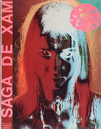
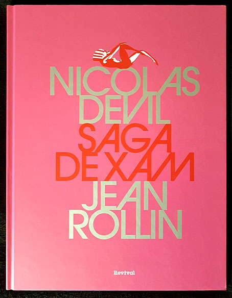
Saga est magnifique. Saga a la peau bleue. Saga est une extraterrestre. Envoyée par la reine de la planète Xam, la voici qui parcourt la Terre à plusieurs époques, traitées dans des styles différents. Son but: découvrir la quintessence artistique, politique et poétique de notre belle Terre. Marquée par l’Art nouveau, le psychédélisme américain, l’érotisme des années 1960 et la contreculture occidentale, Saga est une oeuvre hors norme et inclassable, dessinée sur des formats géants et publiée une première fois par Éric Losfeld en 1967. Hélas, le livre est très vite épuisé et devient un objet pour les collectionneurs. Cette édition reprend l’intégralité des planches de Saga, renumérisées et dotées d’une nouvelle mise en couleurs fidèle à l’originale. Saga peut enfin repartir dans une nouvelle… saga.

Here’s a book I never expected to see in a new edition. Saga de Xam is a 100-page bande dessinée depicting the time- and space-voyaging adventures of a blue-skinned alien woman, Saga, newly arrived on Earth from the planet Xam. The Xamians are a race of humanoid lesbians (their reproduction is parthenogenetic) whose planet is at war with the masculine Troggs; Saga has been sent to Earth to find a way to combat the Trogg invasion, an expedition that instructs her in the propensity of humans towards conflict and violence. The story was drawn by Nicolas Devil, with contributions from guest artists, and based on an outline by Jean Rollin which had been intended originally for a science-fiction film. There’s no need to go into detail about this cult item, I wrote about it at length several years ago after a couple of its pages stimulated my curiosity when they turned up in an exhibition catalogue. The book was published in 1967 by Éric Losfeld, an edition of 5000 which the publisher said he would never reprint, partly because of the expense, but also because he liked to think of the book becoming a rare object in the future. Rare it still is, although the embargo was broken in 1980, a year after Losfeld’s death, by the publication of a second edition. This was only a partial reprint, however, with a poor cover design and all the interior pages reproduced without their colour overlays.
saga2.jpg

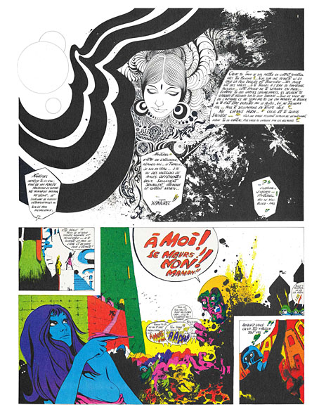
The new edition from Revival is slightly larger than the original (27.5 x 36 cm to the original 24 x 31 cm), and bound between heavy boards. A lengthy preface by Christian Staebler describes the book’s history, offering a few biographical details about Nicolas Deville (as he was known pre-1967), together with further information about the story’s creation. The wildness of the final pages is explained as an attempt by all involved to capture some of the delirium of an LSD trip, while also bringing the story of Saga’s investigation of the human race and its violent nature into the present day. Jean Rollin was apparently unhappy with this dénouement but I find the ending to be a satisfying one for a story where each chapter explores a different period of time (and of space, when Saga returns to her home planet).
saga3.jpg

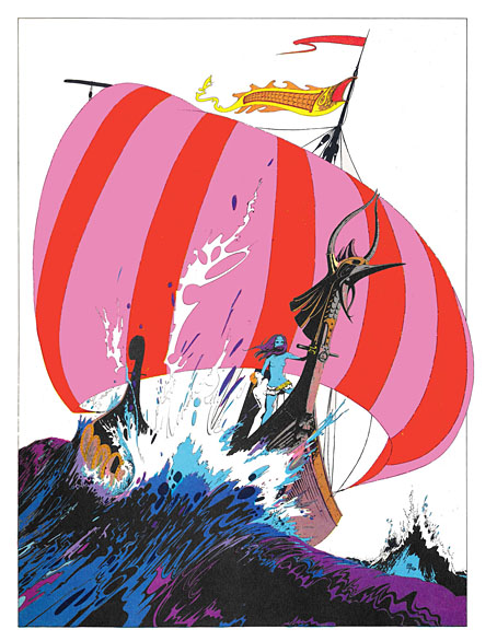
The icing on the cake is the appearance near the end of a few early drawings by Philippe Druillet, together with several beautiful pages by Devil, one of which found wider circulation when reprinted as a poster. The text in the new edition is still in French, of course, and even on slightly larger pages the legibility problem from the original remains. Devil was drawing on boards that were twice the size of their printed equivalents, without caring too much whether the story would be readable when scaled to a printable size. Losfeld’s solution was to provide a magnifying glass with each copy of the book. This isn’t too much of a problem; the story is easy enough to follow once you know the general outline, and for this story it’s the art that counts more than the words.
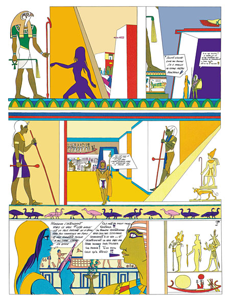
saga4.jpg

Continue reading “Saga de Xam revived”

The groovy look

groovy14.jpg

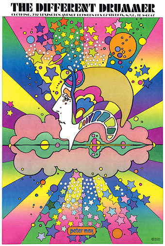
Peter Max, 1968.

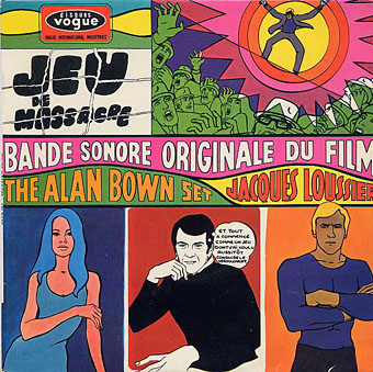
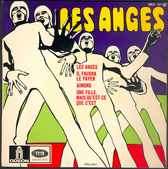
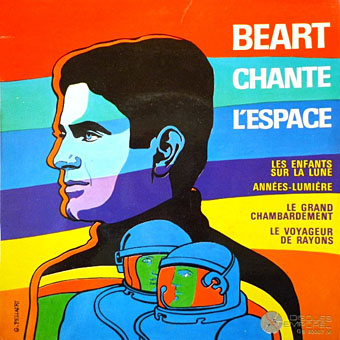
Artists complain justifiably about the constraining effect of labels but sometimes you really do need a label in order to identify a particular idiom. The artwork here is what most people would regard as psychedelic even though the subject matter isn’t always psychedelic at all. I doubt that Citroën intended their new Dyane car to be associated with LSD when they asked Michel Quarez to create a comic book to promote the vehicle, while Quarez’s Mod Love comic is just as hallucinogenically chaste. I tend to think of this style as “groovy”, an unsatisfying term with other associations but “post-psychedelic”, while accurate, feels too cumbersome for such playful graphics. The groovy look is where the purely psychedelic style enters the mundane world, and where the intended audience may be youthful but isn’t always a crowd of experienced lysergic voyagers; a watering down of psych delirium mixed with a dash of Pop Art, all bold shapes, heavy outlines and very bright colours, comic art (or actual comics) with the edges and detail smoothed away and the gain pushed to the maximum. I keep wishing someone would put together a collection of this stuff. There’s a lot more to be found.

Update 1: I knew I’d forgotten somebody. I replaced the book cover by Gray Morrow—an artist who was never really groovy in the manner of these other works—with a contraception poster by Nicole Claveloux, who was very much in the Groove Zone in the 1970s.

Update 2: Added designs by Miguel Calatayud, Mike Hinge, György Kemény, and Tito Topin. Thanks to Vadim for the tips!

• Further browsing: The Peculiar Manicule.

groovy01.jpg

Guy Peellaert, 1967.

groovy02.jpg

Guy Peellaert, 1968.

groovy03.jpg

Guy Peellaert, 1968.

groovy04.jpg

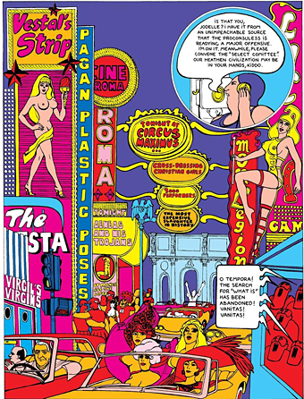
The Adventures of Jodelle by Pierre Barbier and Guy Peellaert, 1966.

Continue reading “The groovy look”

Dracula and I by Christopher Lee

dracula.jpg

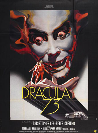
Impossible, not to say foolish, to attempt a brief summary of Christopher Lee’s incredible life and career. Rather than compete with the obituaries, here’s something you won’t find elsewhere, a short piece by Lee himself about his relationship to the role that made him famous. This is taken from The Dracula Scrapbook, a collection of Dracula and vampire-related cuttings assembled by Peter Haining for New English Library in 1976. The Lee piece was originally written for Midi Minuit Fantastique, Éric Losfeld’s film magazine which, we’re told, ceased publication in 1971. Haining dates Lee’s article as 1973 so I’ve left it undated, although it does seem to have been written around the time he was making (or had made) Dracula AD 1972. To compound the confusion, the poster above is for that very film but titled Dracula 73. Lee preferred Jesús Franco’s Count Dracula (1970) to the two final Hammer Draculas but the latter have their enthusiasts.

*

DRACULA AND I by Christopher Lee

I should certainly be pleased to play the part of Dracula again on the screen (surely it is the immortal role par excellence?), although I have many times refused to accept it. Nowadays I think the public identifies me with this part, and if I have sometimes refused it, it was for fear that, like the unfortunate Bela Lugosi, I should spend the rest of my life unable to play anything else. However I would willingly play it again, always provided that the production and scenario of this great subject satisfied me to the full. In any case, I have no intention of playing it to gain some sort of cheap publicity or for the financial benefit of a group of individuals incapable of appreciating or understanding the great power and the classical style of this great subject.

The part is one which needs to be played with respect and dignity, although one must always consider the commercial angle, which nowadays cannot be ignored.

I wrote recently that a true actor ought to be able to play a great diversity of parts. I think I have proved this as far as I am concerned, and that consequently there is no danger for me of being ‘typed’. But I am first and foremost an actor and must earn my living, and if the occasion arises again I shall he delighted to play the part of Dracula again under conditions which satisfy me.

Above all I should wish my interpretation to be more faithful to the novel of Bram Stoker. It seems to me that in the film Horror of Dracula (which, by the way, was excellent and a great success) the scenario left in the shade some aspects of the novel which, if they had been retained, would have improved the film as a whole considerably. For example, the sequences with the wolves and the capital scene with Jonathan Harker and the mirror, not to mention the boat sailing for England. The omission of Renfield was also very regrettable.

I believe that these scenes were not shot for financial reasons; they would have made the film considerably longer and therefore called for a great increase in the production budget.

It may surprise you to know that I have not seen any of the other versions of Dracula. Most of them were produced when I was very young and my age did not allow me to go to see them. But I think this is an advantage in my case, for above all I should not like to be influenced in my approach to the part by those who preceded me, even by the great Bela Lugosi. It will always be a cause for great regret to me that I never met him, whereas I know Boris Karloff very well and have a great admiration for him.

My personal idea of the interpretation of Count Dracula was of course based on the novel which I have read over and over again, and within the framework of the scenario and the production I have tried to give my personal view of its interpretation.

Bram Stoker’s grand-daughter came to see me on the set during the shooting, and was kind enough to assure me that my interpretation was excellent, and that she was sure her grandfather would have appreciated it.

Of course there was a great difference between the scenario and the novel, but I have always tried to emphasise the solitude of Evil and particularly to make it clear that however terrible the actions of Count Dracula might be, he was possessed by an occult power which was completely beyond his control. It was the Devil, holding him in his power, who drove him to commit those horrible crimes, for he had taken possession of his body from time immemorial. Yet his soul, surviving inside its carnal wrapping, was immortal and could not he destroyed by any means. All this is to explain the great sadness which I have tried to put into my interpretation.

Another problem was involved in the interpretation, a problem of a sexual nature. Blood, the symbol of virility, and the sexual attraction attached to it, has always been closely linked in the universal theme of Vampirism. I had to try to suggest this without destroying the part by clumsy over-emphasis. Above all, I have never forgotten that Count Dracula was a gentleman, a member of the upper aristocracy, and in his early life a great soldier and leader of men.

Of course it was impossible, within the limits of the scenario, to show this, but it is still possible by one’s interpretation to suggest the facts of the past without actually showing them.

As I have already told you, I am quite in favour of the idea of playing the part of Count Dracula again, always provided that the period and the Gothic atmosphere of the novel are respected.

I believe it is perfectly possible for a production of a film on this subject to be made in a modern setting, but there is only one Dracula, and his period must not be changed under any circumstances.

I have not read the whole of Bram Stoker’s work; I have only read (apart from Dracula) The Lair of the White Worm and one of his shortest stories, The Squaw. The first could not be screened, but the second in a shortened form would make an extraordinary film. The Squaw is, moreover, one of the most terrifying stories that Bram Stoker ever wrote.

The part of Count Dracula was one of the great opportunities of my career, and earned me a worldwide reputation.

It is one of the greatest parts ever created, one of the most famous and fantastic…no actor can ask more.

Midi Minuit Fantastique

Previously on { feuilleton }
The Dracula Annual
Nightmare: The Birth of Horror
Albin Grau’s Nosferatu
Count Dracula
Symbolist cinema

Saga de Xam revisited

saga01.jpg

Back in December I was thrilled to discover that Nicolas Devil’s large-format psychedelic/erotic comic book, Saga de Xam, had been scanned and uploaded to Scribd. The book was published by Éric Losfeld in 1967 in an edition of 5000 which quickly sold out, and has remained out of print ever since. Losfeld died in 1979 but it was always his intention that the book would remain scarce (although a second edition did appear after his death) with the result that copies today command high prices.

saga01.jpg

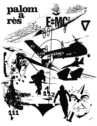
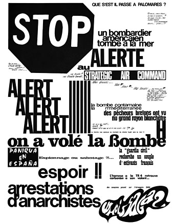
Six of the seven chapters had been uploaded to Scribd in December but the seventh and final episode of the time-travelling Saga’s adventures was frustratingly absent. So I’m pleased to report that the final chapter is now available for reading or downloading, prompted in part by the interest my earlier post generated. The seventh chapter sees Saga arrive in the present day (ie: 1967) where she encounters more human conflict in the form of the US military and marauding Hells Angels. The chapter ends with several Exquisite Corpse pages which had Philippe Druillet among their contributors; it was the appearance of three of these pages in the Musée d’Orsay’s Art Nouveau Revival catalogue in 2010 that first brought the book to my attention. The very end of the book has a key to the alphabets used on some of the pages. I’d love to see Fantagraphics reprint this volume in a translated edition but those alphabets would create some difficulties. For the moment the PDFs at Scribd are the only place you can read this unique publication.

saga02.jpg

saga03.jpg

Continue reading “Saga de Xam revisited”

Philippe Caza covers

caza12.jpg

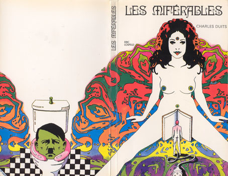
As usual, one thing leads to another. Research for yesterday’s post turned up a Caza book cover I’d not seen before. Les Miférables was published by Éric Losfeld in 1971, a year after producing Caza’s eyeball-searing psychedelic comic book Kris Kool. The author sounds like a character, a friend of André Breton who wrote a handful of novels inspired by his peyote experiences. As should be evident from the cover, Duits’ novel for Losfeld is more concerned with sex, described by this page (which is also the source of the cover art) as being “a kind of mixture of Eastern spirituality and unrestrained pornography”.

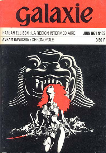
Caza’s art is often concerned with sex even if the subjects are the inhabitants of other planets. Many of the French comic artists of the 1970s produced covers for books and magazines but Caza alone seems to have been very popular as an artist for SF paperbacks. Noosfere has many examples from which I’ve chosen a small selection. (I’ve also had to hunt around for larger copies.) I wouldn’t mind seeing a collection of this artwork without the unsympathetic typography that spoils so many French novels.

caza05.jpg

caza07.jpg

Continue reading “Philippe Caza covers”