Weekend links 215

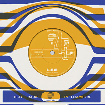
calibair.jpg

Julian House artwork for Other Voices, a new singles series on the Ghost Box label. Other Voices 01 is a collaboration between Sean O’Hagan of the High Llamas and Jon Brooks of The Advisory Circle.

Last week I linked to a copy Zadie Smith’s new introduction for Crash by JG Ballard. That piece could only be read in full by NYRB subscribers but this week the Guardian has the full text:

I was in college when the Daily Mail went to war with [David Cronenberg’s] movie, and found myself unpleasantly aligned with the censors, my own faux-feminism existing in a Venn diagram with their righteous indignation. We were both wrong: Crash is not about humiliating the disabled or debasing women, and in fact the Mail‘s campaign is a chilling lesson in how a superficial manipulation of liberal identity politics can be used to silence a genuinely protesting voice, one that is trying to speak for us all.

Related: Thomas Jones in 2008 reviewing Miracles of Life:

Despite all the bodily fluids spurted and smeared onto wrecked dashboards, the problem isn’t that it’s too pornographic but that it isn’t pornographic enough: the novel is too conscious of the deeper meaning of the sex and violence for the sex and violence to work as elements in themselves.

The fetishisation of Ballard’s novel (and Ballard’s fetishes) show no signs of abating: B-Movie (Ballardian Video Neuronica), is a short film by John Foxx, Karborn and Jonathan Barnbrook.

• Last Thursday I was watching a live performance by Pye Corner Audio and Not Waving, so it’s good to find this mix by the pair surfacing in the same week. Kudos to the latter for choosing something by Chrome. More mixes: FACT mix 468 by Throwing Snow, and Secret Thirteen mix 120 by Drøp.

• Ellen Datlow’s horror anthology, Lovecraft’s Monsters, continues to gather plaudits. Among recent reviews there’s Matt Barone at Complex who included the book in his Year’s Best Genre Fiction Books (So Far) list, and also praised my illustrations.

In recent years, many of the people on book covers have been women without faces. So prevalent is this visual cliché that the publishing industry has cycled through at least two well-documented iterations. The first, the Headless Woman, features some poor thing cut off above the neck, like the swimsuit-clad beachgoer on Alice Munro’s story collection “The View from Castle Rock.” The website Goodreads’s Headless Women page has 416 entries. Last year, the Headless Woman was supplanted by the Sexy Back, in which a woman is shown from behind, often gazing out over a vista.

Eugenia Williamson on the packaging of books for a female readership.

• The latest Taschen volume from Dian Hanson, editor of (among other titles) The Big Penis Book, is My Buddy. World War II Laid Bare, featuring photos from the archives of Michael Stokes. World of Wonder has pages from the interior.

I Have Walked This Body by Jenny Hval and Susanna is a track from a forthcoming album inspired by Maya Deren and Alexander Hammid’s Meshes of the Afternoon. It sounds fantastic so I’m looking forward to hearing more.

• If you have a spare half-million dollars, and don’t mind the possibility of possession by murderous supernatural entities, the Palmer house from Twin Peaks is for sale.

• Read an extract from Season of the Witch: How the Occult Saved Rock and Roll by Peter Bebergal.

The Stars and Their Courses: over six hours of the Nevada night sky in 4k definition.

Lee Siegel on the fraught friendship of TS Eliot and Groucho Marx.

Harmony Korine talked to Kenneth Anger for Interview Magazine.

New Scientist: How magic mushrooms induce a dream-like state.

• 3D-print your own Marcel Duchamp chess set.

Scott O)))

Crash (1980) by Tuxedomoon | Burning Car (1980) by John Foxx | A Crash At Every Speed (1994) by Disco Inferno | Burning Car (Dubterror Remix, 2008) by John Foxx

Weekend links 212

non-format.jpg

Poster for the recent Ballard-themed Only Connect Festival of Sound in Oslo. Design by Non-Format.

Bulldozer by Laird Barron was my favourite piece in Lovecraft’s Monsters, the recent Tachyon anthology edited by Ellen Datlow that I designed and illustrated. So it’s good to hear that Nic Pizzolato, writer of the justly-acclaimed HBO series True Detective, is among Barron’s readers. True Detective, of course, created a stir for referencing Robert Chambers’ weird fiction in a police procedural. The series is out now on DVD and Blu-ray, and I can’t recommend it too highly.

• Citation-obsessed Wikipedians don’t believe Hauntology is a genuine musical genre, a sentiment which will probably surprise some of its practitioners. Whatever the merits of the argument, I rather like the idea of a musical form that resists strict definition.

• “This year, in order to do things differently, I will make a conscious effort to separate the man from his writing.” Giovanna Calvino, daughter of Italo Calvino, remembers her father.

With ideology masquerading as pragmatism, profit is now the sole yardstick against which all our institutions must be measured, a policy that comes not from experience but from assumptions – false assumptions – about human nature, with greed and self-interest taken to be its only reliable attributes. In pursuit of profit, the state and all that goes with it is sold from under us who are its rightful owners and with a frenzy and dedication that call up memories of an earlier iconoclasm.

Alan Bennett delivers a sermon.

Zarina Rimbaud-Kadirbaks, aka Dutch Girl In London, reviews the Chris Marker exhibition that’s currently running at the Whitechapel Gallery, London.

• Exteriorizing the Inner Realms: Christopher Laursen talks to Phantasmaphile and Abraxas magazine‘s Pam Grossman about occult art, past and present.

• The Beast is back: Erik Davis talks to Gary Lachman about his new book, Aleister Crowley: Magick, Rock and Roll, and the Wickedest Man in the World.

• The body as factory: anatomy of a New Scientist cover image. Rick Poynor on the recurrent use of a familiar visual metaphor.

• Mix of the week without a doubt is FACT Mix 445 by Stephen O’Malley, a three-hour behemoth.

• Jennifer in paradise: Photoshop developer John Knoll on the story of the first Photoshopped image.

• The trailer for Grandfather of Gay Porn, a documentary about Peter de Rome by Ethan Reid.

Giorgio’s Theme is a new piece of electronic music by Giorgio Moroder.

Agender, a series of androgynous photo-portraits by Chloe Aftel.

• RIP Little Jimmy Scott

Evil Spirits

Chase (1978) by Giorgio Moroder | Call Me (1980) by Blondie | The Apartment (1980) by Giorgio Moroder

Lovecraft’s Monsters unleashed

lm1.jpg

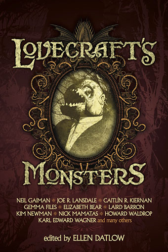
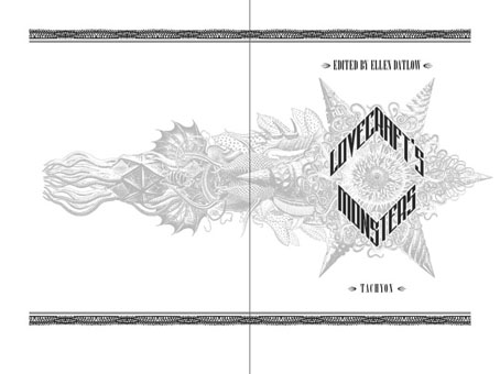
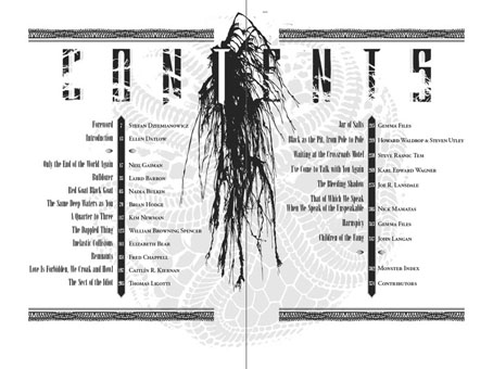
I posted my illustrations for this anthology back in December, after which Tachyon also asked me to create a cover for the book, something that hadn’t been planned at the outset. Lovecraft’s Monsters, edited by Ellen Datlow, is in the shops this month so here’s the cover and a few of my page layouts from the interior. I’m very pleased with this one so it’s been good to hear it’s been selling well already, and picking up positive reviews. My illustrations may be seen at large size here while the book itself should be available via all the usual outlets. If you insist on shopping in a river filled with piranhas then here’s a link. (That fish head on the cover is based on a piranha as it happens.)

The big Lovecraft collection from Centipede Press, A Mountain Walked, was also supposed to be out this month but the release has been bumped (again) to May 2014. It’s a huge volume so I’m not surprised if it’s taking longer than expected.

lm2.jpg

lm3.jpg

lm4.jpg

Elsewhere on { feuilleton }
The Lovecraft archive

Lovecraft’s Monsters

Lovecraft's Monsters

Graphic for the title page and ends of chapters.

I don’t usually post things so far away from publication, but editor Ellen Datlow put these pictures on her Facebook page a few hours ago so I may as well do the same here.

Back in February I bought a Wacom Intuos drawing tablet, something I’ve been using with regularity for the past few months. The Alas Vegas Tarot cards I designed in the summer were the first major attempt at getting used to working with it; Lovecraft’s Monsters, a forthcoming fiction anthology for Tachyon is the second, and I now feel very comfortable working with it. More than that, I’m increasingly pleased with the way it’s possible to combine the drawing techniques I’ve been using for years with the additional possibilities provided by working in Photoshop. As always, it’s the end result that counts but arriving at an end result can be easy or difficult. Some of these illustrations look no different than they would have done had I used ink on paper but they took half the time to create, a considerable benefit when a deadline is looming.

The stories Ellen Datlow has chosen for this collection all present different aspects of monstrosity seen through the lens of Lovecraft’s fiction and his cosmic menagerie. Some are full-on extensions of the Mythos, others are more allusive; all the pieces bar one have been published before but I’d not read any of them so for me this was fresh material. Having spent the past few years saying I was finished with Lovecraft’s fiction I was excited to be working on this book. The stories are good, and I welcomed the challenge of having to illustrate such a variety of material.

Larger copies of all the pictures can be seen here.

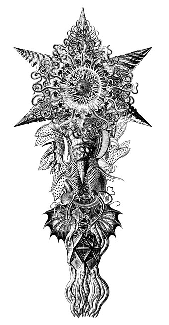
The star-headed thing at the top of this page is another amalgam of elements plundered from Haeckel’s Kunstformen der Natur and other sources. I’ve leaned rather heavily on Haeckel in the past, something I wanted to avoid here; this serves as a kind of visual punctuation separating the stories.

Lovecraft's Monsters

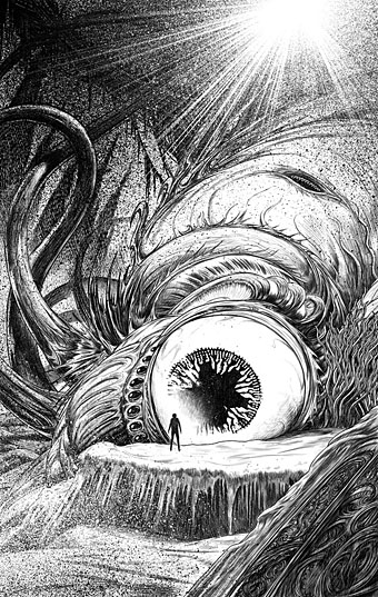
Cthulhu.

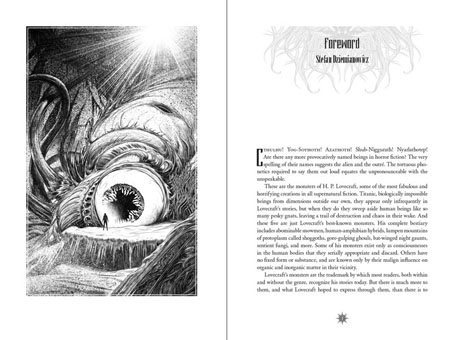
The drawing I’ve called Cthulhu is a piece for the introductory pages. Having already produced a lot of Cthulhoid art I didn’t want to repeat myself. The initial idea was of a tiny human figure faced with something enormous and nightmarish; that could be a vast eyeball or it could be a mouth or some other organ/aperture, the vagueness was intentional. Lovecraft continually impresses upon his readers how difficult things are to describe or apprehend but you seldom find this quality in art based upon his stories. Cthulhu especially has devolved into little more than an outsize man-in-a-rubber-suit à la the Creature from the Black Lagoon. In The Call of Cthulhu the figure on the mysterious statuette is described as having a humanoid shape but Lovecraft doesn’t describe the appalling reality in any detail at all. When Cthulhu is struck by a ship at the end of the story it breaks apart and is then seen recombining, the implication being that the creature is corporeally amorphous.

Lovecraft's Monsters

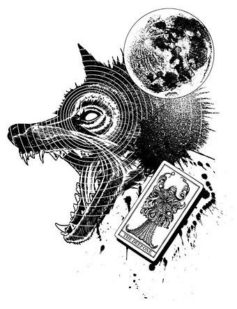
Only the End of the World Again by Neil Gaiman.

Neil Gaiman’s entry concerns a werewolf private detective in Innsmouth. Lovecraft’s decaying fishing village and its inhabitants turn up in several of the stories so care was taken to avoid repetition.

Lovecraft's Monsters

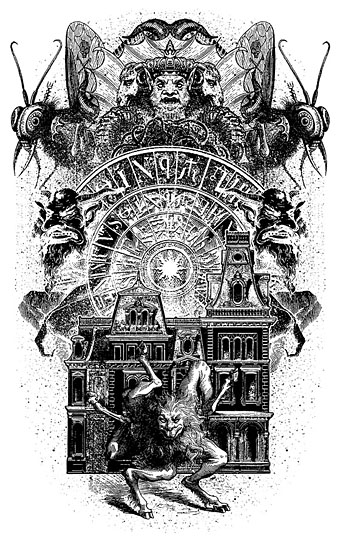
Bulldozer by Laird Barron.

A great story about another detective, a Pinkerton agent this time, hunting his quarry through the Old West. Collin de Plancy’s Dictionnaire Infernal is mentioned so I used some of Louis Breton’s illustrations from the third edition.

Continue reading “Lovecraft’s Monsters”

Ten titles and a cover

cdlcover.jpg

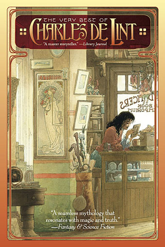
The Very Best of Charles de Lint. Art by Charles Vess.

Over the weekend I found the time to finally update the book design section of the site, adding new pages for most of the titles I’ve been working on recently. There’s still a couple of things missing but I’ll add those in due course. Many of these design jobs have been for the interiors only so what follows is a comparison of title spreads from books I’ve worked on that have been published this year. Lest it seem that I have an army of clones at my service it should be emphasised that I was working on several of these last year (and Engelbrecht was completed in 2008) but the nature of release schedules means they all carry 2010 publication dates.

sr.jpg

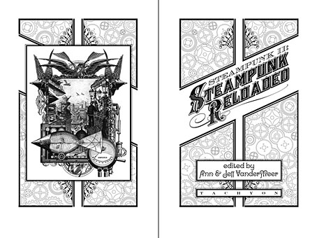
Steampunk II: Steampunk Reloaded, edited by Ann & Jeff VanderMeer.

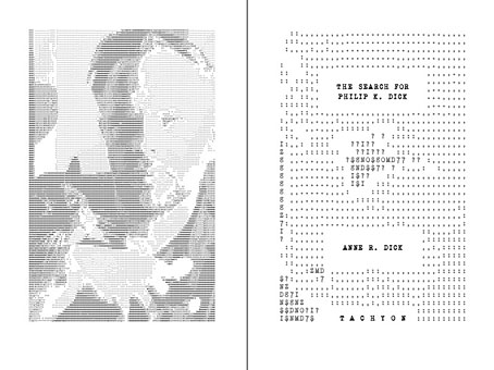
I invariably make a feature of title pages, usually creating them as a spread in order to heighten their impact. The title page is a kind of gateway to the rest of the book which gives you an opportunity to establish a mood for what follows. It’s also the area where you can be most lavish with your graphic treatment and, where necessary, add illustrative material without worrying too much about intruding on the content. With a number of these designs I was following typographic choices from pre-designed covers so the challenge was to find something that would match the cover and connect to the rest of the interior. The Charles de Lint book was a variation on this process in that the author had chosen a Charles Vess drawing for the cover art. I designed a cover to accommodate the drawing then carried the design inside. The colours were chosen to match Vess’s artwork while the general Art Nouveau style came from an Alphonse Mucha poster he’d placed on the wall. With a different cover picture the entire book would have had a very different design.

pkd.jpg

The Search for Philip K Dick by Anne R Dick.

Continue reading “Ten titles and a cover”