Interview with the vampire illustrator

illustration1.jpg

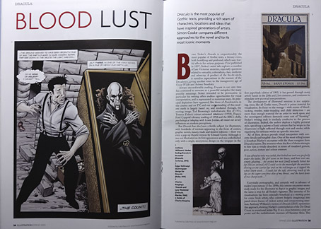
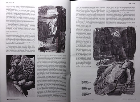
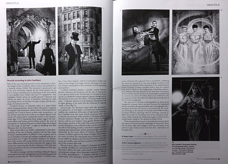
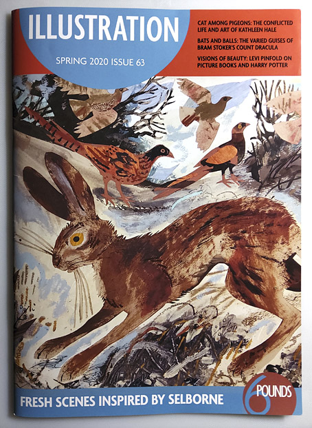
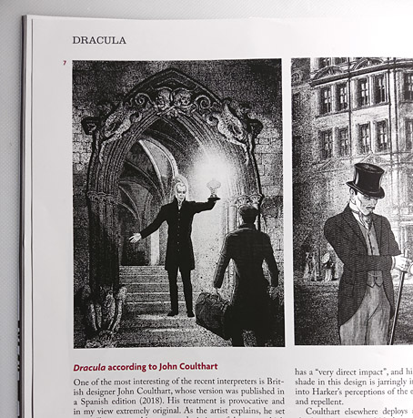
Some of the many illustrators of Bram Stoker’s Dracula are the subject of a six-page feature in the latest issue of Illustration magazine. The writer of the piece, Simon Cooke, asked me a few questions about the edition I worked on for Editorial Alma in 2018 (previously), and he devotes two pages to analysing my illustrations. I was a little unnerved by this since Alma asked me to produce 27 full-page pictures—one for each chapter—in five weeks, which isn’t the kind of deadline I prefer for work that requires so much historical research. Consequently, I still feel the book is compromised but people evidently like the end results so I should stop complaining. Illustration magazine is available from Cello Press.

illustration2.jpg

As for my work of the moment, the Joe Banks Hawkwind book will be published by Strange Attractor in the next few weeks, so everyone will finally get to see my Frank R. Paul-derived wraparound cover. And there’s more science fiction on the way with a new cover design featuring a robot as its centrepiece. Watch this space.

illustration3.jpg

illustration4.jpg

illustration5.jpg

Previously on { feuilleton }
Hawkwind: Days of the Underground
Illustrating Dracula

André Castaigne’s Phantom of the Opera

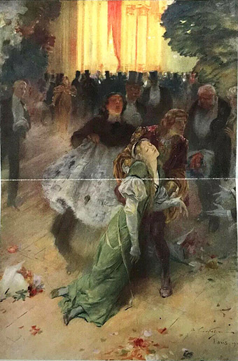
castaigne1.jpg

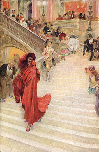
Frontispiece.

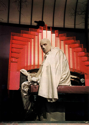
My recent film viewing has included two early adaptations of The Phantom of the Opera, the superb Lon Chaney version from 1925, directed by Rupert Julian, and the not-so-superb 1943 version with Claude Rains as the Phantom. I’d not seen the latter before but it was included in a blu-ray collection of Universal horror films; Rains is wasted in the title role but in its favour the film has Technicolor photography and huge sets, some of which were being reused from the 1925 film. The Chaney version is one of my favourite silent films so it was good to see again after a lengthy absence. It also sent me to Gaston Leroux’s novel at long last, and this in turn led me to the illustrations by André Castaigne for the first edition.

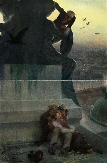
castaigne2.jpg

“She staggered swooning.”

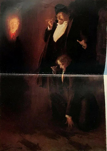
The Phantom of the Opera was published in 1911, and while it hasn’t been subjected to the overexposure sustained by Dracula and Frankenstein it’s still one of those stories where the adaptations now dominate the popular imagination. I’d not seen Castaigne’s illustrations before so I was surprised by how closely the 1925 film followed their details, especially the depiction of the Phantom’s appearance as the Red Death at the bal masque. The same goes for the ghostly head of fire which Raoul and the Persian encounter in the cellars beneath the opera. In the film this is an inexplicable moment but one which would no doubt have been familiar to the novel’s readers. Finally, there’s Lon Chaney’s incredible makeup which turns out to be very close to the glimpses of the Phantom’s skull-like face in these pictures. I often used to wonder about this, how much of Chaney’s appearance was merely an attempt to look as horrifying as possible. (In the 1943 film, and the 1962 Hammer adaptation with Herbert Lom, both Phantoms have been disfigured by acid scarring.)

castaigne3.jpg

“They sat like that for a moment in silence.”

By coincidence, a new illustrated edition of The Phantom of the Opera was published this month by the Folio Society, with a splendid set of illustrations by Taylor Dolan. As for the Lon Chaney film, the restored blu-ray print is the one to look for, with tinted scenes, the bal masque in two-strip Technicolor, and an excellent orchestral score by Carl Davis.

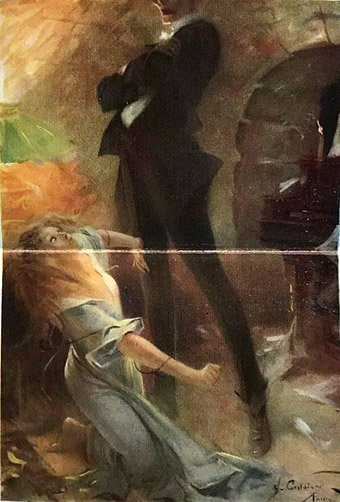
(Note: With the exception of the frontispiece, all the illustrations here were printed over two pages, hence the fold across each picture.)

castaigne4.jpg

“A head of fire came toward them.”

castaigne5.jpg

“Talking of death, I must sing.”

Elsewhere on { feuilleton }
The illustrators archive

Previously on { feuilleton }
A Pictorial History of Horror Movies by Denis Gifford

Weekend links 440

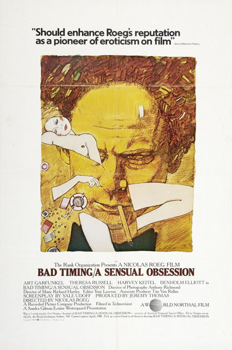
roeg.jpg

The title of that film was originally different [Illusions]… I woke up one day and thought of Bad Timing which sounds exactly like the right title—for my career. Now there was a film I really thought was one to which there would be a different response. Whilst filming I felt sure that this was one for the streets, one that people would really want to see. — Nicolas Roeg

So long to the great Nicolas Roeg, always one of my favourite film-makers. Roeg’s works were naturally attractive when I was a teenager because he’d made a horror film and a science-fiction film; when these eventually turned up on TV it was evident that this was a director working on a level that had more in common with Continental Europe than Hollywood. Beyond the generic content it was his approach to directing that made his films essential: a fragmented editing style derived from Alain Resnais via Richard Lester (see below), a cosmic perspective almost entirely absent from the parochial concerns of British cinema, and a seemingly effortless ability to find visual rhymes in anything. Despite the “bad timing” comment above Roeg was fortunate to be working throughout the 1970s when having an approach that ran counter to the prevailing trends wasn’t an obstacle to maintaining a career; as with Ken Russell, you watch some of the films today and are amazed and grateful that they were made at all. When reading the forthcoming plaudits it would be worth remembering that even the films regarded now as Roeg’s best struggled for acceptance: Pauline Kael dismissed Don’t Look Now as “trash”, US screenings of The Man Who Fell To Earth provided explanatory notes for the hard-of-thinking, Bad Timing was described by its own distributors as “a sick film made by sick people for sick people”, while the distributors of Eureka hated the film so much that for a time it could only be screened in the UK if the director was also present.

• Related: Where to begin with Nicolas Roeg, and Nicolas Roeg: It’s About Time (2015), a 59-minute documentary for the BBC directed by David Thompson. Previous Roeg-related postings on this site include: The Nicolas Roeg Guardian Lecture, 1983 (Roeg discusses Eureka and other films with Philip Strick); Beyond the Fragile Geometry of Space (charting the recurrence of a book title from Don’t Look Now); Canal view (using Google Street View to find the church in Don’t Look Now); and Petulia film posters (designs for a Richard Lester film from 1968 that was photographed by Roeg, and whose fragmentary editing style prefigures the familiar Roeg technique).

• Edward Woodward’s greatest screen role wasn’t a prudish policeman or a mysterious vigilante but was David Callan, a conflicted assassin working for a division of the British Secret Service. Joseph Oldham explains.

• Mixes of the week: A mix for The Wire by Jing, FACT Mix 681 by Kelly Moran, and Crépuscules d’Automne, a seasonal mix by Stephen O’Malley.

• More Gorey: in 1978 Jeremy Brett was playing Dracula in the touring version of the Edward Gorey-designed play.

• Liberated from the LRB paywall for a brief time: George Melly writing in 1992 about René Magritte.

• Welcome to the witch capital of Norway: Chelsea G. Summers investigates.

Space colony artwork from the 1970s.

• At I Love Typography: Magic printed.

Memo From Turner (1970) by Mick Jagger | Wild Hearts (1985) by Roy Orbison | Be Kind To My Mistakes (1987) by Kate Bush

Weekend links 437

watson.jpg

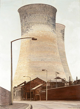
Rawmarsh Road, Rotherham, 1975 by Peter Watson.

Steel Cathedrals (1985), a composition by David Sylvian (with Ryuichi Sakamoto, Kenny Wheeler, Robert Fripp & others) was originally available only on the cassette release of Sylvian’s Alchemy: An Index Of Possibilities, and a video cassette where the music accompanied views of Japanese industry by Yasuyuki Yamaguchi. The video hasn’t been reissued since but may be viewed here.

• “If, as Arthur C Clarke famously observed, any sufficiently advanced technology is indistinguishable from magic, then can we accept that any sufficiently advanced magic is also indistinguishable from technology?” asks Mark Pilkington.

• “I didn’t like the idea of cartoons as just funny jokes, they had to have some relevant piece of observation in them to do with the society we are living in,” says Ralph Steadman.

I listen to music all the time, and I’ll often seek connections across quite disparate genres of that whatever I’m looking for. Sometimes it’s an aesthetic or a feeling, sometimes a pattern or structure, but it tends to cut across genres. The thing I liked about black metal and doom metal is the slowness and weightiness of it, it’s like deep time but in music. Sunn O))), Xasthur, and other bands captured this black gravity of sound. And they also tend to eschew the traditional vocal-lead guitar set-up, and everything is in the slow-moving wash and texture of sound.

I found that in other genres like noise music (especially Keiji Haino), the European avant-garde with composers like Ligeti, Scelsi, and Dumitrescu, dark ambient artists such as Lustmord or vidnaObmana, and contemporary works like Chihei Hatakeyama’s Too Much Sadness, Rafael Anton Irisarri’s A Fragile Geography, or Christina Vantzou’s No.4. There’s a lot to talk about in terms of music and forms of sorrow or grief, certainly every musical tradition has that—the funeral dirge, requiem, lamentation, or whatever.

Eugene Thacker listing a few favourite musicians and composers during a discussion with Michael Brooks about Thacker’s new book, Infinite Resignation

• The fourth edition of Wyrd Daze—”The multimedia zine of speculative fiction + extra-ordinary music, art & writing”—is out now.

• The Library of Congress has opened its National Screening Room, an online service for viewing films in the library’s collection.

The London Library discovered some of the books that Bram Stoker used for research when he was writing Dracula.

• “Oscar Wilde’s stock has never been higher,” says John Mullan, reviewing Oscar: A Life by Matthew Sturgis.

• Mixes of the week: RA Podcast 648 by Sarah Davachi, and Secret Thirteen Mix 269 by Sstrom.

• David Lynch directs a video for A Real Indication by Thought Gang.

• “Edward Gorey lived at the ballet,” says his biographer, Mark Dery.

• A new version of Blue Velvet Blues by Acid Mothers Temple.

• Photos of cooling-tower interiors by Reginald Van de Velde.

Aaron Worth on Arthur Machen: “the HG Wells of horror”.

• The Strange World of…Barry Adamson.

Glass And Steel No. 1 (1983) by Marc Barreca | Death Is The Beginning (1996) by Steel | Painless Steel (2000) by Bohren & Der Club Of Gore
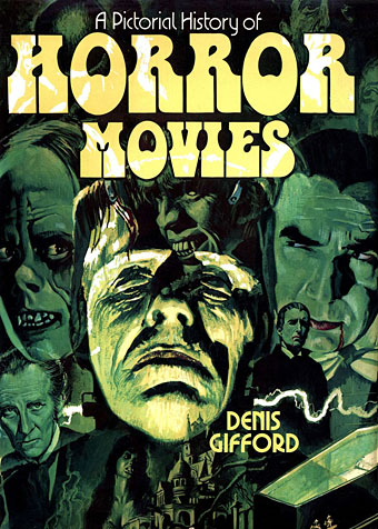
A Pictorial History of Horror Movies by Denis Gifford

gifford01.jpg

Cover art by Tom Chantrell.

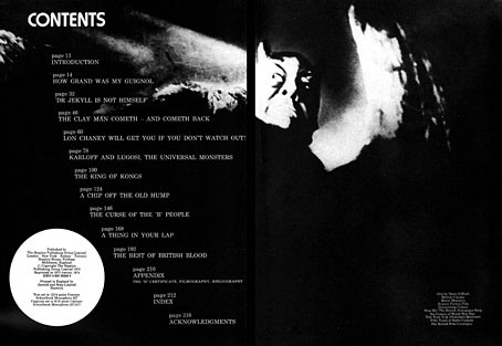
Halloween approaches so here’s a book that suits the season. Denis Gifford’s A Pictorial History of Horror Movies was published in Great Britain by Hamlyn in 1973. A large-format hardback of just over 200 pages, this was a cheap production for wide distribution, and evidently sold well: my edition from 1980 is the 12th reprint, and the book was still in print in 1983, in a slightly longer edition with a new cover.

gifford17.jpg

For a generation of British kids Gifford’s book made an indelible impression, not least because of its ubiquity. It was always easy to find—for years I didn’t have a copy of my own because I invariably seemed to know someone who did—and its mostly black-and-white pictures featured a great deal of imagery that was generally forbidden to those of us under the age of 18. This may seem surprising to Americans, or those in more liberated European countries, but Britain has always had an uneasy relationship with the horror genre despite the legacy of Gothic novels and ghost stories, never mind Dracula, Frankenstein and the rest. Literary manifestations command a grudging acceptance if enough years have passed since first publication but Britain’s moralists and censors have fretted over pictorial horror for decades, especially the film and comic-book variety.

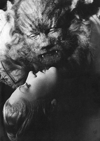
gifford02.jpg

La Belle et la Bête (1946).

Almost all horror films screened in Britain over the past century were for audiences of 18 or over, while horror films on TV were never shown before 10pm. That scene in Halloween (1978) where the kids are watching The Thing From Another World on television in the early evening would have been impossible here. In 1982 we had the start of the “video nasties” panic, a particularly disgraceful episode for those eager to interfere in other people’s entertainment, and an issue that rumbled on for the rest of the decade. As for print media, I still have a leaflet from the late 1980s given to all applicants of UK passports which lists “horror comics” along with weapons, drugs, poisons, etc, among the items forbidden from import into Britain. This climate gave Gifford’s guide an illicit charge it might not have had if published elsewhere: the book delivered a concentrated dose of the forbidden.

gifford03.jpg

Vincent Price as Doctor Phibes.

Denis Gifford (1927–2000) was, among other things, a comics artist, a comics and film historian, and a collector of comic books and horror ephemera. Most of the material in A Pictorial History of Horror Movies is from his own collection, and an excellent collection it was. More than 300 stills run through the entire history of horror cinema from the earliest Méliès shorts to German Expressionism, Universal horror, Hammer horror, AIP monster movies, Toho monster movies, and on to the garish efforts of the late 1960s; he even manages to get in a still from Carry On Screaming. The accompanying text is concise but authoritative, although I doubt anyone ever used the book as a serious study. Yet for a 12-year-old this was a perfect introduction to the genre, as well as a dizzying intimation of hundreds of films yet to be seen. In place of the films you had pictures implying entire worlds of mystery and terror, many of which are so good they give very unrealistic expectations of the films from which they originate. Some of the most memorable examples for me have been those which are more atmospheric or eerie than horrific, like the sinister child at the window in Mario Bava’s Operazione Paura (1966) aka Curse of the Dead. (See this post for more about the extended life of Gifford’s still.) But there were also plenty of monsters, grotesque makeup effects and even some gore; a female friend of mine was obsessed with the picture of a blonde and bloodied young woman with an axe buried in her head (see below). Looking at the book today I suspect Gifford’s punning captions may have been a nod to Famous Monsters of Filmland, a magazine with a devoted readership but not a title I ever read myself.

gifford04.jpg

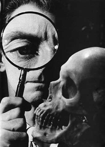
Peter Cushing (The Skull; 1965).

All the pictures here are from an upload of the entire book at the Internet Archive. Gifford isn’t around to complain about this but the book may not remain there for long so enjoy it while you can. A few more pages follow. For an earlier appraisal of the book’s impact on impressionable minds, there’s this piece by Dave Tompkins.

Continue reading “A Pictorial History of Horror Movies by Denis Gifford”