The Thousand Eyes of Dr Mabuse

mabuse1.jpg

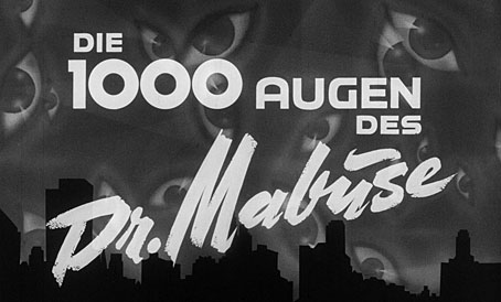
Among the weekend’s viewing was the third and final film in Fritz Lang’s Mabuse cycle, The Thousand Eyes of Dr Mabuse (1960). This was also Lang’s final feature, made after his return to Germany in the late 1950s, and another film of his that for many years I knew only as an impossible-to-find title. I’d read about the Mabuse series in Lotte Eisner’s study of Lang’s career even before the name and character was co-opted by Propaganda for their first single in 1984, but the only films of Lang’s that ever used to appear on TV were the Hollywood features or, if you were lucky, a poor print of Metropolis. Mabuse was a source of fascination for the way the character connected the beginning and ends of the director’s career, as well as being a German take on the Moriarty-like super-criminal. The first film in the series, Dr Mabuse, the Gambler (1922), condenses the corruption of Weimar Germany into a potent physical icon, while the sequel, The Testament of Dr Mabuse (1933), reflects the fevered moment when real super-criminals were taking control of the nation. The Nazis were sufficiently discomforted by Testament to ban it shortly after its release.

mabuse2.jpg

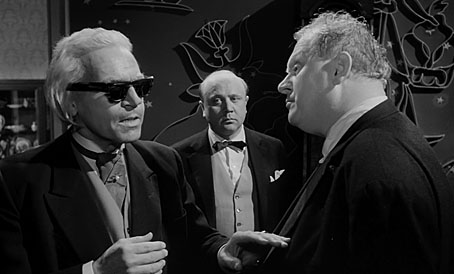
Cornelius the psychic with insurance salesman Hieronymus B. Mistelzweig and police inspector Kras.

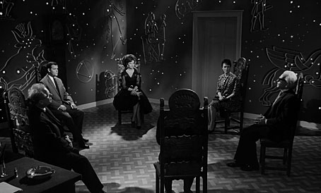
The Thousand Eyes of Dr Mabuse appeared just as new super-villains were emerging to oppose James Bond and his imitators. One of Bond’s early adversaries, Auric Goldfinger, was portrayed on screen by Gert Fröbe who appears here on the opposite side of the law as homicide inspector Kras. Fröbe’s tenacious policeman is one of the few fixed points in a plot filled with twists and deceptive identities. Assassinations and double-crosses are a staple of this type of thriller but Lang also gives us an early example of electronic surveillance in a contemporary setting, together with a séance that harks back to a similar scene in the first Mabuse film. The séance is an unusual touch in a story otherwise devoid of similar moments, prompted by the film’s most mysterious character, Cornelius the blind psychic. With an appearance reminiscent of the late Karl Lagerfeld, Cornelius is an overt throwback to Lang’s pre-war films, many of which hinted at the mystical or supernatural even when such hints seemed unnecessary; Rotwang, the robot-builder in Metropolis (played by the original screen Mabuse, Rudolph Klein-Rogge) is a mechanical genius who just happens to live in a house more suited to an alchemist, with a huge inverted pentagram on one of its walls. The sinister motives of Cornelius aren’t so baldly stated but his consulting room is lavishly decorated with astrological diagrams. The psychic, together with the criminals and the police inspector, create a problem common to films of this kind in which the more colourful characters generate greater interest for the viewer than do the romantic leads. After a succession of breathless opening scenes, Thousand Eyes sags a little while wealthy industrialist Henry Travers (Peter Van Eyck) is getting to know Marion Menil (Dawn Addams), a woman he rescues from a suicide attempt. The film also lacks the subtext of the earlier episodes, although Mabuse’s scheme turns out to be diabolical enough for any of James Bond’s Cold War enemies.

mabuse3.jpg

The séance.

Continue reading “The Thousand Eyes of Dr Mabuse”

The poster art of Josef Vyletal

vyletal11.jpg

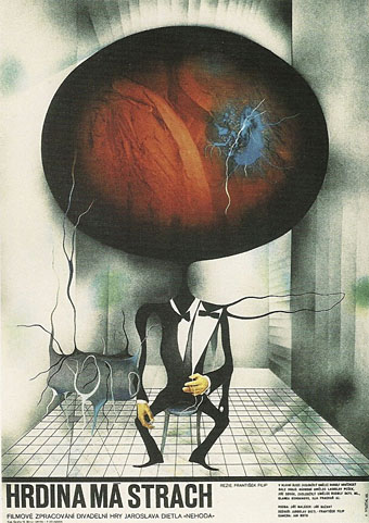
The Hero is Afraid (1965).

Film posters by Czech artist Josef Vyletal (1940-1989) have appeared here in the past, but after watching Juraj Herz’s gloomily Gothic Beauty and the Beast (1978) at the weekend—a film for which Vyletal not only created a poster but also provided the title sequence and paintings seen within the film—I thought the artist deserved a post of his own.

Josef Vyletal was a prolific poster artist and designer—the Terry Posters website states that he created 115 designs for the cinema—who also worked as a book illustrator. Between commercial assignments he produced paintings in a macabre Surrealist style that filtered into his commercial work, the Herz titles included. The absence of barriers between private obsessions and commercial imperatives is what makes the film posters created by Czech and Polish artists so attractive, as well as so surprising to Anglophone viewers. There’s no sense of these works being produced by committee, of a gaggle of marketing executives fretting over details behind the scenes. Some of Vyletal’s interpretations are so extreme and uncompromising by Hollywood standards it’s impossible to imagine even an adventurous chain like Alamo Drafthouse commissioning them, never mind a risk-averse studio. One of the designs I singled out for an earlier post is an ideal example, a poster for Alfred Hitchcock’s The Birds which dispenses with any visual reference to the film in favour of a liberal borrowing of the bird-headed figures from Max Ernst’s The Robing of the Bride. It’s a commonplace when discussing the films of Jan Svankmajer to situate the director in the history of Czech Surrealism which remained a clandestine movement during the Communist years. But Vyletal’s paintings demonstrate a confidence that the average Czech filmgoer could accept Surrealist imagery when being tempted by the latest fare from Hollywood.

vyletal07.jpg

The Naked Eye (1966).

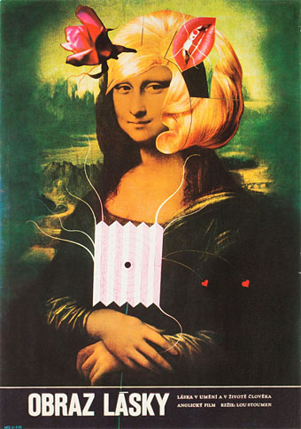
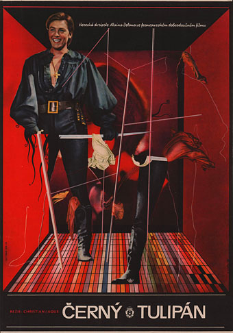
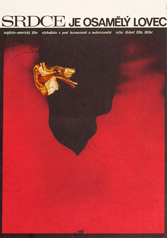
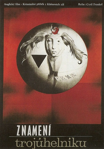
Given my own tastes for Surrealist imagery many of the examples shown here tend in this direction. Vyletal was a versatile artist who utilised a number of different styles, including collage and a bold graphic style of black shapes on coloured backgrounds. In addition to borrowing from Ernst he also borrowed (or swiped) figures from Aubrey Beardsley on at least two occasions (see below). Most of the examples here are collages augmented by or combined with paint, collage being a quicker solution when faced with deadlines. Terry Posters has many more examples.

(Note: the name Vyletal should include an accent but the coding on this blog throws up errors when it encounters unusual accents. My apologies to Czech readers.)

vyletal13.jpg

The Black Tulip (1967).

vyletal01.jpg

The Heart is a Lonely Hunter (1968).

vyletal12.jpg

The Trygon Factor (1968).

Continue reading “The poster art of Josef Vyletal”

The poster art of Raymond Gid

gid-28.jpg

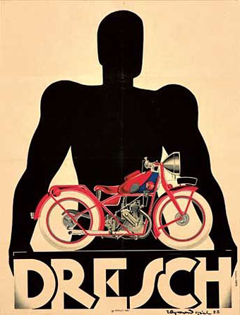
Dresch (1928).

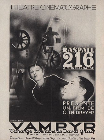
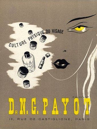
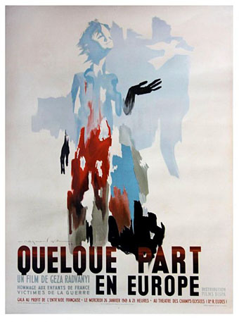
This weekend I was rewatching Henri-Georges Clouzot’s superb thriller, Les Diaboliques (1954) after which I went searching for the equally superb posters by Raymond Gid (1905–2000). I hadn’t really looked at the rest of Gid’s work before so this post remedies the situation with a selection from some of the many examples available online. Gid was something of a French equivalent to Saul Bass, working as a poster artist for feature films while also producing designs for advertising; like Bass he took charge of the typography as well as the illustration, always a useful thing for a poster artist. Typographies (1998), his book on the subject, is still in print.

gid-32.jpg

Vampyr (1932).

gid-38.jpg

Dr. NG Payot (1938).

gid-48.jpg

Quelque part en Europe (1948).

Continue reading “The poster art of Raymond Gid”

High-Rise posters

highrise.jpg

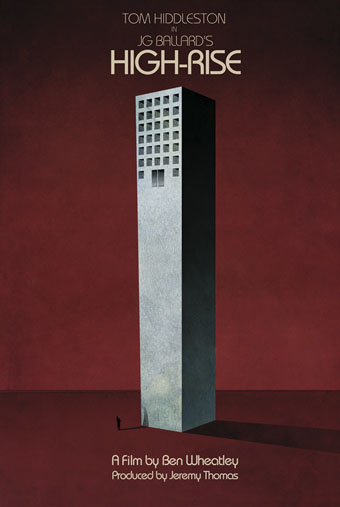
An early promotional poster from 2014 by Jay Shaw.

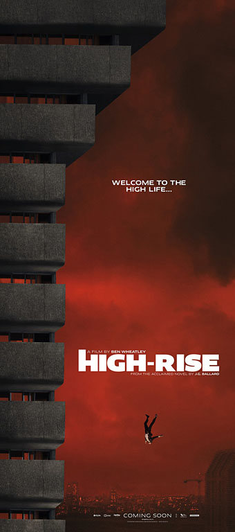
Ben Wheatley’s film of the novel by JG Ballard approaches. As is my custom, I’ve been avoiding the trailers of this and any other film of interest but the posters are increasingly impressive. Ben Wheatley and fellow Brit filmmaker Peter Strickland (whose The Duke of Burgundy was produced by Wheatley’s Rook Films) have distinguished themselves not only by the quality of their films but also by caring about the designs used to advertise their work. Last month I linked to a story about the dire state of the US poster world where design-by-committee is the order of the day. The designs for Wheatley’s films have been a welcome riposte to this trend. Can the film live up to its posters? Find out in March.

highrise1.jpg

The first poster shows the doomed jeweller heading earthwards for his rendezvous with a parked car. Easy to imagine this design giving a Hollywood marketing committee the vapours.

Continue reading “High-Rise posters”

Saragossa Manuscript posters

saragossa1.jpg

Polish poster (1965) by Jerzy Skarzynski who was also the film’s production designer.

I love The Saragossa Manuscript, both the novel by Potocki and the movie by Has. I saw the film three times which, in my case, is absolutely exceptional.

Luis Buñuel in My Last Sigh (1983)

No surprise that a lifelong Surrealist was enamoured with Jan Potocki’s rambling collection of stories-within-stories. The 1965 Polish film by Wojciech Has had another famous enthusiast in Jerry Garcia whose efforts to restore and reissue The Saragossa Manuscript helped bring the film to a new generation of viewers in 1999. I was a beneficiary of this, having been intrigued for years by descriptions whilst hoping in vain that it might turn up on television. I prefer the film to the novel although to be fair to Potocki it’s a long time since I read his book.

saragossa2.jpg

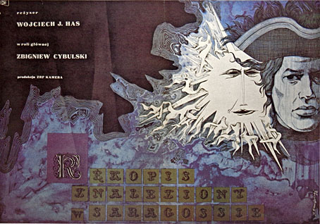
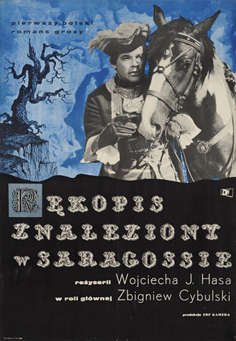
Another Polish design showing Zbigniew Cybulski as Alphonse.

Watching The Saragossa Manuscript again this weekend sent me looking for posters, some of which can be seen below. There are odd omissions: plenty of examples from the Eastern Bloc countries but few at all from Western Europe. The film suffered by having its 3-hour running time hacked about by distributors which didn’t help its reception outside Poland. The manuscript of the title is a book discovered during a skirmish in the Napoleonic wars, an account of the strange adventures of Alphonse Van Worden in the Sierra Morena region of Spain; one of the soldiers reading the manuscript is Van Worden’s grandson, the first of many coincidental connections. Van Worden’s adventures seem macabre at first—there are more bones in the opening scenes than in many horror films—but they soon turn farcical. As a burgeoning cast of characters appears, many of whom have their own tales to tell, the mood veers into outright sex comedy, albeit with mild philosophical overtones. Some scenes aren’t very far removed from Monty Python, especially those that feature an inept band of Spanish Inquisitors.

saragossa10.jpg

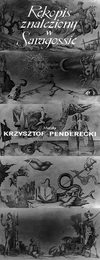
Background drawings from the title sequence. Yes, the score is by Penderecki, his first.

All of which means this is another film that presents a challenge for a poster designer. Most of the early examples take their cues from the opening titles whose backgrounds feature drawings with a vaguely Surrealist and occult flavour that I’m guessing are also the work of Jerzy Skarzynski.

Continue reading “Saragossa Manuscript posters”