Mirror, mirror | Simon Callow on The Picture of Dorian Gray.
Tag: Dorian Gray
The Studio & Studio International
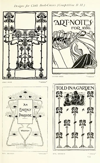
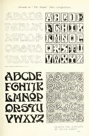
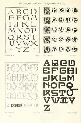
Back in February I posted some pictures from a 1971 collection of Art Nouveau illustration and design, some of which were competition entries from The Studio magazine. The Studio, which later became the long-running Studio International, can be seen from issue 11 onwards at the Internet Archive now that they’ve started uploading Google’s book scans. I’ve only looked at one of these so far, Volume 11–13 which runs over 850 pages and so takes some time to go through, as do all these rather unwieldy PDF books. The issues are missing their covers and so aren’t dated but would appear to be from around 1896 to 1898, one of the final entries being a memorial piece for Aubrey Beardsley who died that year; The Studio was the magazine which had introduced Beardsley to the public only five years earlier.
The Studio ran regular competitions among its readers and the examples shown here are from some of those. I especially like these type designs; dare we assume that the “Dorian” design below is named after Dorian Gray? As a whole the magazine is an odd mix of very dull Victorian art of the landscapes and artisans type, with occasional flares of interest when they devote a feature to the emerging Art Nouveau style or profile a Symbolist artist such as Giovanni Segantini.
A note for anyone wishing to download Google scans from the Internet Archive: some of the PDF links lead you to a Google page where they’re trying to sell you an e-text or get you to buy a book. To see the available files you need to click “All Files: HTTP”.
Previously on { feuilleton }
• The Great God Pan
• Art Nouveau illustration
• Jugend Magazine
Kaleidoscope: the switched-on thriller
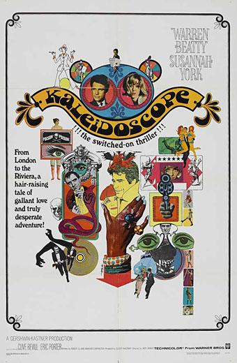
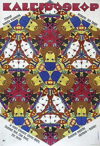
I’ve not seen Jack Smight’s 1966 caper movie for years, and don’t remember much about it beyond Maurice Binder’s kaleidoscopic title sequence. But I like this collage poster, a suitably frenetic piece for one of Hollywood’s many attempts throughout the 1960s to capitalise on modish fashion. I can’t find a credit for the designer so if anyone knows who was responsible, please leave a comment.
This Polish poster, on the other hand, is the work of Witold Janowski who successfully combines the film’s title with its playing card theme. Too arty and cerebral for Hollywood (No girls!…no guns!) but that’s how it is with all those great Polish poster artists.
Update: the US poster was by the great Bob Peak.
Previously on { feuilleton }
• The Robing of The Birds
• Franciszek Starowieyski, 1930–2009
• Dallamano’s Dorian Gray
• Czech film posters
• The poster art of Richard Amsel
• Bollywood posters
• Lussuria, Invidia, Superbia
• The poster art of Bob Peak
• A premonition of Premonition
• Metropolis posters
• Film noir posters
Charles Ricketts’ Hero and Leander
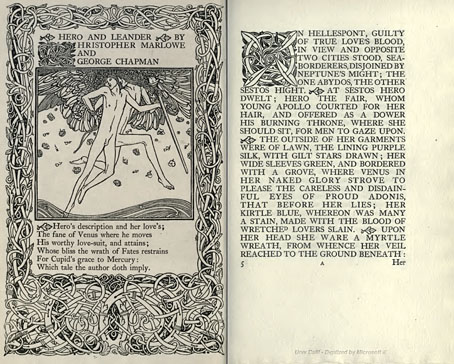
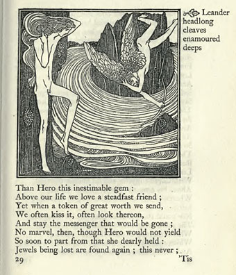
Enthusiasts of Charles Ricketts’ illustrations can find book collections of his drawings and paintings but the artist (with partner Charles Shannon) was also a printer, typographer and book designer who would no doubt have preferred his illustrations to be seen in their intended setting. The Internet Archive has a few choice examples of Rickett’s books, of which the most profusely illustrated is Hero and Leander (1894), Christopher Marlowe’s poem (completed by George Chapman).
Also of interest is Danaë (1903) by Thomas Sturge Moore with its black and red type, A Bibliography of the Books Issued by Hacon & Ricketts (1904), and A Defence of the Revival of Printing (1899). The latter is of interest to book designers and typographers for its presentation of Ricketts’ aesthetic philosophy. Ricketts’ and Shannon’s books made continual use of a small leaf motif as a pilcrow to mark a fresh paragraph. In A Defence of the Revival of Printing Ricketts discusses his replacement for the ampersand (&), which he disliked, preferring instead a new character combining the letters E and T, ampersands being a contraction of the Latin word “et”. There’s also some discussion of his unique type designs which he charmingly refers to as “founts”, preferring, like contemporary William Morris, the antique terminology.
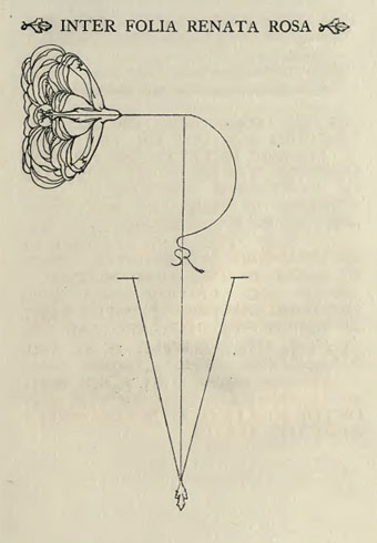
Colophon from Hero and Leander. A rose forms the monogram of Ricketts’ and Shannon’s Vale Press.
Elsewhere on { feuilleton }
• The illustrators archive
Previously on { feuilleton }
• Art Nouveau illustration
• Dorian Gray revisited
Henry Keen’s Dorian Gray
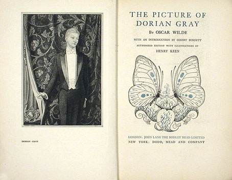
Returning to the golden boy again this week with an illustrated edition of Wilde’s novel from 1925. The publisher was Aubrey Beardsley’s old employer, John Lane, and the illustrator was Henry Keen, an artist of singular and dismaying obscurity. Perhaps some of my knowledgeable commenters can provide more information. Keen’s 12 plates look like lithographs but the book also featured ink embellishments and a splendid sunflower/butterfly design on the boards and slipcase.

