Donald Cammell and Kenneth Anger, 1972

cinema.jpg

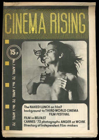
Another resurrected article. Cinema Rising was a short-lived newsprint film magazine that ran for three issues in the UK in 1972. I have a few pages from the rare first issue that was part of a batch of old underground newspapers I was given a few years ago. (The Frendz Hawkwind strip is from the same haul.) Cinema Rising was edited by Simon Hartog and Tony Rayns, the latter being a long-time Kenneth Anger aficionado which would explain both the magazine title and the presence of a photo feature about Anger’s Lucifer Rising. The bulk of this post is a short interview with Donald Cammell that’s of interest for his comments about the gender roles in Performance and his opinion of Jorge Luis Borges whose recurrence as both signifying text and presiding magus in Performance is never really explained.

Cammell’s next film after Performance would have been Ishtar (no relation to the notorious Warren Beatty flop), the themes of which Cammell discusses at the end of the piece. The Cammell biography describes a script concerning a film star and Hollywood producer who want to make a film in Morocco. While there they get involved with a woman who embodies various mystical/mythological feminine attributes; there’s also a sub-plot about the pair kidnapping an American judge. Mick Jagger was down for the role of the film star while William Burroughs was slated to play the judge. Given how wayward Cammell’s later films became it’s difficult to say whether this would have been good or not. Performance could very easily have been terrible but that film also had Nicolas Roeg on board.

After the Cammell piece there are photos from Cinema Rising‘s Kenneth Anger feature which show the director at work on the new version of Lucifer Rising. I’ve not seen any of these stills or the two black actors before—what happened to their parts? Note that some of the captions are misspelled: the photos should be credited to Diarmid Cammell—Donald’s brother—while the Adept (not “Lucifer”) is Haydn Couts.

dc1.jpg

DONALD CAMMELL: PERFORMANCE TO ISHTAR, Cinema Rising, no. 1, April 1972

Donald Cammell’s first movie was Performance, made in collaboration with Nicolas Roeg; the most unexpected British movie of recent years, and one of the very few products of the British industry capable of holding its own in an international context. Cammell’s new script is Ishtar, originally written with Mick Jagger in mind for the lead again, but possibly to be made without him; Cammell is currently in America to raise the backing for the film.

In the following extracts from a conversation with John du Cane (recorded last year), Cammell speaks of his background and interests…matters that inform his new script at least as much Performance.

Collaboration

“In the recent past, reverence for the director of a film as sole creator has been vastly exaggerated, through critical efforts. I’m thinking particularly of the Cahiers du Cinema ‘author’ concept—I’ve been living in Paris, and have been quite aware of it for a long time. The kind of theory of creativity that’s arisen there (and in related worlds in New York) is, succinctly, crap. It’s a way of trying to demonstrate the view that cinema is an artform, and that therefore there must be a single creative mind controlling the artefact, through to its ultimate form. It’s a way of justifying movie-making, socially and culturally.

“But leaving aside the reasons for the concept, I think it’s contradicted by the facts. I think that many of the greatest artefacts things that have moved people most throughout history—have been collectively produced. You don’t even have to look for examples: the whole of Egyptian culture, arcane cultures generally. Today in tribal cultures, the vast majority of the products are collectively produced. The hangup is the concept of one ego necessarily controlling the production in order for that ego to be expressed; the notion that the expression of an ego is the final goal of any artwork, that this is what it’s for. I think that an artwork expresses itself, that the creators involved will all see in it their own egos, each one individually satisfied when looking at the final work. My analogy is with contemporary music, where people go into it collectively, and their egos are satisfied collectively and individually. Look at Mick and Keith and their confreres: they see in their work as The Rolling Stones what they each wanted to say. Working in the film medium is ideally suited to interaction of different heads; it’s the ideal medium for all the good functions of collective work.”

Continue reading “Donald Cammell and Kenneth Anger, 1972”

Martin Sharp, 1942–2013

sharp1.jpg

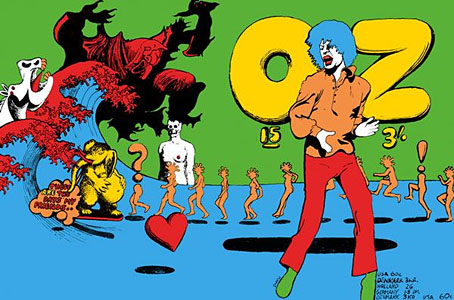
Oz magazine no. 15, October 1968.

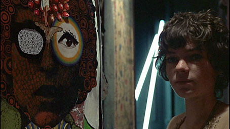
The psychedelic art of Australian artist Martin Sharp has featured here on several occasions. Unlike his British and American contemporaries who maintained a single graphic style, Sharp was a versatile artist whose work could range from loose, often cartoony drawing and painting to very detailed collage designs; he was also as happy as any other artist of the period to plunder art history, as the cover for issue 15 of Oz demonstrates. The Mick Jagger figure from that cover was later reworked as a poster for “Turner’s Purple Orchestra”, one of a number of pieces of Sharp art which can be glimpsed throughout Donald Cammell & Nicolas Roeg’s Performance (1970).

sharp7.jpg

Performance (1970): Michele Breton and a Martin Sharp collage.

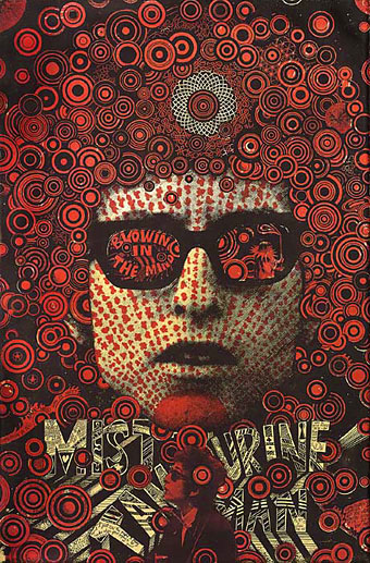
Sharp’s involvement with Oz magazine, and the creation of a handful of endlessly reproduced designs—the Bob Dylan Mr Tambourine Man poster, Jimi Hendrix in a Jackson Pollock explosion, the sleeve art for Cream’s Disraeli Gears—makes his art some of the most visible of the period. People may not necessarily know the name but they’ll recognise the work.

In 2009 Sharp’s Oz colleague Germaine Greer wrote a warm appraisal of the artist and his work. A few more examples follow. There’s a great selection of posters and other art and design here.

The GuardianMartin Sharp, Australian artist who came to symbolise the ’60s | Martin Sharp in pictures

sharp2.jpg

Mister Tambourine Man (1966).

Continue reading “Martin Sharp, 1942–2013”

Fetish photographer Rick Castro

castro.jpg

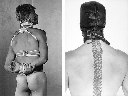
Photographs by Rick Castro.

Presenting another guest post from John Wisniewski who back in May contributed an interview with William E. Jones about gay film director Fred Halsted. The subject this time is Rick Castro, pioneering bondage/S&M photographer, and also the proprietor of the Antebellum Gallery in Los Angeles which bills itself as the only fetish gallery in America. Castro has worked with Joel-Peter Witkin and Bruce LaBruce, and also photographed subjects as diverse as the Dalai Lama and Kenneth Anger, neither of them in bondage, unfortunately. As before, John offers a list of ten questions. Read on to discover why hustlers always used to wear white jeans (I have wondered about this)…

* * *

John Wisniewski: When did you begin photographing?

Rick Castro: 1986…around June…. My first photo was of my longtime friend (and former GF!), Odessa. I was a wardrobe stylist at the time, so I dressed her like Morticia Addams. Very high contrast/high shadowed B&W.

My second photo was of Tony Ward. I cast him for his first “mainstream” photo shoot. Editorial for a now defunct men’s magazine, INSTYLE, (published by porn mag IN TOUCH). We were working for photographer Albert Sanchez at the time. Between takes I’d dressed him up in full leather fantasy—leather hood, harness, gauntlets, codpiece, boots and horsetail!

JW: Whom are some of your influences in photography and art?

RC: I like the dead guys: Brassai, Pierre Moliner, F. Holland Day, Julia Margaret Cameron, Otto Dix, Paul Cadmus, Egon Schiele, Tennessee Williams, Pier Paolo Pasolini, Gilles De Rais.

JW: When did you meet fellow photographer Joel-Peter Witkin?

RC: Also during 1986, I bought Joel’s first book. At the back of the book was a request: “I am looking for people with physical deformations, amputees. Quadriplegics, burn victims, persons into extreme S&M, a woman with three breasts, geeks, pinheads, a woman with severe skin disease that will pose in an evening gown, anyone bearing the wounds of Christ, Christ.”

Later that year the new annex of Book Soup on Sunset Blvd hosted the first LA photo exhibit for Joel. I attended, introduced myself and gave him a stack of photos I had taken of my potential “models.” He called me the next morning. From then I worked with Joel on 13 of his most iconic photographs as a wardrobe stylist, costume designer, location scout, model scout, casting director, photo assistant, art director, make up artist and all around assistant.

Continue reading “Fetish photographer Rick Castro”

Long Live the New Flesh: The Films of David Cronenberg

cronenberg.jpg

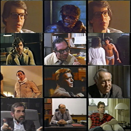
I used to have this documentary on tape but it vanished years ago so it’s good to find it again on YouTube. Long Live the New Flesh: The Films of David Cronenberg was directed by Laurens C. Postma and broadcast on British television in 1987 as a tie-in with the UK release of Cronenberg’s The Fly. The writer was Chris Rodley who subsequently directed some equally good documentaries of his own including the South Bank Show feature about the making of Naked Lunch (now present as an extra on the Naked Lunch DVD), A Very British Psycho about Michael Powell’s Peeping Tom (clips of which can be found in this film), and Donald Cammell: The Ultimate Performance.

Postma’s film captures Cronenberg when he was starting to gain visibility outside the science fiction and horror genres he’d mostly been working in up to this point. Among the interviewees are Martin Scorsese, an early champion, and Stephen King, whose The Dead Zone Cronenberg adapted in 1983. In the critical corner there’s the late film critic Robin Wood who the producers possibly chose on account of his being the voice of dissent in Piers Handling’s 1983 study of Cronenberg’s films The Shape of Rage. Wood isn’t as tiresomely ideological here as he is in Handling’s book (where you can play a drinking game if you count the times he uses the phrase “bourgeois patriarchal capitalism”) but he still seemed to find something reactionary and “unprogressive” (in a political sense) about Cronenberg’s work. Elsewhere there are clips of the films from Shivers on, and I’d forgotten about the comparisons Rodley and Postma make between Cronenberg’s work and Michael Powell’s still astonishing Peeping Tom.

Long Live the New Flesh is 67 minutes long and unfortunately chopped into chunks on the YouTube copy. Watch it here:

Part 1 | part 2 | part 3 | part 4 | part 5 | part 6 | part 7

Petulia film posters

petulia1.jpg

Illustration by Bob Peak.

Further examples of those things you find when you’re searching for something else, these posters for Richard Lester’s Petulia (1968) are a good example of just how differently the same film can be presented by its advertising materials. Petulia (“the uncommon movie”) is a fascinating, unjustly neglected gem, a serious adult drama quite unlike the comedies (or comic dramas) Lester was making before and after. Nicolas Roeg photographed Petulia shortly before embarking on his own directing career, capturing San Francisco just after the Summer of Love in a more documentary fashion than the exploitation films of the period. There are nods to the psychedelic scene with party appearances by Big Brother and the Holding Company, and the Grateful Dead, but the narrative concerns the flipside of hippiedom with a group of middle-class professionals ensnared in adultery and marital failure.

A commonly remarked feature of Petulia is Antony Gibbs’ fragmented editing style which flashes backwards and forwards throughout, even showing events that never happen. The technique is usually taken to be derived from Alain Resnais although Gibbs had earlier edited The Knack…and How to Get It for Lester which is often as fragmented, albeit for a more comic effect. What’s notable about the technique is that Gibbs went on to edit Nicolas Roeg’s first two features, Performance (co-directed with Donald Cammell) and Walkabout, both of which take the fragmentation even further, creating the style which Roeg made his own.

petulia4.jpg

The poster that caught my attention was the marvellous one by Bob Peak who manages to depict the awkward relationship between the two leads—holding hands yet facing away from each other—whilst alluding to the psychedelic backdrop in the details. It’s difficult to tell at a small size but the sheet music design above shows that Peak’s drawing is a complex arrangement of blended faces, the reflected figure of a woman and a pattern of Bridget Riley swirls. If I was still collecting film posters I’d be sorely tempted to buy one of these.

petulia2.jpg

Illustration by Jean Fourastié.

Compared to which this pair of French designs veer off in opposite and unsatisfying directions. Jean Fourastié seems to have been under the impression that the story concerned a San Francisco flower child not a bored housewife, while Jean Mascii’s painting isn’t inaccurate but is more suited to a romance paperback. Big heads were apparently Mascii’s métier even if there were no people in the film.

petulia3.jpg

Illustration by Jean Mascii.

Petulia has been available on DVD for a while now, it’s well worth seeking out. Watch the trailer here.

Previously on { feuilleton }
Lucifer Rising posters
Wild Salomés
Druillet’s vampires
Bob Peak revisited
Alice in Acidland
Salomé posters
Polish posters: Freedom on the Fence
Kaleidoscope: the switched-on thriller
The Robing of The Birds
Franciszek Starowieyski, 1930–2009
Dallamano’s Dorian Gray
Czech film posters
The poster art of Richard Amsel
Bollywood posters
Lussuria, Invidia, Superbia
The poster art of Bob Peak
A premonition of Premonition
Metropolis posters
Film noir posters