The Scarlet Soul: Stories for Dorian Gray

scarlet.jpg

With the running out of the year it’s time to start posting some of the things I’ve been working on for the past few months. This year has been an incredibly busy one with little breathing space between projects. Last month I mentioned not having enough time to put together a decent mix for Halloween; I also haven’t had enough time to prepare a calendar for next year. The latter isn’t a great loss since last year’s effort was a particularly bad seller but I still like doing them when I have the opportunity.

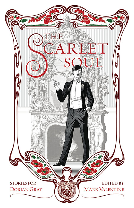
Before I get to one of the big illustration projects, here’s a cover I put together last month for Dublin’s Swan River Press. The theme should be self-evident, and this marks my second entry into Dorian Gray territory. It’s also the second thing that I’ve worked on this year with a connection to Mark Valentine (see this post for details of the first). Swan River publish a range of elegant hardback editions so I’m looking forward to seeing this one in print. As to the artwork, the frame is adapted from a 1900 calendar design by one Oscar Ziemann which I found in an issue of Deutsche Kunst und Dekoration. There’s next to nothing about Herr Ziemann on the web so his design may have been a one-off. The poppies are my own replacement for Ziemann’s floral designs; they relate to the hints that Oscar Wilde gives to Dorian Gray’s opium indulgence, and they’re scarlet flowers, of course.

The Scarlet Soul will be published next month but it’s available for pre-order here. My next work for Swan River Press will be a major edition of William Hope Hodgson’s weird masterwork, The House on the Borderland. More about that later.

Previously on { feuilleton }
Picturing Dorian Gray

The case of the fin de siècle fleuron

artnouveau.jpg

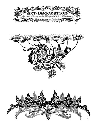
I said yesterday that poppies are a common feature of the fin de siècle magazines for the convenient way they combine long-stemmed flowers—ideal for all those Art Nouveau flourishes—with narcotic connotations that signal Decadence. The spiralling fleuron above is one example that readers of Savoy books may recognise, an occasional company logo which has been in use since the mid-1980s. David Britton chose the design from one of the Dover Pictorial Archive books, Carol Belanger Grafton’s Treasury of Art Nouveau Design and Ornament, and I later made a digital version from this page scan.

heroes.jpg

One of the earliest Savoy uses, a label design for Heroes (1986) by PJ Proby.

Having spent a great deal of time in recent years trawling through Art Nouveau magazines I was sure I was going to run into the original printing of the fleuron eventually. Some of the page decorations in Jugend are very similar but it wasn’t there or in Pan, Deutsche Kunst und Dekoration or The Studio. I don’t have a copy of the Grafton book, and Dave says his copy is lost, so I’ve no idea whether there’s a credit for the source of the designs; not all Dover books credit their source material in any detail. Earlier this week I decided to look in Art et Décoration, a magazine that was the French equivalent of The Studio, since the header at the top of the scanned page implied that the other designs might be from the same magazine. Aside from a couple of copies at the Internet Archive this means looking through the poor-quality scans at Gallica; by a fluke—because they don’t seem to have a complete run of the early issues—the January 1898 edition contained the page below showing the Savoy fleuron, an endpiece for an article devoted to another French art magazine, L’Image.

Continue reading “The case of the fin de siècle fleuron”

Cocorico graphics

graphics01.jpg

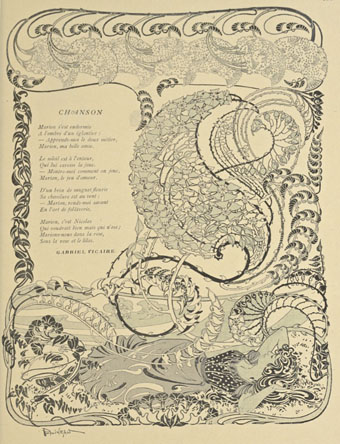
A final visit to Cocorico, the French humour magazine of the fin de siècle. Where graphics are concerned I’ve ignored the cartoons to concentrate on the Art Nouveau decoration which is plentiful in the early issues. The star here is Louis Popineau, an artist I only knew from the excessively florid page above which is reprinted sans poem in one of my design books. Popineau enjoyed foliage running riot in this manner but the magazine also features several of his excellent coloured prints. There’s a lot more of this type of work in the complete run of the magazine which may be found at the Internet Archive.

graphics02.jpg

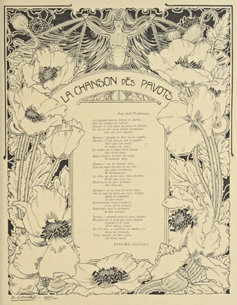
A paean to the poppy by Jérome Doucet illustrated by Adolphe Cossard. Poppies were a very popular plant in the 1890s for obvious naroctic reasons. Cossard made them a feature of his cover for issue 32.

graphics03.jpg

Continue reading “Cocorico graphics”

The art of Fritz Hegenbart, 1864–1943

hegenbart4.jpg

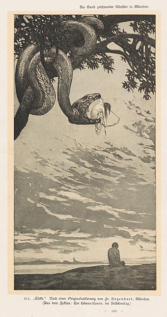
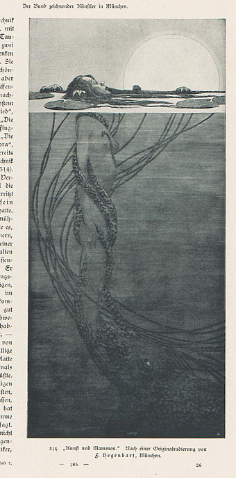
Fritz Hegenbart was an Austrian artist some of whose work has appeared here before in posts about Jugend magazine. Hegenbart provided many illustrations and embellishments for Jugend and other journals circa 1900, the examples here being mostly from a feature in the collected Kunst und Handwerk for 1902/03, a magazine I was rifling through last week. Once you’ve been through Deutsche Kunst und Dekoration and others you find the same contents repeating themselves with slight variations; that’s no surprise when there was only a certain amount of news that any arts magazine could report for a given year.

Hegenbart’s work stands out for conjuring the slightly grotesque allegories I often like to see: The woman aiming an arrow from inside a serpent’s jaws represents Malice, while the woman being dragged under the water by a tentacled monstrosity is Art falling prey to Mammon. An updated version of that picture would have to show Mammon as a bloated and triumphant abomination. Hegenbart seemed to enjoy attaching wings to whatever women he was drawing; further down the page you’ll find a wingless woman being menaced by a particularly dopey-looking dragon.

hegenbart7.jpg

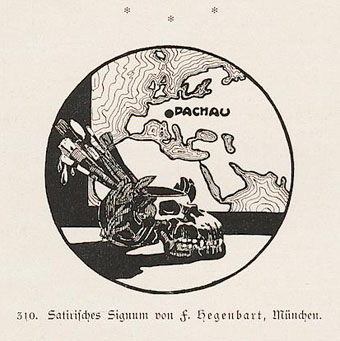
There’s also the curious ink piece below showing the location of the artist’s home in Dachau, Bavaria, and what to our eyes is a supremely inappropriate skull-shaped container for his brushes. The shadow of two world wars always hangs heavily over these magazines (especially in the nationalistic Jugend) but the imagery is seldom as prescient as this.

hegenbart3.jpg

Continue reading “The art of Fritz Hegenbart, 1864–1943”

Julius Klinger’s Sodom

klinger1.jpg

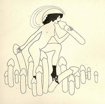
The more I look at the work of Austrian artist Julius Klinger (1876–1942), the more I like what I see. This Pinterest sample shows his versatility, equally at home with detailed illustration, often with a Beardsley-like quality, as he was with more Modernist design. Sodom (1689) (aka The Farce of Sodom, or The Quintessence of Debauchery) is the notorious Restoration drama attributed to John Wilmot, the second Earl of Rochester, which is here illustrated by Klinger for an edition privately published in Leipzig in 1909. The play is one of the most flagrantly outrageous works in the English language, with a cast of characters that includes Bolloxinion, the King of Sodom, Cuntigratia, his Queen, and so on; you can see parts of it performed in The Libertine (2004) with Johnny Depp playing Rochester, and taking the role of Bolloxinion.

Klinger produced 16 illustrations in all. His picture of Salomé gets linked to this series on a number of websites but I’ve seen other sites that list it as a separate piece. Since Salomé isn’t mentioned anywhere in Sodom I’d also be inclined to keep them separate.

klinger2.jpg

klinger3.jpg

klinger4.jpg

Elsewhere on { feuilleton }
The illustrators archive

Previously on { feuilleton }
Deutsche Kunst und Dekoration #21
Julius Klinger’s Salomé