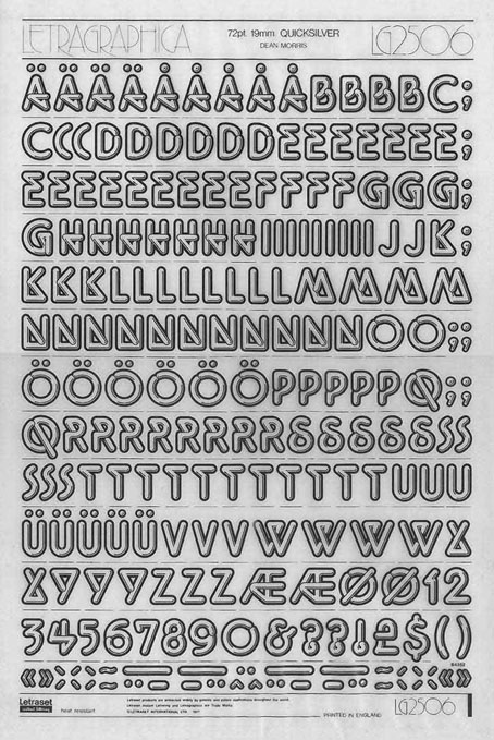
Letraset rub-down sheet, 1977.
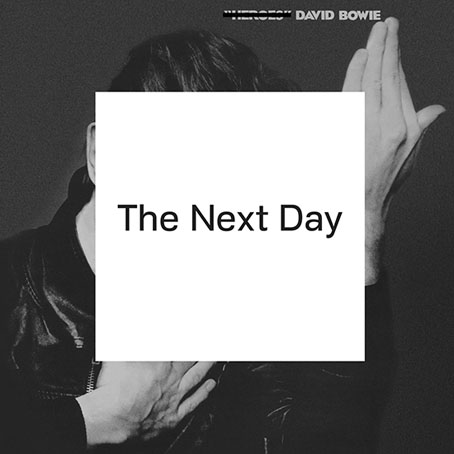
Work-related research this past week had me looking for old Letraset fonts like Quicksilver here, one of the foundry’s many quirky type designs from the 1970s whose novelty inspired brief flushes of popularity before they were replaced by trendier designs. Quicksilver, which first appeared in 1976, has been lodged in my memory since I first saw it in a Letraset catalogue that was one of only two books lurking in a cupboard in the art room at school. (The other was a much-thumbed copy of The World of MC Escher.) The catalogue fascinated me because it revealed that these unusual typefaces could be identified by name: Data 70, Block Up, Pluto, Shatter, etc. I already knew that typefaces had names, of course, thanks to the occasional notes you’d find in paperbacks telling you that the book was set in 11pt Plantin or similar; but in the days before computers made everyone a lot more familiar with typography the typesetting business was a remote and mysterious world. Information about new type designs wasn’t easy to find unless you had access to the latest design magazines or a well-stocked library. The further realisation, that typefaces were designed by individuals who also had names, came later.
Quicksilver was designed by Dean Morris who was only 16 at the time he sent off his design to Letraset:
The name Quicksilver was my second choice, however. Letraset Englishly felt that my first choice, ‘Polished Sausage’, would be ‘rather unpopular in foreign markets’. I designed it as a 16-year-old kid at John Glenn High School in Bay City, Michigan (born in Mercy Hospital 3 months after Madonna), and sent Letraset a xerox of a tight marker sketch of 3″ letters letterspaced with the heavy outlines slightly overlapping as I originally intended. I drew only a skinny S without an alternate, and submitted no punctuation. I knew nothing about submitting typeface artwork and I assumed there’d be, you know, discussion.
But Letraset wanted it, and they must have wanted it REAL FAST (fifties nostalgia and disco were WHITE HOT then, remember), because they sent a letter and contract soon after, and they did the finished art themselves at 5″ high (they can’t have known my age, maybe they had no confidence in my technical skills), starting with the E as did I in the design stage. And what a gorgeous rendering job they did in the pre-Mac days of ruling pens, straight-edges, and compasses (they shunned rapidographs!) — and they hand retouched the curves where they met the straight lines! Letraset sent a 5″ sample E for approval, but I’m sure they had already drawn all the characters. They followed my sketch very closely, designed the punctuation, and suggested an alternate but weird wide S, which I approved, figuring there was probably no other decent way to design it. I don’t know if the thematically wrong heavy-overlap-line on the P came from me or them. (more)
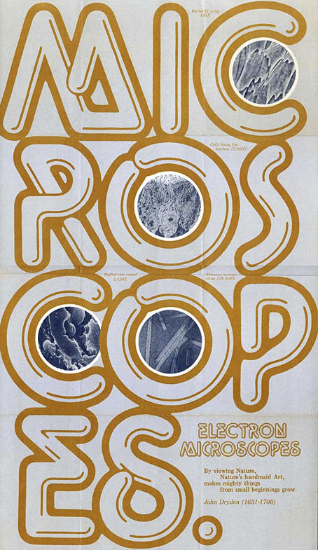
Morris has a collection of Flickr albums which show how popular the design was in the late 70s and early 80s, especially on record sleeves. It’s probably going a little too far to describe this as “the disco font” but it was certainly popular with the disco crowd. The robot book below is one of the few book covers. I expected there to be many others but Morris’s design might have been regarded as too eccentric for use in the publishing world where readabilty is more of an issue.
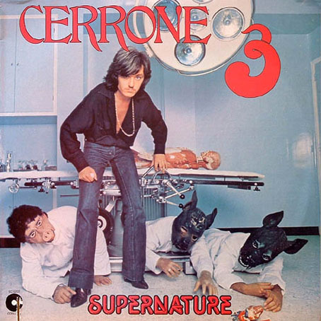
Cerrone 3 (Supernature) (1977) by Cerrone. Silly cover art but Supernature is a great song.
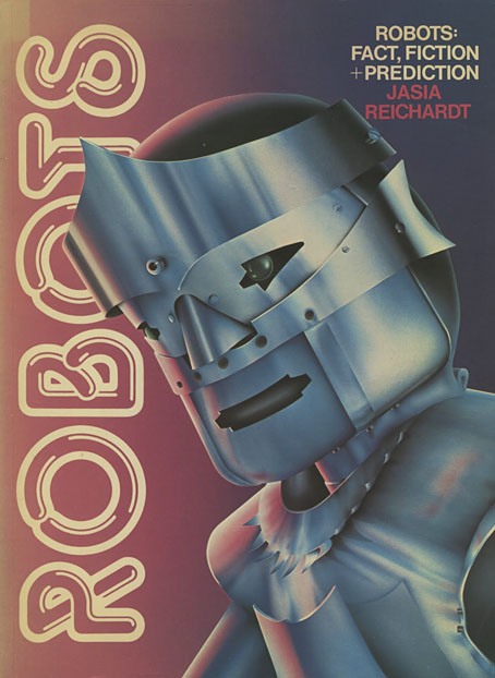
Robots (1978).
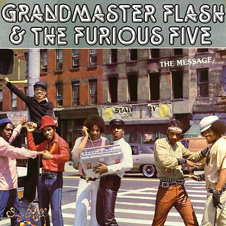
The Message (1982) by Grandmaster Flash And The Furious Five.
Quicksilver also proved distinctive enough but not too weird (like Block Up, for example) to stay around and find further uses years later, often ironically as tends to happen to type designs that become associated with a particular period or idiom. The font’s bold outline is an unusual feature, one that gives it an advantage over similar designs like Letraset’s later Chromium One which doesn’t read so well at a distance. And I like the shape of the letters, the result of Morris’s determination to shape everything with a single shiny bar.

One thing that Quicksilver does share with a handful of its contemporaries from that old Letraset catalogue is a lack of an official digital version. The sample above has been created with Neon Lights, a copy afflicted with poor spacing and inconsistent character sizes. It works if you need something in a hurry but Morris’s design deserves better treatment. As to my use of the font that prompted the Letraset search, this is subject to the usual embargoes so you’ll have to wait a while before seeing the results.
Previously on { feuilleton }
• Typefaces of the occult revival

