Robot Artists and Black Swans

robotartists.jpg

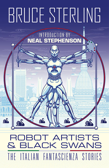
Four years ago I designed and illustrated a book for Tachyon written by Bruce Sterling, Pirate Utopia. Robot Artists and Black Swans is a kind of sequel, being the work of the same author for the same publisher, and with a similar geographical focus on southern Europe. The new book differs from the earlier one by being a collection of stories rather than a single piece, many of which are set in or near the city of Turin where Sterling and his wife, Jasmina Tesanovic, spend much of their time. Sterling has been living in Europe for many years, long enough to have cultivated an alter-ego, Bruno Argento, an Italian science-fiction writer who is offered as the real author of the stories in Robot Artists and Black Swans.

Pirate Utopia was an easy book to design because of the Futurist theme which I illustrated by adapting graphics by artist and designer Fortunato Depero. For the cover of the new volume I considered trying something similar with another Italian artist/designer, Franco Grignani (1980–1999). In addition to having studied in Turin, Grignani was commissioned by David Pelham to create cover art for a handful of Penguin science fiction titles in the late 1960s. Much of Grignani’s artwork is heavily indebted to the Op Art style popularised by Bridget Riley and Victor Vasarely, especially the early Riley formula of dazzling arrangements of parallel lines, a formula he made his own after Riley’s work evolved in other directions. Despite these favourable qualities, Grignani’s art proved too abstract for my purposes, and for Tachyon’s who wanted something more illustrative, so I ended up co-opting a very different Italian artist/designer, Leonardo da Vinci. The figure of Da Vinci’s Vitruvian Man has been parodied and pastiched many times so this isn’t remotely original (I’ve also used the original drawing on a pastiche book cover I designed for the Lambshead Disease Guide), but making the figure a robot was a convenient way of combining the title with Italian history. One of the stories in the collection, Pilgrims of the Round World, concerns the inhabitants of Turin during the Renaissance years, and mentions Leonardo (or “the Vinci boy”) several times, so the figure does have some actual relevance beyond being recognisably Italian. The background is, of course, the city of Turin given a slightly futuristic tweak, although it’s more Turinesque than a match for the place itself.

As usual, I’ll save discussion of the book’s interior until after publication which will be in March, 2021. Watch this spacetime.

Previously on { feuilleton }
Pirate Utopia by Bruce Sterling
Futurismo!

Jean Alessandrini book covers

alessandrini05.jpg

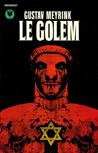
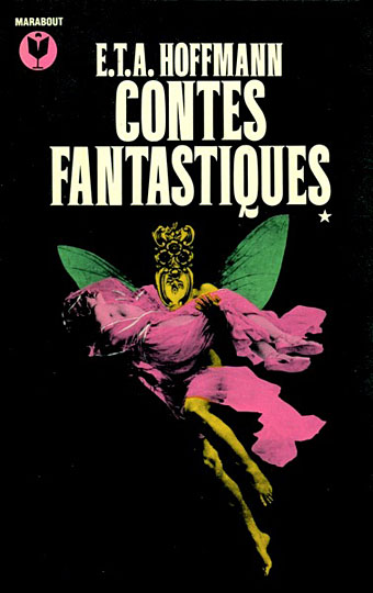
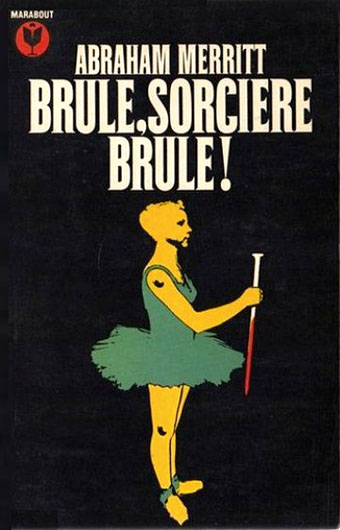
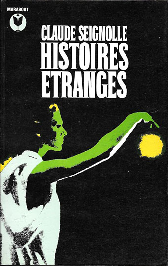
It’s that Golem again, depicted in 1979 by Jean Alessandrini. The publisher was Bibliothèque Marabout, a French fantasy/horror imprint active from the 1960s to the 1990s that was the genre division of Éditions Marabout, itself a division of publishing behemoth Hachette. Bibliothèque Marabout published a wide range of titles, with many familiar names in addition to writers such as Jean Ray, Thomas Owen and Paul Féval whose work receives little attention in the Anglophone sphere. By 1970, many of these covers had a uniform appearance, predominantly painted illustrations on black backgrounds with the titles set in Roberta, one of the Art Nouveau-styled typefaces of the occult revival. All the Alessandrini covers date from the late 70s and early 80s, and show an evolution of the imprint’s style, with the same black livery but a different typeface that I can’t identify (Coliseum is the closest digital equivalent), together with artwork that’s more of a design rather than an illustration of the book’s contents.

alessandrini02.jpg

Jean Alessandrini is a French artist, designer, typographer and author, also the creator of Typomanie, a book of type designs that I’d like to see. He provided cover drawings in the late 1960s for French SF magazine, Fiction, and later worked for the popular comics magazine Pilote, but his Marabout covers look like collage works, with the grainy appearance of photocopied photos that Neville Brody also favoured for his album cover designs. The combination of a simple symbolic graphic in bright colours on a black background is very reminiscent of David Pelham’s designs for Penguin, some of which also used collage elements. French genre titles seldom seem to follow design trends exterior to France so if there was a Penguin influence at work it’s an unusual case.

Jean Alessandrini has a small but well-designed website here.

alessandrini01.jpg

alessandrini03.jpg

Continue reading “Jean Alessandrini book covers”

Weekend links 413

bester.jpg

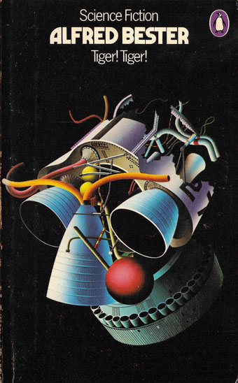
Cover art and design by David Pelham, 1974. The author’s name is set in Marvin (see below).

• Revelation of the week is a lengthy, career-spanning interview with Igor Wakhévitch, the French composer whose extraordinary run of albums from the 1970s are cult items in these parts. (Previously) Wakhévitch isn’t exactly reclusive but he lives in India, and hasn’t recorded anything since the 1980s, so in recent years he wasn’t visible or even known much at all outside France. The release in 1998 of a CD collection, Donc…, and a handful of vinyl reissues, brought him out of obscurity, although all the reissues to date have been in limited quantities. Work of this quality really warrants a wider release.

The Sky Torn Apart is a new album by Paul Schütze, his first for several years. Very good it is too, 56 minutes of growling and glittering atmospherics that could equally suit the enervating heights of summer (as in Wendy Carlos’s drone piece from Sonic Seasonings) as the depths of winter, the inspiration being the apocalyptic cycles of Norse mythology.

• At Lambda Literary: Cathy Camper talks to cartoonist Justin Hall about his planned film, No Straight Lines, about the history of queer comics. There’s a Kickstarter for the project, and more background detail at QueerClick (NSFW).

• Introducing Marvin Visions, a digital revival of Marvin, a photoset typeface first launched in 1969, and very popular during the 1970s on science-fiction cover designs. Marvin Visions is free for personal use.

• The second number of the relaunched Wyrd Daze—”The multimedia zine of speculative fiction + extra-ordinary music, art & writing”—has arrived.

• At New Noise: Dylan Carlson (again) talking about the influences on his solo album, Conquistador.

• Video Drone: Russell Cuzner talks to Rose Kallal about her audio-visual concerts.

• Mix of the week: a Dark Souls-inspired drone mix from Justin C. Meyers.

• RIP Glenn Branca

The Ascension (1981) by Glenn Branca | Ascension (1992) by O Yuki Conjugate | Ascension (2014) by The Bug

Weekend links 349

burgess.jpg

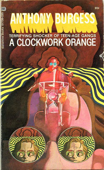
• Before Stanley Kubrick fixed an image of Alex and his droogs in the popular imagination, artists could get away with playing on the threat of biker gangs as Wilson McLean does in this vaguely psychedelic cover from 1969. (McLean’s interpretation may possibly derive from a 1965 edition.) LibraryThing has a collection of Clockwork Orange covers from around the world which run the gamut of cogs, orange hues and variations on David Pelham’s famous Penguin design from 1972. Meanwhile, AL Kennedy celebrates 100 years of Anthony Burgess by examining the writer’s career as a whole, although the web feature still manages to get a photo of Malcolm McDowell in there.

• “Even bad books can change lives,” says Phil Baker reviewing The Outsider by Colin Wilson and Beyond the Robot, a Wilson biography by Gary Lachman. I wouldn’t call The Outsider a bad book but Wilson’s more wayward opinions (and later works) are best treated with scepticism.

• “Murtaugh refers to his subject’s ‘pervasive sense of doom’ and Welch himself speaks of ‘the extraordinary sadness of everything.'” David Pratt reviewing Good Night, Beloved Comrade: The Letters of Denton Welch to Eric Oliver, edited by Daniel J. Murtaugh.

• At The Quietus this week: Tinariwen bassist Eyadou Ag Leche is interviewed by Richie Troughton, Jane Weaver unveils a new song from her forthcoming album, Modern Kosmology, and Danny Riley explores the strange world of Ben Chasny.

• “A micro-history of cultural gatekeeping: once told by the censors what we may read, then by critics what we should, we are now told merely what we can read.” Ben Roth writing against the use of “readability” as a literary value.

• Yayoi Kusama’s amazing infinity rooms are at the Hirshhorn Museum and Sculpture Garden, Washington DC, until May. For the rest of us, Peter Murphy’s panoramic photo is still online.

• More music: my friends Watch Repair have become visible enough to be interviewed by an Argentinian website. The group’s Bandcamp page recently made three new releases available.

• Yet more music: They Walk Among Us, a new song and video by Barry Adamson, and Anymore, a new song and video by Goldfrapp.

• Earth and The Bug announce Concrete Desert, a collaborative album inspired by Los Angeles and the fiction of JG Ballard.

• Bad Books for Bad People: Episode 7: The Incal – Epic French Space-Opera Comics.

• Mixes of the week: FACT Mix 589 by Aisha Devi, and Secret Thirteen Mix 212 by Qual.

Eduardo Paolozzi‘s forays into fashion and furnishings.

Cooking with Vincent [Price]

Moroccan Tape Stash

• Tin Toy Clockwork Train (1986) by The Dukes Of Stratosphear | Clock (1995) by Node | Clockwork Horoscope (2009) by Belbury Poly

Science Fiction Monthly

sfm01.jpg

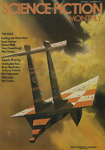
Art by Chris Foss.

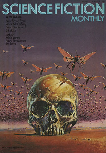
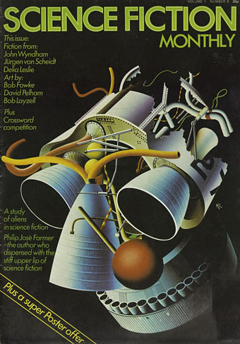
Recent uploads at the Internet Archive include an incomplete run of British magazine Science Fiction Monthly, a large-format collection of SF art and original fiction that ran for 28 issues from 1974 to 1976. Science Fiction Monthly was significant for my generation since it was the only regular British SF magazine available in the mid-70s. (Michael Moorcock and co. were still producing issues of New Worlds but the only ones I saw were the quarterly paperbacks). Science Fiction Monthly was published by New English Library which made it seem at first glance like a promotional tool for the publisher, even more so when most of the cover art and almost all the ads were for NEL titles. The early issues lean heavily on NEL content but later issues had a broader reach and contained all the features you’d expect from an SF magazine of the period: news columns, film reviews, interviews, a bad comic strip, and so on. The thing I liked most at the time was the reproduction of book cover art at a large size, with full-colour paintings filling the broadsheet pages or spreads, all printed with the intention of being removed and fixed to bedroom walls. The early issues were also unique in giving regular attention to the artists, running interviews and even showing photographs of the people responsible for all of that familiar paperback art. I didn’t see all of the early issues but the interviews were later collected in book form by NEL in Visions of the Future (Janet Sacks ed., 1976), a volume that made a considerable impression since it showed me that SF and fantasy illustration was a viable career rather than the product of remote and mysterious talents.

sfm02.jpg

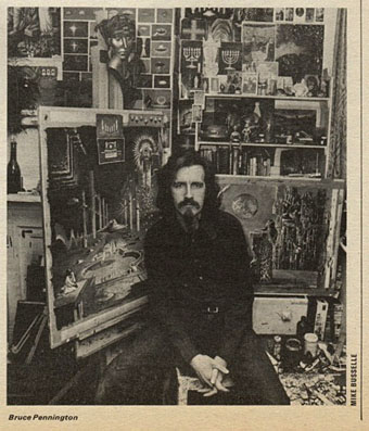
Artist Bruce Pennington (see this post).

A few page samples follow. It’s a shame the collection at the Internet Archive is incomplete since the magazine’s contents were interesting to the end. The only copy I own today is the one for October 1975 (not currently available online) which is almost a JG Ballard special, with a feature on the writer, an interview about his new novel, High-Rise, and an original piece of fiction.

sfm03.jpg

Art by Bruce Pennington.

sfm04.jpg

Art by David Pelham.

Continue reading “Science Fiction Monthly”