The Sonic Assassins

assassins1.jpg

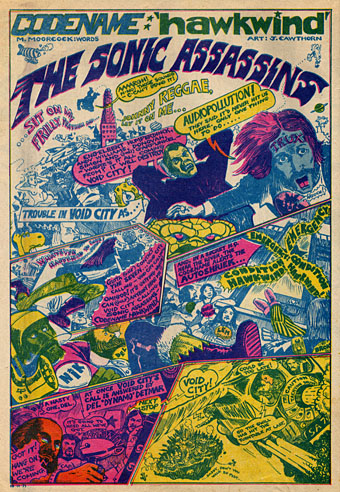
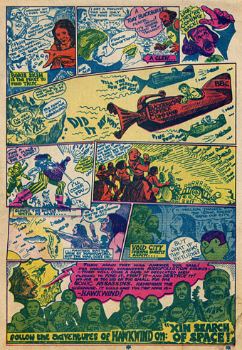
Searching through discs for scans of Jim Cawthorn art turned up this comic strip curio from a November 29th, 1971 issue of UK underground magazine Frendz. Cawthorn and writer Michael Moorcock present rock band Hawkwind as musical superheroes and although this is done largely as a promotional piece for that year’s new album, In Search of Space, the Sonic Assassins tag was one which stuck, becoming almost a secondary name for the band in later years. The name Void City also recurred later as the name of a track on the Choose Your Masques album. It may have been around this time that Cawthorn painted special T-shirt designs for Hawkwind; up to 1980 Dave Brock was still wearing his Baron Meliadus shirt on stage.

assassins2.jpg

Previously on { feuilleton }
Jim Cawthorn, 1929–2008
Design as virus #7: eyes and triangles
Barney Bubbles: artist and designer
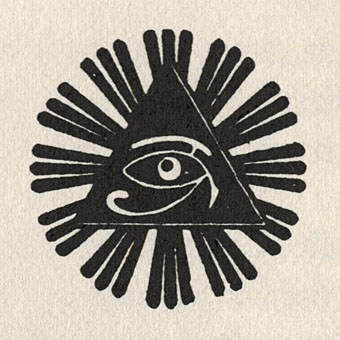
Design as virus 7: eyes and triangles

eye0.jpg

Continuing this occasional series. The above motif is the Golden Dawn’s Wedjat or Eye of Horus emblem as reproduced in the hardback edition of The Confessions of Aleister Crowley, an “autohagiography”. Crowley was under discussion here a few days ago and the eye in a triangle symbol can also be seen on the sleeve of the single featured in that posting, forming a part of the seal of the Ordo Templi Orientis, the occult order which Crowley joined in 1910. Crowley’s use of the eye in a triangle caught the attention of writer Robert Anton Wilson and the first part of his Illuminatus! trilogy (written with Robert Shea) is titled The Eye in the Pyramid. That latter symbol appears on the reverse of the American dollar bill, of course, and some of the conspiracy theories surrounding that usage are explored in the novel. Wilson went on to make the eye in a triangle something of a personal symbol and his obsessive use of the motif caught my attention in turn when I began reading his books.

All of which leads us to Hawkwind and a person whose name keeps turning up on these pages, designer Barney Bubbles.

eye1.jpg

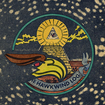
Hawklog cover (detail) by Barney Bubbles.

The booklet which BB designed for Hawkwind’s second album, In Search of Space (1971), featured a version of the dollar bill symbol on its cover. This is the only eye in a triangle design I’ve seen among Barney Bubbles’ work although he was so prolific there may well be others. When I began producing my own significantly inferior Hawkwind graphics in the late Seventies I incorporated eyes in triangles partly as a way of avoiding having to draw hawks all the time but mainly because of Robert Anton Wilson. BB had already established a precedent and it so happens that the eye in the Golden Dawn/Crowley version is the eye of a hawk-headed Egyptian god.

Continue reading “Design as virus 7: eyes and triangles”

New things for July

motorway_city_sm.jpg

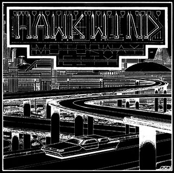
Motorway City by Hawkwind, Flicknife Records single (1983).

This month’s issue of Record Collector magazine has a feature about Hawkwind which featured my Motorway City sleeve among its illustrations. It was odd seeing this again, being a single it doesn’t turn up so often and it has the distinction of being one of the oldest of my works in print. Although the single was released in 1983, the drawing was done in 1980 (I was 18 at the time) and it ended up with Dave Brock somehow.

The A-side is taken from the Zones album, which sports one of my more successful cover illustrations for the band, and the song is a Ballardian eulogy to driving on motorways at night. Despite their reputation for being a bunch of spaced-out hippies, Hawkwind were frequently drawn to the harder side of things (Lemmy used to shout “Die! Die!” at their tripping audience and was proud of freaking people out), and this song isn’t even science fiction, despite my flat futuristic cityscape in the background. Before he finished with the band for good, singer Robert Calvert wrote two songs based on JG Ballard books, High Rise and the punk- and Crash-derived thrash piece Death Trap, both on the PXR5 album from 1979. Motorway City was written around the same time and it’s a shame it didn’t have Death Trap on the B-side instead of yet another version of Master of the Universe. My drawing was done as black on white but the record company smartly (for once) reversed out the design which I always felt made it look a lot better, as well as fitting more with the night-driving theme.

Also this month, I’m in the process of reworking the website a bit which means making more prints of artwork available. I’ve started with some of the Lovecraft pictures, which is always the most popular stuff but I’ll gradually be working through everything and setting up PayPal facilities for other items. Many pictures and designs can already be had as prints at CafePress but that system is best for t-shirts and other goods, it lacks the personal touch which people often want from a signed print.

Previously on { feuilleton }
Hawkwind: They’re still feeling mean
Barney Bubbles: artist and designer