Rock shirts

shirt1.jpg

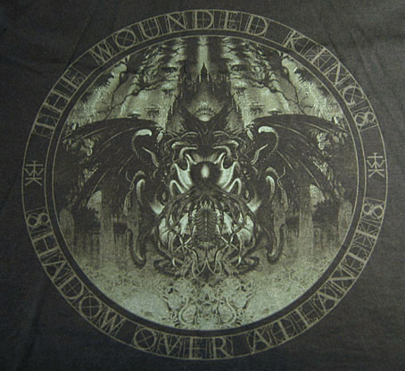
Arriving in the post at the end of last week was this T-shirt for British Doom band The Wounded Kings. The Shadow Over Atlantis (2010) was the band’s second album, and they asked permission a while ago to use my Cthulhuesque De Profundis piece on this limited edition shirt. Permission was granted happily enough, my only concern was that the fine detail and dark tones might not reproduce well on black fabric. The printing is remarkably good, however, and the circular design and type layout works very well. The shirts are on sale here.
shirt2.jpg

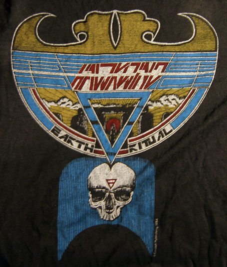
All of which reminded me that I have a couple of shirts from the Hawkwind era in the 1980s. I’ve not aired these designs before, mainly because the Earth Ritual design is one of my many pieces of Hawk-art that I find amateurish. I used to put considerable effort into the cover designs (some of them, anyway; a few were pieces of art sent to Dave Brock as samples that were later used as official covers); but much of the art I produced for the tour programs and merchandise was done in haste, and should have been a lot better considering it was being used for costly souvenirs.

Earth Ritual was the title of an EP released in 1984 that was notable for having Lemmy as guest bassist, his first appearance on a Hawkwind record after being sacked from the band in 1975. I did the cover for that one but I don’t like it very much. The 1984 tour was named after the EP, hence the shirt, although the show was nothing remotely like the elaborate Space Ritual concept. The triangle with a bar on the skull is the alchemical symbol for Earth, a detail the band used in their stage set. I’ve never liked that skull which is very badly drawn, I’d have been better off using a photocopy of the skull on this drawing from the same year. The design was drawn in black ink on white paper; I had no say in the colouring which was done by the merchandise company. From the same drawing they also made small enamel badges (where the skull looks even worse!), and a sew-on patch which looks much better since they dispensed with the skull.
shirt3.jpg

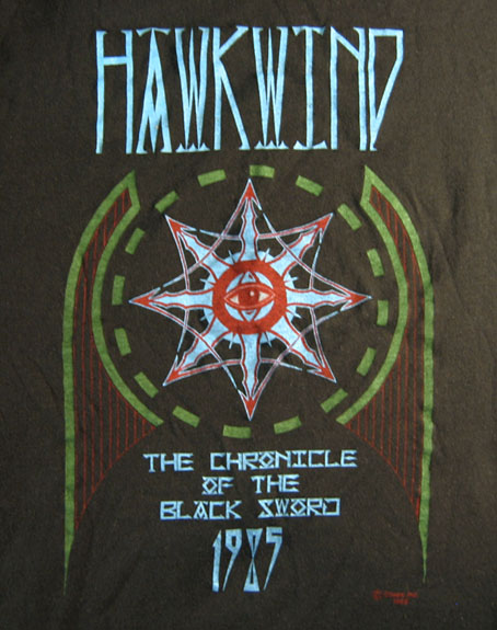
This was the shirt design for the 1985 tour, one of the final designs for the Chronicle of the Black Sword project, and one of the very last pieces I did for Hawkwind. The design of this one is a little more successful although once again the colours weren’t my choice.

These aren’t the only shirts I’ve done for the music world, in addition to other occasional work for metal bands I produced many exclusive designs for Cradle of Filth from 2001–2005 but they never sent me any of those. To return to De Profundis, I ought to note that the artwork is available as a print from CafePress.

Previously on { feuilleton }
The Cosmic Grill
Void City
Hawk things
The Sonic Assassins
New things for July
Barney Bubbles: artist and designer
The Cosmic Grill

hotmg1.jpg

Design and illustration by Barney Bubbles.

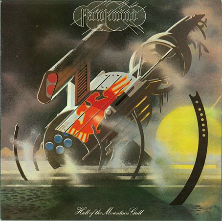
The past week’s music listening has alternated between the back catalogue of Seattle band, Earth (who I recommend highly), and the early recordings of my erstwhile employers, Hawkwind. The latter were reissued recently in a 10-CD box, This Is Your Captain Speaking…Your Captain Is Dead (The Albums And Singles 1970–1974) which I also recommend, it’s very good value, and packages the albums in those facsimile card sleeves that now seem de rigueur for album reissues. A swathe of my rare Hawkwind vinyl got sold off circa 1990, and I’ve never replaced any of the albums or singles so this was a good opportunity to catch up. If you like this period of the band there’s the added bonus of the complete Greasy Truckers concert from the Roundhouse in 1972, a ramshackle performance that nonetheless sounds pristine (my Greasy Truckers vinyl—which I do still own—was ruined by a previous owner with a spillage of tea on the Hawkwind side); there’s also the entirety of the 1999 Party concert from Chicago which I’d not heard before.

hotmg2.jpg

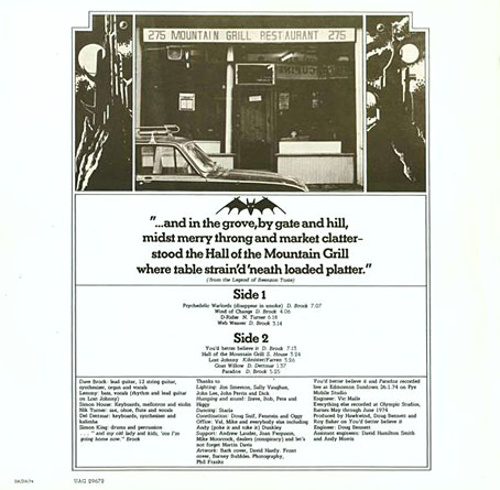
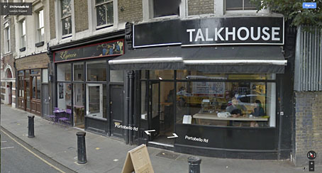
Listening again to Hall Of The Mountain Grill (1974) had me thinking about the origin of the album’s title. Hawkwind never took themselves as seriously as many of their contemporaries, but naming an album of ostensible space rock after a very mundane café in the Portobello Road was one of their more eccentric moments. The humour is compounded by Barney Bubbles’ cover design which for the title uses the kind of typeface (Palace Script) that you see on menus; on the inner sleeve there’s a photo of the fabled restaurant flanked by a pair of Barney’s futuristic towers. The verse beneath the photo (“from the Legend of Beenzon Toste”) refers to nearby Ladbroke Grove, and, of course, to Notting Hill Gate which in 1974 was still a haven for counterculture freaks, the very antithesis of that film. The verse was probably the work of Robert Calvert who explained the attraction of the restaurant in Pete Frame’s Hawkwind family tree:

The Mountain Grill was a working man’s café in Portobello Road—frequented by all the dross and dregs of humanity. Dave Brock always used to go and eat there—which is how I first met him…because I used to eat there too, when I worked on Frendz magazine. It was a kind of Left Bank café/meeting place for Notting Hill longhairs—a true artists’ hangout…but it never became chic, even though Marc Bolan, David Bowie and people like that often went there to eat lunch.

portobello.jpg

Photos on Flickr show how the place looked in 1977 when the sign from the album sleeve was still intact, and also in 2003 shortly before the restaurant closed down. The premises are a very different kind of eaterie today, remodelled and upmarket as befits a gentrified area.

Previously on { feuilleton }
Void City
Hawk things
The Sonic Assassins
New things for July
Barney Bubbles: artist and designer
Lyrical Substance Deliberated

beatles.jpg

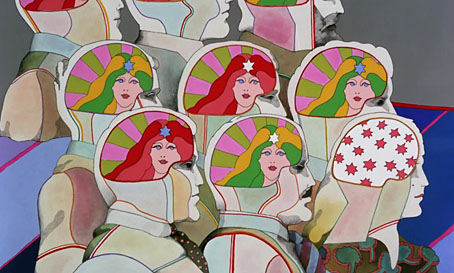
Lucy In The Sky With Diamonds from Yellow Submarine (1968).

The advent of spring invariably gets me listening to favourite psychedelic songs, and this year has been no exception. Earlier this week I was idly wondering how many songs there are that follow the Beatles’ lead in telegraphing their drug metaphors by using the initials L-S-D in their titles. Wikipedia’s page for Lucy In The Sky With Diamonds (1967) relates John Lennon’s oft-repeated claim that the initialism in the title was a coincidence, and the song itself is really a bit of Lewis Carroll-like whimsy. This might be credible if works of art only ever carried one meaning but they don’t, of course, and the song is both a piece of Lewis Carroll-like whimsy as well as being a pretty obvious paean to the drug experience: “Climb in the back with your head in the clouds / And you’re gone”. Jefferson Airplane’s White Rabbit (1967) was similarly ambivalent with mushrooms/pills replacing acid.

Among the many things birthed by the enormous success of the Sgt Pepper album, a small flurry of songs or instrumentals have imitated Lennon’s initialism for their titles. The ones that came immediately to mind are detailed below, and they make a curious group. If anyone knows of any others—there must be others…—then please leave a comment.

hendrix.jpg

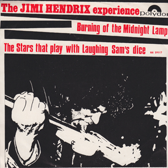
Burning Of The Midnight Lamp/The Stars That Play With Laughing Sam’s Dice (Aug, 1967).

The Jimi Hendrix Experience’s B-side not only alludes to LSD but also to STP. The song itself doesn’t go very far before collapsing into freakout mode.

trip.jpg

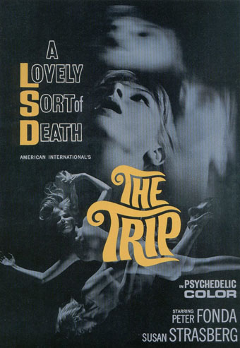
The Trip (1967).

Not a song but included here for that “Lovely Sort of Death” tag. Written by Jack Nicholson! With Dennis Hopper as the acid dealer! See the trailer here, then watch the whole film here.

power.jpg

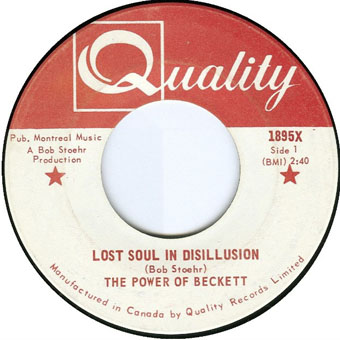
Lost Soul In Disillusion (November, 1967).

Hard to imagine anyone in London would have heard this in 1967. The Power of Beckett were a Montreal garage group who only released two singles. Lost Soul In Disillusion turned up years later on compilation albums.

Continue reading “Lyrical Substance Deliberated”

Void City

hawkwind.jpg

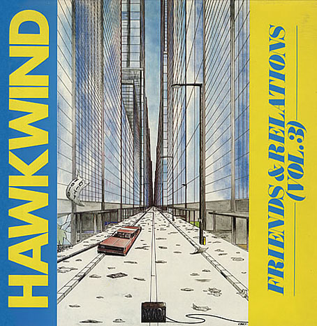
Friends & Relations Vol. 3 (1985) by Hawkwind.

Unless you assiduously collect everything you’ve ever worked on—which I don’t—you occasionally have to rely on the web to remind you of something you created years ago. This Hawkwind album is a good example, being one of the last releases by the band to use a piece of my artwork. (And I’ll quickly note that the accompanying type design was nothing to do with me; my design suggestions were always ignored, hence a growing frustration at that time with album cover work.) The album itself was the third in a series of odds and ends compilations gathering stray tracks by, yes, friends and relations of Mr Brock and co. Subsequent CD reissues used different packaging so the original vinyl is the only place you’ll see this illustration.

The reason I don’t have a copy is that the record label never sent me anything so unless Dave Brock put something in the post I had to buy them myself. (This happens more often than you’d expect.) I evidently didn’t think this one was worth it even though I much prefer the artwork to many of the earlier things of mine that were used. The drawing was a couple of years old, being inspired by the track Void City on the Choose Your Masques album from 1982. Void City is an atypical piece of electronica which I liked for its resemblance to some of the higher level synth pop and industrial music that was around in the early 1980s. 1982 to ’84 was the height of my JG Ballard obsession so Ballard is also a slight influence here. I had in mind his 1981 novel Hello America, which takes place in a post-apocalypse United States. And there’s also a trace influence from one of my early pieces of writing, a mercifully unpublished splurge of intense prose influenced by the New Worlds school of speculative fiction in which someone wanders around a vast and almost completely depopulated city. Looking at this drawing now it seems emblematic of my loss of interest in doing any kind of science fiction art; it also no longer seems futuristic. I produced my last album cover for Hawkind, The Chronicle of the Black Sword, in 1985; in January 1986 I started adapting HP Lovecraft’s The Haunter of the Dark. This took me out of the public eye for a few years but it was a more rewarding place to be for many other reasons.

Elsewhere on { feuilleton }
The album covers archive

Previously on { feuilleton }
Hawk things
The Sonic Assassins
New things for July

Hawk things

hawkmask1.jpg

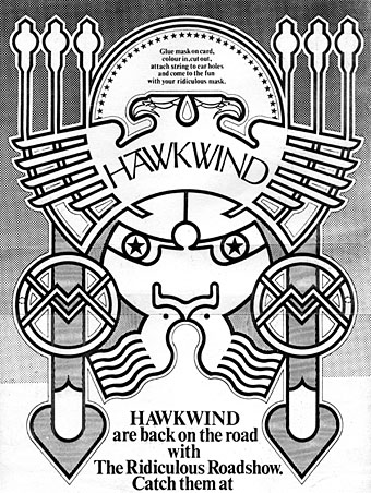
The Barney Bubbles revival continues with news of Space Ritual 09, a concert dedicated to BB by ex-Hawkwind members at the Roundhouse, London on March 8th. The headline band is a new version of Hawklords, notably sans Dave Brock who controls the Hawkwind name and hasn’t been too happy recently with Nik Turner’s revisionist activities. Quarrels aside it’s good to see them honouring Barney’s memory and the Roundhouse is the place to do it, being the venue where Hawkwind played a very stoned set in 1972 as part of the Greasy Truckers concert.

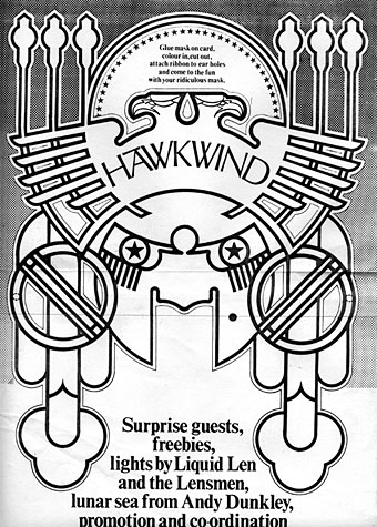
All of which had me searching in vain for a double-page ad from the NME for Hawkwind’s Urban Guerilla single; you can see the ad in a smaller vertical version on the original Barney Bubbles post. I was hoping to find the full thing and scan it for display here but it seems to have gone astray for the time being. As it was the search turned up these photocopies of some later Bubbles Hawkwind ads created for the band’s UK tour of winter 1973/74. A pair of typically meticulous ink and Letratone renderings and also another example of what you might call Barney’s interactive design since these instruct the reader to glue the masks to card, colour them in then cut them out and wear them to the gig. David Wills has featured some other examples along these lines, including this cut-out doll birthday card. Did anyone ever try wearing these masks? And if so, is there photo evidence?

hawkmask2.jpg

Previously on { feuilleton }
The Sonic Assassins
Reasons To Be Cheerful, part 2
Barney Bubbles: artist and designer