Berni Wrightson’s Frankenstein

frankenstein1.jpg

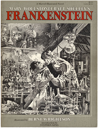
A recent conversation with Evan J Peterson touched on the subject of Mary Shelley’s Frankenstein. Evan is currently working on something based on the novel and—in the interests of disclosure—he wrote a very flattering piece about these pages recently. In addition to this, Peter Ackroyd’s latest book works his familiar intertextual games with the same story, placing the monster creator in London where he meets various significant literary types. Andrew Motion reviewed the latter this week and wasn’t impressed.
frankenstein2.jpg

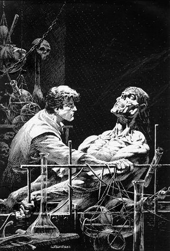
Which preamble brings us to Berni Wrightson’s treatment of the story and a work which was a major inspiration for my HP Lovecraft comics and illustrations. Wrightson’s illustrated edition of Shelley’s complete novel was published in 1983 with an introduction by Stephen King. I’d admired Wrightson’s technique for years but wasn’t always impressed by his subject matter which tended to revolve around the stock selection of favourite American horror characters—vampires, werewolves, zombies and so on—while much of his early art was indebted to the EC horror comics which never interested me at all. Jokey horror has always seemed to me a debased and neutered horror, horror-lite, and yes, that includes plush Cthulhus and the rest of that tat.
frankenstein3.jpg

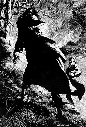
So the immediate attraction of the Frankenstein book was seeing Wrightson take the story back to its origins and treat it seriously. Frankenstein—creator, monster and myth—has been subject to as much degradation as Dracula over the past century which made Wrightson’s approach very welcome. Crucially, it also gave me the key to interpreting Lovecraft visually. It was very evident that his drawings owed a debt to a favourite illustrator of mine, Gustave Doré; two of the pieces were almost straight copies of Doré drawings from The Rime of the Ancient Mariner. In terms of overt influence, Wrightson’s book is dedicated to the great Roy G Krenkel, one of the finest fantasy illustrators of the early 20th century. I wasn’t aware of it at the time but Wrightson’s style here also owes much to American illustrator Franklin Booth (1874–1948), one of Krenkel’s own influences. If the monster in his drawings had a touch of the lumbering EC zombie about its features that was allowable given the other influences at work, and besides, his compositions are perfect. Once I started work on my Lovecraft drawings I quickly found an approach that suited my own obsessions with fine line and detail. But it was Wrightson’s example which pointed the way.

The only problem discussing this is that the copies available on various sites, including Wrightson’s own gallery pages, don’t do the drawings much justice at all. (There’s a large copy of one picture here.) Where the more detailed pieces are concerned you’ll have to try and find a copy of the book. This year is the 25th anniversary of the book’s publication so Dark Horse Comics will be publishing a hard cover edition in October 2008. In addition, Darkwoods Press have announced an “ultimate edition” which will reprint all the artwork (some drawings weren’t used) with quality reproduction. No further information about that, however, and given that they’ve having to source all of the original drawings it may be a while before it appears.

Elsewhere on { feuilleton }
The illustrators archive

Previously on { feuilleton }
Berni Wrightson in The Mist
The monstrous tome
Franklin Booth’s Flying Islands
The faces of Parsifal

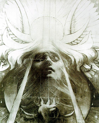
parsifal.jpg

Parsifal by Jean Delville (1890).

Continuing the occasional series of posts examining the evolution of a particular design or image, this one begins with a mystical charcoal drawing by Belgian Symbolist, Jean Delville (1867–1953), our object of concern being that entranced or dreaming face.

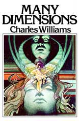
lamb.jpgMy first encounter with Delville’s image wasn’t via the original but came with this Seventies’ version produced for a Charles Williams paperback cover by illustrator Jim Lamb. (And this copy is the only one I can find, reused on a recent audiobook of Williams’ novel. If anyone has a link to a larger copy of the paperback cover then please post it in the comments.) Yes, this is tenuous but when I eventually got to see Delville’s picture it made me think immediately of Lamb’s illustration. Many Dimensions is one of my favourite books by Williams and unusually for him it deals with Islamic rather than Christian mysticism; in that case if Lamb was borrowing from Parsifal then it’s a case of the right image for the wrong book.

Jim Lamb is another illustrator from this period who now works mainly as a landscape artist.

Continue reading “The faces of Parsifal”

New things for August

cyaegha.jpg

Arriving in the post today was Steps of Descent, the new CD from American band Cyaegha featuring my design and illustration. The name Cyäegha (sic) belongs originally to a Cthulhu Mythos entity invented by Eddie C Bertin, author of The Whispering Horror, my favourite story from the Pan Book of Horror anthologies of the Seventies. The cover illustration is based on a scene from HP Lovecraft’s The Dream Quest of Unknown Kadath and the cover and inner pages feature some photographic material from one of my Paris trips. I was very pleased with the way this turned out and I believe the band are too. Steps of Descent is officially released by Canonical Hours on the 8th of August.

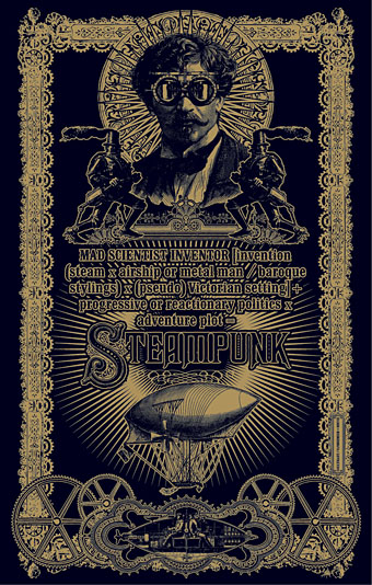
steampunk.jpg

Another recent piece of work is this Steampunk design suggested by writer Jeff VanderMeer who wanted a suitable layout for his semi-serious Steampunk formula. Jeff and wife Ann edited the recent Steampunk anthology from Tachyon so he knows whereof he speaks. This was going to be a T-shirt design but it seems now it may have a different outlet; more about that if and when it happens. The growing popularity of Steampunk as a sub-culture has raised some hackles recently but I like it even though I’ve not read many of the latest literary contributions. Anything which puts more brass, dirigibles and florid Victoriana into the world gets my vote.

Previously on { feuilleton }
Zeppelin vs. Pterodactyls
Wanna see something really scary?

Picasso-esque

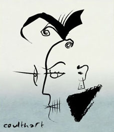
picasso1.jpgJessica Helfand at Design Observer draws attention to Mr Picassohead, a site which allows you to create your own Picasso-style portraits. The interface doesn’t have as much choice of elements as the Simpsonizer did but messing around with it this afternoon yielded a passable rendering of David Britton’s Lord Horror.

This idling reminded me that I’ve yet to finish reworking the Lord Horror series Reverbstorm which I’ve been engaged with on and off for the past year. The handful of people actually waiting for this magnum opus should know that other work and new Savoy projects keep intervening at the moment. Anyone who saw the original comics will be aware that pastiching Picasso was a consistent theme from issue five onwards. For those who haven’t seen the comics (and few people have…) I’ve posted a couple of the original Picasso-esque Horrors below, beginning with a more representational view of his Lordship for those unfamiliar with the appearance of the man.

lord_horror.jpg

A 1997 portrait which owes much to the style of Burne Hogarth‘s later Tarzan illustrations.

Continue reading “Picasso-esque”

Maldoror illustrated

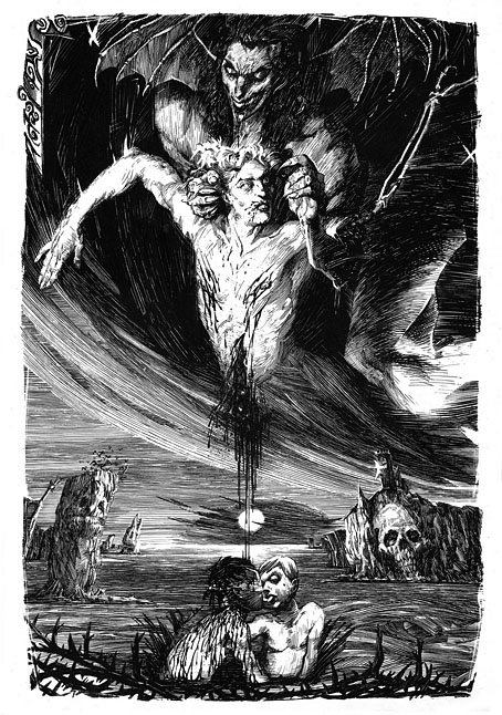
maldoror.jpg

Les Chants de Maldoror by Corominas (2007).

There seems to be no escaping from HP Lovecraft just now, the illustration above having been created for a PDF publication entitled CTHULHU, Cómics y relatos de ficción oscura, produced by these people. The Cthulhu-zine seems to be unavailable but you can see more of these splendid illustrations, based on Lautréamont’s Les Chants de Maldoror (1869), at Dorian Gray BD. The artist, Corominas, has an additional blog showcasing more commercial work.

maldoror2.jpg

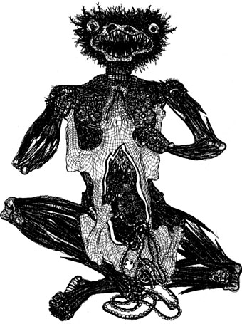
Les Chants de Maldoror by Jacques Houplain (1947).

Lautréamont’s delirious masterpiece isn’t exactly the easiest book to illustrate but the Corominas drawings certainly capture some of its ferocious energy. The Surrealists were big Maldoror enthusiasts, of course, and did much to establish Lautréamont’s current reputation. Salvador Dalí produced a series of engravings for a Skira edition in 1934 although his drawings look less like illustrations of the text than a rifling of the artist’s usual preoccupations. The picture above by Jacques Houplain is one of a series of twenty-seven engravings produced for a French edition in the 1940s. More recently, Jean Benoît created (among other things) a Maldororian dog and there’s even been an attempt at a comic-strip adaptation from Hernandez Palacios. On the whole I prefer the Corominas pictures but then I’m biased towards that style of drawing which owes something to all the comic artists and illustrators influenced by Franklin Booth.

Elsewhere on { feuilleton }
The illustrators archive
The etching and engraving archive

Previously on { feuilleton }
Franklin Booth’s Flying Islands
Carlos Schwabe’s Fleurs du Mal
The art of Jean Benoît