Resurgam variations

resurgam1.jpg

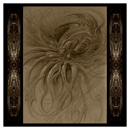
Another new page completed for my forthcoming Cthulhu Calendar, I decided to give this one another Latin title for maximum pomposity. “Resurgam” means “I shall rise again” which seems a fitting sentiment for the loathsome Spawn of the Stars. This piece was an improvised drawing which from the outset I wanted to leave incomplete. I’ve always liked pencil drawings which grade from detail to an insubstantial sketchiness, and most of the other representations in the calendar are already highly finished. I usually can’t resist filling every last centimetre so this should be regarded as a rare exercise in restraint.

resurgam2.jpg

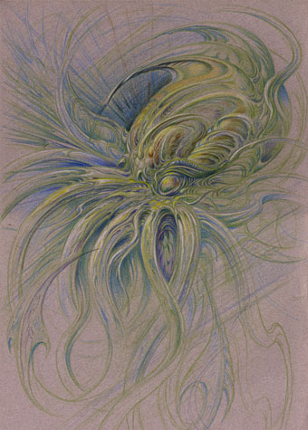
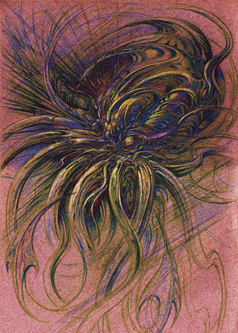
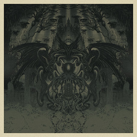
This is the drawing in its original state. After scanning it and messing with various colour overlays I decided to go with sepia tones. The calendar is already heavy on the green so umber shades will vary things a little. Since it’ll be a CafePress product all the pages have to be square which presents a problem for non-square artwork. I dislike cropping a drawing to fill the page so the additional panels are samples from the drawing quartered and mirrored, a simple effect that always works well. The picture below is one of the earlier variations, the result of applying some Photoshop solarisation then inverting the image.

resurgam3.jpg

I now have one more page to fill then the calendar will be finished. (The cover is already done.) I’m hoping to have it completed by this time next week. Keep your tentacles crossed.

Elsewhere on { feuilleton }
The Lovecraft archive

De Profundis

deprofundis.jpg

De Profundis (2012).

The title is nothing to do with Oscar Wilde’s famous epistle from prison, but then that should be obvious looking at my latest piece of tenebrous artwork. “De Profundis” means “From the depths” which in this case is applied to another piece with a Cthulhu theme. I made a decision earlier this year that my calendar design for 2013 would comprise a collection of all my Cthulhu portraits to date, from The Call of Cthulhu on. I didn’t have 12 pictures, however, so I’m currently making up the numbers between other jobs. This is the first completed piece which steals a background from the illustrations by Alphonse de Neuville and Édouard Riou for Jules Verne’s Twenty Thousand Leagues Under the Sea (1871). The voyagers in the Nautilus encountered some fearsome creatures but nothing quite like this. I can’t say at the moment when the calendar will be ready but I’m hoping to have it finished before the end of the month.

Elsewhere on { feuilleton }
The Lovecraft archive

H.P. Lovecraft: The Complete Fiction

lovecraft1.jpg

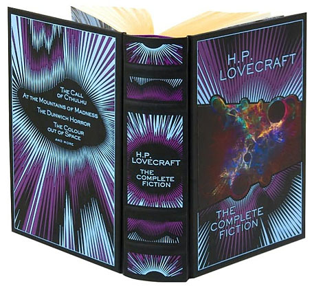
Illustration by Sven Geier, design by Jo Obarowski and Rebecca Lysen.

HP Lovecraft would have been as surprised as anyone if he could have witnessed the tremendous posthumous triumph he and his work have achieved.

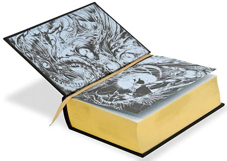
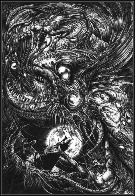
Thus leading Lovecraft biographer and scholar ST Joshi in the introduction to this suitably monstrous book. H.P. Lovecraft: The Complete Fiction was published in a new edition last year after first appearing in 2008 as part of Barnes & Noble’s Leatherbound Classics Series. My drawing of Dagon from 1999 adorns the silvered endpapers, and the reason for this belated mention is because I was only sent copies this week after moaning about not having seen a copy in a Tor.com post about the series. In truth the oversight was partly my own fault: one hazard of this line of work is that artwork is requested months (or even years) in advance of publication, so if the work in question is a reprint it’s easy to forget all about it as you get involved with other things.

lovecraft2.jpg

So anyway, this is a handsome volume of over a thousand pages, not quite leather, it’s more of a leatherette with the design blocked into it. Sven Geier’s cosmic illustration has been given an iridescent finish, and the copies I was sent have metallic silver on the edges as well as a purple ribbon which makes a better match with the colour scheme. The contents comprise all of Lovecraft’s solo fiction (no collaborations, in other words) from the juvenilia through to the non-fiction of his Supernatural Horror in Literature essay. In addition to the introduction there’s a short note from ST Joshi for each story. Needless to say, I’m very pleased to be associated with Lovecraft’s work in this way.

Anyone considered buying a copy should note that the book is currently cheaper at B&N than at Amazon. Also, complaints about typos would appear to apply to the earlier edition although I’ve not had a chance to read any of the stories.

My Dagon picture below appears here larger than it has done before. The drawing was done with a Biro pen, something I’ve always liked using, then tweaked slightly in Photoshop to blur the lines a little and bring out the highlights. I’m not sure now the tweaking was necessary so I may dig out the original at some point to see how it compares.

dagon.jpg

Dagon (1999) by John Coulthart.

Elsewhere on { feuilleton }
The Lovecraft archive

Frederic Leighton’s sculptures

leighton1.jpg

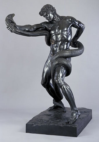
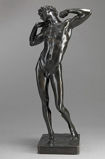
An Athlete Wrestling with a Python (1877).

The python wrestler by Frederic Leighton (1830–1896) has appeared here before, and it’s one sculpture that always catches my eye for having appeared in my adaptation of The Call of Cthulhu in 1988. It’s now one of the Leighton works available for close viewing at the Google Art Project although only from a single angle, something that seems a flaw in web presentation of three-dimensional art.

leighton2.jpg

The Sluggard (c. 1895).

In the same collection is a copy of Leighton’s The Sluggard from the Yale Center for British Art. What’s notable about this piece is that it’s generally offered as Exhibit A for the homo-prosecution during discussion of the artist’s sexuality. The Sluggard to which most people refer is the life-size bronze which is a lot more robust and muscular than this lithe and twinky specimen. According to a note at the V&A Yale’s copy is one of many cast from the clay model for the life-size version. What was excused at the time as a late Victorian exercise in contrapossto looks even more camp—in the Philip Core definition—than the finished piece which makes me wonder whether Leighton beefed up the original to disguise something. Core defined camp as “the lie that tells the truth”; camp art always pretends to be one thing whilst simultaneously telegraphing a very different message about its creator. Leighton’s sexuality is a source of continual speculation which means it’s unlikely now to be resolved in any direction, and the artist himself would loathe our prurience, but it’s only by reappraising works in this way that we’re able to show that gay people didn’t magically erupt via some process of spontaneous generation in 1967. If Leighton had any dalliances whilst holidaying in the gay resort of Capri then he was perfectly circumspect. Back at home, as a President of the Royal Academy he had a rather pompous and remote reputation, being memorably described by Violet Paget as “something between an Olympian Jove and a head waiter.” For more camp, see The Narcissus Hall in the artist’s incredibly lavish home, Leighton House in London, where 1st Baron Leighton, PRA, lived splendidly alone.

Previously on { feuilleton }
Angelo Colarossi and son
Men with snakes

Heavy Metal, October 1979: the Lovecraft special

hm1.jpg

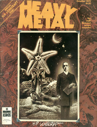
Mr Lovecraft by JK Potter.

HP Lovecraft died seventy-five years ago on 15th March, 1937. Twenty-five years ago I was halfway through drawing my comic strip adaptation of The Call of Cthulhu, conscious at the time that, yes, it was fifty years ago today… I mentioned at the weekend the special Lovecraft edition of Heavy Metal that was published in October 1979; of the many stimuli that led to the drawing of CoC, this magazine was by far the most important. Given the date, now seems as good a time as any to say something about it.

hm2.jpg

Illustration for the contents page by Stephen R. Bissette.

Heavy Metal was the US offshoot of Métal Hurlant, the sf/fantasy comics magazine founded by Jean Giraud (Moebius), Philippe Druillet and Jean-Pierre Dionnet in 1974. Copies of Métal Hurlant could be found in London but none ever made it further north. The advent of Heavy Metal provided an invaluable introduction to a generation of European artists whose work was otherwise difficult to find. Even better: their stories were being translated into English for the first time. The late 70s was a dizzying period for a Lovecraft reader: HR Giger appeared apparently out of nowhere in 1977 when Big O published the first UK collection of his art (which I couldn’t afford at the time), a book with Necronomicon in the title; a year later Thames & Hudson published Franz Rottensteiner‘s The Fantasy Book, an overview of the genre that devoted eight pages to Lovecraft and Arkham House, and which included many illustrations I’d never seen before; in 1979 Giger was all over the newspapers and magazines thanks to Alien; then in October the Lovecraft special dropped onto the shelves. I was stunned: this was that rare occasion when someone creates exactly the thing you want to see at precisely the right moment.

hm3.jpg

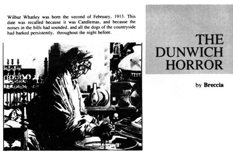
The Dunwich Horror by Alberto Breccia. A superb adaptation.

Looking back, the issue isn’t quite as good as it seemed at the time: many of the stories are slight, a couple have nothing whatever to do with Lovecraft, and, Breccia aside, none of the artists tackle the major works. What counted in the end was the idea of the issue, the implication that Lovecraft’s imagery was there to be seized and reworked in visual form. There were better issues of the magazine, before and after, but for the next six years this one remained for me a tantalising possibility. They hadn’t got it quite right…what if someone else did? After searching comic shop shelves in vain I eventually decided to have a go myself.

Continue reading “Heavy Metal, October 1979: the Lovecraft special”