Wildeana 9

dine.jpg

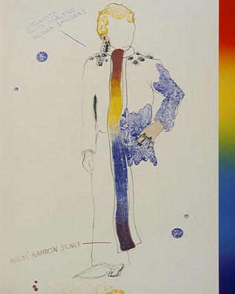
Dorian Gray (1968) by Jim Dine; one of a series of prints for an illustrated edition. Rainbows didn’t become a gay symbol until Gilbert Baker’s flag design ten years later.

Continuing an occasional series.

• “…the Public is a very curious thing; it is sometimes perverse, and even obstinate, and it has evidently made up its mind to like the plays of Mr. Oscar Wilde.” Callum at Front Free Endpaper found a sceptical review of The Importance of Being Earnest in The Sketch for 20th February, 1895.

• “Wilde’s vision of Socialism, which at that date was probably shared by many people less articulate than himself, is Utopian and anarchistic.” George Orwell, writing in 1948, looks back at Wilde’s The Soul of Man Under Socialism.

Oscar Wilde between Paris and Brighton: Research at the excellent Charles Ricketts & Charles Shannon blog following Wilde’s travels in the early months of 1891.

Wilde Ride by Anthony Paletta: “Oscar Wilde spent a year in the US and met the likes of Walt Whitman and Henry James.”

• There’s plenty of Wildeana at Pinterest.

Elsewhere on { feuilleton }
The Oscar Wilde archive

Picturing Dorian Gray

dorian1.jpg

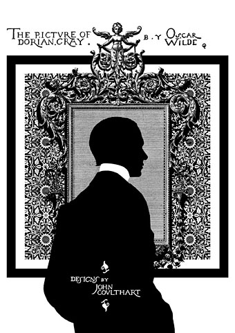
It’s taken a while but here at last are some of the pages from my series of illustrations based on The Picture of Dorian Gray, as featured in volume 2 of The Graphic Canon (“The World’s Great Literature as Comics and Visuals”) edited by Russ Kick. I agreed with Russ not to run everything so there’s some incentive to buy the book (or books…there are three volumes altogether). Now I’ve seen the printed edition the whole project seems even more remarkable: 500 large illustrated pages in a variety of media and art styles. Volume 2 runs through the 19th century and ends with my contribution; I opted to do this story in black-and-white but there’s colour used throughout the books. I especially like the Moby-Dick sequence by Matt Kish, a very different take on a very familiar tale.

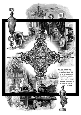
As with many of the things I’ve been doing recently I opted for adapting materials of the period. Since I have a lot of Oscar Wilde-related reference material I was able to go further and incorporate details that relate directly to the book and Wilde’s life. All the text is taken from a scan of the first printing of the novel at the Internet Archive, the title lettering being drawn originally by Wilde’s friend, publisher and illustrator Charles Ricketts. A heavy black square on each page provides some continuity as well as resembling the frames of comic pages. (Or a picture frame.) The silhouette on the opening page is another of Wilde’s friends, the writer Max Beerbohm, taken from a drawing by William Rothenstein. The pair were dandyish Café Royal regulars throughout the 1890s.

dorian2.jpg

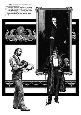
This is my favourite page. I liked the way the composition came together and also enjoyed being able to use John Singer Sargent’s portrait of W. Graham Robertson as the picture of Dorian. I’ve noted in an earlier post the similarity between this painting and the portrait seen in the BBC’s adaptation of the novel by John Osborne. Robertson was a theatre designer and illustrator who Wilde consulted when planning stage designs for what would have been the London debut of Salomé. Robertson was also (so far as we know) homosexual which adds an extra resonance.

dorian3.jpg

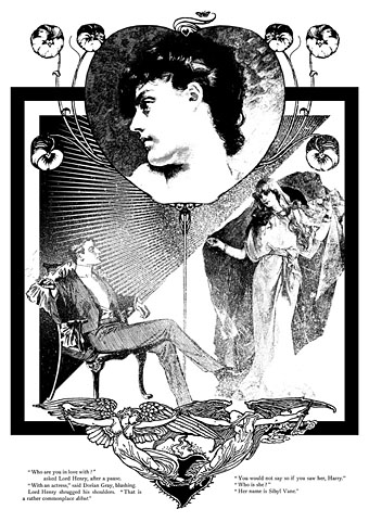
The Sibyl Vane page: a combination of details from The Studio, The Strand and The Magazine of Art. The motif at the foot of the page is by Walter Crane. Nothing of Wilde’s appeared in The Strand but that magazine’s most popular writer, Arthur Conan Doyle, had his second Sherlock Holmes adventure, The Sign of Four, commissioned at the same dinner that saw the commissioning of Dorian Gray, both novels being published by Lippincott’s Monthly Magazine in 1890.

dorian4.jpg

A page depicting Dorian’s distracting obsession with jewels and luxurious goods. This chapter can seem somewhat superfluous unless seen in the light of Wilde’s intention to write something like Huysmans’ À rebours (1884).

dorian5.jpg

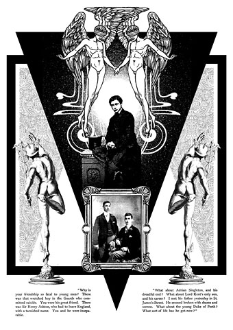
The “Love that dare not speak its name” page. This makes explicit the subtext of the book although if you read the two paragraphs I selected it’s evident enough why Dorian is causing a problem for so many young men. The blindfolded Eros was a drawing by Walter Crane which I doubled then re-drew slightly so the pair were holding hands. The boy below is a picture from The Strand of the young Edward VII, a robust heterosexual in later years but with a son, Prince Albert Victoria, who became linked to the notorious Cleveland Street Scandal which involved a male brothel catering to aristocrats. The two young men in the picture frame are described as a pair of “panthers” in Neil McKenna’s The Secret Life of Oscar Wilde (2003), by which he means that they were fin de siècle rent boys (as in Oscar’s remark about “feasting with panthers”); McKenna doesn’t give any further details about the photo but it suited the picture.

In addition to this series of illustrations, volume 2 of The Graphic Canon includes two of my Lewis Carroll illustrations in a section by different artists based on the Alice books. I’d be recommending The Graphic Canon even if I wasn’t a contributor, as I said above it’s a remarkable achievement. Watch out for it.

Elsewhere on { feuilleton }
The Oscar Wilde archive

In the Key of Blue by John Addington Symonds

symonds1.jpg

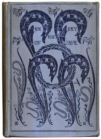
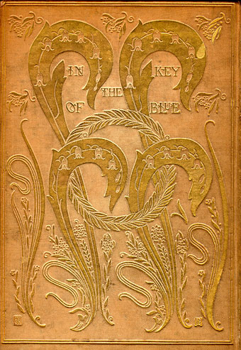
I probably overspent a little on this charity-shop purchase, the third edition (published 1918) of In the Key of Blue by John Addington Symonds (1840–1893), a personal selection of writings first published in 1893. First edition copies sell for over a thousand pounds so this was an opportunity to acquire something close to the original without breaking the bank. The book is significant for two reasons: on a decorative level the cover design is one of my favourites by book designer (he preferred the term “book builder”) Charles Ricketts. The first editions have the design blocked in gold on cream cloth (below); a few copies were made with blue cloth but Ricketts apparently changed the colour after worrying that reviewers would joke about “Reckitt’s Blue” a popular laundry product. The contraposed curves of the leaf shapes pre-empt the Art Nouveau style which only started to emerge a year or two later.
symonds2.jpg

The other notable feature of Symonds’ book is its being one of the more outspoken manifestations of the author’s advocacy for what he called “a man’s love for a man”. Symonds was a pioneer of what are now called gay studies: in addition to accurately translating the love sonnets of Michelangelo which previous translators had heterosexualised, his 1873 study A Problem in Greek Ethics sought to show 19th-century readers that the Ancient Greek culture they so admired had an indisputable history of same-sex relationships running through its core. This was only one side of Symonds’ work but it was an admirably continual thread. I often think of Symonds and Oscar Wilde as twinned in this respect: Wilde made frequent use of Greek attitudes as a justification for his views on love; both men had to perform a careful balancing act, trying to advocate the unacceptable without drawing too much attention to their own proclivities. If Wilde was the public advocate for Uranian desire then Symonds was a kind of think-tank man, labouring behind the scenes to bring to light the historical precedent. Finally, both men were connected by Charles Ricketts, a friend of Wilde’s who designed and illustrated a number of Wilde’s early editions.

In the Key of Blue was published in the last year of Symonds’ life by which time much of his previous equivocations had been abandoned. In homoerotic terms it’s far more out of the closet than pre-trial Wilde ever dared to be. The title piece is a poem which presents eight studies of an unnamed “you”, a figure seen by the poet in various Venetian settings, painted in a range of colours with blue as the dominant tone. I have the poem in another book; taken alone as it is there it seems mildly homoerotic—the ecstatically observed subject is obviously male—but remains ambiguous enough for any subtext to be a matter of interpretation. In the collected edition Symonds adds additional text that picks apart the poem, explaining the origin of each setting. Thus we learn that the mysterious “you” is a 19-year-old Venetian porter named Augusto whom the author had befriended. The explanatory paragraphs discuss the artistic intent of the poem, its depiction of contrasted tones and colours, while the circumstantial details quietly remove all the ambiguity from its paean to male youth.

Elsewhere in the book, there’s a discussion of male love among the Greeks, culled from Symonds’ earlier researches, then in Clifton and a Lad’s Love, written thirty years earlier, we have another piece of alternating poetic verse and prose description. Part seven of the poem could hardly be less equivocal:

I saw a vision of deep eyes
In morning sleep when dreams are true:
Wide humid eyes of hazy blue,
Like seas that kiss the horizon skies.

Then as I gazed, I felt the rain
Of soft warm curls around my cheek,
And heard a whisper low and meek:
“I love, and canst thou love again?”

A gentle youth beside me bent;
His cool moist lips to mine were pressed,
That throbbed and burned with love’s unrest:
When, lo, the powers of sleep were spent;

And noiseless on the airy wings
That follow after night’s dim way,
The beauteous boy was gone for aye,
A theme of vague imaginings.

Yet I can never rest again:
The flocks of morning dreams are true;
And till I find those eyes of blue
And golden curls, I walk in pain.

Anyone wishing to read In the Key of Blue can find most of Symonds’ work online. Project Gutenberg has all his major texts available while the Internet Archive has a scan of the 1918 edition, albeit in slightly better condition than my copy.

Elsewhere on { feuilleton }
The book covers archive

Previously on { feuilleton }
Greek games
Charles Ricketts’ Salomé
Achilles by Barry JC Purves
Der Eigene: Kultur und Homosexualität
Charles Ricketts’ Hero and Leander
Charles Ricketts’ Salomé

ricketts1.jpg

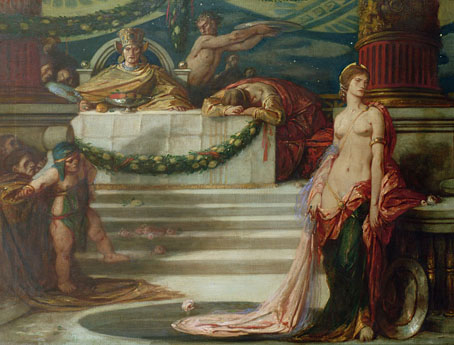
Here is my scheme. I proposed a black floor – upon which Salomé’s white feet would show; this statement was meant to capture Wilde. The sky was to be a rich turquoise blue, and across by the perpendicular fall of strips of gilt matting, which should not touch the ground, and so form a sort of aerial tent above the terrace. Did Wilde actually suggest the division of the actors into separate masses of colour, today the idea seems mine! His was the scheme, however, that the Jews should be in yellow, the Romans were to be in purple, the soldiers in bronze green, and John in white. Over the dresses of Salomé, the discussions were endless: should she be black “like the night”? Silver, “like the moon”? Or – here the suggestion is Wilde’s – “green like a curious poisonous lizard”? I desired that the moonlight should fall upon the ground, the source not being seen; Wilde himself hugged the idea of some “strange dim pattern in the sky”.

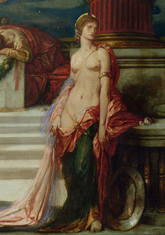
Thus artist, designer, publisher and writer Charles Ricketts (1866–1931), describing in later years his proposal for what would have been the first staging of Oscar Wilde’s Salomé in London. The scheme never materialised since the play was banned but Ricketts did create costume and stage designs for subsequent productions elsewhere, including performances in Japan in 1920. The V&A has Ricketts’ sketch of the stage for a private production in 1906 by the Literary Theatre Society, London. (The ban on Biblical themes in theatre kept the play from public performance in London until 1931.) In the Tate archives there’s what may be one of Ricketts’ costume designs from the Japanese production. Ricketts’ painting of Salomé dates from 1925, and for such a lurid and passionate subject seems rather passionless and inert. This isn’t so surprising, he was always a better designer and graphic artist than a painter; his lifelong partner, Charles Shannon, was the one who excelled with oils.

And speaking of Ricketts and Shannon, searching around turned up this recent blog devoted to the pair which contains much detail about their celebrated book designs.

ricketts2.jpg

Elsewhere on { feuilleton }
The Salomé archive

Previously on { feuilleton }
Charles Ricketts’ Hero and Leander
L’art dans la décoration extérieure des livres

livres1.jpg

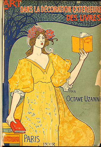
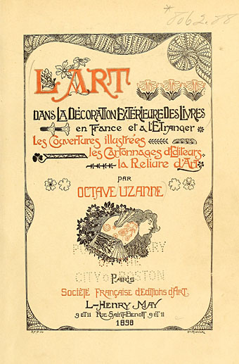
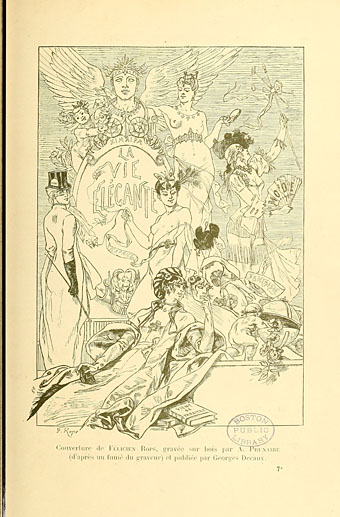
Back at the fin de siècle with this study by Octave Uzanne of book cover design in the 1890s. L’art dans la décoration extérieure des livres is over four hundred pages of very varied designs, from covers for popular novels to the state of the art by usual suspects Aubrey Beardsley, Charles Ricketts et al. Léon Rudnicki provides the cover and some interior illustrations. The examples below include pieces by Symbolist artists Félicien Rops and Franz Stuck, as well as one of Alphonse Mucha’s designs for Judith Gautier’s Mémoires d’un Éléphant blanc. The complete book may be browsed here or downloaded here.

livres2.jpg

livres3.jpg

Continue reading “L’art dans la décoration extérieure des livres”