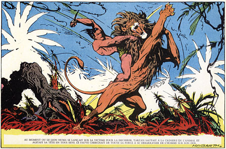
Virgil Finlay’s Tarzan

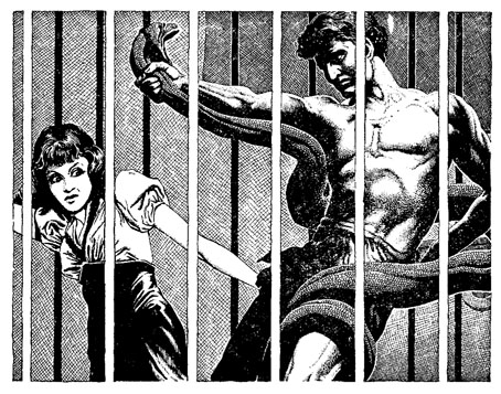
finlay.jpg

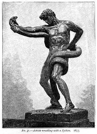
Thanks are due to Ty Reutel for alerting my attention to this one. I’d no idea that the great Virgil Finlay had illustrated Tarzan but here’s the proof, one half of an interior drawing for The Quest of Tarzan in Argosy Weekly for 1941. That’s the first surprise, the second, of course, was that Finlay had copied Frederic Leighton’s Athlete Wrestling with a Python (1877) ( below), a sculpture which has been a subject of discussion here recently. I’ve mentioned before my including Leighton’s work in one of my Lovecraft adaptations; I referred to many other artworks in those stories but never made any direct reference to Virgil Finlay even though he was the original illustrator of Lovecraft’s The Haunter of the Dark when it was first published in Weird Tales in 1936. Finlay’s illustrations for that story later appeared with some of my own in the enormous Centipede Press collection of Lovecraft art so it’s strange to find that we were also led to the same Leighton sculpture.

Tarzan illustration has been in my thoughts for the past few weeks while I’ve been at work (again!) on the collected Reverbstorm, many pages of which played variations on Burne Hogarth’s comic adaptations of the Tarzan stories. Reverbstorm is at long last very close to being finally, absolutely finished, and ready for printing in a single definitive volume. No production schedule just yet but any news will be announced here.
leighton4.jpg

Previously on { feuilleton }
Frederic Leighton’s sculptures
Virgil Finlay’s Salomé
Die Farbe and The Colour Out of Space
Lovecraft’s favourite artists revisited
Angelo Colarossi and son
The monstrous tome
Men with snakes

Signals from Mars

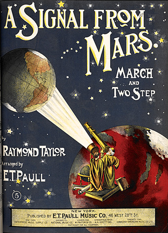
signal.jpg

Raymond Taylor’s composition, A Signal from Mars (1901).

This sheet music cover turned up recently as one of the pieces of science fiction-related graphics which will be on display at the British Library’s Out of this World: Science Fiction but not as you know it exhibition when it opens on Thursday. I don’t know what the music sounds like but the design is very familiar from a reworked version used for the cover of A Beacon from Mars, the second album by psychedelic band Kaleidoscope. It was always obvious that this cover had been copied from somewhere but I hadn’t seen the original until now. On the reissue CD there are no design credits so I’ve no idea who drew the cover; given its rather crude felt-tipped appearance that may be just as well. It’s a nice idea but poorly rendered.

beacon.jpg

A Beacon from Mars (1968) by Kaleidoscope.

There are two Kaleidoscopes among the psychedelic groups of the late 60s so it should be emphasised that it’s the American one we’re dealing with here. The UK group were very good, especially on their second album, Faintly Blowing (1969), but the US band are in a different league altogether. I’d rate them as highly as any other group you care to name from the period 1967–69, including The Beatles. A troupe of formidable multi-instrumentalists, they started out as the Baghdad Blues Band (the name change was prompted by their manager), and played a unique blend of psych-rock, blues, bluegrass, English folk and Middle Eastern instrumentals. Jimmy Page called them his favourite band of all time, and it’s notable that Led Zeppelin adopted a similarly eclectic formula shortly after. The last of Kaleidoscope’s trio of 60s albums is aptly titled Incredible; the standout piece on that opus is Seven-Ate Sweet which can be heard in its full 11-minute glory here. For more about the band, this fan site is the place to go.

Elsewhere on { feuilleton }
The album covers archive

Design as virus 13: Tsunehisa Kimura

kimura.jpg

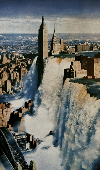
Waterfall by Tsunehisa Kimura.

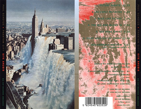
Continuing an occasional series. Japanese artist Tsunehisa Kimura (1928–2008) was initially inspired by the polemical graphics of John Heartfield to create his own photomontages, a painstaking collage technique now rendered obsolete by Photoshop. Kimura’s work exchanges Heartfield’s satire for an overt and frequently apocalyptic Surrealism, as in his most visible piece, Waterfall. The copy above is one of a number of pictures reproduced by Geoff Manaugh at BLDGBLOG from a 1979 Kimura collection, Visual Scandals by Photomontage.

schutze1.jpg

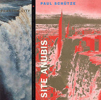
Design by Anne-Louise Falson & Paul Schütze.

I was first startled by Waterfall in 1996 when Paul Schütze released his Site Anubis album, the product of a “virtual group” comprised of musicians recording in different studios around the world:

The musicians comprising Phantom City—the name, incidentally, originating from the book title Topology of a Phantom City by French novelist Alain Robbe-Grillet—never met for the recording of Site Anubis, as each one recorded in a different studio in a different country: guitarist Raoul Björkenheim in Helsinki, bass- and contra-bass clarinetist Alex Buess in a Basel studio, soprano saxophonist Lol Coxhill in London, bassist Bill Laswell at Green Point Studio in Brooklyn, New York, trombonist Julian Priester in Seattle, drummer Dirk Wachtelaer in Brussels, and Schütze himself in London and Basel. Incredibly, Laswell had only Schütze’s electronic backing track to respond to. Wachtelaer had Laswell and Schütze to play against, Björkenheim had drums and bass,—in short, certain players had more information than others.

schutze2.jpg

Kimura’s picture is an ideal accompaniment to this excellent album, especially when you note a Ballard reference in the titles (not the first in Schütze’s oevre), and read the scene-setting piece of fiction on the CD insert, an explanation of the album title:

That morning a report came in from an unmarked helicopter somewhere over the city. The waters were subsiding and the smoke from a thousand fires had begun to drift inland revealing an impossible new structure. Towering some eight hundred feet over the gleaming devastation of the streets, its base occupying an entire city block, was a colossal black basalt figure. The body was male and human, – the head, which stared expectantly toward the boiling western horizon, was the head of a jackal. From the air it was clear that the pattern of destruction on the ground was radial and that the massive figure was sited precisely at its centre.

Continue reading “Design as virus 13: Tsunehisa Kimura”

Design as virus 12: Barney’s faces

lowe.jpg

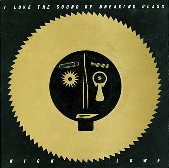
Sleeve for I Love The Sound Of Breaking Glass (1978), a 7″ single by Nick Lowe. Design by Barney Bubbles.

Continuing an occasional series. Designer Vic Fieger had a guest post at Reasons To Be Cheerful earlier this week examining Barney Bubbles’ use of the human face in his graphic designs. This is one side of the Bubbles work I really enjoy, he had a remarkable facility for demonstrating a versatility with abstract shapes—or found objects, as in the piece above—while playing games with our pattern recognition. A recurrent playfulness was one of the many notable things about his approach to design.

colour.jpg

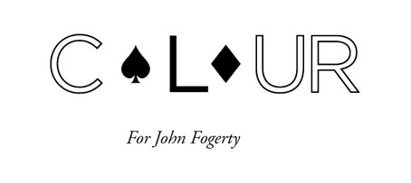
Story title from The Best of Michael Moorcock (2009).

Fieger’s focussing on the faces in Barney’s work struck a chord for me since I’d deliberately tried something similar last year, taking a cue from Barney’s example. The Colour piece above is one of the story titles from The Best of Michael Moorcock published by Tachyon. For each story I designed a different title in a style which complemented the subject; Colour is a science fiction piece in which card games figure, hence the symbols. Mike Moorcock was friends with Barney during the 1970s so there was an additional reason for the reference.

booklife.jpg

I don’t know whether anyone has noticed the face on the cover of Booklife but it is there, with the two flowers at the top forming the eyes and the book’s title standing for the mouth. Once again, this wasn’t strictly necessary for the success of the design but it gave a rationale for the arrangment of the flowers. There’s also the hope when something is this subtle that the attraction of the pattern impells a browser to pick up the book in a shop without quite knowing why.

Booklife and The Best of Michael Moorcock are both available from Tachyon. Paul Gorman’s Barney Bubbles book, Reasons To Be Cheerful: The Life & Work Of Barney Bubbles, will be relaunched later this year in a new edition.

Previously on { feuilleton }
Into the Media Web by Michael Moorcock
Design as virus 11: Burne Hogarth
Design as virus 10: Victor Moscoso
Design as virus 9: Mondrian fashions
The Best of Michael Moorcock
Design as virus 8: Keep Calm and Carry On
Designing Booklife
Design as virus 7: eyes and triangles
Design as virus 6: Cassandre
Design as virus 5: Gideon Glaser
Design as virus 4: Metamorphoses
Design as virus 3: the sincerest form of flattery
Design as virus 2: album covers
Design as virus 1: Victorian borders
Barney Bubbles: artist and designer

Design as virus 11: Burne Hogarth

mighty_baby.jpg

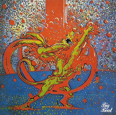
Mighty Baby (1969). Illustration by Martin Sharp.

Yet another album cover prompts this post, part of an occasional series. Mighty Baby were a British rock band who formed out of psychedelic group The Action in the late Sixties, and their music is fairly typical of the period, being “heavy” without any of the psych trappings which—for me—often make everything from that time a lot more interesting. This was a journey undertaken by many groups at the end of that lurid decade, a junking of the playful and evocative side of what was now called rock music in favour of a denim-clad earnestness. This album isn’t one I like very much—I’d rather listen to their earlier incarnation—but the cover painting by psych artist Martin Sharp is certainly a startling piece, being a violent mutation of one of the most famous Tarzan drawings by comic artist Burne Hogarth.

hogarth.jpg

Tarzan by Burne Hogarth (194?).

Hogarth was drawing Tarzan for much of the 1940s and this particular panel showing the Ape-Man attacking Numa the lion dates from the latter part of his run on the series. I wish I could pin this to an actual year but I don’t have a complete set of the comics and that detail eluded me. If anyone knows the date, please leave a comment.

Continue reading “Design as virus 11: Burne Hogarth”