Alexander McQueen, 1969–2010

mcqueen1.jpg

“He was a Brothers Grimm of fashion, enchanting and captivating the audience with the most incredibly beautiful clothes, only to make their stomachs lurch with the underlying menace that shot through his work. Because every show contained outfits designed to thrill, shock – and catch the eye of picture editors – many people never realised that much of McQueen’s work was, quite simply, heart-stoppingly gorgeous: exquisite tailoring, beautifully sculpted dresses and glorious print.”
Jess Cartner-Morley. (More.)

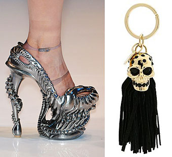
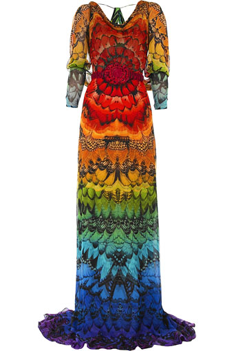
Butterfly-print dresses (how fitting for Darwin Day), Giger-style shoe designs, skull key chains… Yes, Alexander McQueen was something special.

Guardian obituary | Independent obituary

mcqueen2.jpg

Mervyn Peake at Maison d’Ailleurs

peake.jpg

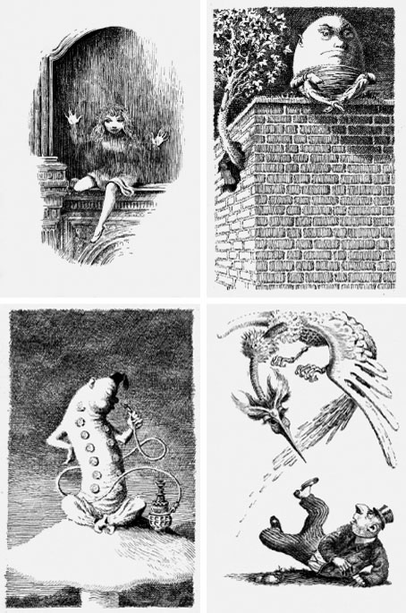
I should have mentioned this a lot sooner considering the museum sent me a copy of the exhibition prospectus. Maison d’Ailleurs is the Museum of Science Fiction, Utopia and Extraordinary Journeys in Yverdon-les-Bains, Switzerland, and their current exhibition is Lines of Flight—Mervyn Peake, the Illustrated Work. Yverdon-les-Bains is too out of the way for most of us but the event gives me another excuse to draw attention to Peake’s illustrations for Lewis Carroll; some of the drawings from Alice’s Adventures in Wonderland, Through the Looking-Glass and The Hunting of the Snark are among the works on display until February 14, 2010.

Mervyn Peake (1911–1968) is celebrated today as the writer of the extraordinary series of novels about Titus Groan (often referred to as the Gormenghast books). Yet, during his lifetime he was more known for his graphic work.

From 1939 and for almost two decades, Peake produced illustrations both for his own work (Captain Slaughterboard; Rhymes without Reason) and for classics (Household Tales by the brothers Grimm; Alice in Wonderland; Treasure Island). His mastery of the pen and the pencil were unrivalled. Visually, his style could be disarmingly economical, using very pure and clean single lines to create a striking sense of volume. But with cross-hatching and dots Peake could also make his drawings look like engravings, providing the characters and objects he depicted, or the background to them, with rich and varied textures and a wide range of shades. (More.)

For more of Peake’s illustration work, see Mervynpeake.org.

Elsewhere on { feuilleton }
The illustrators archive

Previously on { feuilleton }
Charles Robinson’s Alice’s Adventures in Wonderland
Humpty Dumpty variations
Alice in Wonderland by Jonathan Miller
The art of Charles Robinson, 1870–1937
Lovecraftian horror at Maison d’Ailleurs
The Illustrators of Alice

DIY aesthetics

penguin_blank.jpg

“According to consumer research conducted on what factors matter to people when they decide whether or not to pick up a book in a bookshop, the cover design comes out as most important. So this might be the stupidest thing we’ve ever done.

“…The covers are art-quality paper, and from internal Penguin efforts we know that they hold ink, paint, pencil and glue…. Each one comes shrink-wrapped so the paper doesn’t get dirty, and I hope people might give them as gifts.”

Helen Conford, Senior Commissioning Editor at The Penguin Press.

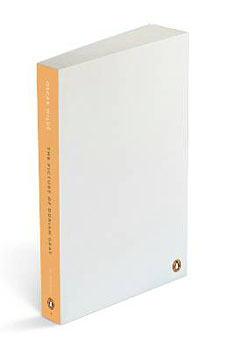
The latest ploy by Penguin to shift that tricky back catalogue of classics that everyone has heard of but few people read, resorts to what might be called audience interactivity, in other words print a book with a blank cover and the suggestion that the reader draw their own. They’re calling the scheme “My Penguin” which is unfortunate, this has the same treat-me-like-a-child quality as Microsoft’s dreadful “My Computer” and “My Documents”. The new line will be unveiled next week with the following titles: Crime and Punishment by Fyodor Dostoyevsky, Emma by Jane Austen, Magic Tales by the Brothers Grimm, Meditations by Marcus Aurelius, The Picture of Dorian Gray by Oscar Wilde and The Waves by Virginia Woolf.

This is a rather more interesting idea than Headline’s repackaging of Jane Austen as Georgian chick-lit earlier this year, a move guaranteed to disappoint anyone expecting Helen Fielding in period costume. Penguin is asking readers to send in their designs which they’ll then feature in an online gallery. In a way this goes against the traditional function of the paperback which serves as a cheap(ish), easily portable object that’s often treated with considerable disrespect while being used. Anyone who spends a couple of hours crafting their own cover design will quickly find they have a bespoke art object in their home that they want to preserve, not bend out of shape during the morning commute then discard when finished. It’ll be interesting seeing how this project develops. Will many of these unique designs turn up later on the Oxfam shelves along with all the other secondhand volumes, or will people want to keep them? Will we start seeing dedicated collectors of these titles and their artworks? (Some will no doubt be worth a great deal of money in the future if the cover is drawn by a famous owner.) And some are easier to illustrate than others; everyone knows the story of Dorian Gray but what would be suitable for Marcus Aurelius, for instance?

Elsewhere on { feuilleton }
The book covers archive

Previously on { feuilleton }
The Picture of Dorian Gray – I