Alex Steinweiss: creator of the album cover

steinweiss2.jpg

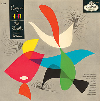
Contrasts in Hi-Fi by Bob Sharples.

A Tribute to Alex Steinweiss
The Creator of the Album Cover

Robert Berman Gallery announces an exhibition of Alex Steinwiss. Original album covers, paintings, and collages by Steinweiss, and special tribute by selected artists. Co-curated by Kevin Reagan and Greg Escalante.

In 1939, a 23 year-old graphic designer revolutionized the music industry. No longer would records come in plain brown wrappers. As Art Director at Columbia Records, Steinweiss created the ‘album package.’ His idea was to create a visual to complement the musical. It was an instant success, and spawned an entire new field of illustration and design: Album Cover Art. Steinweiss was the king of the genre; his covers are still regarded as icons.In his four decade career, Steinweiss created album covers for musical luminaries such as Louis Armstrong, Duke Ellington, Igor Stravinsky and Benny Goodman.

steinweiss1.jpg

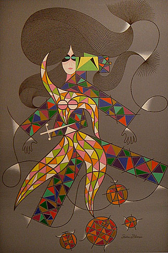
The Miraculous Mandarin (circa 1977).

The Steinweiss exhibition will feature 50 of his original cover designs, plus 50 original ‘tribute’ works, created specifically for this show. Artists that are honoring Steinweiss in the show include: Clive Barker, Bill Barminski, Ron English, Mick Haggerty, Raymond Pettibon, Shag, and Glenn Wexler. The featured artists have created album covers for a wide range of musicians, including Black Flag, Dixie Chicks, Goo Goo Dolls, Supertramp, and Rob Zombie.

“Steinweiss is 90 years old this year; this tribute is long over-due. The art community is excited to have a chance to pay homage to Alex’s unprecedented contribution to album cover art,” says Kevin Reagan, three time GRAMMY winning Art Director.

“It’s amazing to discover this one man, this un-sung hero, who is responsible for inventing the album. Steinweiss should be a household name,” says Greg Escalante, curator of Juxtapoz, and co-founder of Copro-Nason Gallery.

“The opportunity to highlight ‘the art of music’ is exciting. You have the energy of two different genres, and their combination is explosive,” says gallery owner Robert Berman. “Just plain design didn’t mean a damn thing,” Steinweiss says. You had to know music. I had to find a way to bring out the beauty of the music and the story.” (dwell, 10/07)

Alex Steinweiss lives in Sarasota, Florida, where he continues to design and paint.

A Tribute to Alex Steinweiss
Gala Opening: January 19th
Show runs through February 12th, 2008

Robert Berman Gallery
Bergamot Station Arts Center
2525 Michigan Avenue, C2
Santa Monica, CA 90404

Alex Steinweiss at the Art Director’s Club Hall of Fame
For the Record: The Life and Work of Alex Steinweiss at Amazon
Alex Steinweiss at Soundfountain

Elsewhere on { feuilleton }
The album covers archive
Design as virus 2: album covers

mcgriff.jpg

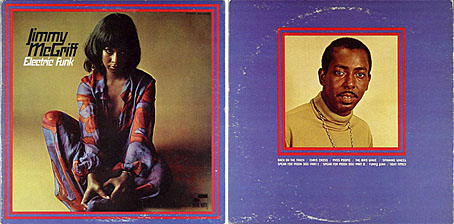
Electric Funk by Jimmy McGriff (1969).

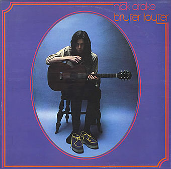
Okay, so the graphical similarity between Jimmy McGriff’s album sleeve and Nick Drake‘s, which appeared a year later, is probably coincidence but I couldn’t help noting it. Electric Funk was released on the Blue Note Records label which was highly regarded for its sleeve design so it wouldn’t be too surprising if someone at Island Records had seen it.

drake.jpg

Bryter Later by Nick Drake (1970).

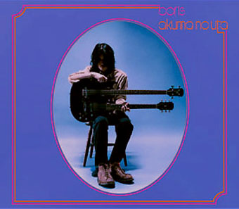
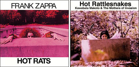
The album below by Japanese band Boris is a copy of Nick Drake’s, of course, a pastiche technique they’ve adopted for a couple of their other releases. The Japanese seem to be especially fond of this approach, Kawabata Makoto and Acid Mothers Temple (also below) having released many CDs which work playful riffs on western rock history.

boris.jpg

Akuma No Uta by Boris (2003).

hot_rats.jpg

Hot Rats by Frank Zappa (1969); Hot Rattlesnakes by Kawabata Makoto and the Mothers of Invasion (2001).

Elsewhere on { feuilleton }
The album covers archive

Previously on { feuilleton }
Design as virus 1: Victorian borders

Exotica!

hypnotique.jpg

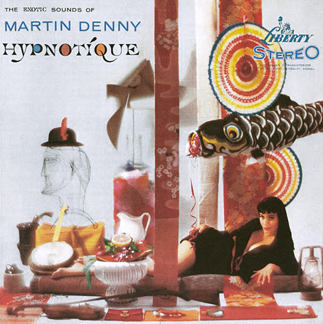
Hypnotique by Martin Denny (1959).

In Waikiki, where I live whenever I get the chance, a bistro known as the Daggar Bar and its accompanying Bora Bora Lounge has for some time been the mecca of people who enjoy a new type of music. I’m one of the gang that gathers there to hear the fresh, clean tropical sounds of Martin Denny and his group.

By the time James Michener wrote the sleeve notes for Hypnotique, Martin Denny‘s fifth album, the composer was attempting to broaden his horizons and outpace his imitators by introducing strings and vocals to augment his “fresh, clean tropical sounds”. This perhaps explains the curious jumble of objects on the album sleeve (a rifle?), my favourite among the wonderful covers Liberty Records’ art department supplied for Denny’s work. The best of these feature model Sandy Warner who appears in a variety of guises, shown here as a cross between a Japanese temptress (if we take the paper mobiles as a cue) and a precursor of Carolyn Jones as Morticia Addams. The art direction was by Bill Pate with photography by Garrett-Howard.

denny.jpg

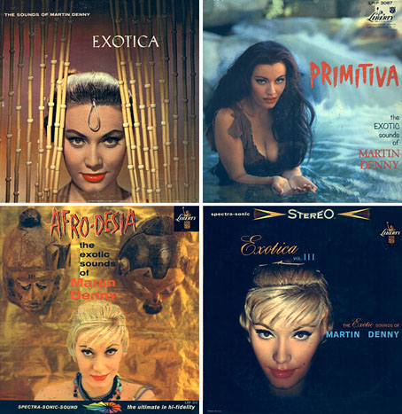
top left: Exotica (1957); top right: Primitiva (1958).
bottom left: Afro-Desia (1959); bottom right: Exotica vol. III (1959).

Sandy Warner appeared on 16 album sleeves for Denny and was even persuaded to record an album of her own to capitalise on her renown as “Miss Exotica”. In design terms, these sleeves are some of the more successful products of the late Fifties’ fad for tribal kitsch. Other covers were crazier or more garish—and few could resist flaunting a bikini-clad woman—but Bill Pate showed more care with his layouts and Sandy Warner’s alluring presence went a long way towards conjuring the required mystique. Denny’s records aren’t too bad either although when it comes to tiki-fuelled easy listening I tend to prefer his rival Arthur Lyman, especially Taboo from 1958.

Large copies of the covers shown here can been seen at Shellac.org. There are many more sites with galleries devoted to this style of music and sleeve art; Space Age Pop A Go-Go and 317x are two of the better ones. And let’s not forget Dana Countryman’s Virtual Museum of Unusual LP Covers or LP Cover Lover (check the great blogroll) or the Retro Records Flickr Pool

Elsewhere on { feuilleton }
The album covers archive

Street Sounds Electro

electro.jpg

I spent much of the summer of 1983 playing games on a very primitive ZX Spectrum computer while listening to the first couple of Street Sounds Electro compilations. Those mix albums were among the best releases that year and remain highly sought after, seeing as they’ve never been reissued on CD.

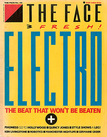
face.jpg

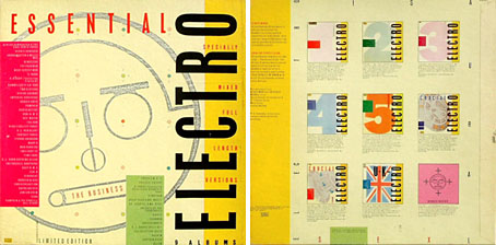
The musical reputation of the compilations has overshadowed the sleeve design which was very distinctive for the time and undoubtedly a factor in their success. The vertical ELECTRO type was inspired by Neville Brody’s design for The Face which had turned the magazine’s title through ninety degrees the year before. Also very Brodyish was the use of photocopier-processed graphics and narrow typography although it should be pointed out that Brody hand-drew nearly all his headlines which left his imitators searching through type catalogues for approximations. The sleeve designs are credited to “Red Ranch for Carver’s” about whom I can find no information whatever. Things came full-circle when The Face ran a feature on the electro scene in 1984 giving Brody the opportunity to do a cover with his own variant on the sleeve layouts.

essential.jpg

Essential Electro 9-album box, HBOX 1 (1984).

One of the big attractions of these albums for me was the new directions they were opening up for electronic music. Outside the mainstream pop world electronica in the early Eighties meant either the polite fare of Tangerine Dream or the dreary sludge of minor industrial acts such as Portion Control. Cabaret Voltaire were still vital in the early 1980s: their thundering Crackdown single (with sleeve design by Neville Brody) was remixed for its 12-inch incarnation by dance producer John Luongo while electro producer John Robie (whose production is featured on Electro 1) remixed their Yashar single for Factory Records. But nothing matched the excitement of a bunch of NYC kids lifting Kraftwerk riffs and playing in a very unselfconscious manner with new and relatively cheap equipment, especially the Roland TR-808 drum machine which provides the backbone for many of these recordings.

Continue reading “Street Sounds Electro”

Occultism for kids

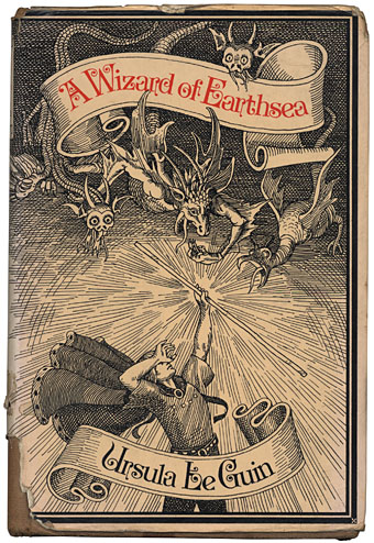
wizard.jpg

My battered 1973 Gollancz hardback. Cover illustration by David Smee.

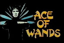
It may be all Harry Potter starter homes crowding the imaginative landscape these days but the lush fields of the early Seventies bred a peculiar brand of wizardry and wild romance, something I was reminded of recently by reviews of a new compilation of psychedelic singles (yes, another one), Real Life—Permanent Dreams on the Castle Communication label. Mention of a curio from the heady days of 1970, Tarot by Andrew Bown, summoned vague memories of a childrens’ television series, Ace of Wands, for which Tarot was the theme song. You can see the title sequence here and this clip compilation features the whole song plus trippy lyrics (“Velvet roofs, tattooed skies, patterns made from words…”). The wonderfully facetious TV Cream describes the series thus:

ACE OF WANDS (1970–72), THAMES TELEVISION. Jim-Morrison-alike boy magician Tarot (MICHAEL MACKENZIE) has adventures through history, for which read cheap studio set representing pyramid, cheap studio set representing Stonehenge and so on. DR WHO-style menace on a budget. Fought enemies such as Madame Midnight, Mr Stabs and Mama Doc, aided by an owl called Ozymandias (played by FRED THE OWL). Tarot cards and tarot phenomena abounded, much worthy roustabouts ensued. Prog-heavy title theme babbling – “Jet white dove/Snow black snake/Time has turned his face/From the edge of mystery” – singularly failed to assault the charts.

ace_of_wands.jpgI’ve mentioned before how magic and occultism were more popular at this time than they’ve probably ever been, and this flush of popularity, much of it coming from underground culture, managed to work its way into children’s television in a diluted form. Ace of Wands is easily the most baroque example of this, mixing the bell-bottom trendiness of Jason King with pulp plots given a psychedelic twist (hallucinogenic gases anyone?). Also from 1970 and far more down-to-earth (and, it should be said, more fun for kids) was Catweazle, written by Richard Carpenter and starring Geoffrey Bayldon. TV Cream has the details again:

CATWEAZLE (1970–71), LWT. Hairy tinker who can’t speak but who’s really an 11th Century magician (and who’s really GEOFFREY BAYLDON) tries to escape from some pissed off Norman soliders, jumps in a pond to hide and finds himself transported to Children’s Film Foundation-era Britain. Luckily there’s a posh (as always) boy on hand to explain all our modern day shit to him.

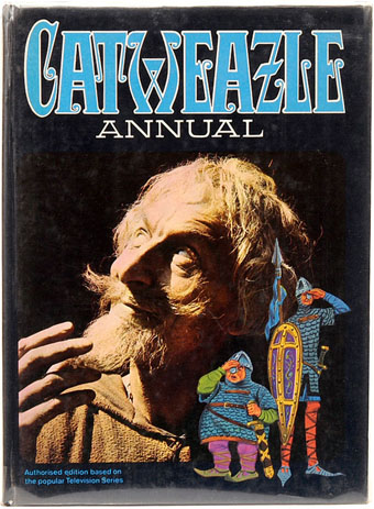
catweazle.jpgCatweazle quickly became the most popular kids’ progamme of its day and part of its attraction was the way in which Bayldon’s Norman time-traveller mistranslated modern technology as magic. So the telephone became a device called the “telling bone”, electricity was “electrickery” and so on. I had the first Catweazle annual which was an odd mixture of comic strips, text stories and articles about stage magicians with a smattering of genuine occult history.

Best of all for this Seventies kid was my favourite reading on the frequently dull Jackanory (“Ramshackle reading-is-fun relic wherein a Famous Person would sit on a chair with a pretend book and ponderously recount the contents of your local mobile library” says TV Cream) which one week had Ursula K Le Guin‘s A Wizard of Earthsea as its featured book. Try as I might, I’ve been unable to find the name of the actor who read this (black clothes, medieval chair) but I was knocked out by it. Years later the Earthsea cycle is still the only work of Le Guin’s I’ve been able to read, her science fiction seemed boring by comparison.

The inflated success of Harry Potter has had people casting about for JK Rowling’s influences over the past few years. A Wizard of Earthsea was first published in 1968 and also concerns a school of wizards, as do several other pre-HP novels. Rowling has acknowledged this although that acknowledgement hasn’t been loud or regular enough to appease a grouchy Le Guin. The Earthsea books are a lot shorter than the Potter door-stops and the first book at least is rather more sophisticated, reading equally well as a fantasy adventure for children and as a Jungian fable for adults with hints of Buddhist or Taoist philosophy. The characters are also notable for not being the Caucasians that most fantasy characters usually are, one of many details a recent TV adaptation (which Le Guin condemned) managed to ignore. It’s worth noting that JK Rowling is part of my generation (I’m 45, she’s 42) so she would have watched all this Seventies stuff herself. One of the reasons fantasy readers and writers (as opposed to snooty broadsheet critics) are often disappointed by the Potter juggernaut is that it could have been so much more considering the wealth of precedent that it draws upon. But then books rarely achieve this scale of popularity without being conservative and undemanding, Rowling’s work is merely the most recent example of this.

Le Guin spoiled the impact of her excellent first Earthsea book with several sequels of diminishing interest. A new animated film from Japan, Gedo Senki or Tales from Earthsea, based on the later works is released in the UK this month. The great British director Michael Powell had plans for an Earthsea adaptation scripted by Le Guin when he was director in residence at Francis Coppola’s Zoetrope Studios in 1980. Powell was great with fantasy (watch his Thief of Bagdad) so it’s a shame that nothing came of this. Ace of Wands is on DVD now and so is Catweazle. I can’t vouch for the former having much value beyond pure nostalgia but there’s plenty of clips from the latter at YouTube. Proceed with caution.

Previously on { feuilleton }
The art of Bob Pepper
Of Moons and Serpents
Austin Osman Spare