“What sort of criticism is it to say that a writer is pessimistic? One can name any number of admirable writers who indeed were pessimistic and whose writing one cherishes. It’s mindless to offer that as a criticism. Usually all it means is that I am stating a moral position that is uncongenial to the person reading the story. It means that I have a view of existence which raises serious questions that they’re not prepared to discuss; such as the fact that man is mortal, or that love dies. I think the very fact that my imagination goes a greater distance than they’re prepared to travel suggests that the limited view of life is on their part rather than on mine.”
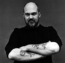 Thomas Disch castigating a science fiction readership which often regarded his work with a disdain born of narrow expectations. Disch (left), who took his own life a few days ago, was one of the New Worlds group of writers who frequently caused consternation among the kind of readers who only ever want to read about future technology. He was also much more than that, of course, and he wrote a lot more widely than most genre writers but it’s for his sf novels that he’ll be remembered. Rather than attempt another encomium I thought it far better to post a Charles Platt interview from 1979 which gives an insight into Disch’s character as a man as well as a writer. This was one of a number of interviews Platt conducted with leading sf writers during the late Seventies, published as Who Writes Science Fiction? in the UK (by Savoy Books) and Dream Makers: The Uncommon People who Write Science Fiction in the US.
Thomas M Disch by Charles Platt
New York, April 1979
 NEW YORK, city of contrasts! Here we are on Fourteenth Street, walking past The New School Graduate Faculty, a clean modern building. Inside it today there is a fine museum exhibit of surreal landscape photography, but the drapes are permanently closed across the windows because, out here on the stained sidewalk, just the other side of the plate-glass, it’s Filth City, peopled by the usual cast of winos, monte dealers. shopping-bag ladies festooned in rags and mumbling obscenities, addicts nodding out and falling off fire hydrants. Fourteenth Street, clientele from Puerto Rico, merchandise from Taiwan. And what merchandise! In stores as garish and impermanent as sideshows at a cheap carnival, here are plastic dinner-plates and vases, plastic toys, plastic flowers and fruit, plastic statues of Jesus, plastic furniture, plastic pants and jackets-all in Day-Glo colors, naturally. And outside the stores are dark dudes in pimp-hats and shades, peddling leather belts, pink and orange wigs, and afro-combs… itinerant vendors of kebabs cooked over flaming charcoal in aluminium handcarts… crazy old men selling giant balloons.., hustlers of every description. And further on, through the perpetual fanfare of disco music and car horns, past the Banco Populare, here is Union Square, under the shadow of the Klein Sign. Klein’s, a semi-respectable old department store, was driven out of business by the local traders and has lain empty for years. But its falling apart facade still looms over the square, confirming the bankrupt status of the area. While in the square itself—over here, brother, here, my man, I got ’em, loose joints, angel dust, hash, coke. THC, smack, acid, speed, Valium, ludes. Seconal. Elavil!
Union Square wasn’t always like this. Michael Moorcock once told me that it acquired its name by being the last major battlefield of the American Civil War. Foolishly, I believed him. In truth there are ties here with the American labor movement; many trades unions are still headquartered in the old, dignified buildings, outside of which stand old, dignified union men, in defensive lunch-hour cliques, glaring at the panhandlers and hustlers toting pint bottles of wine in paper bags and giant, 20-watt ten-band Panasonic stereo portables blaring more disco! disco! disco!
Oddly enough we are looking for an address, here, of a writer who is known in the science fiction field for his almost elitist, civilized sensibilities. He has moved into an ex-office building that has been converted from commercial to residential status. Union Square is on the edge of “Chelsea”, which is supposed to be the new Soho, a zone where, theoretically, artists and writers are moving in and fixing up old buildings until, when renovations are complete, advertising execs and gallery owners will “discover” the area and turn it into a rich, fashionable part of town.
Theoretically, but not yet. In the meantime this turn-of-the-century, 16-storey, ex-office building is one of the brave pioneer outposts. We are admitted by a uniformed guard at the street entrance, and take the elevator to the 11th floor. Here we emerge into a corridor recently fabricated from unpainted sheets of plaster-board, now defaced with graffiti, but high-class graffiti, messages from the socially-enlightened tenants criticising the owner of the building for his alleged failure to provide services (“Mr. Ellis Sucks!” “Rent Strike Now!”) and here, we have reached a steel door provisionally painted in grubby Latex White, the kind of paint that picks up every fingermark and can’t be washed easily. There’s no bell, so one has to thump the door panels, but this is the place, all right, this is where Thomas M. Disch lives.
Continue reading “Thomas M Disch, 1940–2008”

 Thomas Disch castigating a science fiction readership which often regarded his work with a disdain born of narrow expectations. Disch (left), who took his own life a few days ago, was one of the
  NEW YORK, city of contrasts! Here we are on Fourteenth Street, walking past The New School Graduate Faculty, a clean modern building. Inside it today there is a fine museum exhibit of surreal landscape photography, but the drapes are permanently closed across the windows because, out here on the stained sidewalk, just the other side of the plate-glass, it’s Filth City, peopled by the usual cast of winos, monte dealers. shopping-bag ladies festooned in rags and mumbling obscenities, addicts nodding out and falling off fire hydrants. Fourteenth Street, clientele from Puerto Rico, merchandise from Taiwan. And what merchandise! In stores as garish and impermanent as sideshows at a cheap carnival, here are plastic dinner-plates and vases, plastic toys, plastic flowers and fruit, plastic statues of Jesus, plastic furniture, plastic pants and jackets-all in Day-Glo colors, naturally. And outside the stores are dark dudes in pimp-hats and shades, peddling leather belts, pink and orange wigs, and afro-combs… itinerant vendors of kebabs cooked over flaming charcoal in aluminium handcarts… crazy old men selling giant balloons.., hustlers of every description. And further on, through the perpetual fanfare of disco music and car horns, past the Banco Populare, here is Union Square, under the shadow of the Klein Sign. Klein’s, a semi-respectable old department store, was driven out of business by the local traders and has lain empty for years. But its falling apart facade still looms over the square, confirming the bankrupt status of the area. While in the square itself—over here, brother, here, my man, I got ’em, loose joints, angel dust, hash, coke. THC, smack, acid, speed, Valium, ludes. Seconal. Elavil!