Weekend links 167

field.jpg

Poster by Luke Insect & Kenn Goodall.

In recent years I’ve had little patience for British cinema: too much dour “realism” with little of Alan Clarke’s vitality, too many comedies that aren’t funny, too many Hollywood calling cards, too much Colin Firth… So it’s been a pleasure to see Peter Strickland’s Berberian Sound Studio followed this month by Ben Wheatley’s A Field In England, a pair of films that stand out by daring to be different in a medium which seems to grow more creatively conservative with each passing year. A Field In England adds to the micro-genre of weird British films set around the time of the English Civil War. In place of witchfinders and devil worshippers we have magic, murder, madness, and a field of hallucinogenic mushrooms. Wheatley, like Strickland, takes risks that wouldn’t be allowed with a bigger budget which makes me excited to see what they’ll be doing next. A Field In England is already out on DVD & Blu-ray. The trailer is here. The director talked to Mat Colegate about the genesis of the film (spoiler alert). There’s more big hats and cloaks in this list of ten 17th century films.

• “I like to look at men…the way they look at women,” photographer Ingrid Berthon-Moine says about her pictures of sculpted testicles.

Roger Dean has finally sued James Cameron over the designs for Avatar. Will be interesting to see how this one turns out.

• Google has taken its Street View cameras to Battleship Island, “the most desolate city on earth“.

• The strange fantasy novels of Edward Whittemore are available again in digital editions.

Julia Holter talks about her forthcoming Gigi-inspired album Loud City Song.

• At Pinterest: Maneki-neko, the beckoning cat of good fortune.

Beautiful Books: Decorative Publishers’ Cloth Bindings.

• The abstract paintings of Hilma af Klint (1862–1944).

Lee Brown Coye illustrates August Derleth in 1945.

Bill Laswell’s discography intimidates the collector.

• Mix of the week: Kit Mix #23 by Joseph Burnett.

• The Soundcarriers: Last Broadcast (2010) | Signals (2010) | This Is Normal (2012)

Weekend links 135

kuhlman.jpg

Two Grove Press covers by Roy Kuhlman. From Arden Kuhlman Riordan’s Pinterest page collecting her father’s cover designs.

• “When people asked me what boylesque was, I’d say I’m doing burlesque and I have a penis,” said Mr. Ferguson.

Sequence5: 42 tracks of new, atmospheric/ambient music. A free download in a variety of formats.

The trailer for Jimmy’s End, the forthcoming film by Alan Moore and Mitch Jenkins.

As a porn performer, I can say from experience and with confidence that I’ve never been objectified by other performers. Nor have I been objectified by viewers. At least not in a way that seemed to confuse them into thinking I was an object. What happens instead is that I shift in and out of object-hood. Athletes do this too—they engage with their bodies for a specific task. At the end of the game or the shoot, the context changes.

Conner Habib on The Virtues of Being an Object

Secret Weapons (1972), David Cronenberg’s lost TV movie resurfaces.

Joseph Burnett reviews Nude, the new album by The Irrepressibles.

Over a third of e-readers are used just once before being set aside.

The guarded, the cautious, the small-scale, the modest, the well-crafted—such books may be rewarded (in our own time, at the national level), but they are rarely preserved. They are not preserved because guardedness, caution, smallness, modesty, and craft can be replaced in any given generation. What is irreplaceable is excess: Of verbal kinesis, religious intensity, intellectual voracity.

Amit Majmudar on Entertainment and Excess: The Great Literary Audiences

Miniature Book Interviews with Louis Wain Bound by Hand.

A Tour Inside Salvador Dalí’s Labyrinthine Spanish Home.

• Horror fiction should be deep, not cheap, says Nina Allan.

• RIP Peter Kuhlmann aka Pete Namlook

More is More by Alex Trochut

The Useless Web

Lost In The Sea (1992) by Sequential (Pete Namlook & DJ Criss) | Angel Tech (1994) by Bill Laswell & Pete Namlook | Yenlik (Part II) (1996) by Burhan Öçal & Pete Namlook

Weekend links 98

postcard.jpg

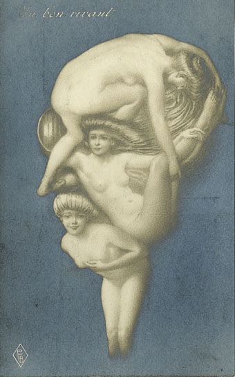
The Arcimboldo Effect again. An undated postcard from the image section of A Virtual Wunderkammer: Early Twentieth Century Erotica in Spain.

“I took George Clinton and Bootsy Collins to the Battle Station for the first time, and they left feeling like they’d just had a close encounter,” said the bassist and music producer Bill Laswell, who met Rammellzee in the early 1980s and remained one of the few people who saw him regularly.

Rammellzee’s Work and Reputation Re-emerge

• Also in the NYT: China Miéville on Apocalyptic London: “Everyone knows there’s a catastrophe unfolding, that few can afford to live in their own city. It was not always so.” Reverse the perspective and find Iain Sinclair writing in 2002 about Abel Ferrara’s The King of New York: “A memento mori of the century’s ultimate city in meltdown.”

• The Inverted Gaze: Queering the French Literary Classics in America by François Cusset. Related: Glitterwolf Magazine is asking for submissions from LGBT writers/artists/photographers.

• The vinyl releases of Cristal music by Structures Sonores Lasry-Baschet continue to be scarce and unreissued. Mark Morb has a high-quality rip of the group’s No. 4 EP here.

Henri’s Walk to Paris, the children’s book designed by Saul Bass in 1962, is being republished. Steven Heller takes a look.

As the critic Jon Savage points out, even rock’n’roll’s very roots, the blues, contained a weird gay subculture. The genre was home to songs such as George Hannah’s Freakish Man Blues, Luis Russell’s The New Call of the Freaks, and Kokomo Arnold’s Sissy Man Blues. “I woke up this morning with my pork grindin’ business in my hand,” offers Arnold, adding, “Lord, if you can’t send me no woman, please send me some sissy man.”

Straight and narrow: how pop lost its gay edge by Alexis Petridis

David Pelham: The Art of Inner Space. James Pardey interviews the designer for Ballardian.

BBCX365: Johnny Selman designs an entire year of news stories.

• Sarah Funke Butler on Nabokov’s notes for Eugene Onegin.

• Leslie S. Klinger on The cult of Sherlock Holmes.

How piracy built the US publishing industry.

SynthCats

The Light Pours Out Of Me (1978) by Magazine | Touch And Go (1978) by Magazine | Motorcade (1978) by Magazine | Feed The Enemy (1979) by Magazine | Cut-Out Shapes (1979) by Magazine.

Soft machines

smseven.jpg

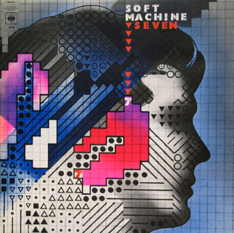
Seven (1973) by Soft Machine. Design by Roslav Szaybo.

You’re the great, grey man whose daughter licks policemen’s buttons clean,
You’re the man who squats behind the man who works the soft machine.

Mick Jagger, Memo From Turner (1968)

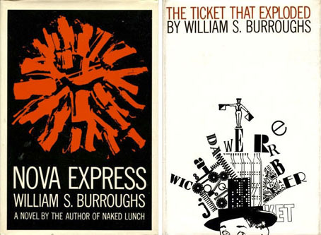
By coincidence this month I’d been re-reading some William Burroughs when I picked up a nice box set of five Soft Machine albums, part of a series of reissues that Sony have been doing recently. They’re very cheap and sound excellent, and also have the additional benefit of being a card slipcase holding the discs in card sleeves so there’s no nasty plastic packaging. The set comprises the Third (1970), Fourth (1971), Fifth (1972), Six (1973), and Seven (1973) albums. I have the band’s first two studio albums already so this has been an opportunity to get fully acquainted with the rest of their output up to the point where the machine started to run out of steam.

smone.jpg

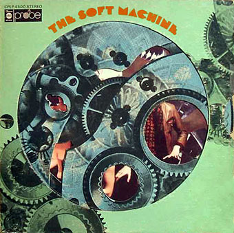
The Soft Machine (1968) with die-cut sleeve. Design by Byron Goto, Eli Allman, Henry Epstein.

Third and Fourth are freaked-out jazz fusion recorded when Robert Wyatt was still on drums; Fifth, which I had for years on vinyl, is post-Wyatt fusion of a more polite variety, great compositions but it sounds lightweight compared to Miles Davis’s On The Corner which was released the same year. Six, which I’d hardly heard at all, is a set of live recordings and four superb studio tracks. Seven is the weakest of the lot but it prompts this post on account of the cover which I always liked the look of when flicking past it in record shops. Seen today it still looks surprisingly advanced for 1973, and the intention behind the design is still mysterious. I used to regard it as vaguely “futuristic” despite knowing that the music was nothing of the sort. The accumulation of abstract symbols contained by a human head implies either a score for some aleatory composition (which again is belied by the short jazzy pieces within), or can perhaps be read as a “soft machine”, especially if one considers that the popular idea of electronics at this time involved patch-boards and banks of flashing lights. Ten years later with synthesizers in common use this kind of semi-cybernetic imagery was a lot more topical.

smtwo.jpg

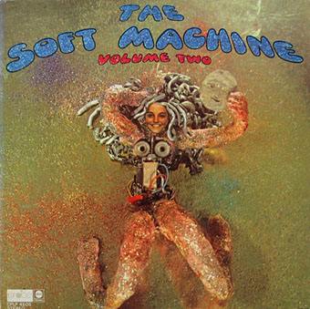
The Soft Machine Volume Two (1969). Design by Byron Goto, Henry Epstein.

The first two Soft Machine albums both showed literal renderings of Burroughs’ “soft machine” idea albeit couched in the naked-woman-as-decoration style of the late 60s. Six has a horrible cover with an airbrushed attempt at a soft machine, one of those pictures common to the 1970s that you’re amazed was approved by band and record company.

v2.jpg

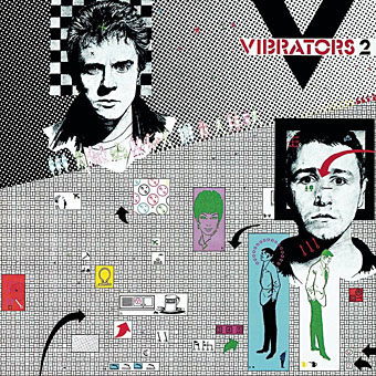
V2 by The Vibrators (1978). Design by Roslav Szaybo.

The design for Seven is credited to Roslav Szaybo, an in-house designer at CBS. Looking through Mr Szaybo’s other credits there’s little that resembles his Soft Machine cover until you arrive at the sleeve for V2, the second album by British punk band The Vibrators. This was another cover I always liked for similar graphical reasons to the Soft Machine sleeve; they also share a similar stencil typeface. Musically they’re worlds apart, of course, although William Burroughs’ influence on music carried on into the punk era (another Brit punk band named themselves Dead Fingers Talk) and beyond. It’s an influence reaching from the mid-60s with Soft Machine and his appearance on the cover of Sgt Pepper, into the 1990s with the many recordings he collaborated on or inspired from Bill Laswell, Hal Willner and others. His influence generally may have fallen off since his death in 1997 but it’s still a remarkable achievement for someone who never seemed to care much for music beyond the popular tunes he heard as a boy.

Elsewhere on { feuilleton }
The album covers archive
The William Burroughs archive

Design as virus 13: Tsunehisa Kimura

kimura.jpg

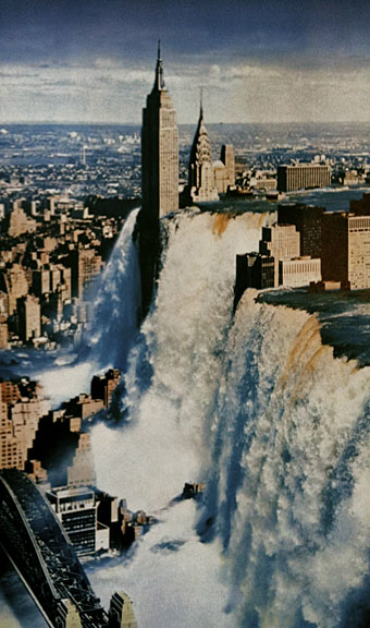
Waterfall by Tsunehisa Kimura.

Continuing an occasional series. Japanese artist Tsunehisa Kimura (1928–2008) was initially inspired by the polemical graphics of John Heartfield to create his own photomontages, a painstaking collage technique now rendered obsolete by Photoshop. Kimura’s work exchanges Heartfield’s satire for an overt and frequently apocalyptic Surrealism, as in his most visible piece, Waterfall. The copy above is one of a number of pictures reproduced by Geoff Manaugh at BLDGBLOG from a 1979 Kimura collection, Visual Scandals by Photomontage.

schutze1.jpg

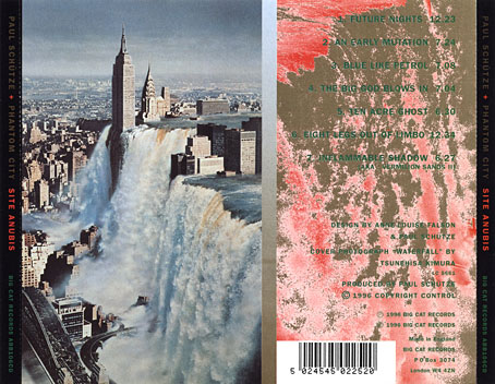
Design by Anne-Louise Falson & Paul Schütze.

I was first startled by Waterfall in 1996 when Paul Schütze released his Site Anubis album, the product of a “virtual group” comprised of musicians recording in different studios around the world:

The musicians comprising Phantom City—the name, incidentally, originating from the book title Topology of a Phantom City by French novelist Alain Robbe-Grillet—never met for the recording of Site Anubis, as each one recorded in a different studio in a different country: guitarist Raoul Björkenheim in Helsinki, bass- and contra-bass clarinetist Alex Buess in a Basel studio, soprano saxophonist Lol Coxhill in London, bassist Bill Laswell at Green Point Studio in Brooklyn, New York, trombonist Julian Priester in Seattle, drummer Dirk Wachtelaer in Brussels, and Schütze himself in London and Basel. Incredibly, Laswell had only Schütze’s electronic backing track to respond to. Wachtelaer had Laswell and Schütze to play against, Björkenheim had drums and bass,—in short, certain players had more information than others.

schutze2.jpg

Kimura’s picture is an ideal accompaniment to this excellent album, especially when you note a Ballard reference in the titles (not the first in Schütze’s oevre), and read the scene-setting piece of fiction on the CD insert, an explanation of the album title:

That morning a report came in from an unmarked helicopter somewhere over the city. The waters were subsiding and the smoke from a thousand fires had begun to drift inland revealing an impossible new structure. Towering some eight hundred feet over the gleaming devastation of the streets, its base occupying an entire city block, was a colossal black basalt figure. The body was male and human, – the head, which stared expectantly toward the boiling western horizon, was the head of a jackal. From the air it was clear that the pattern of destruction on the ground was radial and that the massive figure was sited precisely at its centre.

Continue reading “Design as virus 13: Tsunehisa Kimura”