Weekend links 47

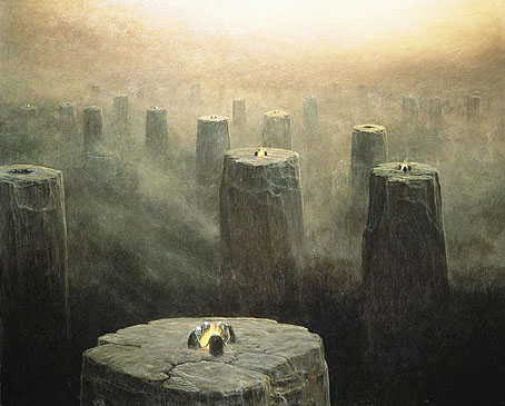
beksinski1.jpg

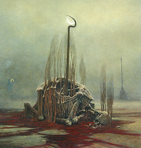
DG-2499 (1975) by the fantastic (in every sense of the word) Zdzislaw Beksinski (1929–2005). See the Dmochowski Gallery for a comprehensive collection of the artist’s work. Thanks to BibliOdyssey for the tip.

• More ICA events: From Animism to Zos: Strange Attractor Salon will be “a series of weekly events, consisting of a talk and a film, exploring some lesser-known intersections of culture, history, mind and nature” running from 10 March–12 May, 2011.

• And on May 10, the London Word Festival presents a Dodgem Logic evening with entertainment provided by contributors to that magazine:

Alan Moore’s reinvigoration of the underground fanzine, Dodgem Logic, comes alive in the non-conformist surroundings of Hackney’s Round Chapel. A night of art, comedy, comment and put-something-back localism. (…) With Robin Ince heading up a colossal stand-up bill, artists Steve Aylett, Savage Pencil, Melinda Gebbie and Kevin O’Neill panel-up to talk about their comic work, while music comes from hyperactive racketeers The Retro Spankees. With an exhibition of artwork from the magazine, and conducted by editor-in-chief Alan Moore.

• Taschen publishes a collection of Dennis Hopper’s photographs this week. The Independent has a small selection here. Also new from Tachen, Alex Steinweiss, The Inventor of the Modern Album Cover.

Bass Notes: The Film Posters of Saul Bass at the Kemistry Gallery, London.

beksinski2.jpg

DG-2507 by Zdzislaw Beksinski.

While riding through the bustling streets of London from 1603 to 1621, one was liable to hear the shout “Long live Queen James!” King James I of England and VI of Scotland was so open about his homosexual love affairs that an epigram had been circulated which roused much mirth and nodding of the heads: Rex fuit Elizabeth: nunc est regina Jacobus—”Elizabeth was King: now James is Queen.”

There’s more about the private life of the man who gave his name to the King James Bible here.

Addams and Evil, a Tumblr devoted to the great Charles Addams.

Hannes Bok again at Golden Age Comic Book Stories.

Caravaggio’s crimes exposed in Rome’s police files.

Deserted City, photographs by Kim Høltermand.

• The blue sand dunes of the planet Mars.

• A map of the ghost signs of Chicago.

The movie title stills collection.

The pitfalls of e-book buying.

Life On Mars? (1971) by David Bowie | Uncle Sam’s On Mars (1979) by Hawkwind | Eyes On Mars (1980) by Chrome | Cache Coeur Naif (1997) by Mouse on Mars.

Victorian typography

type1.jpg

“Victorian” isn’t really the correct term for the products of 19th century America but then “19th century” covers rather a lot of ground. Mr BibliOdyssey’s most recent post is a stunning collection of title pages from fire insurance maps of the late 19th and early 20th century. Rather than repost any you ought to go and see them for yourself, they’re excellent examples of the best and worst of “Victorian” graphic design, insanely and pointlessly ornate yet often very inventive in their elaborations and stylised letterforms. Being a typophile I’d often feel frustrated when looking at 19th century documents and seeing type designs in use for which there were no contemporary equivalents. There was such a profound reaction against ornamented design in the 20th century that it’s only relatively recently that typography of this period has been reappraised and, in some cases, resurrected. The book from which these examples are taken dates from 1897, and it fascinates for putting names to some of those neglected designs. This is a big catalogue of 740 pages so I’ve been sparing in my selection. Anyone wishing to see more can download the whole thing here.

type2.jpg

Despite my affection for curvilinear Art Nouveau, when it comes to typography I’m often drawn to the spikier styles. Atlanta was digitised by P22 in a style they call Victorian Gothic. Their accompanying ornament set replicated that curious shape from Victoria below.

type3.jpg

type4.jpg

This typeface, or ones which resemble it, is a common one in 19th century newspaper and advertising design but I’d never seen it given a name until now. The catalogue pages have a number of variations which is no doubt an indicator of its popularity. A bold weight of the design was digitised by Scriptorium as a font they call Mephisto.

type5.jpg

Rubens is my favourite of all the designs in this catalogue, probably because I always liked the way it looked when it enjoyed a surprising flush of popularity in the 1960s and 1970s. The narrow style made it very useful for book covers (as with the examples here) while those spiky serifs made it popular with art directors looking for a typeface that said “horror”. Wooden Type Fonts recently digitised a version of Rubens but their version lacks the elegance of the original. Anyone else want to have a go?

type6.jpg

Lastly the catalogue has many pages of clip art figures and decorations including the pointing hands which people always associate with 19th century design. I’d wondered a few times whether these jagged decorations were meant to be electrical or not. Electricity was a new thing in 1897 so these would have seemed distinctly modern.

Previously on { feuilleton }
Steampunk overloaded!
Penguin Labyrinths and the Thief’s Journal
Masonic fonts and the designer’s dark materials

The specimen jars of Frederik Ruysch

ruischii1.jpg

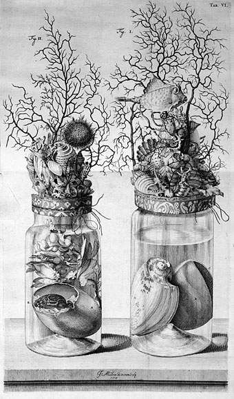
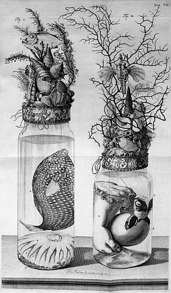
Some plates for Darwin Day from Thesaurus Animalium Primus (1710) by Dutch botanist and anatomist Frederik Ruysch. As is evident from these examples, Ruysch wasn’t above some frivolous indulgence when it came to illustrating his scientific texts, and he often gathered specimens into little tableaux which verge on the bizarre, such as the conjunction below of a child’s arm and a hatching turtle. Gone are the days when a renowned man of science might be depicted plucking at the entrails of a dead baby. This site has more about Ruysch’s specimens while BibliOdyssey posted some examples of Ruysch’s anatomical tableaux (with baby skeletons this time) and links to the books which contain them.

ruischii2.jpg

Previously on { feuilleton }
Darwin at 200

Odilon Redon lithographs

redon1.jpg

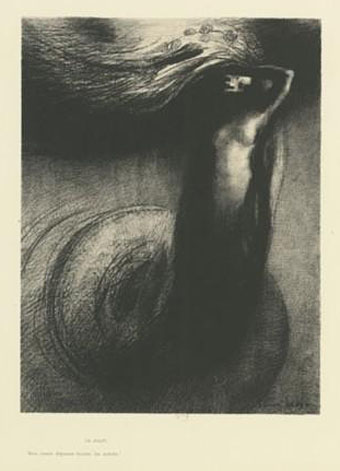
La mort: mon ironie dépasse toutes les autres! (1889).

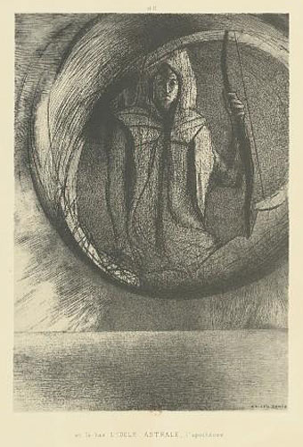
Two samples from a collection of Odilon Redon etchings lithographs at Gallica, an archive I’ve only recently begun to look at. A shame that the larger images scale up the content and the empty margin, often leaving a very small picture in the centre not much bigger than thumbnail size. Oh, well… On the plus side there’s a portrait I hadn’t seen before of Des Esseintes from Huysmans’ À Rebours, the book which in 1884 introduced Redon’s work to a wider public. Via BibliOdyssey, without whom, etc.

redon2.jpg

Et là-bas l’IDOLE ASTRALE, l’apothéose (1891).

Previously on { feuilleton }
The eyes of Odilon Redon
Arthur Zaidenberg’s À Rebours

Fascinating tentacula

squid.jpg

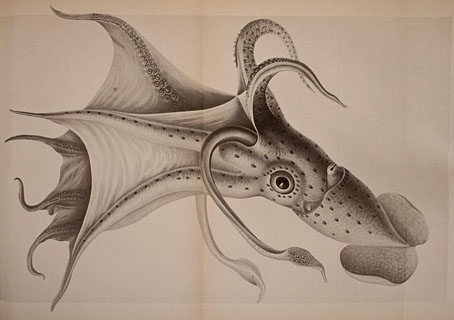
Histioteuthis ruppellii.

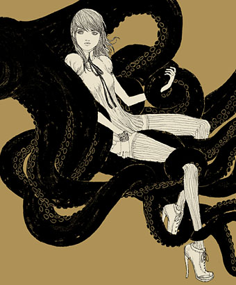
Suckered pseudopods flex and writhe again this week with simultaneous postings at BibliOdyssey and Sci-Fi-O-Rama. Coincidence or some cephalopodic zeitgeist thing? You decide. BibliOdyssey has a fine set of natural history plates showing various squid and octopuses while Sci-Fi-O-Rama presents a small collection of illustrations by Barnaby Ward. If it’s boys and tentacles you want (and who doesn’t?), then there’s always the art of NoBeast.

ward.jpg

Untitled drawing by Barnaby Ward.

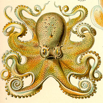
Ernst Haeckel remains my favourite tentacle illustrator, and the octopus below is one of his examples from Kunstformen der Natur (1899–1904). Somewhere (although Cthulhu knows where) I have a drawing by Hal Foster from one of his Prince Valiant strips showing a sinister octopus in a pit which is almost a match for Haeckel’s, and may even have been based on it. If I ever find it again I’ll post it here. Meanwhile, China Miéville’s Kraken is currently lurking on bookshelves, and let me remind you again that he discusses that novel and other works over at Salon Futura. While we’re on the subject, let’s not forget the Octopulps.

haeckel.jpg

Octopus by Ernst Haeckel.

Finally, a note to say that my webhost is moving this site to a new server which may cause some disruption to these pages for the next few days. As always, your patience is appreciated.

Previously on { feuilleton }
Jewelled butterflies and cephalopods
Haeckel fractals
Ernst Haeckel, Christmas card artist
The art of Rune Olsen
Octopulps
The art of NoBeast