Queer Noise and the Wolf Girl

queer_noise.jpg

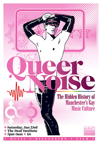
Two recent pieces of work which were being created at the same time so they share some similarity of style (and the same baroque flourish). Queer Noise is a music-related event taking place in Manchester (UK) next month. Music journalist Jon Savage will be leading the discussion and some may recognise the event title as relating to his Trikont CD compilation Queer Noises 1961–1978: From the Closet to the Charts. There are further details about the event at the MDMArchive.

Designing for gay content can be a fraught business since it’s almost inevitable that someone will disagree with your choices. Best then to abandon any thought of trying to please everyone and follow your own instincts. Making this a riot of pink seemed like a good way to offset the fetishised figure as well as making an eye-catching design. My first impetus had been to try an arrangement of pink and black on white similar to that used by Barney Bubbles in one of his Ian Dury designs. In the end this evolved away from that idea but it was a useful starting point. And while we’re on the subject of pink, there’s a growing backlash against the way the colour is forced on young girls:

Back in the 1800s, most children were dressed alike. Gender differences weren’t really apparent until they could walk, or later: boys and girls both wore dresses or skirts until they were six or so. By the end of the century, as the Ladies’ Home Journal noted, boys’ and girls’ clothing styles began to diverge. According to Professor Jo Paoletti of the University of Maryland, pink emerged as an appropriate colour for boys because it was “a close relative of red, seen as a fiery, manly colour”. Blue was considered better suited for girls because of its associations, in art, with the Virgin Mary. (More.)

curse.jpg

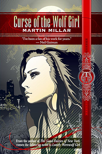
Curse of the Wolf Girl is a young adult title by Martin Millar about which I can tell you very little at the moment other than I’ve finished the cover and the book will be out some time in the new year from Underland Press. More about that when it happens.

Previously on { feuilleton }
Coming Out Day
Over the rainbow
Queer Noises

Barney ascendant

costello.jpg

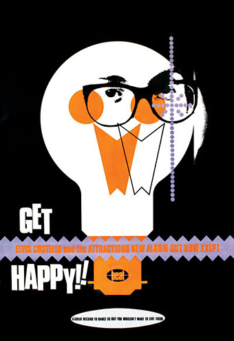
Poster by Barney Bubbles for Elvis Costello’s Get Happy!! (1980).

Adelita, the publishers of Reasons To Be Cheerful: the life and work of Barney Bubbles, announced this week that Paul Gorman’s essential collection of BB graphics has been named Book of the Year in Mojo magazine:

Reasons To Be Cheerful – the acclaimed study of the life and work of the late graphic genius Barney Bubbles – has been declared Book Of The Year by the UK’s leading rock monthly Mojo magazine.

Described as “fascinating and definitive” by the Sunday Times and “moving and lovingly researched,” by GQ editor Dylan Jones in The Independent, Reasons To Be Cheerful was written by Paul Gorman (author of style bible The Look and Straight with Boy George) and published by British independent popular culture imprint Adelita (sales and distribution through Turnaround Publisher Services).

Mojo will name Reasons To Be Cheerful Book Of The Year in its January 2010 issue (published November 27) with an exclusive interview with Factory Records designer Peter Saville praising its publication.

A quarter of a century after he took his own life at the age of 41, Reasons To Be Cheerful has transformed Barney Bubbles’ cult status by elevating him into the pantheon of graphic design greats. Among fans of the book are such prominent musicians as Paul Weller, Jah Wobble, Mick Jones, Nick Lowe and Billy Bragg.

Reasons To Be Cheerful is the first and definitive exploration of this important visual artist’s body of work, with more than 600 images including student sketchbooks, private paintings, product, brand, underground and music press and examples of the hundreds of record sleeves, posters, adverts, promotional items and music videos he created for the likes of the Rolling Stones, Hawkwind, Ian Dury, Elvis Costello, Nick Lowe, Squeeze, Depeche Mode, The Specials and Billy Bragg.

Reasons To Be Cheerful has also spawned a spectacular online presence featuring fresh interviews, information and rare and previously unseen images (see http://barneybubbles.com/blog) and has been well received in the UK and US (where it is distributed by D.A.P). Author Paul Gorman will also curate a Barney Bubbles exhibition to be inaugurated at London’s Chelsea Space gallery during Design Week in September 2010.

By coincidence, two days after Mojo appears the All-Day Barney Bubbles Benefit Memorial Concert will be staged at the 229 Club, Great Portland Street, London. Bands featured include various members of the Hawkwind/Hawklords family led by Nik Turner. There’ll also be the return of Turner’s post-Hawks outfit Inner City Unit, for whom Barney created some of his last designs, and the resurrection of the Imperial Pompadours, a one-off rock’n’roll collaboration between Nik and Barney. That’s happening on 29th November and Turner’s website has all the necessary details.

The Elvis Costello poster above comes from a feature about the Get Happy!! album at Paul Gorman’s BB site. I was never a great fan of Costello’s records but the designs Barney created for those early releases were outstanding and represent the peak of his career. (See the Armed Forces sleeve design for a real eye blast.) Paul’s post shows how much work went into creating a range of integrated graphics for the album, singles and promotional material, and he also has some exclusive material which didn’t make it into Reasons To Be Cheerful. The BB book has been a continual treat to look through this year, and the book design I happen to be finishing has not only been inspired by Barney’s example but also manages to make passing reference to him inside. More about that later.

Previously on { feuilleton }
Hawk things
Who is Heeps Willard?
The Sonic Assassins
Reasons To Be Cheerful, part 3: A Barney Bubbles exclusive
More Barney Bubbles
Reasons To Be Cheerful, part 2
Reasons To Be Cheerful: the Barney Bubbles revival
Barney Bubbles: artist and designer

Album cover postage stamps

albums1.jpg

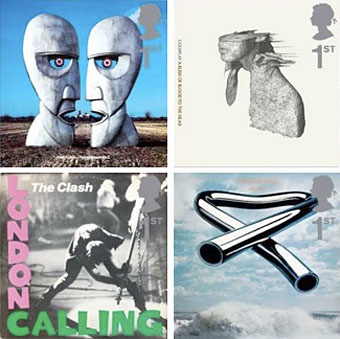
top row: The Division Bell by Pink Floyd; A Rush of Blood to the Head by Coldplay.
bottom row: London Calling by The Clash; Tubular Bells by Mike Oldfield.

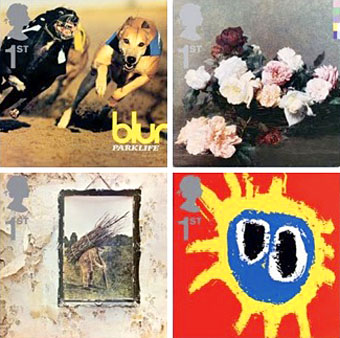
The Royal Mail follows its series of British Design Classics postage stamps with a series dedicated to what they call “classic” album covers. The design classics in the earlier series deserved the term—a  Mini motor car, a Penguin book cover, the London Underground map, etc—whereas here we have the word “classic” being used in its lazy journalist sense where it becomes a synonym for “popular” and “familiar”, two attributes which often diminish with time.

albums2.jpg

top row: Parklife by Blur; Power, Corruption and Lies by New Order.
bottom row: IV by Led Zeppelin; Screamadelica by Primal Scream.

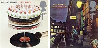
It should be noted that the choice of cover art was limited to releases by UK artists, and the designs had to be readable at the very small size of a postage stamp. Even so, I can’t help but regard this as a missed opportunity. There was no need to feature the Beatles since they’d been given their own set of stamps in 2006, but I’ve never thought of the cover of Let It Bleed (below) as a classic, even though musically it’s one of the best Stones albums. I’d rather choose Andy Warhol’s cover for Sticky Fingers but you can imagine the upset at stamp users being forced to lick a picture of a bulging pair of jeans. As for Pink Floyd’s Division Bell, it’s a typically striking design from Storm Thorgerson but does anyone really think it’s more classic than earlier Floyd covers, not least the Dark Side of the Moon prism which even people who hate the band can instantly recognise? Nearly all these choices seem confused or compromised; the Clash cover is the token punk offering—Royal Mail wouldn’t dare choose Never Mind the Bollocks—but Ray Lowry’s design was copied from an Elvis Presley sleeve; Led Zeppelin’s IV is a great album but other releases had far better covers; Primal Scream, another great album but the whole sleeve design is perfunctory; the Blur choice is merely bewildering.

albums3.jpg

left: Let It Bleed by The Rolling Stones; right: The Rise and Fall of Ziggy Stardust and the Spiders from Mars by David Bowie.

As far as designers go, Hipgnosis (via Storm T), Peter Saville (New Order), and Stylorouge (Blur) are included here but there’s nothing from Barney Bubbles, Malcolm Garrett, 23 Envelope, Neville Brody, Designer’s Republic or any of the other pioneering British designers of the past 30 years. The trouble with those names, of course, is that many of the artists they worked for aren’t popular or familiar enough to the average British stamp purchaser so their work can’t be deemed “classic”. A best of British, then, which could have been a lot better.

Classic Album Covers will be issued on January 10th, 2010.

Elsewhere on { feuilleton }
The album covers archive

Previously on { feuilleton }
British Design Classics
Stamps of horror
Endangered insects postage stamps
James Bond postage stamps
Please Mr. Postman

Design as virus 10: Victor Moscoso

india.jpg

Continuing an occasional series.

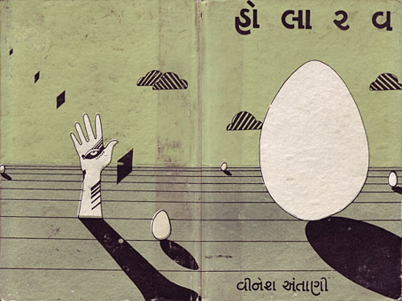
A recent post at A Journey Round My Skull is a stylish series of Indian book jackets from 1964 to 1984. These impress partly for the way they rework western design approaches, and they consequently look very different from the florid visuals one might (lazily) expect of Indian cover design. Western culture borrowed more than enough from India in the 1960s, from clothes to music, so it only seems right that the sub-continent should be free to take something back.

luna.jpg

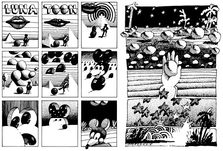
Luna Toon by Victor Moscoso (1968).

Will at A Journey Round My Skull mentions the above cover design as reminding him of this Krautrock bible, The Crack in the Cosmic Egg, a book which happens to be a favourite repository of musical obsession. The cover reminded me more of the weirdly abstract comic strips created by artist and graphic designer Victor Moscoso for the early run of Zap Comix in the late Sixties. Moscoso was one of the most graphically revolutionary of the West Coast poster artists, and his approach to comics looks surprisingly fresh today next to the work of fellow artists like Robert Crumb. Those limitless vistas go back to Giorgio de Chirico but it was Salvador Dalí who made deserts raked by evening shadows reflect interior landscapes of his own, and it was Dalí’s immense popularity that in turn popularised that endless plane as a stage for surreal events. Moscoso borrows from the Surrealists and comic artists like George Herriman as much as he borrows from Disney; in his posters he was one of many artists taking motifs or whole designs from Art Nouveau. Our Indian egg may well be an original work but the first example in Will’s post is a very Saul Bass-like hand, so I’m guessing that the designers of these books were looking around for inspiration. And that eye-in-a-hand? Moscoso had done that as well.

neon.jpg

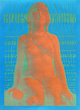
Blues Project Poster by Victor Moscoso (1967).

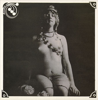
While we’re discussing Victor Moscoso, it’s convenient to draw attention to a slight mystery connecting his poster art and the great album cover designer, Barney Bubbles. The poster above was one of a number that Moscoso made incorporating Victorian or Edwardian photographs, and two at least of these use antique erotica as their central image.

ritual.jpg

Space Ritual interior, design by Barney Bubbles (1973).

This particular photo always stands out for me. The woman is familiar to anyone who’s seen the interior of the fold-out sleeve Barney Bubbles created for Hawkwind’s Space Ritual album in 1973. Barney spent some time in San Francisco in the late Sixties and was undoubtedly familiar with Moscoso’s work, as he was with all the great designs coming from the West Coast at that time. What surprises me is that he should have somehow found the same image to use as Moscoso did. Was there a popular book of Edwardian erotica which everyone was familiar with? Did he ask Moscoso where he’d found the photo? Did he find it by chance? Barney Bubbles experts don’t know the answer (I’ve asked) and the question is in any case a rather trivial one. But I’m still curious… As early porn photos go it’s a particularly fine one and I’d like to know whether there are more like it and where it came from. Needless to say, if anyone knows more about this, please leave a comment.

Previously on { feuilleton }
Design as virus 9: Mondrian fashions
Design as virus 8: Keep Calm and Carry On
Design as virus 7: eyes and triangles
Design as virus 6: Cassandre
Design as virus 5: Gideon Glaser
Design as virus 4: Metamorphoses
Design as virus 3: the sincerest form of flattery
Design as virus 2: album covers
Design as virus 1: Victorian borders

Sleeve craft

randf.jpg

Another authorless design: Vertigo #6360 616 (1973).

Things we did (or didn’t) learn about album cover design this week.

• The jury is still out as to whether Barney Bubbles designed the covers for the UK releases of Kraftwerk’s third and fourth albums, Ralf and Florian and Autobahn. BB experts Rebecca & Mike did clarify a few points with Kraftwerk designer and collaborator Emil Schult, however. This matter requires further research if only to satisfy my own curiosity.

The Guardian finally caught up with the CD Cover Meme which was discussed here last year. “Labels spend fortunes on what you lot have managed in minutes” says the paper. By the same rationale anyone who keeps a blog is, de facto, a journalist because all that either involve is writing down a few words. Clever.

• Taking the DIY theme one stage further, Figment is a site where you can invent your own band and promote them via imaginary album sales on the site. You can also create your own cover art, of course, and Figment have asked me to judge an album cover contest with the very real and worthwhile first prize of the latest edition of Photoshop and a copy of Paul Gorman’s excellent Barney Bubbles monograph, Reasons To Be Cheerful. The contest is running now until April 3rd, 2009, if you’re interested.

Update: Cover versions: How Hipgnosis created some of the most memorable images of the Seventies. The Independent on the new Hipgnosis book.

Elsewhere on { feuilleton }
The album covers archive