The art of Jessica Harrison

harrison.jpg

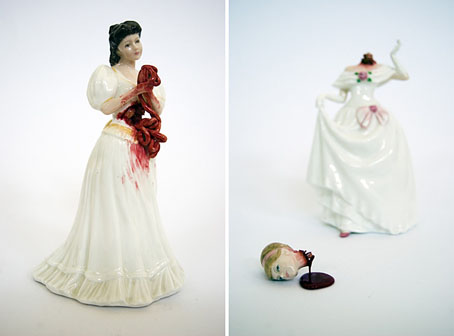
left: Maria (2010); right: Dawn (2010).

British artist Jessica Harrison undermines the saccharine innocence of porcelain figurines in a manner which would no doubt appeal to a Surrealist and black humorist like Jan Svankmajer. As well as these recent pieces, her website features further contemporary takes on Surrealism including a number of pencil drawings, one of which is a self-portrait alluding to that Svankmajer favourite, Giuseppe Arcimboldo.

Previously on { feuilleton }
Surrealism, graphic design and Barney Bubbles
Jan Svankmajer: The Complete Short Films

Surrealism, graphic design and Barney Bubbles

starowieyski.jpg

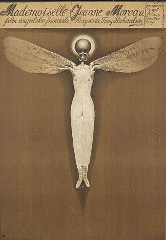
Poster for Mademoiselle (1970) by Franciszek Starowieyski.

Work has cranked into overdrive this week so posting will no doubt be minimal until some semblance of normality is restored. I can however mention two essential exhibitions which will be running through the forthcoming months.

Uncanny: Surrealism and Graphic Design at the Moravian Gallery in Brno, Czech Republic, is curated by design writer Rick Poynor and runs to 24 October, 2010. On display is an intriguing mix of work from familiar names such as Jan Švankmajer and Eva Švankmajerová, poster artist Franciszek Starowieyski, graphic designers Vaughan Oliver and Stefan Sagmeister, and many others.

Uncanny: Surrealism and Graphic Design uncovers the presence of an alternative tradition in graphic design. The Surrealist movement of the 1920s and 1930s focused on literature, painting, photography and the object, and the Surrealists’ publishing activities provided only hints of what a fully conceived Surrealist graphic design or typography might look like. Many of the most suggestive early examples came from Czechoslovakia, where Surrealism would become a lasting influence. Subsequently, Surrealist ideas and images had a profound impact on image-makers in every sphere of art and design, and by the 1960s the effects of Surrealism were widely felt in international graphic communication. Uncanny traces this intermittent line of development up to the present.

There’s further information at the gallery site including a page of related works.
process.jpg

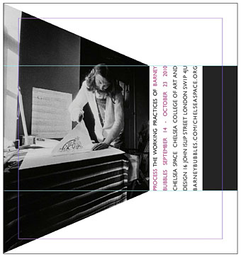
And launching later in the year is Process: The Working Practices of Barney Bubbles, a very timely exhibition of the designer’s work at Chelsea Space, London. Bubbles biographer Paul Gorman is the curator and the event will also see the launch of a second edition of his study of Barney’s life and work, Reasons To Be Cheerful.

The show will contain many never-before-seen items drawn from private collections, including student notebooks, working sketches, original artwork, paintings, books and photography. These were the raw material for videos, record sleeves, t-shirts and posters created by Bubbles for such performers as Ian Dury, Hawkwind, Elvis Costello, The Damned and Billy Bragg (who is contributing a one-off rug with a rendition of the designer’s Masereel-quoting cover for his album Brewing Up With).

Process opens on September 14 and will run to October 23, 2010.

Previously on { feuilleton }
Franciszek Starowieyski, 1930–2009
Jan Svankmajer: The Complete Short Films
Barney Bubbles: artist and designer

Into the Media Web by Michael Moorcock

itmw11.jpg

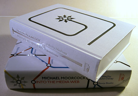
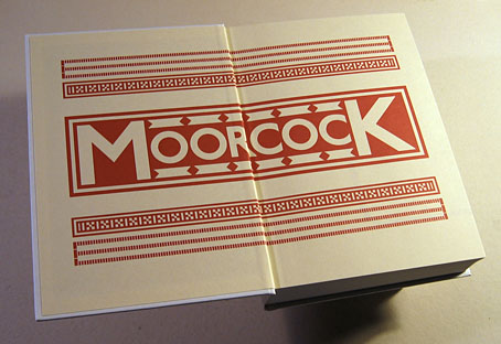
Here at last is the book I spent a good part of last year designing. Into the Media Web is a huge volume as befits a huge talent, 720 pages of Michael Moorcock’s non-fiction spanning fifty years of his career from his days writing for sf and fantasy fanzines, through to journalism, reviews and articles for major newspapers and magazines. Moorcock expert John Davey did an amazingly thorough job of compiling, editing and annotating it all, and it’s been a considerable pleasure to design such an important collection. Alan Moore provided the substantial introduction. Savoy Books haven’t announced a price yet but it’s going to be about £45 since it’s another limited edition and weighs a ton. Into the Media Web makes a fine companion to last year’s The Best of Michael Moorcock from Tachyon, also edited by John Davey (with Ann & Jeff VanderMeer) and whose interior I also designed. Details about Into the Media Web‘s design follow below.

itmw12.jpg

The dust jacket is matt white with a spot UV layer which picks out the titles and lines in gloss.

itmw13.jpg

Continue reading “Into the Media Web by Michael Moorcock”

Storm Thorgerson: Right But Wrong

storm.jpg

Storm Thorgerson, he of the great design partnership Hipgnosis, has some of his album covers and other work in exhibition this month at the Idea Generation Gallery, London. The exhibition runs to May 2nd. This Sunday (April 11th) he’ll be signing copies of his books at the gallery from 2pm.

Alongside some of the most iconic images from his seminal career, the exhibition will include previously unseen sculptures, sketches and writings from the artist. Right But Wrong will provide an in-depth account of the artist and the processes behind some of the artist’s most acclaimed works. Especially for Idea Generation Gallery, Storm will also present a number of brand new site-specific installations, including ambitious reinterpretations of a few his most renowned pieces. (More.)

xtc.jpg

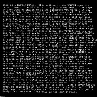
Go 2 by XTC (1978).

News of the exhibition inspired the BBC news site to create a slideshow featuring Hipgnosis covers and examples of Thorgerson’s post-Hipgnosis work. Everyone invariably throws up a Pink Floyd cover when discussing Hipgnosis. Rather than do that, allow me to point you to XTC’s Go 2 album from 1978, the last word (so to speak) in self-referential album design.

Elsewhere on { feuilleton }
The album covers archive

Roger Dean: artist and designer

Kieran at Sci-Fi-O-Rama was in touch recently asking me to contribute a paragraph about a favourite Roger Dean picture for this feature about the artist. The following splurge of polemic was the result, something I’d been intending to write for a while. Since so many words would have overwhelmed the other contributions it’s being presented here while Kieran’s post has a variety of shorter appreciations and further examples of Dean’s art and design.

dean1.jpg

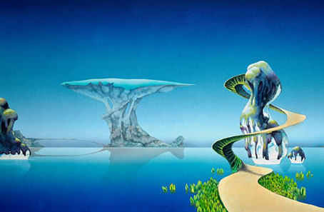
Pathways (1973). A slightly reworked version of the original painting.

“Science fiction is unfortunate in having a most unsatisfactory framework of existence—it’s considered literary kitsch. I believe it should be the mainstream of literature because all the books that have become important down the generations of civilisation have been books about ideas. Superficially, science fiction would seem to offer the most scope for idea content, but the promise is unfulfilled. Good ideas and good writing rarely coincide. All too often the medium is used for entertainment alone and its potential beyond this should be obvious to everyone. I don’t just mean in the sense of fantasy technology. The potential for anticipating human evolution is there and perhaps the means to bring it about and definitely the means to bring about a social evolution.”

Roger Dean, interviewed in Visions of the Future (1976).

If popularity is often a curse as well as a blessing, it’s been Roger Dean‘s curse to see his work dismissed along with many other products of a decade—the 1970s—with more than its share of cultural heroes and villains. Music journalists in Britain have for years given the impression that the arrival of the Sex Pistols in 1976 swept away all that preceded them, in particular bands such as Yes whose album covers had helped raise the visibility of Dean’s art to an international level. This is not only a lazy assumption, it’s also wrong. When Yes released Going For the One in 1977 it was their first studio album in three years, yet despite the punk explosion it went to no. 1 in the UK album charts, while a rare single release from the band made the UK top ten. Yes were playing sell-out tours in Europe and the US in 1977 and 78, as were Pink Floyd whose The Wall was massively popular worldwide in 1979. Punk didn’t sweep prog away, what happened with its advent was that progressive rock and everything associated with it—Roger Dean’s art included—became critically disreputable almost overnight, such that no music journalist would dare say anything good about it. That disrepute has persisted for thirty years despite a lasting and indelible influence. This is an old argument but some facts often need restating anew. *

dean6.jpg

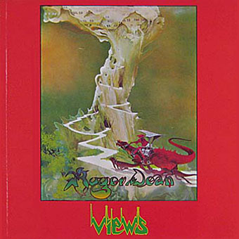
Views (1975).

I was 13 in September 1975 when Roger Dean’s first collection of his illustration and design work, Views, was published. At that time, I hadn’t heard any of the music to which his paintings and drawings were attached, and I didn’t even see a copy of the book until February 1976 when I happened to be in London on a school trip and found a big pile of what I guess was the second edition in Foyle’s book shop. This appeared at exactly the right moment. I wasn’t listening to the music but I was reading a lot of science fiction, and was starting to notice and imitate the work of various paperback artists. I recognised many of the pictures in Views from the covers displayed in the window of our local record shop, Cobweb, whose shopping-bag logo was a cowled magician figure à la Dean or Rodney Matthews. It’s difficult to say what struck me about Dean’s work at the time since you rarely articulate your preferences at that age. I think I liked the consistency of vision and the invention which blended the organic and mechanical, the architecture which looked at once ancient and futuristic, and the flat landscapes which put lone pine trees into rocky terrain familiar from Japanese and Chinese prints. For a teenager his style was also relatively easy to imitate if you forgot about basic things such as imagination and finesse, and I spent a year producing a lot of badly-drawn reptiles posed against lurid watercolour skies.

Continue reading “Roger Dean: artist and designer”