Tony Grubhofer’s Exposition Universelle sketches

grubhofer01.jpg

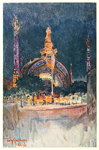
The Exposition gateway.

In a blizzard of work this month I finished another project with a Victorian theme (not more Steampunk!) which I won’t reveal just yet as I dislike spoiling the surprise for publishers. Part of the preparation involved yet more trawling through scanned volumes at the Internet Archive, looking this time at British art magazines from the 1890s. As with the German magazines of the period, some of these are more interesting than others: The Magazine of Art, for example, has its moments but for the most part it’s a champion of the stodgily dull, conservative fare which no one would ever want to revive today. Their columnists also hated the Decadents; I found a wonderful rant against Aubrey Beardsley’s art from 1897 which suggested that the artist and others like him ought to stop poisoning the soul of the nation and emigrate to France. Poor Aubrey only had a year to live, and, as things turned out, ending up dying in that iniquitous nation. I think it’s fair to say he’s had the last laugh.

grubhofer02.jpg

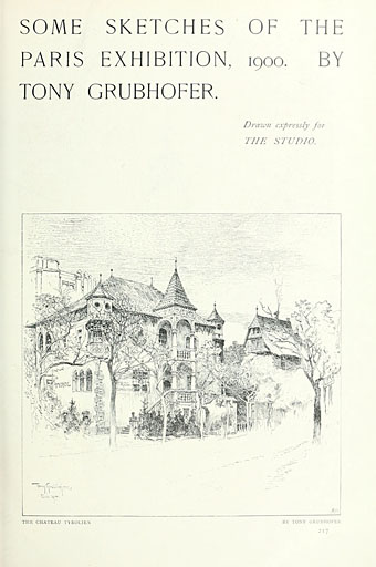
The Chateau Tyrolien.

The Studio magazine, on the other hand, was very sympathetic to the Decadents and Symbolists in general, and to Beardsley in particular, who had his work featured in the first number of the magazine in 1893. The drawings in this post are a surprise find in one of the numbers for 1900, and concern that locus of everything The Magazine of Art loathed: Paris! We’re back again at the Exposition Universelle, a subject which has been explored here on so many occasions I’m surprised I keep finding anything new that’s worthy of mention.

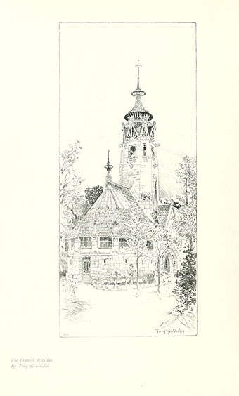
Tony Grubhofer (1854–1935) was apparently an Austrian artist who in these drawings manages to crop his views so selectively that many of them don’t look like they’re part of an exposition in one of the world’s capital cities. Of interest for me are his watercolour of René Binet’s monumental gate, which gives an idea of how the structure would have looked at night illuminated by the novelty of electric light, and his view of Eliel Saarinen’s Finnish pavilion which he renders as though it was a provincial church. This was Saarinen’s first major commission (he was 27 at the time), and Philippe Jullian in his book about the exposition declares this design to have been the most interesting and successful of all the national pavilions that year. It’s certainly better than Edwin Lutyens’ pastiche of an Elizabethan manor for the British pavilion. Eliel Saarinen had a very successful career, as did his more well-known son, Eero Saarinen, one of the major architects of the 20th century.

Volumes 20 to 22 of The Studio can be downloaded here.

grubhofer03.jpg

The Finnish Pavilion.

Continue reading “Tony Grubhofer’s Exposition Universelle sketches”

The Happy Hypocrite by Max Beerbohm

beerbohm01.jpg

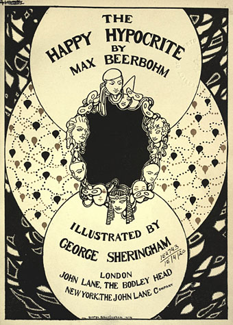
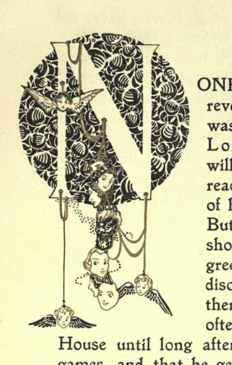
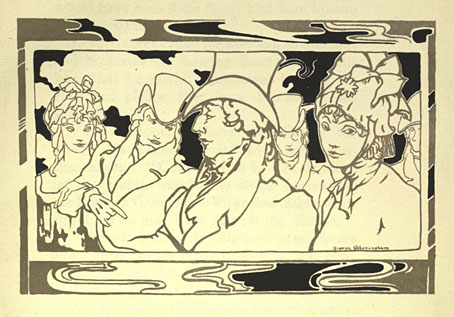
The spirit of the 1890s persists in this 1915 edition of a story the splendid Max wrote originally for The Yellow Book in 1896. Originally subtitled “A Fairy Tale for Tired Men”, The Happy Hypocrite is a typically light-hearted affair concerning the misadventures of one Lord George Hell. The setting is the Regency era so beloved of many of the London Decadents, Aubrey Beardsley included, and the rather fine illustrations are by George Sheringham whose style was distinctive enough to avoid any Beardsley pastiche. The copy preserved at the Internet Archive includes a number of full-colour plates but time and the vicissitudes of reproduction haven’t done them any favours, hence the concentration here on the monochrome drawings.

beerbohm02.jpg

beerbohm03.jpg

Continue reading “The Happy Hypocrite by Max Beerbohm”

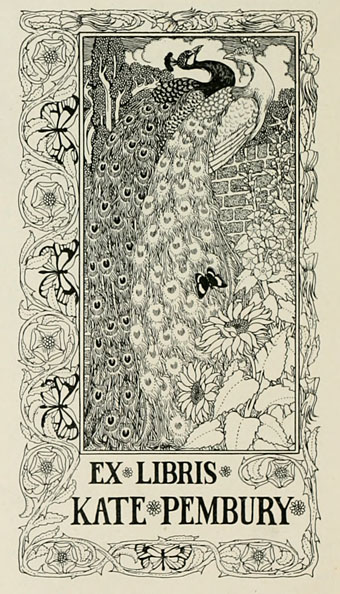
Bookplates from The Studio

studio01.jpg

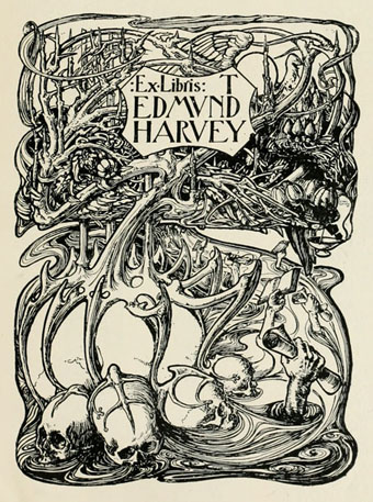
Cyril Goldie.

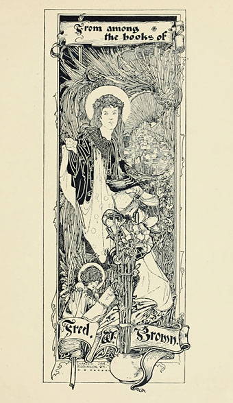
Selections from Modern Book-plates and their Designers, an overview of British, American and European designs published by The Studio magazine in 1898. These small Studio books are always good to see, not least for the period ads in the opening and closing pages. A couple of the designs are familiar from later reprints, notably Cyril Goldie’s remarkable accumulation of thorns and skulls. Many others are in the swirling and tendrilled style of Art Nouveau which The Studio did much to promote in Britain. Also of interest are a few entries from well-known fine artists who are seldom associated with this kind of design. Among these is Belgian Symbolist Fernand Khnopff who contributes a design of his own and an article about Flemish bookplate design.

studio02.jpg

Charles Robinson.

studio03.jpg

PJ Billinghurst.

Continue reading “Bookplates from The Studio”

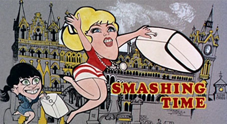
Smashing Time

st1.jpg

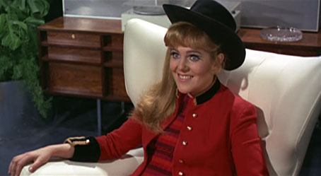
Writing about the late Lynn Redgrave last year I picked out this film as a career highlight despite not having seen it for a very long time. Watching it again recently was an interesting experience, not least for the way it connects to more recent points of obsession, none of them evident the first time round.

st2.jpg

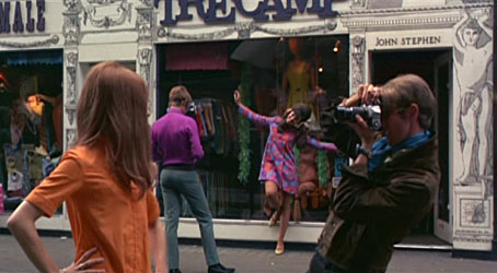
Carnaby Street antics.

Smashing Time was directed by Desmond Davies in 1967, and the direction is as perfunctory as you’d expect from someone whose career before and after was mostly for television. Of more interest is the script by George Melly, a bisexual jazz singer, writer, and lifelong evangelist for Surrealist art. This was Melly’s first job as a screenwriter and he seems an odd choice. He was 41 at the time, and his portrayal of Swinging London and its denizens is often typical of the acerbic older generation’s view of the younger groovers. It’s never as cynical as the Private Eye crowd but without Melly’s humour the tone might seem patronising. That said, it was the satire magazine that originated the names of the two lead characters, Brenda (Rita Tushingham) and Yvonne (Lynn Redgrave) being Private Eye‘s names for Queen Elizabeth and Princess Margaret respectively. The story is a simple one of the pair coming to London from the north of England in search of “a smashing time”, and, in Yvonne’s case, an attempt to make it big somehow. Misadventures ensue.

st3.jpg

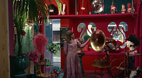
Brenda in the Too Much boutique.

Along the way there are digs at avant-garde artists, lecherous men, greedy pop promoters and wealthy boutique owners. Melly leavens his barbs with yet another example of the Lewis Carroll influence on late-60s culture. One of the scenes takes place in the Jabberwock Gallery, while Jabberwocky-derived character names appear throughout: Tom Wabe (Michael York), Charlotte Brillig, Mrs Gimble (the always wonderful Irene Handl), Bobby Mome-Rath (Ian Carmichael), Jeremy Tove. There’s also an Alice Boojum, and a band named The Snarks (real-life psych band Tomorrow) who don’t get to play, unfortunately. Tomorrow, who appear in the final party scene, are the sole connection with the genuinely hip London of 1967. Everything else we see is the Sunday supplement view of the city with Carnaby Street, shots of Chelsea and a dishevelled Camden. The raucous finale is staged at the top of that bright new landmark of 1960s London, the Post Office Tower.

st4.jpg

Yvonne begins her pop career.

My childhood enthusiasm was obviously taken with the film’s superficial qualities—there are so many songs it’s almost a musical—whereas now I’m impatient with the laboured slapstick but enjoy all the peripheral stuff. Many of the documentary shots of streets away from the centre are a reminder of how shabby and grimy the capital really was at that time, as was the rest of Britain when there was still a century of industrial soot on the walls. I also realise I’d missed the double-meaning of the title: “smashing time” isn’t only a modish phrase for an enjoyable experience but a nod to the way Brenda and Yvonne cause havoc wherever they go. The jabs from an older musician at brainless pop culture would have annoyed some but Yvonne’s hit song, I’m So Young (which is actually very good), has lyrics which resonate today:

I can’t sing but I’m young
I can’t do a thing but I’m young
I’m a fool
But I’m cool
Don’t put me down

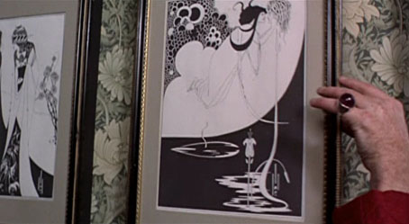
Lynne Redgrave is fantastic as Yvonne, completely convincing in a part that requires her to be loud, selfish and petulant without ever being too obnoxious. She also wears a different wig in nearly every scene. Among other moments of note there’s some fleeting gay humour with a pair of waiters camping it up in the Sweeney Todd pie shop (as does Murray Melvin in another scene). And there’s also an incident which, being an Aubrey Beardsley obsessive, I have to draw attention to:

st5.jpg

Was this the first appearance of Beardsley’s work in cinema? The V&A exhibition which began the Beardsley revival had taken place only a year before, and I can’t think of any examples earlier than this. The William Morris wallpaper is a fitting touch as well.

Reservations aside, this is a film I could watch more often than “properly” psychedelic fare like Wonderwall. For a snapshot of the period, it’s still a smash, baby.

Previously on { feuilleton }
Lynn Redgrave, 1943–2010
Through the Wonderwall

Thomas Mackenzie’s Aladdin

aladdin1.jpg

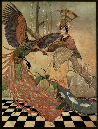
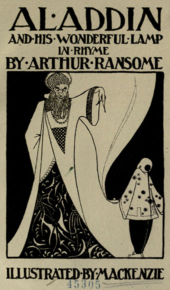
The tip for this one came via Beautiful Century. Thomas Mackenzie (1887–1944) was a minor British illustrator whose work I hadn’t seen before, and if I’d seen the picture above uncredited I might have taken it for something by Kay Nielsen or Edmund Dulac. Mackenzie’s colour plates for the 1919 edition of Aladdin and His Wonderful Lamp in Rhyme by Arthur Ransome are very similar to his more famous contemporaries, while the black-and-white pieces owe a considerable debt to Aubrey Beardsley, especially the title page below. Not all the drawing is as assured as one might hope but the book as a whole is still worth a look.

aladdin2.jpg

Continue reading “Thomas Mackenzie’s Aladdin”