The Golden Hind: A Quarterly Magazine of Art and Literature

golden01.jpg

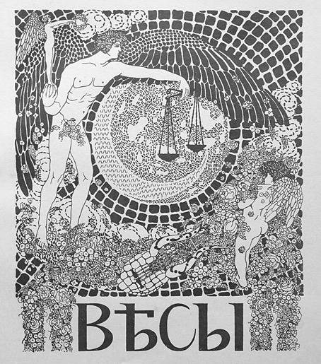
Well, here we are at last… After years of waiting for scanned copies of The Golden Hind to turn up, now that they have done I’m still frustrated. The magazine was one of the many small arts periodicals being published in Britain during the 1920s. It had an erratic, eight-issue run from 1922 to 1924, and remains notable for being the second (and last) magazine to be co-edited by Austin Osman Spare. The artist’s first magazine venture, Form, had been edited by Spare and “Francis Marsden” (Frederick Carter), with the pair publishing two issues before the outbreak of the First World War, followed by a final issue in 1921. Spare co-edited The Golden Hind with writer Clifford Bax, creating a publication whose contents were less mystical than Form had been, while also providing more of a showcase for artists other than Spare himself.

golden02.jpg

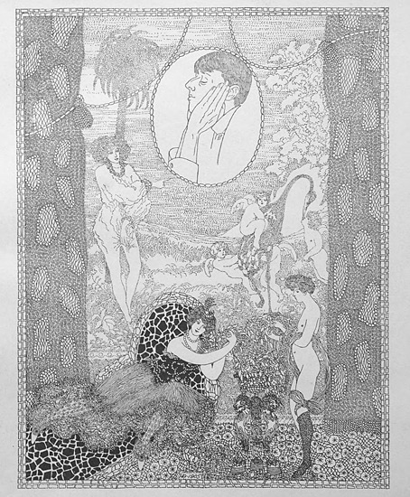
Inevitably, it’s the artists that interest me the most in The Golden Hind, even though the magazine was running pieces by writers like Aldous Huxley and Edith Sitwell. Many of the artists have been featured here before, some of them on many occasions: Alastair (Hans Henning Voigt), John Austen, Harry Clarke, Garth Jones, Henry Keen, and Allan Odle. Spare’s own drawings have since been recycled in various books but most of the other drawings, woodcuts, linocuts and prints remain exclusive to the magazine. The John Austen contributions are especially fine, further examples of his decorated style which borrows heavily from Aubrey Beardsley and Harry Clarke, and which he used so well in his illustrated Hamlet. The spirit of Beardsley’s 1890s is very much in evidence in The Golden Hind, a demonstration, perhaps, that Spare was once again looking back to The Savoy magazine as an example to be followed; one of the essays concerns the poety of The Savoy‘s literary editor, Arthur Symons.

golden03.jpg

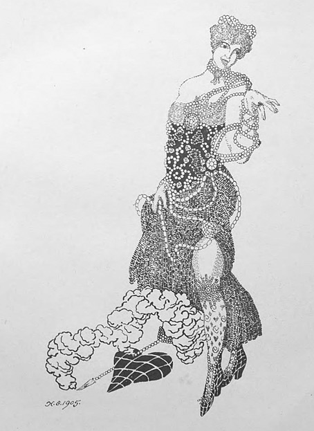
In addition to artists whose popular works are still reprinted today there are less well-known figures like Sidney Hunt whose drawings owed more to contemporary trends than many of the other contributors. Hunt later edited an avant-garde magazine of his own, Ray, while producing his own brand of homoerotic prints like the Ganymede with Zeus which may be seen in The Golden Hind’s final issue.

golden04.jpg

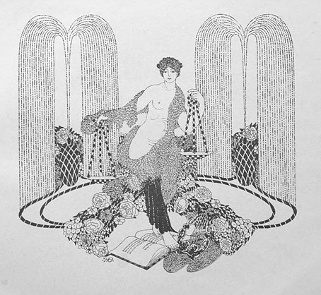
The frustration I referred to above is my usual complaint about image quality. All the copies of the magazine have been taken from microfilm archives which means the pages aren’t grey enough to be illegible but their general murkiness is enough to destroy a lot of the artwork, especially the lithographs and other prints. The samples you see here have been brightened a little which does improve some of the line art but can do nothing for the rest. But I’m not going to complain too much. It’s taken a long time to be able to browse a complete run of this magazine, and I feel fortunate to do so even in this compromised manner. Better copies may still surface eventually. Fingers crossed.

golden05.jpg

Continue reading “The Golden Hind: A Quarterly Magazine of Art and Literature”

Weekend links 730

beardsley.jpg

Cover Design for ‘The Yellow Book’ Vol.I (1894) by Aubrey Beardsley.

• “[Dorian Gray’s] version of Decadence filled the popular imagination when Decadence became an ostentatiously stylish zeitgeist—stylish being the operative word. For Decadent style encapsulated the attitude of being hellbent on thrilling experiences.” The danger of Decadence is also its value. We need more of it, says Kate Hext.

• At Swan River Press: Of Wraiths, Spooks and Spectres. Robert Lloyd Parry, in an interview with John Kenny, talks about the researches that led to the compiling of his latest ghost-story collection, Friends and Spectres.

• The latest pictorial accumulation from DJ Food is a collection of late-60s concert posters by Jim Michaelson, an artist whose designs look like Mad magazine going fully psychedelic.

• Old music: Future Travel by David Rosenboom; new music: Taking Shasta Mountain (By Strategy) by John Von Seggern & Dean DeBenedictis.

• At Public Domain Review: Hunter Dukes on Rückenfiguren, views of the human back as a subject in the history of art.

• In a week when Adobe has been in the news for pissing off its users, a list of alternatives for Adobe software.

• At Spoon & Tamago: Hokusai-inspired erasers reveal Mt. Fuji the more they get used.

• At Unquiet Things: A celebration of Annie Stegg Gerard’s enchanting worlds.

• Mix of the week: DreamScenes – June 2024 by Ambientblog.

• At The Quietus: The Strange World of…Diamanda Galás.

Wraith (2002) by Redshift | El Wraith (2002) by Amon Tobin | Wraith (2015) by John Carpenter

Weirdsly Daubery and friends

hearn.jpg

You think you’ve seen all of the Aubrey Beardsley parodies then another one turns up… This poster by James Hearn dates from 1894, the year that Beardsley’s art became a succès de scandale thanks to his illustrations for Oscar Wilde’s Salome and his covers for The Yellow Book. Beardsley’s art was so original that the parodies arrived swiftly and continued into the following year, until the downfall of Oscar Wilde affected the artist’s position at The Yellow Book and rendered his person, as well as his drawings, even less palatable to the general public. Hearn’s piece is rather poor in comparison to the jibes in Punch magazine, and unusual for being part of a functional design rather than a satirical item.

punch01.jpg

The Punch parodies, several of which worked their own transformations of the artist’s name, used to be available for viewing on a university website, but as I was saying in the previous post, these places have a tendency to vanish when you go to revisit them. The Hearn poster is part of the V&A’s collection but everything else here is from scans of Punch at the Internet Archive. Back issues of the magazine, even those from the 19th century, haven’t always been easy to find online. Punch only gave up the ghost in 2002, and it seems that the restriction on publishing its more recent contents has affected even the older issues, so that the copies at the University of Heidelberg, for example, can only be seen by visiting the university library. It was worth looking for all of these, however. In addition to the drawings you can also see whatever text came with them, while one of the volumes for 1894 also includes a parody of Oscar Wilde’s The Sphinx, together with an illustration that lampoons the poem’s illustrations by Charles Ricketts. The Beardsley parodies are by ET Reed and Linley Sambourne for the most part, although none are credited as such.

punch02.jpg

punch03.jpg

punch04.jpg

Continue reading “Weirdsly Daubery and friends”

The Parade and Baron Verdigris

parade01.jpg

Design by Paul Woodroffe.

The Parade, subtitled An Illustrated Gift Book for Boys and Girls, is something that children with wealthy parents or relatives might have received as a Christmas present in December 1897. The contents are an unusual mix of fairy tales, frivolous seasonal fare—A Christmas Mummery, complete with songs and music—and adventure stories set in other parts of the world. The collection was edited by Gleeson White, an art critic whose former position as editor of The Studio magazine explains the very Studio-friendly choice of illustrators.

parade02.jpg

The design on the title page is a curious piece by Aubrey Beardsley, one with less authority than the most of the other drawings he was producing in his penultimate year. Those dots filling out the arabesque plant forms are the kinds of things that amateurs do when they’re uncertain about whether or not to decorate a design. The tendril which terminates in a tasselled confection is, however, a typical example of the artist’s bizarre invention, the kind of caprice that used to infuriate the critics who disliked his work. Beardsley’s career had been launched four years earlier with a profile in The Studio, but by 1897 he was often struggling for money after being fired from The Yellow Book in the wake of the Oscar Wilde scandal. Gleeson White is to be commended for supporting him at a time when many others refused to do so.

parade03.jpg

L. Leslie Brooke.

Elsewhere in The Parade there are contributions both written and pictorial from Beardsley’s friend, Max Beerbohm; also a story by Richard Burton, a writer you wouldn’t usually expect to find in a book aimed at children. The list of illustrators includes Charles Robinson, Laurence Housman and Manchester’s own Alfred Garth Jones. Beardsley didn’t draw anything else for The Parade but he’s mentioned again in a list of titles advertised in the book’s final pages as having provided a frontispiece for Baron Verdigris, “A Romance of the Reversed Direction” by one Jocelyn Quilp. The title was unfamiliar, and I wasn’t sure at first whether I’d seen the illustration, but the drawing shown below appears in two of my Beardsley books—albeit at small sizes—including the copious Brian Reade collection from 1967.

beardsley.jpg

“Baron Verdigris” sounds like a minor character from Michael Moorcock’s Dancers at the End of Time trilogy, while the improbable “Jocelyn Quilp” turns out to be a nom de plume of Halliwell Sutcliffe whose book is described as a “singular novella, a curious amalgam of parodies based on a time-travelling theme“; shades of the Dancers again. It’s tempting to think that this may be the sole example of Aubrey Beardsley illustrating science fiction (or something like it)—the book is generic enough to be listed at ISFDB—but Brian Reade describes the story as “pseudo-mediaeval and facetious”, “dedicated to ‘Fin-de-Siécle-ism, the Sensational Novel, and the Conventional Drawing-Room Ballad'”. That does at least explain the peculiarities of the drawing. Maybe the Moorcock comparison is an apt one after all.

More illustrations from The Parade:

parade04.jpg

Charles Robinson.

parade05.jpg

Léon V. Solon.

Continue reading “The Parade and Baron Verdigris”

Alastair’s Manon Lescaut

alastair01.jpg

The illustrated works of Alastair aren’t always easy to find, not when Hans Henning Voigt (as the artist was known to his German parents) chose a nom de l’art shared by a large portion of Scottish manhood, past and present. This 1928 edition of Manon Lescaut by the Abbé Prévost is a recent arrival at the Internet Archive. The publisher, John Lane, specialised in illustrated editions, and their Manon Lescaut gives an idea of what we might have seen from Aubrey Beardsley had he survived into the 20th century. John Lane had published collections of Beardsley’s drawings together with related works like Robert Ross’s memories of the artist. It was in their interest to continue the posthumous association, hence the pairing of Alastair with a novel that Beardsley himself might have illustrated. Alastair not only positioned himself as an inheritor of Beardsley’s filigreed drawing style but in photographs appears to be adopting the persona of one of Beardsley’s etiolated characters.

alastair02.jpg

This edition of the novel is an English translation by DC Moylan, with an introduction by Arthur Symons, Beardsley’s friend and collaborator when the pair were teamed as editor and art editor of the short-lived Savoy magazine. Symons was an astute critic, his essays are always worth reading; he remembers his friend here while stepping lightly around Alastair’s imitation of Beardsley’s decorations. As for Alastair himself, he did a good job with the illustrations. The figure-drawing isn’t as uncertain as in some of his earlier works, and each piece is printed in two colours (“the colour of fire and night” as Symons describes it), a process he favoured elsewhere. The leading study of Alastair’s art, Alastair: Illustrator of Decadence (1979) by Victor Arwas, reproduces five of the fourteen drawings, only one of which is shown in colour.

alastair03.jpg

alastair04.jpg

alastair05.jpg

Continue reading “Alastair’s Manon Lescaut”