L’Amour Fou: Surrealism and Design

manray2.jpg

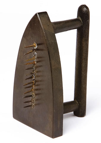
Cadeau Audace by Man Ray (1921).

L’amour fou by Robert Hughes
Fur teacups, wheelbarrow chairs, lip-shaped sofas … the fashion, furniture and jewellery created by the Surrealists were useless, unique, decadent and, above all, very sexy.

The Guardian, Saturday March 24th, 2007

THE VICTORIA AND Albert’s big show for this year, Surreal Things: Surrealism and Design, is—well, maybe we don’t much like the word “definitive”. But it’s certainly the first of its kind.

Everyone knows something about surrealism, the most popular art movement of the 20th century. The word has spread so far that people now say “surreal” when all they mean is “odd”, “totally weird” or “unexpected”. No doubt this would give heartburn to André Breton, the pope of the movement nearly a century ago, who took the title from his friend, the poet Guillaume Apollinaire, who had called his play The Breasts of Tiresias, “a surrealist drama”. But too late now. The term is many years out of its box and, through imprecision, has achieved something akin to eternal life. Surrealist painting and film, that is. In fact, some surrealist images have imprinted themselves so deeply and brightly on our ideas of visual imagery that we can’t imagine modern art (or, in fact, the idea of modernity itself) without them.

Think Salvador Dalí and his soft watches in The Persistence of Memory. Think Dalí again, in cahoots with Luis Buñuel, and the cut-throat razor slicing through the girl’s eye, as a sliver of cloud crosses the moon (actually, the eye belongs to a dead cow, but you never think this when you see their now venerable but forever fresh movie An Andalusian Dog, 1929). Think of photographer Man Ray’s fabulous Cadeau Audace (‘Risky Present’, 1921), the flatiron to whose sole a row of tacks was soldered, guaranteeing the destruction of any dress it would be used on. Think of Rene Magritte’s The Rape, that hauntingly concise pubic face, with nipples for eyes and the hairy triangle where the mouth should be. Think of the shock, the horniness, the rebellion, the unwavering focus on creative freedom, the obsessive efforts to discover the new in the old by disclosure of the hidden…

Continues here

Previously on { feuilleton }
The Surrealist Revolution
Surrealist Women
Las Pozas and Edward James
Surrealist cartomancy

The World in 2030

2030.jpg

The incomparable Culture Archive presents an embarrassment of riches in scanned form; if only there were more sites as good as this. Easier for you to go and look for yourself than waste time reading a poor description of the place.

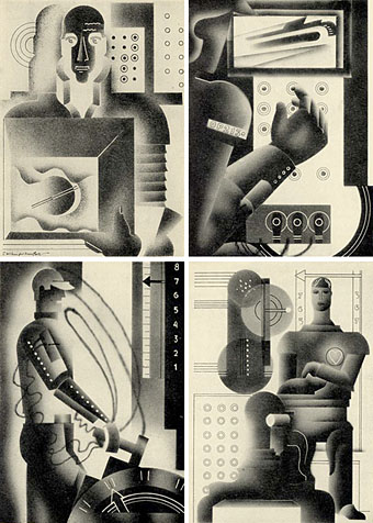
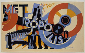
Random browsing turned up pages from the Earl of Birkenhead’s study of the state of the world a century from 1930. But it’s not the Earl’s prognostications that concern us here, rather the book’s airbrush illustrations by E McKnight Kauffer, an artist and designer better known for his Art Deco poster designs like Metropolis (1926) below.

kauffer.jpg

Previously on { feuilleton }
Metropolis posters
Frank Lloyd Wright’s future city

Barney Bubbles: artist and designer

barney1.jpg

Image-heavy post! Please be patient.

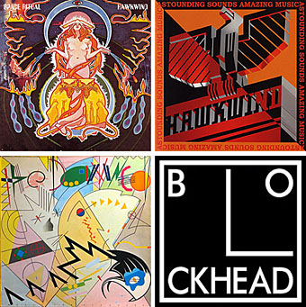
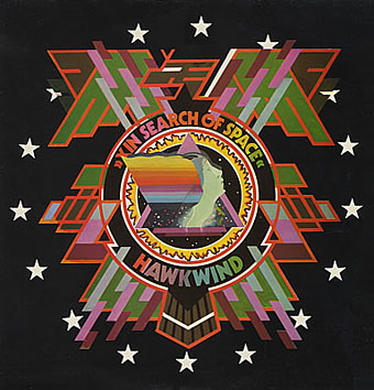
Four designs for three bands, all by the same designer, the versatile and brilliant Barney Bubbles. A recent reference over at Ace Jet 170 to the sleeve for In Search of Space by Hawkwind made me realise that Barney Bubbles receives little posthumous attention outside the histories of his former employers. Since he was a major influence on my career I thought it time to give him at least part of the appraisal he deserves. His work has grown in relevance to my own even though I stopped working for Hawkwind myself in 1985, not least because I’ve made a similar transition away from derivative space art towards pure design. Barney Bubbles was equally adept at design as he was at illustration, unlike contemporaries in the album cover field such as Roger Dean (mainly an illustrator although he did create lettering designs) and Hipgnosis (who were more designers and photographers who drafted in illustrators when required).

Colin Fulcher became Barney Bubbles sometime in the late sixties, probably when he was working either part-time or full-time with the underground magazines such as Oz and later Friends/Frendz. He enjoyed pseudonyms and was still using them in the 1980s; Barney Bubbles must have been one that stuck. The Friends documentary website mentions that he may have worked in San Francisco for a while with Stanley Mouse, something I can easily believe since his early artwork has the same direct, high-impact quality as the best of the American psychedelic posters. Barney brought that sensibility to album cover design. His first work for Hawkwind, In Search of Space, is a classic of inventive packaging.

Update: BB didn’t work with Mouse in SF, I’ve now been told.

in_search_of_space.jpg

Hawkwind: In Search of Space (1971).

It’s fair to say that Hawkwind were very lucky to find Barney Bubbles, he immediately gave their music—which was often rambling and semi-improvised at the time—a compelling visual dimension that exaggerated their science fiction image while still presenting different aspects of the band’s persona. In Search of Space is an emblematic design that opens out to reveal a poster layout inside. One of the things that distinguishes Barney Bubbles’ designs from other illustrators of this period is a frequent use of hard graphical elements, something that’s here right at the outset of his work for Hawkwind.

This album also included a Bubbles-designed “Hawklog”, a booklet purporting to be the logbook of the crew of the Hawkwind spacecraft. I scanned my copy some time ago and converted it to a PDF; you can download it here.

Continue reading “Barney Bubbles: artist and designer”

New work for July

sh_cover.jpg

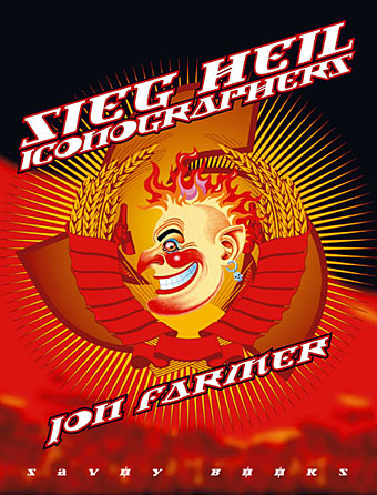
This new Savoy volume was an exhausting task, 608pp with illustrations on nearly every page. The book is another study of Savoy’s long career as publishers with many digressions examining the various maverick and often unsavoury characters that have fuelled David Britton’s books and the wider Savoy corpus, from real and imagined fascists to pulp writers, movie cowboys, PJ Proby and sundry rock’n’rollers. It forms a loose trilogy with two earlier books, Robert Meadley’s A Tea Dance at Savoy and DM Mitchell’s A Serious Life.

For the design I wanted to avoid the obvious that the title would imply and play around with a different brand of totalitarian imagery, namely the iconography of Soviet Russia and its accompanying propaganda. We used Jonathan Barnbrook’s Newspeak font for all of the titles and headings, a great design that has the right look while still being contemporary. The cover and interior chapter spreads borrow elements of the Soviet style, with some nods towards the general Bauhaus and Art Deco designs of the 1920s and ’30s. It was an enjoyable project even if it did seem interminable at times.