Now It’s Dark

dark1.jpg

Now It’s Dark by Lynda E. Rucker; cover art by John Coulthart; jacket design by Meggan Kehrli; introduction by Rob Shearman; edited by Brian J. Showers and Timothy J. Jarvis; copyedited by Jim Rockhill; typeset by Steve J. Shaw; published by Swan River Press.

Hardback: Published on 27 January 2023; limited to 400 copies of which 100 were embossed and hand numbered; signed by Lynda E. Rucker, Rob Shearman, and John Coulthart; xii + 225 pages; lithographically printed on 90 gsm paper; dust jacketed; illustrated Wibalin boards; sewn binding; head- and tail-bands; ISBN: 978-1-78380-043-8.

dark2.jpg

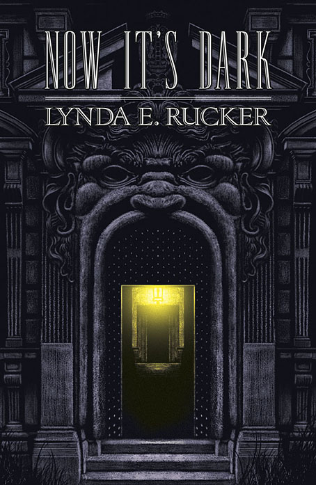
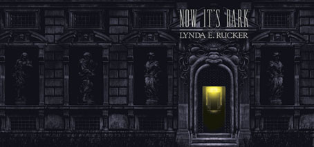
Dust jacket.

dark3.jpg

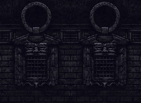
Printed boards.

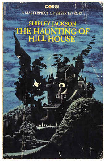
This is the last of the books I was working on last year, and being another design for Swan River Press means that once again the artwork is a wraparound cover with printed boards under the wrap. Now It’s Dark is a collection of horror stories (or possibly “strange stories” à la Robert Aickman), and a very fine collection it is. I was given carte blanche with this one so the cover is a mood piece rather than anything directly illustrational. One of the stories concerns the god Pan, which tempted me at first to do something with a satyr-like face, possibly as an architectural feature like a mascaron. But focusing on a single story in this way usually makes me worry about giving that story too much attention if it hasn’t also provided the title of the collection. Thinking about mascarons and their positioning above arched doorways led to the design you see here, a gesture towards a minor trend in horror illustration that makes use of the Arcimboldo effect, as with my battered Shirley Jackson paperback.

haunting.jpg

Corgi Books, 1977. No artist credited.

zuccari1.jpg

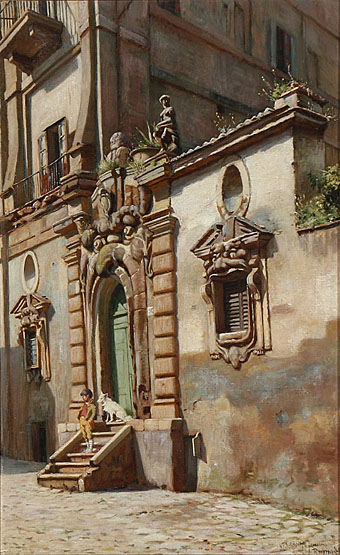
A Boy and His Dog on a Staircase in Rome (1886) by Niels Frederik Schiøttz-Jensen.

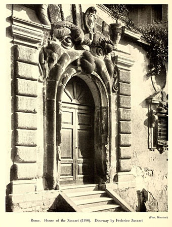
My cover is a variation on a real place, the “House of Monsters” entrance of the Palazzo Zuccari in Rome which today houses the Bibliotheca Hertziana. I placed the portal into an extended Baroque facade while moving the monstrous windows to the boards of the book. Given the way the grotteschi concept was a common feature of the Baroque you’d expect there to be more doorways like this but the palazzo street entrance seems to be unique. Equivalents such as the Ogre’s Head at Bomarzo are more like theme-park attractions than architectural features. I’ve never seen Umberto Eco mention the Palazzo Zuccari but I imagine he would have enjoyed seeing an infernal mouth as an entrance to a library.
zuccari2.jpg

Previously on { feuilleton }
Infernal entrances
Yuggoth details

yuggoth01.jpg

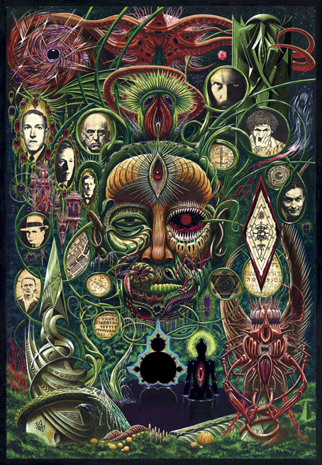
Yuggoth Cultures (1994) by John Coulthart.

Earlier this week I spent a day scanning this painting—which I’m now surprised to find is 21 years old—so I might at last have a good quality digital copy. There’s been a copy on the website for years but that was a print made at a high-street copy shop that did nothing for the detail and range of colour. It’s quite a large piece—49.54 x 71.39 cm (19.5 x 28.1 inches)—done with acrylics on board. Since 2003 the painting has been used (in another poor reproduction) on the cover of The Starry Wisdom, the controversial collection of Lovecraftian fiction from Creation Books. The painting wasn’t originally intended for that collection, however, and doesn’t quite fit since a number of the portraits don’t feature in the book at all.

Yuggoth Cultures would have been an earlier collection of Lovecraftian fiction and non-fiction that Alan Moore had begun writing for Creation in 1993. Alan’s idea was to take Lovecraft’s Fungi from Yuggoth sonnet sequence as the basis for a collection that would explore Lovecraft’s fictional world and also draw together a variety of figures from the same era: fellow writers, occultists like Aleister Crowley and Austin Spare, and Harry Houdini for whom Lovecraft ghost-wrote Imprisoned with the Pharaohs in 1924. Unfortunately the stars were not right on this occasion; Alan took the sole copy of the half-written manuscript to London in order to read selections at an event in Soho but left the papers in a cab. Some pieces survived, having been copied and stored elsewhere—The Courtyard in The Starry Wisdom is one of these—and there was talk for a while of the lost pieces being rewritten but enthusiasm for the project flagged.

yuggoth08.jpg

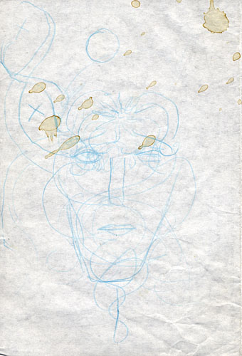
This is Alan’s sketch for the cover, the idea being to have a Lovecraft head made of fungal growths rather like an Arcimboldo painting. The head would be sprouting tendrils whose loops would contain pictures of some of the people featured in the book. Alan’s quick sketch is actually a better approximation of Lovecraft’s strange features than my painted version which isn’t narrow enough. For the record (and because people always ask), the other people on the cover are Alan himself, Austin Osman Spare, Aleister Crowley, Harry Houdini, Robert E Howard (not Al Capone as people often think) and Clark Ashton Smith.

yuggoth09.jpg

yuggoth10.jpg

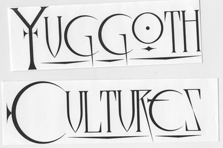
While searching through the archives I discovered these lettering designs although they’re probably not bold enough to read very well on such a busy painting. Before I started using a computer, designs like this had to be drawn at large size then scaled down using a photocopier.

Continue reading “Yuggoth details”

Vertumnus

arcimboldo1.jpg

Rudolf II of Habsburg as Vertumnus (detail).

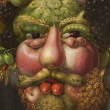
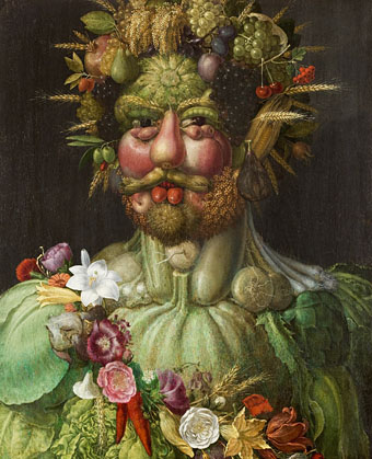
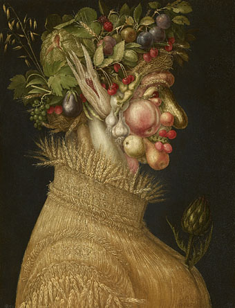
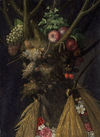
With the spring here starting to show its reluctant face it’s an apt moment to find a handful of Giuseppe Arcimboldo’s paintings at the Google Art Project. Vertumnus is the perennial favourite, Arcimboldo’s portrait of his patron, Rudolf II of Hapsburg, as the Roman god of the seasons. I’ve always thought this portrait flattered Rudolf more than those which faithfully depict his homely features. We’re told the Emperor was very pleased with his fruity likeness.

arcimboldo2.jpg

Rudolf II of Habsburg as Vertumnus (1590).

arcimboldo3.jpg

Summer (1563).

arcimboldo4.jpg

Four Seasons in One Head (c. 1590).

Previously on { feuilleton }
Arcimboldo’s Four Elements

Reverbstorm at Supervert

reverbstorm.jpg

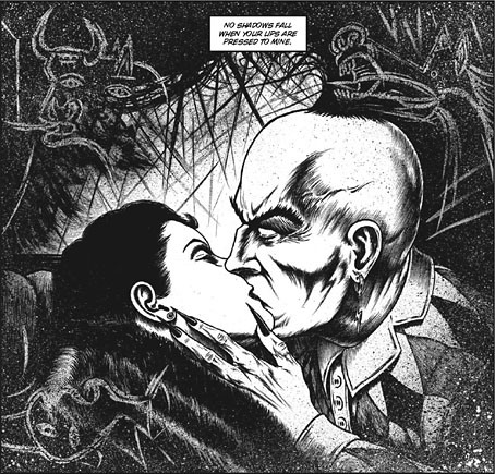
Keith Seward’s Horror Panegyric was a concise examination of David Britton’s multimedia Lord Horror project which Savoy Books published in 2007. I designed the book, the cover of which was my Arcimboldo pastiche of Lord Horror’s profile which appeared on the cover of issue 3 of Reverbstorm. The Supervert site which hosts an online copy of Horror Panegyric has this month posted my answers to some questions about Reverbstorm, the series having grown out of the first Lord Horror novel and the earlier comics:

The graphics in Reverbstorm sometimes seem more narrative than the words. How did you and David work out a scenario?

I don’t have objections per se to the usual story structures but in this series we both wanted to create something that wasn’t following familiar adventure narrative lines. The precedents for me were the European comic artists from Métal Hurlant who often favoured art over story; also Burne Hogarth whose work was a great influence on the style I used to draw Lord Horror. Hogarth’s Tarzan strips are adventure narratives but in his later books it’s the art that’s paramount. James Joyce is one of the characters in Reverbstorm, and you can also find a precedent in Ulysses where the story is overwhelmed by the surface detail.

Reverbstorm began with Paul Temple’s lyrics for the Reverbstorm song and a brief Lord Horror film treatment that Dave and Mike had put together for a production company. I don’t recall much about the treatment — I only looked at it once in the office — but it concerned Horror and Jessie Matthews in New York City, opening with a sequence where his Lordship kills some policemen in an alleyway. That vague outline can be seen in the first few pages of Reverbstorm with NYC changed to Torenbürgen. Other elements taken from the film treatment included the name Blue Blaze Laudanum — the actual robotic character came later — and the Souls which likewise became more substantially developed as the comic progressed.

Once we’d introduced all the characters things developed along thematic lines rather than strictly narrative ones. So the second part introduces the Ether Jumpers, the third part has the Apes, the fourth part the Ononoes, the fifth part Picasso and T.S. Eliot, and so on. Musical structure is an obvious parallel, and I consider some of the recurring background material to be visual leifmotifs which can indicate or imply one of the three main characters even if they aren’t present on the page. This musical analogy is an important one for appreciating the series as a whole. The entwined themes and references work in a manner that’s a lot closer to musical works than to the mechanics of an adventure narrative. (more)

Previously on { feuilleton }
Reverbstorm in print
Reverbstorm update
James Joyce in Reverbstorm
A Reverbstorm jukebox
Reverbstorm: Bauhaus Horror
Reverbstorm: an introduction and preview

The weekend artists, 2012

barnes.jpg

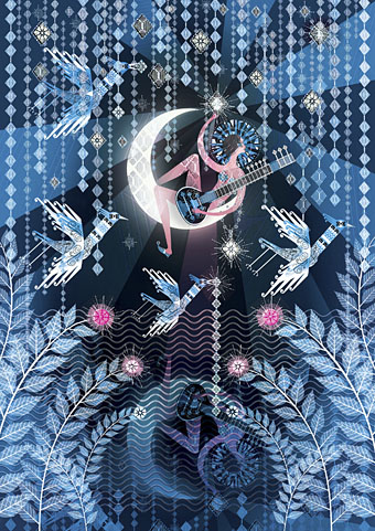
Lucy in the Sky with Diamonds (2012) by Lesley Barnes. She also has peacock wrapping paper.

The most popular post of the year was one I made last December featuring all the artists whose work had appeared throughout 2011 in the weekend links posts. (The surge of views occurred early in January when it was linked on Stumbleupon.) Since I’ve been away this week there aren’t any links so here’s a retrospective of things that caught my eye in 2012.

durette.jpg

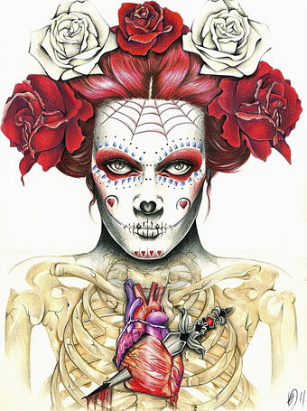
Heartsick (2011) by Kelly Durette.

jacobsen.jpg

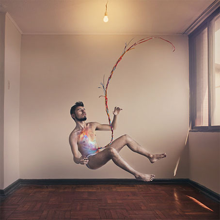
Self-portrait by Jon Jacobsen from his Home series.

tintenfisches.jpg

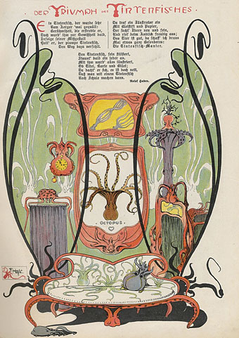
Der Triumph des Tintenfisches from Meggendorfer-Blätter (c. 1900). Via Beautiful Century.

kuhlman.jpg

Two Grove Press covers by Roy Kuhlman. From Arden Kuhlman Riordan’s Pinterest page collecting her father’s cover designs.

ulian.jpg

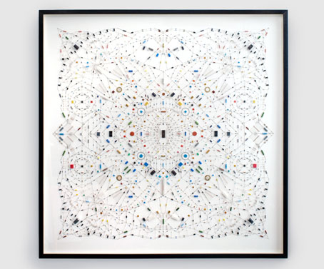
Technological mandala 02 (The beginning) (2012) by Leonardo Ulian.

Continue reading “The weekend artists, 2012”