Weird Fiction Review

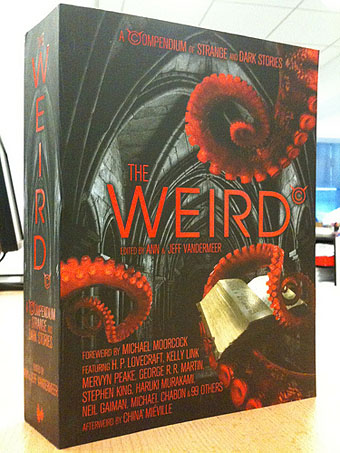
weird.jpg

weird, a.

1. Having the power to control the fate or destiny of human beings, etc.; later, claiming the supernatural power of dealing with fate or destiny. Originally in the Weird Sisters = †(a) the Fates; (b) the witches in Macbeth.

2. a. Partaking of or suggestive of the supernatural; of a mysterious or unearthly character; unaccountably or uncomfortably strange; uncanny.

b. of sounds or voices.

3. Of strange or unusual appearance, odd-looking.

4. a. Out of the ordinary course, strange, unusual; hence, odd, fantastic. (Freq. in recent use.)

b. Colloq. phr. weird and wonderful, marvellous in a strange or eccentric way; both remarkable and peculiar or unfathomable; exotic, outlandish. Freq. ironical or derog.

5. Comb., as weird-looking adj.

Oxford English Dictionary

Weird: I’ve relished the word since I was at school for the way it managed to embody or describe so many of the things I was deeply attracted to, especially in the world of fiction. Weird Tales magazine when it was at its height in the 1930s was able to publish stories of fantasy, horror and science fiction, or hybrid stories of fantasy/horror or horror/sf, none of which needed to be alloted specific definitions when “weird” was there to cover everything. China Miéville noted the usefulness of the “weird” designation ten years or so ago, and I’ve been hoping ever since that other people might pick up the broader, more inclusive term instead of dividing the major genres into ever smaller sub-genres. “Weird” could accommodate generic work but also encompass those stories that were simply strange without possessing the usual genre trappings.

So far the term hasn’t found the widespread favour I’d been hoping for but that may change thanks to the Weird Fiction Review, a site launched this week by my friends and occasional collaborators Ann and Jeff VanderMeer whose enormous brick of an anthology, The Weird: A Compendium of Strange and Dark Stories, is published by Corvus this month. Weird Fiction Review states that:

its primary mission over time will be to serve as an ongo­ing explo­ration into all facets of the weird, in all of its many forms—a kind of “non-denominational” approach that appre­ci­ates Love­craft but also writers like Franz Kafka, Angela Carter, and Shirley Jack­son—along with the next gen­er­a­tion of weird writ­ers and inter­na­tional weird.

Already on the site is an interview with Neil Gaiman who says:

I think of Hor­ror as a sec­tion of a book­shop, gothic as a type of book that ended, truly, with North­hanger Abbey, and The Weird as an attempt to unify what­ever it was that Robert Aick­man did, that Edward Gorey did—using the tools of hor­ror to delight and trans­form.

I’m re-reading some of Aickman’s stories at the moment. He called them “strange” but I’d call them 100% weird. There’s one in Ann & Jeff’s anthology whose contents are an ideal introduction to this zone of literature.

Previously on { feuilleton }
The Vengeance of Nitocris
Die Andere Seite by Alfred Kubin
The King in Yellow
Hugo Steiner-Prag’s Golem

Weekend links 69

evans.jpg

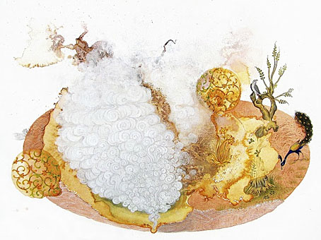
Peacock Apocalypse (detail) by Julie Evans in collaboration with Ajay Sharma.

Here at { feuilleton }, home of the curly bracket affectation, your correspondent is still surprised to find his postings the subject of a critique by Rick Poynor in the latest edition of Eye magazine, the international review of graphic design. I haven’t seen a print copy yet but you can read Mr Poynor’s appraisal here. Meanwhile, over at Design Observer this week there’s another Poynor piece about the collage illustrations of Andrzej Klimowski.

Alan Moore (yes, him again) discusses the moment when the League of Extraordinary Gentlemen gets all swinging and psychedelic. And Iain Sinclair (yes, him again) is still doing the interview rounds promoting his current book, Ghost Milk.

Ayin Acla, a short film by Anna Thew with a soundtrack by Cyclobe. The most recent Cyclobe album, Wounded Galaxies Tap at the Window, was previously vinyl-only but is now available on CD.

• Bones and beads and other things in Wren Britton’s Pure Vile clothing and accessories. Related: Patrick Veillet’s wearable bone sculptures.

Lambshead Cabinet of Curiosities Q&A: Ann & Jeff VanderMeer answer questions about their latest anthology at Fangoria.

• Being a lifelong introvert, I’m sympathetic to Four Ways Technology Can Enable Your Inner Introvert by Philip Bump.

• In an all-too-rare meeting of minds and talents, Roy Harper talks to Joanna Newsom.

Jon Macy’s Teleny and Camille is reviewed at Lambda Literary.

• Author Carol Birch tells us how best to read Finnegans Wake.

Joel Pirela’s Design Classics posters.

Each And Every Word Must Die (1999) by Cyclobe | Brightness Falls From The Air (2001) by Cyclobe | Indulge Yourselves With Our Delicious Monster (2006) by Cyclobe

The Colmore Fatagravures

colmore1.jpg

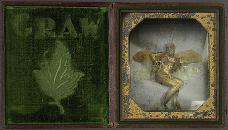
Golden Fairy Specimen.

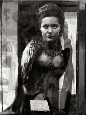
These have already been featured on many other sites but that shouldn’t exclude their presence here. The Wunderkammer concept seems to be a recurrent fascination on the web—see here and here and here, for example—possibly because the nature of the medium lends itself to the accumulation of curiosities. It’s a small step from collecting genuine curios to inventing those the world stubbornly refuses to provide, that’s what we see happening here and also at some of the earlier posts below. About the Colmore Fatagravures we’re told:

A Scottish adventurer, inventor, and photographer named Neville Colmore claimed to have constructed a device capable of “…parting the veil of Faery…”. The device, which he called the “Spectobarathrum”, produced beautiful photo graphic plates he called “fatagravures”, through a now lost process. The original “Spectobarathrum” along with all of the images he claimed to have made were believed destroyed in a fire. (More.)

colmore2.jpg

French Harpy of Questionable Provenance.

In a similar vein, I’ve already mentioned that I’ve done some design and illustration for the Thackery T. Lambshead Cabinet of Curiosities, the sequel to the Lambshead Disease Guide which is forthcoming from HarperCollins. The new book is edited by Ann & Jeff VanderMeer and publication has been announced for June. Jeff unveiled the near-final cover design just before Christmas (not my work, I should note) and a preview of some of the contents, including one of my interior pages. More about this closer to publication.

Previously on { feuilleton }
The specimens of Alex CF
Walmor Corrêa’s Memento Mori
Harpya by Raoul Servais
The art of Ron Pippin
Custom creatures
Jan Svankmajer: The Complete Short Films
Cryptozoology
The Museum of Fantastic Specimens

Ten titles and a cover

cdlcover.jpg

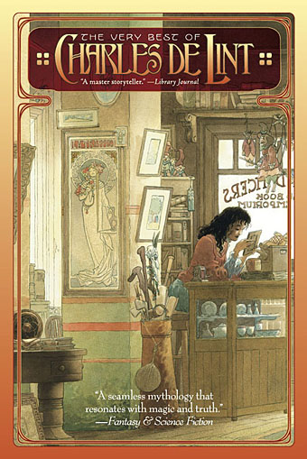
The Very Best of Charles de Lint. Art by Charles Vess.

Over the weekend I found the time to finally update the book design section of the site, adding new pages for most of the titles I’ve been working on recently. There’s still a couple of things missing but I’ll add those in due course. Many of these design jobs have been for the interiors only so what follows is a comparison of title spreads from books I’ve worked on that have been published this year. Lest it seem that I have an army of clones at my service it should be emphasised that I was working on several of these last year (and Engelbrecht was completed in 2008) but the nature of release schedules means they all carry 2010 publication dates.

sr.jpg

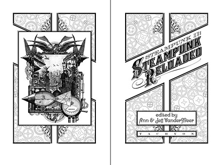
Steampunk II: Steampunk Reloaded, edited by Ann & Jeff VanderMeer.

I invariably make a feature of title pages, usually creating them as a spread in order to heighten their impact. The title page is a kind of gateway to the rest of the book which gives you an opportunity to establish a mood for what follows. It’s also the area where you can be most lavish with your graphic treatment and, where necessary, add illustrative material without worrying too much about intruding on the content. With a number of these designs I was following typographic choices from pre-designed covers so the challenge was to find something that would match the cover and connect to the rest of the interior. The Charles de Lint book was a variation on this process in that the author had chosen a Charles Vess drawing for the cover art. I designed a cover to accommodate the drawing then carried the design inside. The colours were chosen to match Vess’s artwork while the general Art Nouveau style came from an Alphonse Mucha poster he’d placed on the wall. With a different cover picture the entire book would have had a very different design.

pkd.jpg

The Search for Philip K Dick by Anne R Dick.

Continue reading “Ten titles and a cover”

Gilliam’s shaver and Bovril by electrocution

pears.jpg

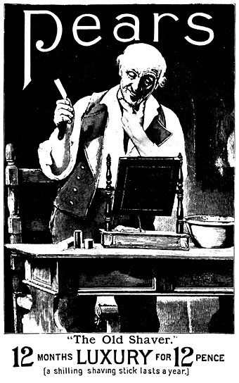
Pears Soap ad, Illustrated London News, March 16, 1895.

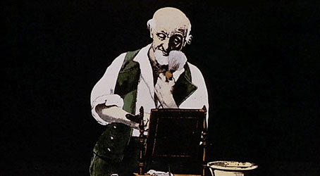
I’ve been working feverishly this week to complete page designs for The Thackery T. Lambshead Cabinet of Curiosities which will be published next year by HarperCollins. This is a sequel of sorts to 2003’s Thackery T. Lambshead Pocket Guide to Eccentric and Discredited Diseases to which I was also a contributor and designer. Ann and Jeff VanderMeer are editing the new collection, and Jeff has posted a couple of teaser introductions to the contents here and here. Gabriel in yesterday’s comments mentioned Terry Gilliam’s animations for the Monty Python TV series, something I was reminded of today while leafing through a 1968 collection of old advertising graphics looking for suitable pictures. Victorian Advertisements was compiled by Leonard de Vries and Ilonka van Amstel, and its Pears Soap ad (above) is obviously the source of Gilliam’s animation (below) showing a man lathering his face then beheading himself with a straight razor, a gag which features in both the TV series and the first Monty Python feature film And Now For Something Completely Different.

gilliam.jpg

And Now For Something Completely Different (1971).

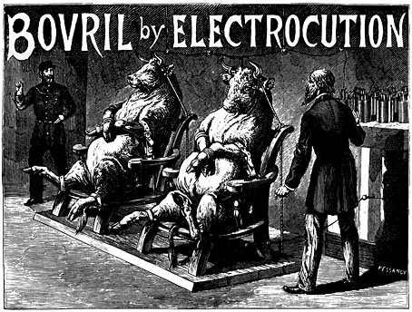
It’s easy to see what would have attracted Gilliam to the De Vries book when it’s filled with bizarre or grotesque ads like the Bovril one below; someone evidently decided that the meaty drink ought to be promoted via the novelty of electricity.

bovril.jpg

Bovril ad from The Graphic, Christmas number, 1891.

De Vries features many ads for electrical products, not all of them genuine or even likely:

Pseudo-science began to play the part it still plays in therapeutic advertising. Electric light was, by the end of the century, being installed in theatres and restaurants and in some private houses. To what other uses could the magnetic fluid be put? Electricity was the new magic and all kinds of quarters began to exploit its possibilities—and impossibilities. The Medical Battery Company Limited, of Oxford Street, assured the public that its Electropathic Belt had “restored thousands of sufferers to health and vigour”, and had “proved an inestimable blessing to the weak and languid”. It was particularly recommended for “weak men suffering from the effect of youthful errors”. Did the weak men in question wear the contraption in bed? Women also could benefit by it, and one is a little surprised to find this and other remedies for “female irregularities” so frankly discussed. An Electric Corset was the “Very Thing” for ladies. One can only wonder how the batteries if there were any operated. And what could possibly be meant by an “electric” towel, and how could failing sight be cured by an “eye battery”?

There’s also an Electric Hair Brush which gives “hope for the bald” without explaining how it differs from an ordinary brush. Several of the pieces in the new Lambshead volume will be exploring similarly eccentric territory. Watch this space for further details.

Previously on { feuilleton }
Portuguese Diseases
Pasticheur’s Addiction
Short films by Walerian Borowczyk