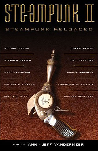
Cover design by Ann Monn. Cover image by Dan Jones / Tinkerbots.
Here at last is the steampunk anthology I mentioned back in September and whose interiors I designed. This is another Tachyon publication, and also another anthology edited by Ann & Jeff VanderMeer. I went further with the design for this than I have done for other Tachyon books, partly because if there’s one thing steampunk lends itself to, it’s decoration but also because the book includes illustrations from Ramona Szczerba, Eric Orchard, and others, plus a comic strip by Sydney Padua; adding extra spot illustrations stopped the pictorial material from seeming too isolated.
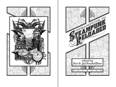
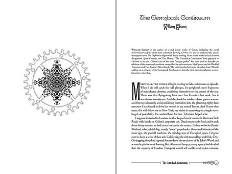
Title spread. The illustration on the left is one I created last year.
This is a sequel to an earlier steampunk anthology by the same editors but the contents are just as strong as the first collection with excellent stories throughout. (For a review, see here.) By coincidence the book is published in the wake of a recent (and inevitable) backlash against steampunk as science fiction sub-genre and cultural phenomenon. This collection can serve as a repudiation to some of the lazier accusations that writers are ignoring the moral and physical squalor of the Victorian era and the legacies of imperialism; several stories in Steampunk Reloaded address those very issues. For my part I’ve read Friedrich Engels’ Condition of the Working Class in England, Henry Mayhew’s London Labour and the London Poor, and Kellow Chesney’s The Victorian Underworld so I don’t feel in urgent need of a lecture on the iniquities of the 19th century, thank you very much.
While we’re on the subject, the cover of The Steampunk Bible, edited by Jeff VanderMeer and SJ Chambers, has been revealed here. Abrams will be publishing this next year and having seen some of the interior pages it’s going to be a splendid book. More about that later. Further pages from Steampunk Reloaded follow.
Update: A couple more reviews here and here.
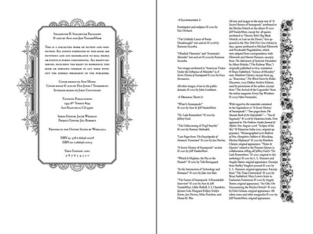
Contents spread.

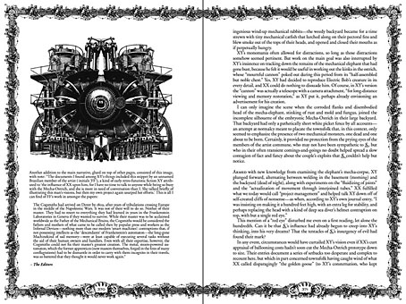
A detail of one of the page footers.
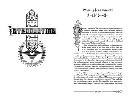
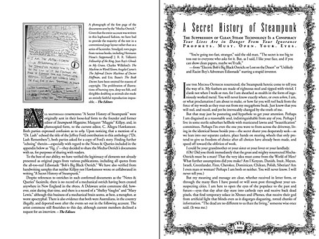
Title page for A Secret History of Steampunk, a self-contained section within the body of the book.
Previously on { feuilleton }
• Steampunk overloaded!
• Skeleton clocks
• Vickers Airship Catalogue
• The Air Ship
• Dirigibles
• More Steampunk and the Crawling Chaos
• The art of François Schuiten
• Steampunk Redux
• Steampunk framed
• Steampunk Horror Shortcuts
• The Airship Destroyer
• Zeppelin vs. Pterodactyls

