The Contrary Tale of the Butterfly Girl

butterfly1.jpg

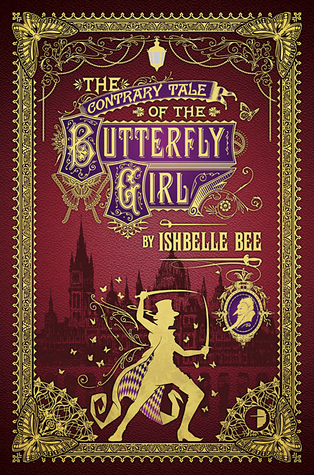
Three months after The Singular & Extraordinary Tale of Mirror & Goliath I can reveal my cover design for Ishbelle Bee’s sequel, The Contrary Tale of the Butterfly Girl. Here’s a summary, swiped once again from the Barnes & Noble SF & Fantasy blog:

Two orphans, Pedrock and Boo Boo, are sent to live in the sinister village of Darkwound. There they meet and befriend the magical and dangerous Mr Loveheart and his neighbour Professor Hummingbird, a recluse who collects rare butterflies. Little do they know that Professor Hummingbird has attracted the wrath of a demon named Mr Angel-Cakes.

One night, Mr Angel-Cakes visits Boo Boo and carves a butterfly onto her back. Boo Boo starts to metamorphose into a butterfly/human hybrid, and is kidnapped by Professor Hummingbird. When Mr Loveheart attempts to rescue her with the aid of Detective White and Constable Walnut, they are turned into butterflies.

Caught between Professor Hummingbird and the demon Angel-Cakes, Loveheart finds himself entangled in a web much wider and darker than he could have imagined, and a plot that leads him right to the Prime Minister and Queen Victoria herself…

I also supplied some comments about the design for the B&N post. I knew this would be an enjoyable job as soon as I read the title since I approve of anything involving butterflies. The main challenge was that the first cover came out so well—and has been very well received—that the new design needed to be just as successful. Ishbelle’s novels are wild and crammed with so much incident I keep thinking these covers are, if anything, a little sedate. But the main task of a cover is to attract new readers not illustrate every last plot detail, and in that the first cover seems to be doing its job. The Singular & Extraordinary Tale of Mirror & Goliath will be out at the end of June; The Contrary Tale of the Butterfly Girl will be published at the beginning of August.
Previously on { feuilleton }
The Singular & Extraordinary Tale of Mirror & Goliath
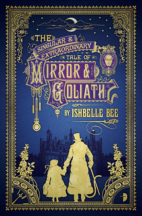
The Singular & Extraordinary Tale of Mirror & Goliath
mirror.jpg

In yesterday’s post I mentioned having recently finished a cover design featuring silhouettes, not expecting the design in question to be revealed on the Barnes & Noble SF & Fantasy blog a few hours later. So here it is. The Singular & Extraordinary Tale of Mirror & Goliath is the first of two novels by Ishbelle Bee from publisher Angry Robot. Rather than attempt a précis it’s easier to swipe one from the B&N post:

1888. A little girl called Mirror and her extraordinary shape-shifting guardian Goliath Honeyflower are washed up on the shores of Victorian England. Something has been wrong with Mirror since the day her grandfather locked her inside a mysterious clock that was painted all over with ladybirds. Mirror does not know what she is, but she knows she is no longer human.

John Loveheart, meanwhile, was not born wicked. But after the sinister death of his parents, he was taken by Mr Fingers, the demon lord of the underworld. Some say he is mad. John would be inclined to agree.

Now Mr Fingers is determined to find the little girl called Mirror, whose flesh he intends to eat, and whose soul is the key to his eternal reign. And John Loveheart has been called by his otherworldly father to help him track Mirror down…

An extraordinary dark fairytale for adults, for fans of Catherynne M. Valente and Neil Gaiman.

Having spent the past few years scrutinising Victorian graphic design this was a very enjoyable assignment that didn’t feel like work at all. The title design took some time to put together, the challenge with these things being to pour on the decoration while maintaining legibility. You also need to choose the typefaces carefully. The capitals in “Mirror” and “Goliath” were drawings based on period cover designs, while the author typeface isn’t a font but is letterforms scanned from a Symbolist art book from the 1970s. Revival fonts continue to proliferate but I’ve yet to see one in that exact style. The Singular & Extraordinary Tale of Mirror & Goliath is out in June with a sequel, The Contrary Tale of the Butterfly Girl, following in August.

More vapour trails

jeter.jpg

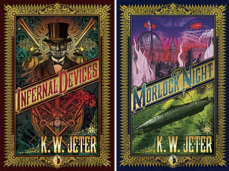
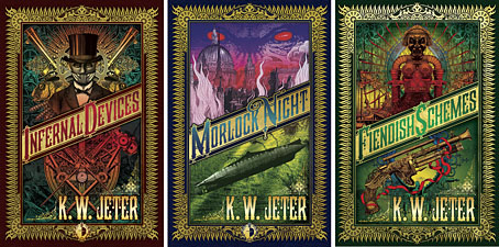
Those covers everyone likes. My designs for KW Jeter’s steampunk novels from Angry Robot and Tor Books.

When I wrote a brief history of steampunk for Eye magazine last year I ended by somewhat provocatively declaring that until something better appeared this was the defining aesthetic of the moment. A year later, the movement (if we can use that term) continues to evolve despite the steady drip of complaints that it’s all reactionary, historically illiterate, and so on. Much of the ire remains nonsensical, and often seems to boil down to a common disdain for people enjoying themselves in some unorthodox manner.

manual.jpg

Design by Galen Smith after the Hetzel editions of Jules Verne’s novels.

If I hadn’t got involved on the art side I would have found it difficult to avoid being attracted by steampunk in one form or another since so much of it originates in areas I was already interested in, not least HG Wells and Victorian science fiction. The rapid evolution of the past few years means we’re currently seeing an aesthetic leaving behind its origins to become an international subculture. What’s striking about this activity—and this is something that doesn’t seem to have been discussed very much—is the way the whole thing has been birthed by genre fiction rather than by pop music, as was the case for the second half of the 20th century. This piece is meant to be a news post, however, not another cultural critique, but if I happen to write any more on the subject there’s something there that’s worth exploring.

manual2.jpg

As to the news: this month finds my steampunk artwork manifesting in three very different locations in one of those odd coincidences of timing that occur now and then. First up there’s the Steampunk User’s Manual edited by Jeff VanderMeer & Desirina Boskovich, a follow-up to 2011’s Steampunk Bible. For the new volume I designed spreads for three entries by Jess Nevins from The Encyclopedia of Fantastic Victoriana: Alternative History Edition.

Continue reading “More vapour trails”

Two covers

patel1.jpg

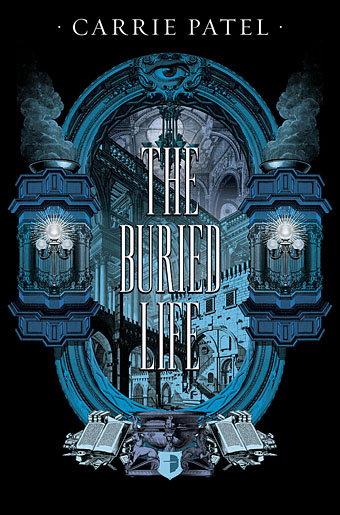
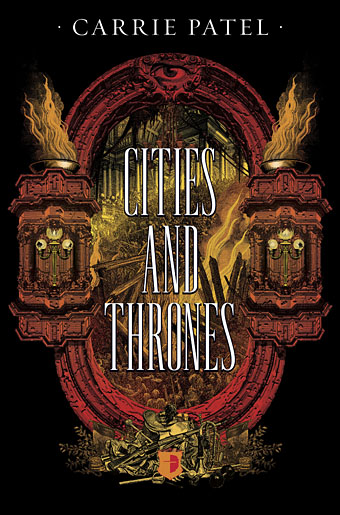
More new work of mine has been unveiled in the past few days so I can show these here. The Buried Life and Cities and Thrones are a pair of fantasy novels by new author Carrie Patel being published by Angry Robot. I was asked to provide something in an engraved style set against a black background, with imagery that reflected themes of vast, underground architecture and armed conflict.

patel2.jpg

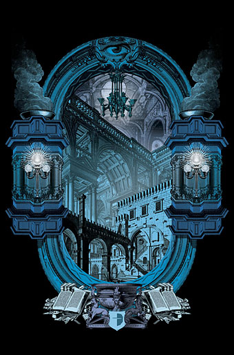
Vast architecture of any description is something I’ve always enjoyed, the main challenge with each book came in trying to imply the architecture and events without the pictorial content becoming incoherent. Marc at Angry Robot asked for something Piranesian where the architecture was concerned. Looking over Piranesi’s non-Carceri designs didn’t turn up anything with a suitably dramatic perspective, however, so most of what you see in the first cover comes from Giuseppe Galli Bibiena’s Architetture e Prospettive (1740). The Bibienas were a family of architects and theatrical engineers who specialised in dizzying perspective views for their stage designs; Bibiena’s book was produced to preserve some of his more celebrated designs, the originals of which are now lost. I’ve had a book of these drawings for years but this is the first opportunity I’ve had to make use of them in any kind of collage.

patel3.jpg

This style of Baroque architecture doesn’t suit steampunk imagery which tends towards 19th-century urban/industrial; the plates are also rather staid scenes without the graphic flare that Piranesi gave to everything he rendered, real or imagined. But I do like those plunging perspectives, and pieces from two of the plates turned out to share both the same perspective and the same lighting direction. It’s easy to collage things into a flat view but creating a realistic sense of depth from bits and pieces can be tricky.

patel4.jpg

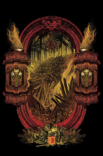
The frame for the second cover has more of a Piranesian quality being chipped and eroded. The typography for the titles went through several changes, the versions here show a late suggestion of mine with lettering that’s probably too thin to read well at a distance (or a small size on a web page). SF Signal has a post showing the Angry Robot versions which will probably be the final ones, together with a preview of the first book.

Previously on { feuilleton }
Aldous Huxley on Piranesi’s Prisons

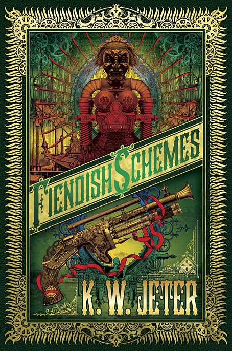
Fiendish Schemes

fiendish.jpg

Now that this cover has appeared on Amazon I can mention it here. As usual, the machinery of publishing grinds slowly: this cover was commissioned in November last year, and worked on from the end of that month up to Christmas. Fiendish Schemes is a sequel by KW Jeter to his Infernal Devices, one of the original steampunk novels which was first published in 1987. In 2011 I created covers for reprints by Angry Robot of that title and the author’s earlier Morlock Night. Both those covers were very well received so Tor Books asked me to match their designs with a cover for the new book. This is quite unusual in publishing. Unless they make a real impact, cover designs seldom last beyond a couple of editions before being updated, and they rarely travel to other publishers.

jeter.jpg

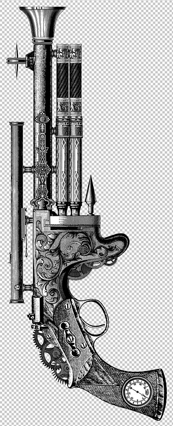
As with the earlier designs, the artwork is pieced together from very small pieces of period engravings, mostly from product catalogues or design books. In the novel, the steampunk weapon below is more alluded to than described but I was pleased with the way the illustration of it came together. Even though it’s composed of pieces of guns, fountain pens and clock parts it looks like something that could physically exist. One of the challenges I enjoy with this kind of collage illustration is trying to make something which doesn’t appear collaged at all.

Fiendish Schemes will be published on October 15th, 2013.

fiendish2.jpg

Previously on { feuilleton }
Ghosts in Gaslight, Monsters in Steam
Steampunk Revolution
The Bookman Histories
Aether Cola
Crafting steampunk illustrations
SteamPunk Magazine
Morlocks, airships and curious cabinets
The Steampunk Bible
Steampunk Reloaded
Steampunk overloaded!
More Steampunk and the Crawling Chaos
Steampunk Redux
Steampunk framed
Steampunk Horror Shortcuts