Cronenberg curates Warhol

empire.jpg‘He created his own universe and became its star’

Director David Cronenberg explains the debt he owes to Andy Warhol’s bizarre and chillingly prophetic work

David Cronenberg
Monday September 11, 2006
The Guardian

EMPIRE IS THE CLASSIC. It was outrageous—yet somehow it worked. An eight-hour shot of the Empire State Building, it was high concept, not in the Hollywood sense, but the art sense. It’s got potency, resonance. Andy even said the Empire State Building was a star. It’s so New York, which was the centre of the artistic universe at the time, the 1960s. That’s why I decided to begin the Andy Warhol show I am curating with Empire.

I can’t recall when I first saw a Warhol. I feel as though he was always in my consciousness. I started making films at the same time he did, and the New York underground scene is what influenced me—and that was Andy. He didn’t think you needed access to anything to do what he was doing—just grab a camera, do your own thing, and it’ll work.

Preparing this exhibition, I was initially planning to ignore the films. It seemed too obvious to bring a film-maker in and for him to choose the films. But I didn’t have to dig deep to realise it would be a major oversight. Andy started the silk screens, the film-making and the Death and Disaster series at the same time. Everything influenced everything.

Continue reading “Cronenberg curates Warhol”

The lost art of sleeve design

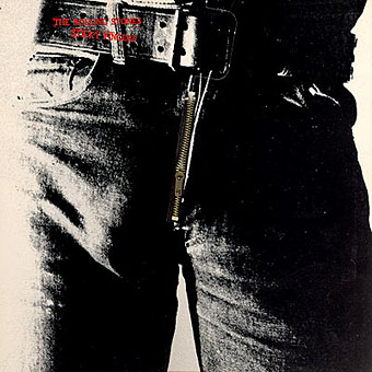
stickyfingers.jpg

Listening to the Rolling Stones’ Sticky Fingers recently had me musing about the great cover design by Andy Warhol, probably his most well-known after the first Velvet Underground album. The music may sound better than it ever did in the Seventies but CD reissues can’t reproduce the brilliant sleeve which included a real metal zipper on the front of the jeans. The Seventies were the golden age of cover design, popular music had evolved considerably since Sgt. Pepper and the “album as artform” meant that bands were searching continually for new ways to exploit the medium of the record sleeve. Gatefold sleeves became commonplace, then expanded into multiple foldout affairs; expensive gimmicks like the Stones’ zipper arrived pretty swiftly and there were other striking novelties like the first Faust album, a clear vinyl record, in a clear plastic sleeve.

Significantly, Warhol’s Velvet Underground design was also a) gimmicky, with its peel-able banana skin, and b) similarly phallic-oriented, as the banana beneath the skin was a pink one. (Original copies of this album are easy to spot in shops since they’re nearly always missing the skin). Joe Dallesandro is supposed to be filling out the trousers on the Stones’ album, a refreshingly homoerotic moment in the often resolutely sexist world of rock graphics. Nice of the Stones to be so daring but then Jagger at least didn’t mind dancing along the boundaries of sexuality in Performance and it was about this time that they were playing their scurrilous rent boy song, Cocksucker Blues. It’s also quite a macho image, of course, and aggressively sexual, so they get to have their cock cake, and eat it, as it were.

Fancy album sleeves fell out of fashion somewhat when punk came in but there were still things like the first Durutti Column album with its sandpaper sleeve intended to destroy the records it was stored with. I was fortunate to be able to do some vinyl design when I was starting out in the early eighties, even if I wasn’t allowed to design anything quite so elaborate. Some of the designs for the Alan Moore and Tim Perkins CDs take advantage of different booklet arrangements but it’s not the same as having all that space to play with. Now that music is thoroughly digital the visual component is reduced even further. A 300 x 300 pixel image in iTunes is a poor substitute for the tactile (and erotic…) pleasures of the album as artefact.

Elsewhere on { feuilleton }
The album covers archive