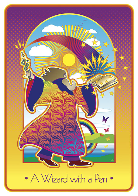
A Wizard with a Pen

wizard.jpg

The wizard is Mr Alan Moore who celebrated his 70th birthday last month. This piece is my contribution to Alan Moore: Portraits of an Extraordinary Gentleman, a birthday book put together by Smoky Man, curator of the Alan Moore World blog:

This 150-page volume contains short essays, memories and portraits by 50+ contributors including Gary Spencer Millidge (cover), Iain Sinclair (foreword), Peter Hogan (afterword), Paul Gravett, Russell Willis, John Coulthart, Koom Kankesan, Gene Ha, Zander Cannon, Hilary Barta, Jacen Burrows, Eduardo Risso, Hunt Emerson, and more…

100% of the net profits proceed from this book are to be donated to the NGO Doctors Without Borders. (more)

The book is a print-on-demand production via Amazon so anyone interested in a copy should click the above link which will direct you to a regional outlet. I’d have preferred the printing to have avoided Bezos’s feudal empire but the decision wasn’t mine to make.

As for the artwork, after spending the past couple of years looking for examples of the style I refer to as “the groovy look” I’d been itching to do something similar myself. Alan happens to enjoy this look as well—see all those Promethea covers, especially the one for issue 16 which nodded to Peter Max. Alan also likes the Beatles’ psychedelic years so my portrait is a riff on the Yellow Submarine art style: small head, big feet, and the same Kabel typeface they used for the film titles. The garment pattern is the Art Nouveau wallpaper design by André Morisset that I resurrected last year, and which I’ve been using in another project that’s yet to see the light of day. More about that later.

Previously on { feuilleton }
32 Short Lucubrations Concerning Alan Moore
Voice of the Fire by Alan Moore
The Blake Video
The Cardinal and the Corpse
Mapping the Boroughs
Art is magic. Magic is art.
Alan Moore: Storyteller
Alan Moore: Tisser l’invisible
Dodgem Logic #4

Pavonine pattern play

pattern1.jpg

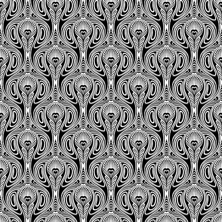
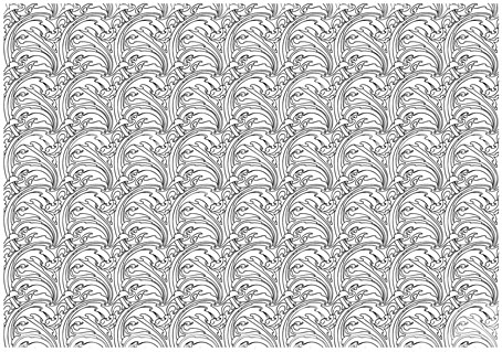
One of the projects I’ve been working on recently contains a large quantity of Art Nouveau design. I can’t discuss this any further for the usual embargo reasons, but I can show off this pattern which has been generated as a by-product of the main work. This is one of those fin-de-siècle designs that looks like it might have originated in the 1960s, a decade which saw a revival of interest in Art Nouveau graphics. Those sinuous lines would work well on a psychedelic poster, and there’s even a touch of Op art in the melting ovals that separate the peacock feathers.

pattern7.jpg

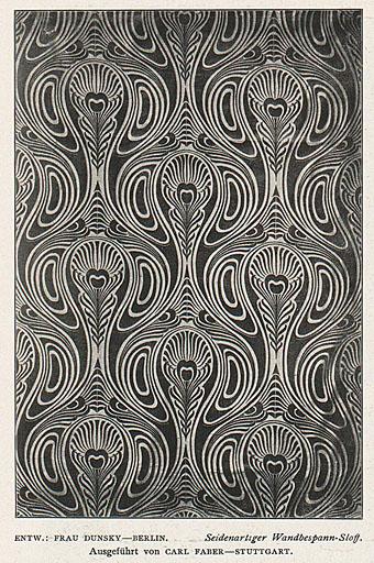
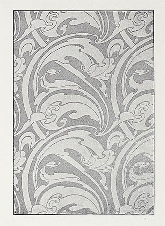
But this isn’t a design from 1970, it actually dates from 1900, the source being a small wallpaper sample that I spotted some years ago in issue 7 of Deutsche Kunst und Dekoration. “Frau Dunsky, Berlin” is named as the designer although there’s no further information about her design in the text. After seeing this I thought I’d have a go at copying the pattern in order to create a digital version but I soon gave up when it became apparent that too much work was required to convert the indistinct image into a sharp outline. I didn’t have a graphics tablet at the time, and my printer had broken down, so the only way to draw an outline was the hard way, using a mouse pointer.

pattern2.jpg

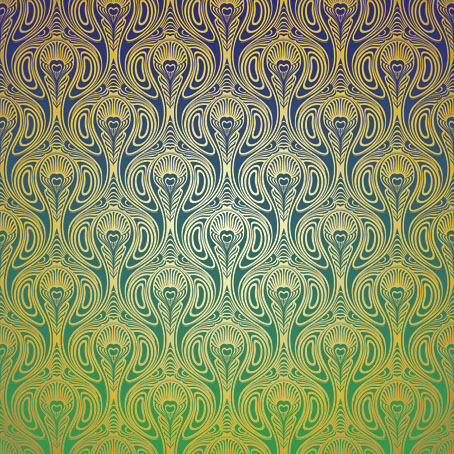
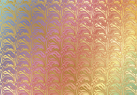
Vectorised and coloured.

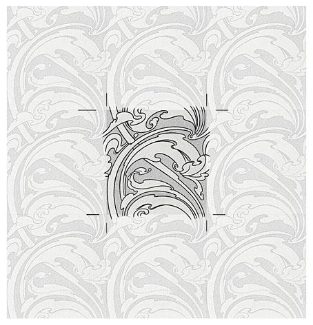
A few days ago I pulled out the copy I’d been working on and, since I now have a graphics tablet, decided to try again. Even though creating the outline was easier this time I still wasn’t sure whether a repeatable pattern would be possible. The magazine sample is slightly warped, and the repeated elements don’t match exactly when overlaid, but I was able to compensate for the flaws with some stretching and redrawing in Photoshop. It’s very satisfying getting something like this to work, even more so when it’s a 120-year-old design that you’ve managed to resurrect. I also feel a little familial continuity with this kind of pattern making. My mother worked as a textile designer for a few years in the 1950s, although she never worked on anything like this, the designs produced by her studio were generally chintz-like floral patterns.

pattern3.jpg

Prior to redrawing the peacock design I’d resurrected another wallpaper design from the same period. This is one of several examples by a French designer, André Morisset, that appeared in issue 15 of L’Art Decoratif. Monsieur Morisset’s design was easier to work into a digital version, being a better reproduction, while the design itself is a square that tiles vertically and horizontally so it’s easier to build into a pattern.

pattern4.jpg

Drawing the outline.

pattern5.jpg

A tessellated tiff.

pattern6.jpg

A coloured vector version.

I’ll be doing a few more things like this when I get the chance. I’m not sure yet whether they’ll find a place in the things I’m working on, but once you have a satisfactory vector outline you can file the art away until you need it later.

Previously on { feuilleton }
Louis Rhead’s peacocks
Peacocks
Rene Beauclair
Whistler’s Peacock Room
Beardsley’s Salomé